

Jump to section
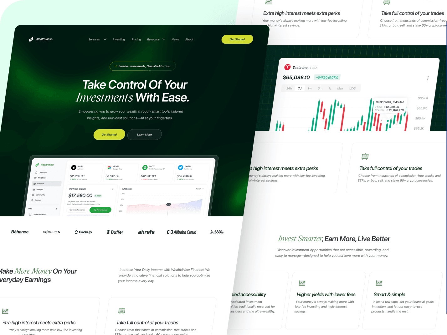
WealthWise — Investment Website
Overview
WealthWise is a concept for a UK consumer investing platform built around one idea: you name a goal, and your money gets invested and managed toward it automatically.
The pitch is calm. The "before" is a first-time investor frozen by jargon, a screen of tickers they don't understand, and the feeling they've already left it too late. The "after" is one place where you pick a goal, answer a few questions, get a portfolio matched to you, and watch it grow while the platform handles the rest.
I designed and built the full marketing site across four pages: Home, How It Works, Portfolios, and Learn. The brief I set myself: make an intimidating category feel calm and legible, and make an invisible service — automated investing — concrete enough to trust.
My Role
Designed and built solo. Positioning, site structure, copy, UI, and front end. Figma for the design, Claude Code for the build.
Strategy and positioning
An investment platform can position on returns, on low fees, or on control. I positioned on demystification. The competitor isn't another app, it's the anxiety that stops people starting. That set the audience (UK first-time investors who keep putting it off), the tone (premium but plain-spoken), and the job of every page.
I studied how Wealthfront, Betterment, and Wealthsimple frame goal-based investing, and borrowed a craft move from high-end B2B sites like Hyperline: show the product as real, populated interface rather than stock photography. That became the spine of the whole site.
The design challenge
Two problems sat on top of each other.
First, investing scares people. The category is buried in jargon and fear of loss, and most first-timers bounce before they start. The site had to feel calm and understandable, premium without becoming a Bloomberg terminal, clear without talking down.
Second, the product is automation, and automation is invisible. Money moves in the background, so there's nothing to photograph. The real work was making the service legible: a goal filling toward its target, a portfolio rebalancing itself, contributions compounding over twenty years, every holding laid bare. Turn an abstract promise into something you can watch working, and it becomes something you can believe.
Process: what I decided, and why
The finished page is the survivor of a few forks. The decisions mattered more than the pixels.
Gave each page one job. Home sells the idea. How It Works walks through the four onboarding steps. Portfolios shows exactly what you'd own. Learn builds confidence for people not ready yet. Every page ends at the same action.
Showed onboarding instead of describing it. How It Works pairs each step with the live product state for that step: the goal picker, a risk question ("how would you feel if your portfolio dropped 15%?"), the recommended portfolio, then the tracking view. You see the signup before you start it.
Organised portfolios by risk, not by theme. Four tiers from Cautious to Adventurous, each with its allocation, risk level, performance range, and typical time horizon, plus a comparison table. A beginner can answer "how much movement can I stomach?" far more easily than "which fund theme do I want?"
Let people look inside the product before signing up. On Portfolios, a pinned dashboard walks through value, allocation, holdings, and goals one region at a time, with the rest blurred. I made it scroll-driven rather than hover-driven, because hover doesn't exist on the phones most visitors use.
Localised for one market, properly. Pounds, FCA regulation, FSCS cover to £85,000, a Barclays account in the withdrawal flow, a Stocks & Shares ISA top-up in the activity feed. A finance site that mixes currencies or regulators reads as fake in seconds.
Made people the main trust signal. Member stories carry the social proof, each face tagged with a real goal: a first flat, retiring at 55, a university fund. The logo strip was repurposed to show companies you'd own through your portfolio, so it explains the product instead of decorating it.
Merged two reference patterns for the features. The navigable list from Seamless, the visual-plus-header-plus-subtext card from Hyperline. Six capabilities, each with its own mockup, no padding past what the product does.
Rebuilt a muddled section. An early mechanics block stacked four unrelated layouts. I turned it into four cards that each answer a skeptic's question before signup: how is my mix decided, what do I own, can I take it out, where does my money live. It now appears on Home and How It Works.
Fixed the projection math. The headline number first contradicted its own footnote, an 8% result labelled as 6%. Corrected to £115,500 at 6%. On a finance site, one wrong number costs you the whole page.
The work
Here are some sections from the website.
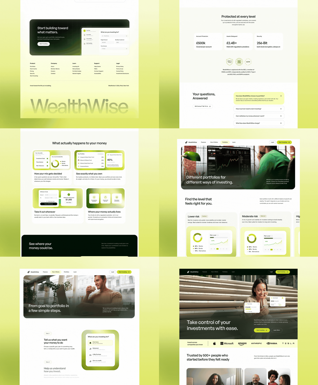
Designing for conversion
Every structural call pointed at one action: Start Investing.
Start Investing is the single primary action and appears at every decision point: hero, goal picker, calculator, comparison table, and the closing CTA. The closing CTA on every page previews the four-step onboarding (goal, details, portfolio, confirm), so signing up looks short before anyone commits.
The calculator is the emotional peak. It splits the result into what you'd put in versus what growth adds, and the CTA sits right under that number.
Secondary links (How It Works, Learn, member stories) route to proof, not away. Learn has twelve plain-language guides and ends in the same CTA, so the reader who isn't ready yet still has a way back in. Trust sits where people hesitate: the companies strip near the top, the "Protected at every level" section with FCA, FSCS, SOC 2, ISO, and GDPR marks near the decision.
Design notes
- Realistic, populated product UI is the hero of nearly every section, so the site shows the product working instead of describing it
- Built as a small shared system: FAQ, protection section, closing CTA, and the card shells repeat across pages, so the site scales past a landing page without redesigning each one
- Killed the jargon throughout — "take it out whenever," "see exactly what you own" — on a calm emerald-on-off-white palette that avoids both neon-fintech and heritage-bank blue
Enjoyed reading this? Thank you.
This took a bit of work to put together, so if you liked it, I’d really appreciate you sharing it. If you have a similar project in mind, let’s work together.


What People Say About Me and My Work
One of the smoothest design experiences we've had. Joshua turned complex ideas — AI onboarding, unified inbox, automation builder — into polished, intuitive flows, with a design system that kept us consistent across mobile and web.

Brian T George
CEO, Unifiedbeez

Love his work! Always professional, detail-oriented, and delivers top-quality results. He understands the vision and brings it to life better than expected. Reliable, creative, and a joy to work with — highly recommend!

Becky Idiale
CEO, Daibo Consulting

Josh redesigned our landing page and nailed it. His attention to detail and smooth communication made everything easy. The new design boosted engagement and feels more aligned with our brand. Highly recommend.

Areous A
CEO, Pixel Pioneer Studios

Joshua consistently delivers clean, thoughtful, user-centered designs. He's proactive, reliable, and communicates ideas clearly. Every project gets real creativity and attention to detail — a true asset to any design team.

Chi Onyeukwu
CEO, Njem

Working with Joshua on the Koboneer app was smooth start to finish. He understood the product, turned complex ideas into a clean, intuitive interface, and stayed open to feedback. His attention to detail made a real difference.

Solomon Okafor
CEO, Koboneer

Joshua has been an outstanding contributor at Dingpay. His design solutions are thoughtful, intuitive, and aligned with our users' needs. He works with speed and precision while keeping strong creativity and brand consistency.

Itohowo Udofia
CEO, Dingpay

Great experience working with Joshua. He pays attention to details and provided excellent communication throughout the project.

Donny Gamble
CEO, The Elevation Group

Joshua transformed the AllFoods UK site into something modern, professional, and easy to navigate. He was proactive, responsive, and cared about reflecting our brand. We've had great feedback since.

Akinyemi Arabambi
CEO, AllFoods UK



Let’s Work Together!
Whether it's a freelance project, a full-time role, or you just want a second opinion on something. Tell me a bit about what you're building and where you're stuck. That's plenty to start.


© Joshua Ikhine, 2025.
All rights reserved.
 hello@joshuaikhine.com

 +234 806 258 9858