 Back
Back
Shoppr — E-commerce Mobile App
Jump to section
Shoppr — E-commerce Mobile App
Overview
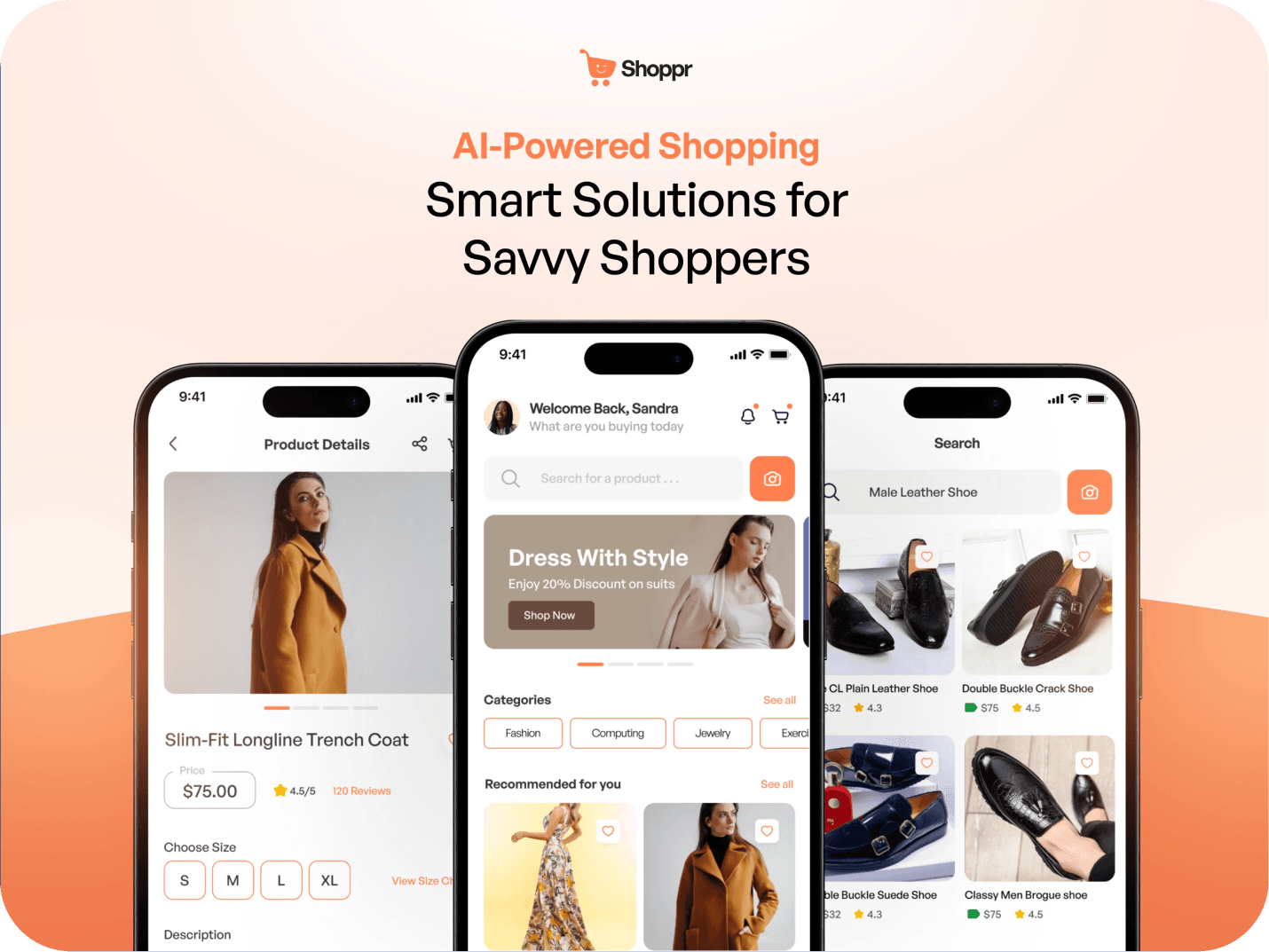
Shoppr is a concept e-commerce app built around one idea: take the two things online shopping is worst at — not being able to picture a product on yourself, and drowning in choice — and actually fix them.
It does that with a virtual try-on that previews items on you before you buy, and an in-app assistant that helps you narrow things down when you don't know exactly what you want. A self-initiated project where I designed the full experience, brand included, end to end.
My Role
Solo project, start to finish, over about four weeks. I owned research, UX, UI, the design system, and the brand identity. Tools were Illustrator and Figma, with Google Meet and Forms for the research.
Target Audience
From the research, Shoppr is built for the people who shop online most and expect it to be effortless:
- Online shoppers — people who buy across categories regularly and want one app that does it all well
- Tech enthusiasts — early adopters drawn to features like visual search and try-on
- Busy professionals — people who value speed and want to decide fast without endless scrolling
- Fashion-focused shoppers — people who care how something looks on them before buying, the core try-on audience
- Creators and hobbyists — people sourcing specific tools and materials who need to find exact items quickly
Problem & Solution
The problem. Online shopping still leaves people guessing. You can't tell how something will actually look on you, the "help" is generic, and big catalogs are exhausting to dig through — so people hesitate, second-guess, and abandon carts.
The approach. Shoppr answers each of those directly: virtual try-on so you can see it before you commit, an assistant that gives real recommendations instead of a wall of filters, and navigation built to get you to the thing you want fast.
User Research
I kept research light and informal — a handful of interviews and a short Google Form with people who shop online regularly, across a few different ages and backgrounds. Enough to sanity-check my assumptions and hear real frustrations, not a formal study.
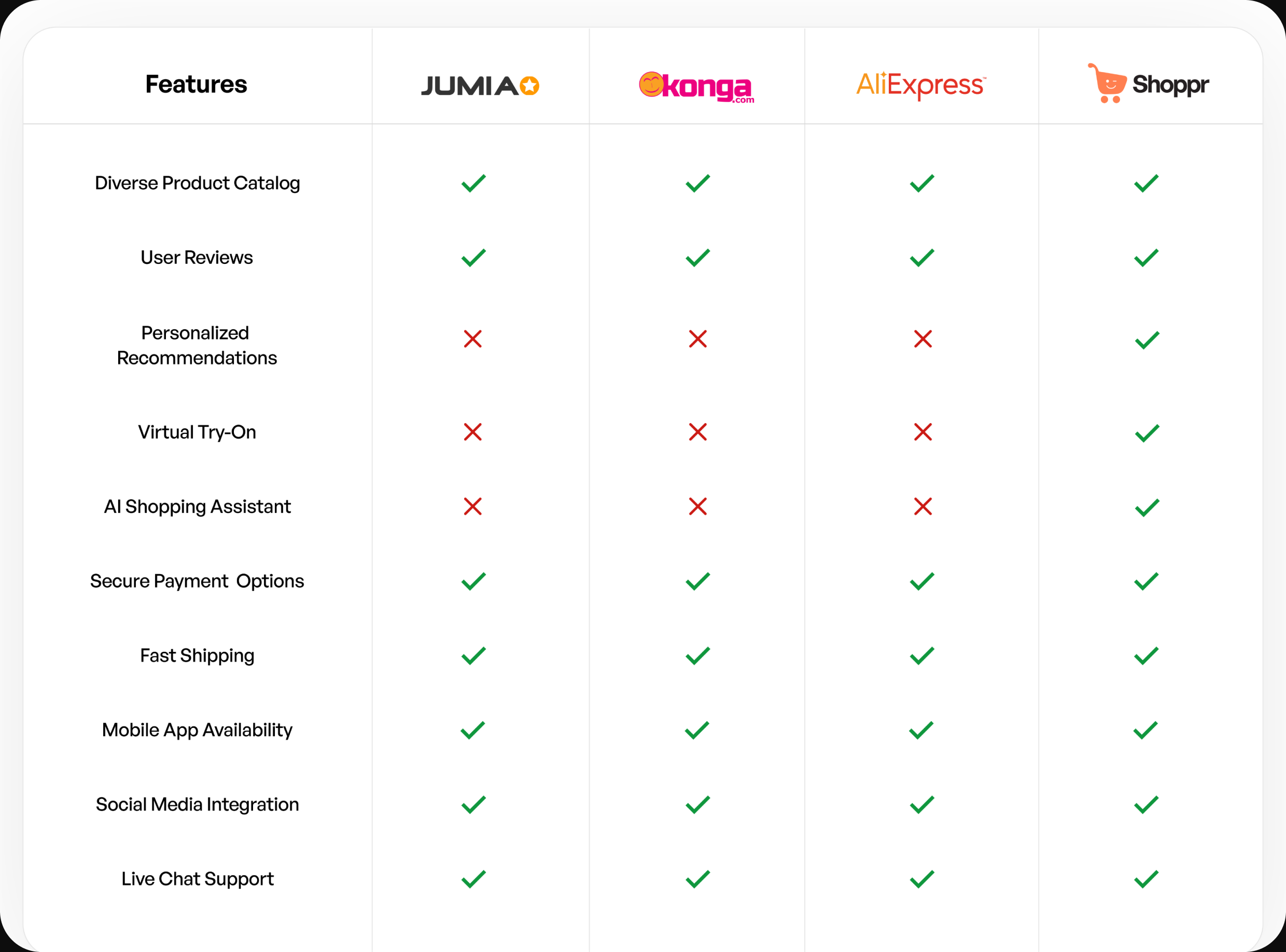
The recurring themes were consistent: people want to see before they buy, they want help deciding without being upsold, and they trust reviews more than any marketing.
Competitive Analysis
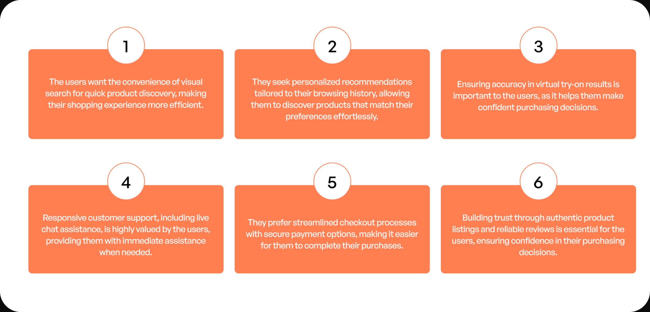
I looked at how the big players — Jumia, Konga, AliExpress — handle the same problems, feature by feature. The pattern was clear: everyone nails catalog, payments, and shipping, but nobody offers personalized recommendations, virtual try-on, or a real shopping assistant. That gap is where Shoppr lives.
Design System
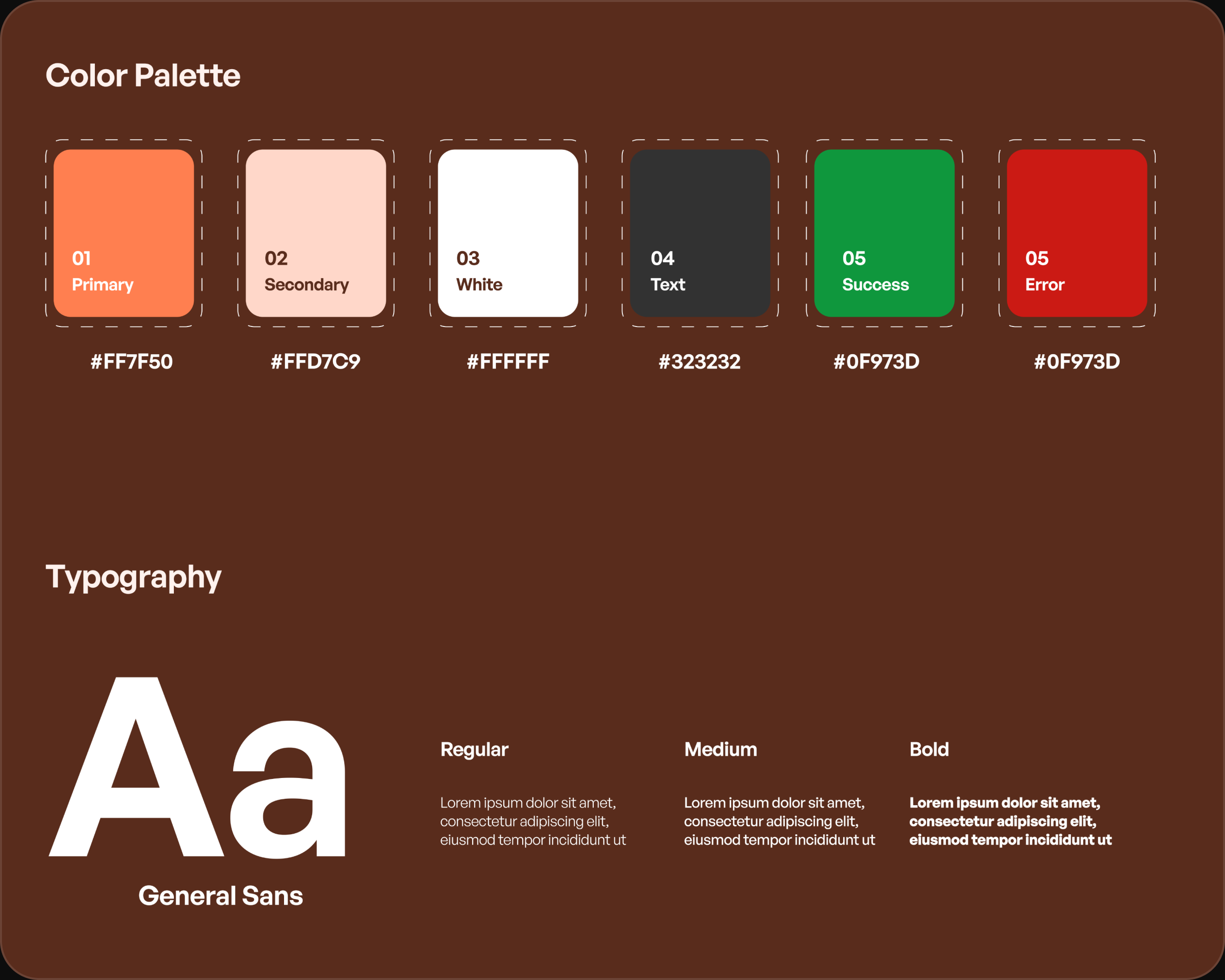
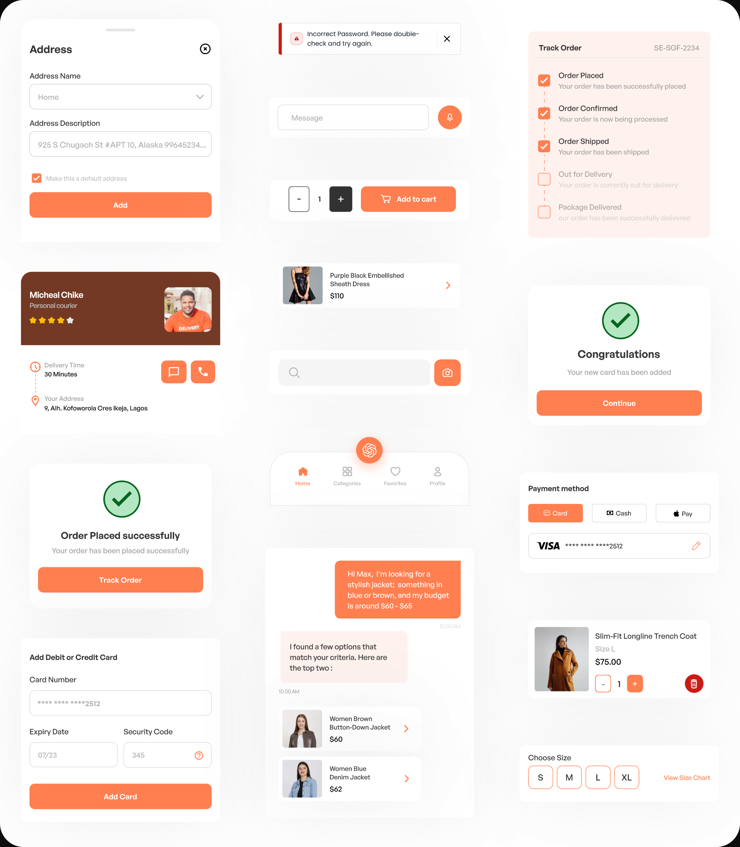
Shoppr runs on a defined system: General Sans as the typeface across three weights, a palette built on a warm coral primary with supporting neutrals and clear success/error states, and a component library the whole app is assembled from. It's what keeps 40-plus screens feeling like one product.
Brand Identity
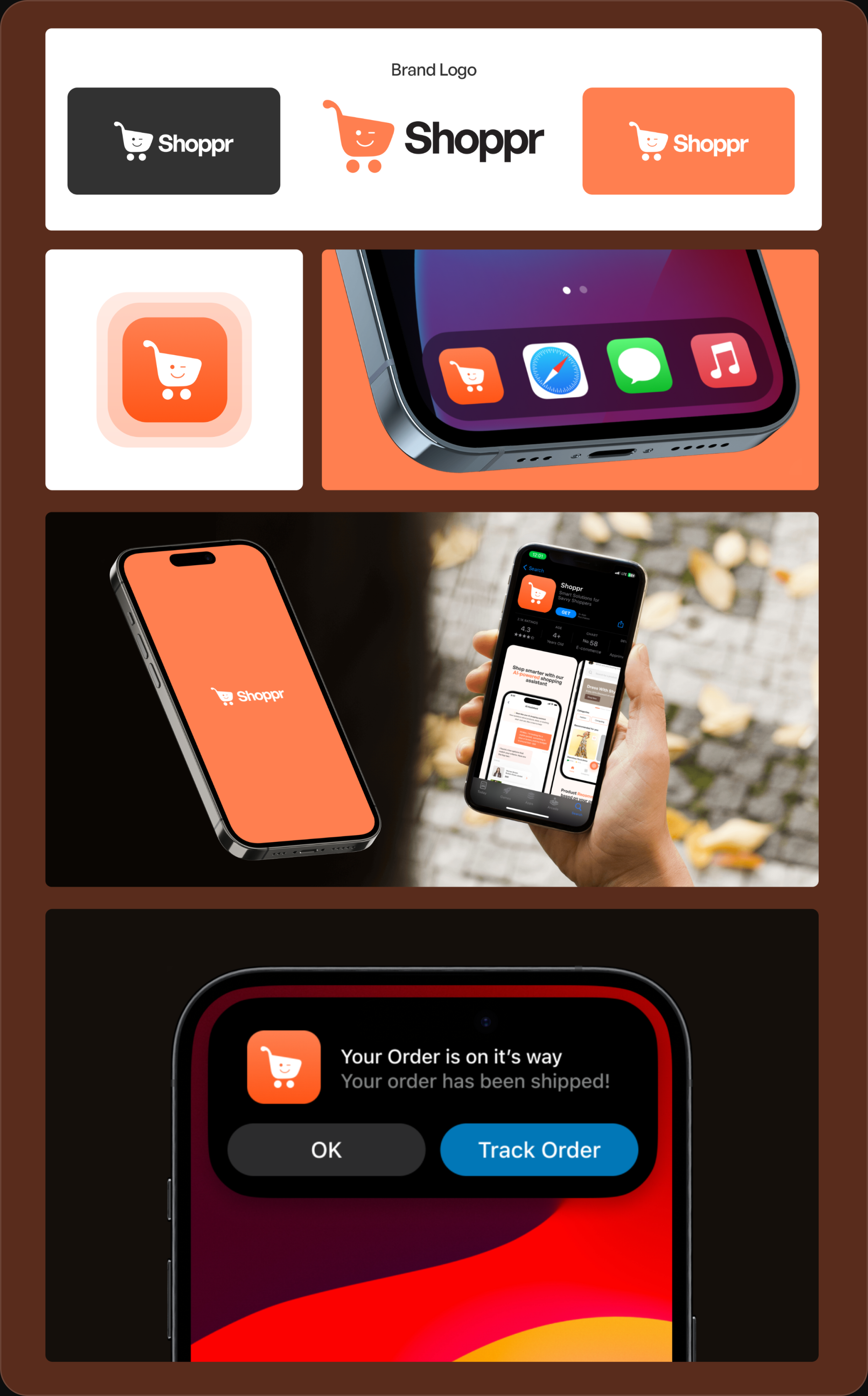
The brand is a friendly cart with a wink — approachable rather than corporate, which fits an app trying to make shopping feel lighter. I built it out across the logo, app icon, store listing, and notification states so it holds up everywhere it shows, not just on a logo slide.
The Product + Annotated Flows
Here are the screens I designed for the mobile app
Onboarding Flow
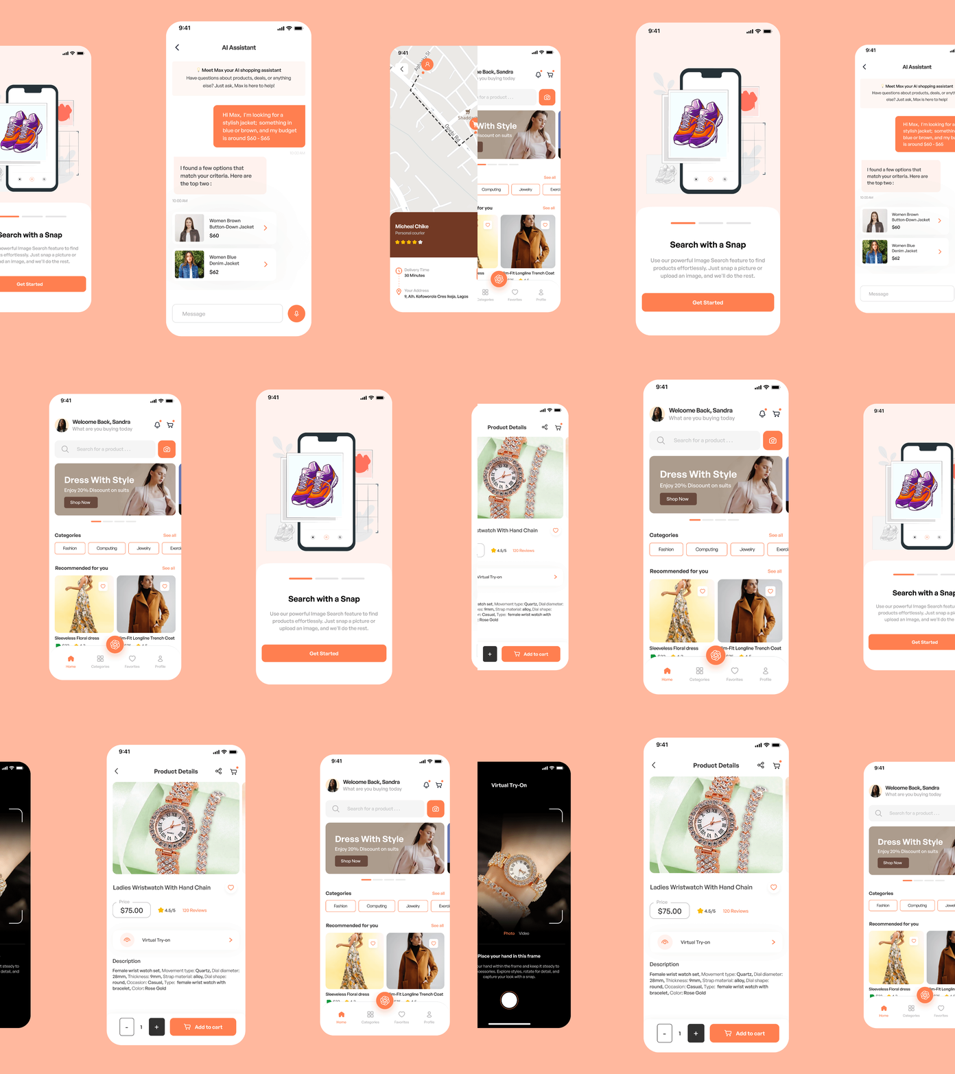
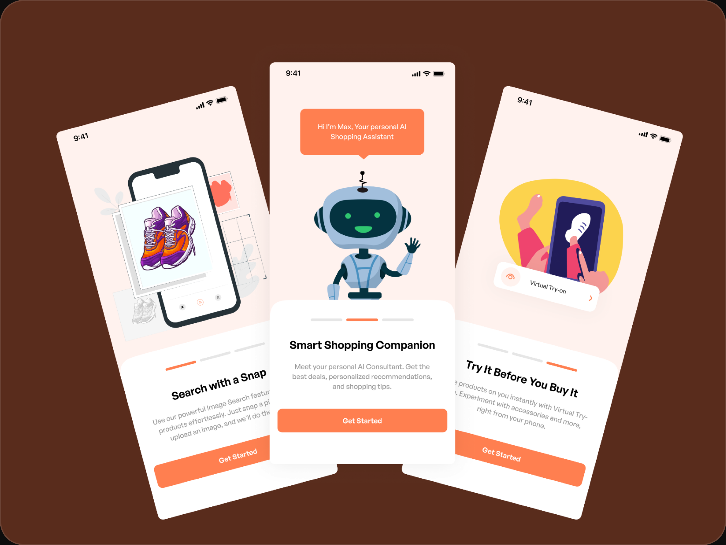
First run introduces the three things that make Shoppr different, one screen each: snap-to-search, so you can find a product from a photo instead of guessing keywords; Max, the shopping assistant; and virtual try-on. Three screens, three features, then straight into the app — no long tour.
Sign-Up & Log-In
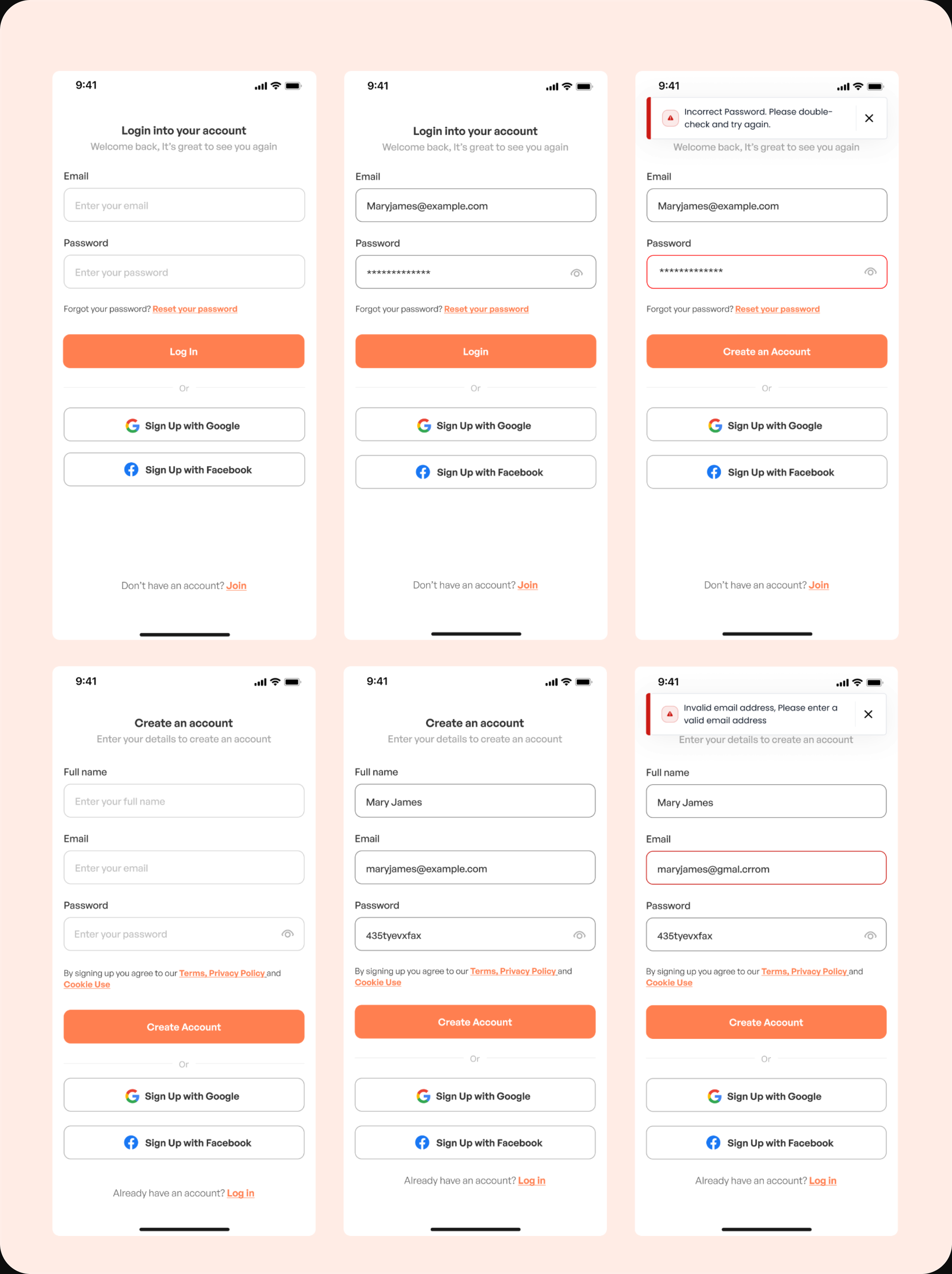
Standard email-and-password with Google and Facebook as faster options. What's worth noting is the states: I designed the error cases, not just the happy path — wrong password, invalid email — each with a clear inline message so the user knows exactly what to fix instead of staring at a rejected form.
Product Details & Order
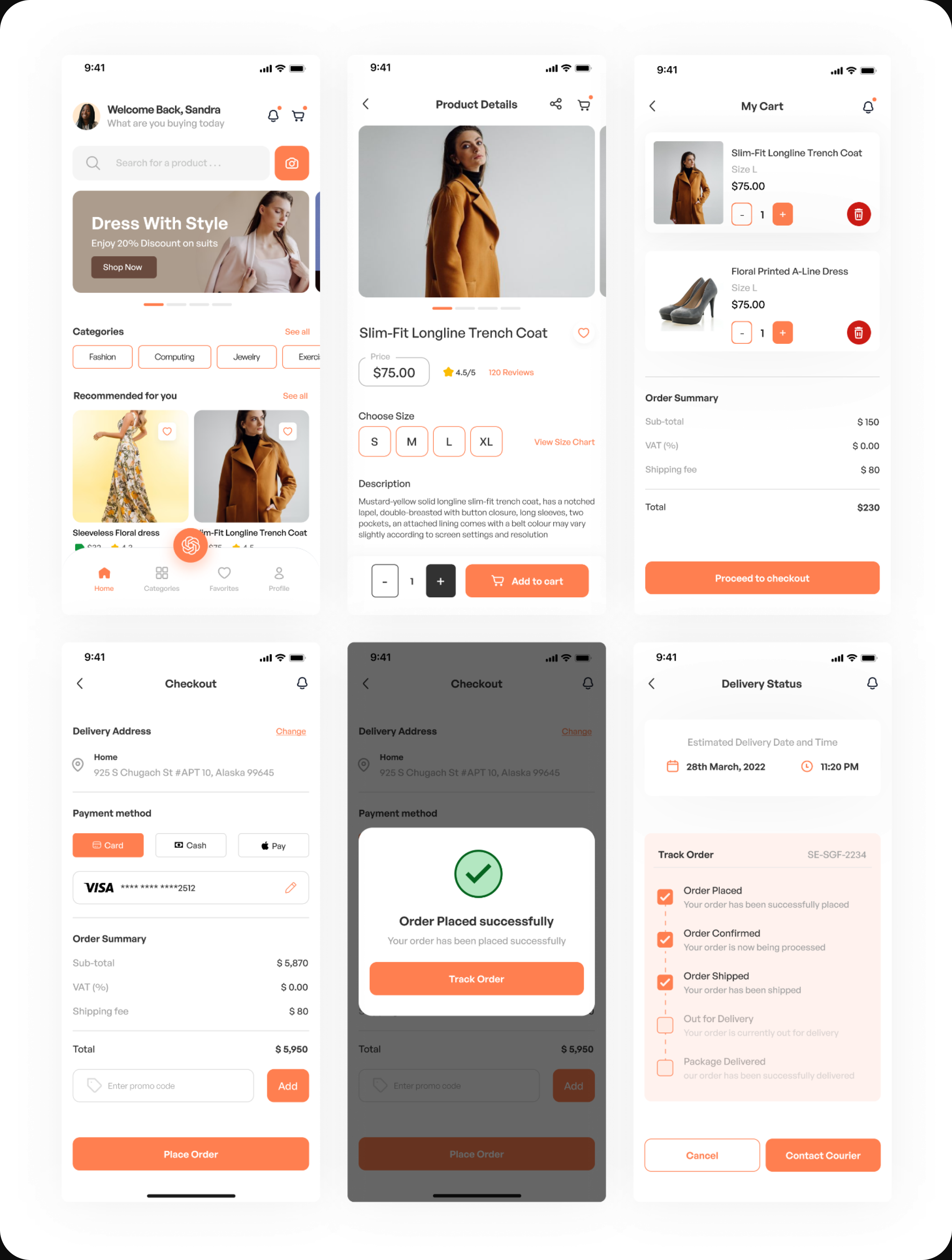
From a product, the user picks a size, checks reviews and the size chart, adds to cart, then moves through cart → checkout → order placed → delivery tracking. The order summary is honest about subtotal, VAT, and shipping before the user commits, and the tracking screen shows live status right down to contacting the courier.
Virtual Try-On
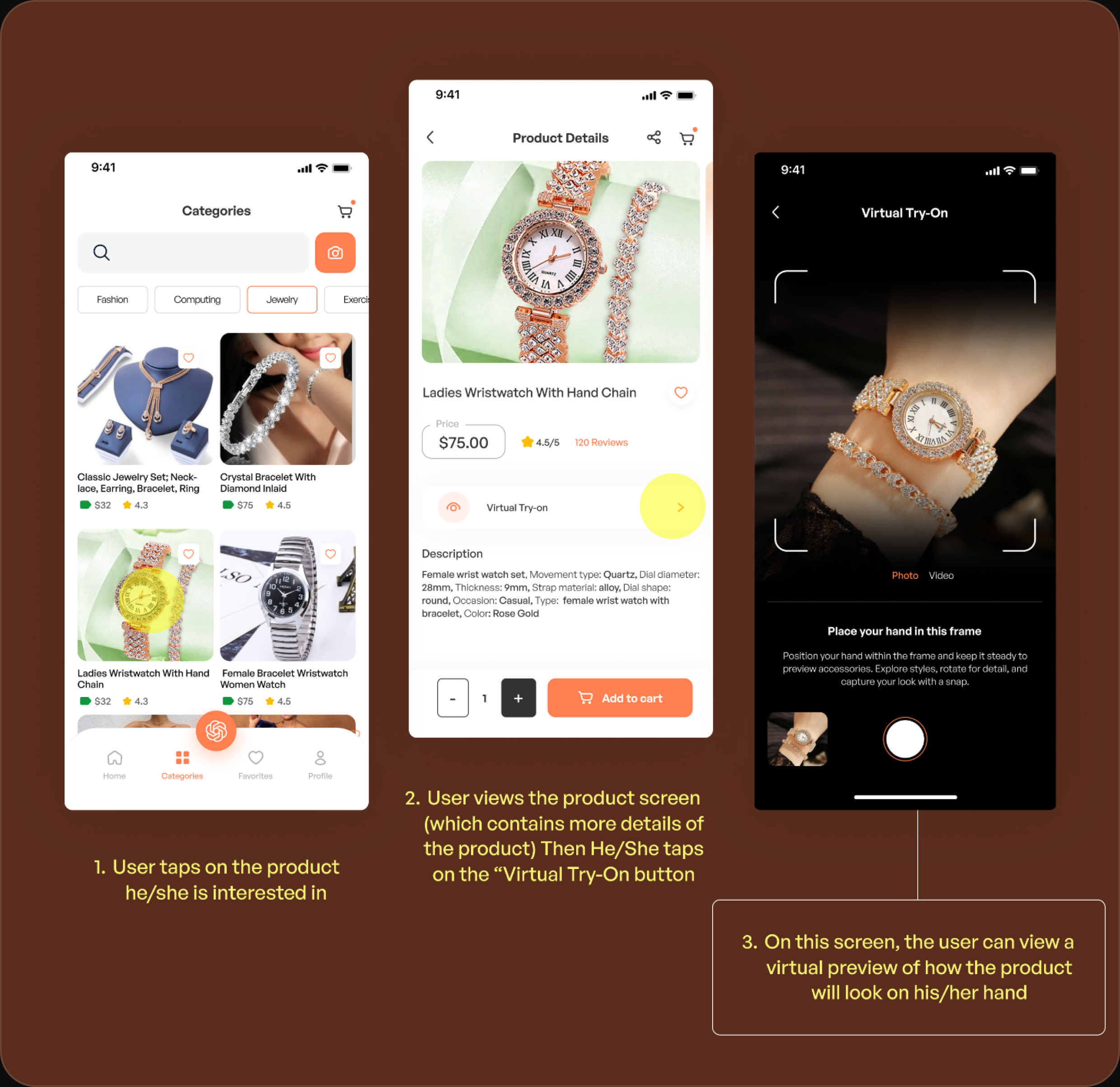
The feature Shoppr is built around. From a product the user taps Virtual Try-On, positions the item in-frame — say a watch on the wrist — and sees a live preview of how it actually looks on them before buying. It's the direct answer to the biggest problem in the research: not being able to picture a product on yourself. The flow is annotated step by step so the intent reads even as a static case study.
AI Assistant (Max)
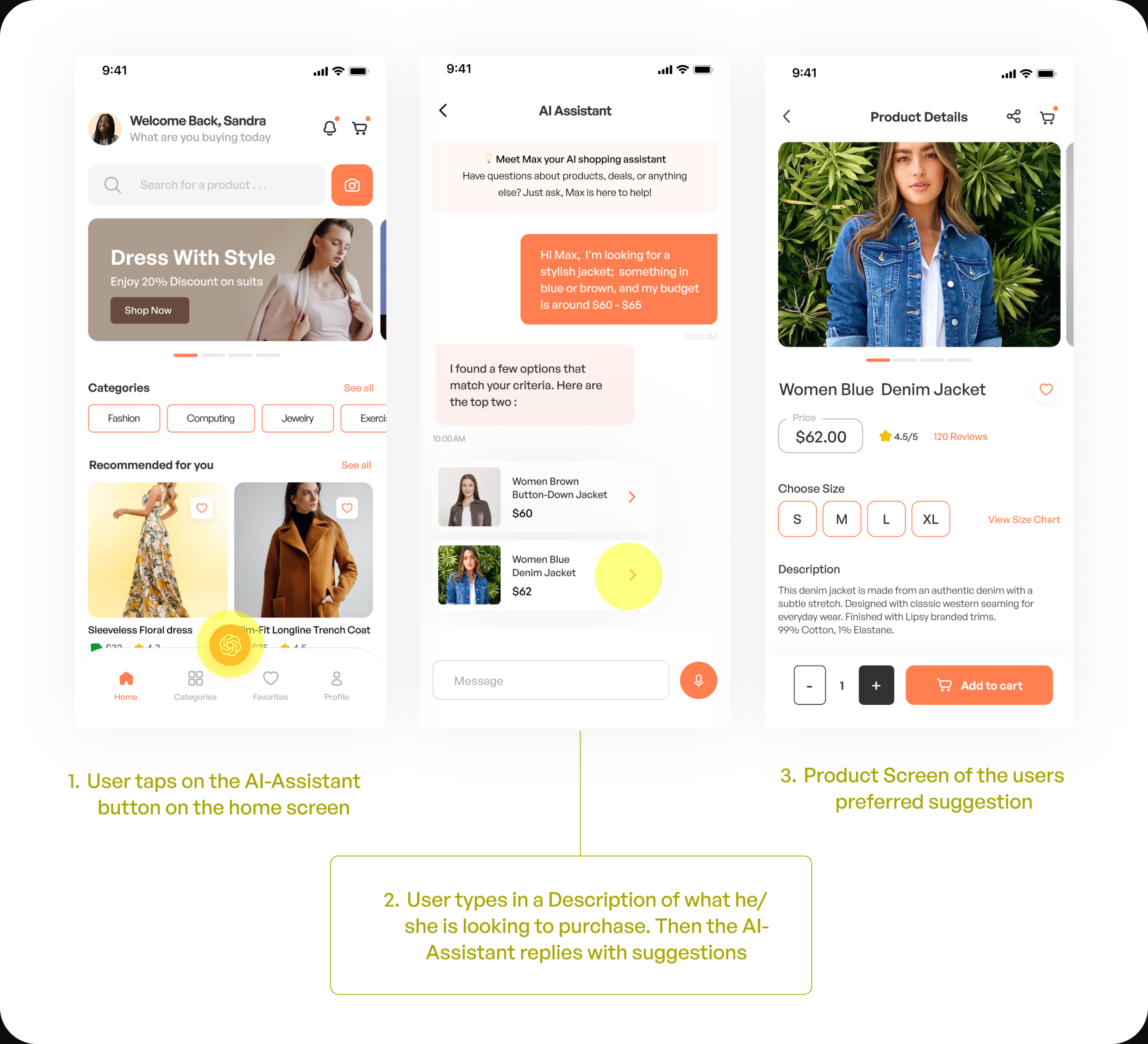
When someone doesn't know exactly what they want, they open Max and describe it in plain language — "a stylish jacket in blue or brown, budget around $60." Max replies with a couple of real matches pulled to that brief, and tapping one goes straight to the product. It replaces filter-hunting with just saying what you're after.
Other Screens
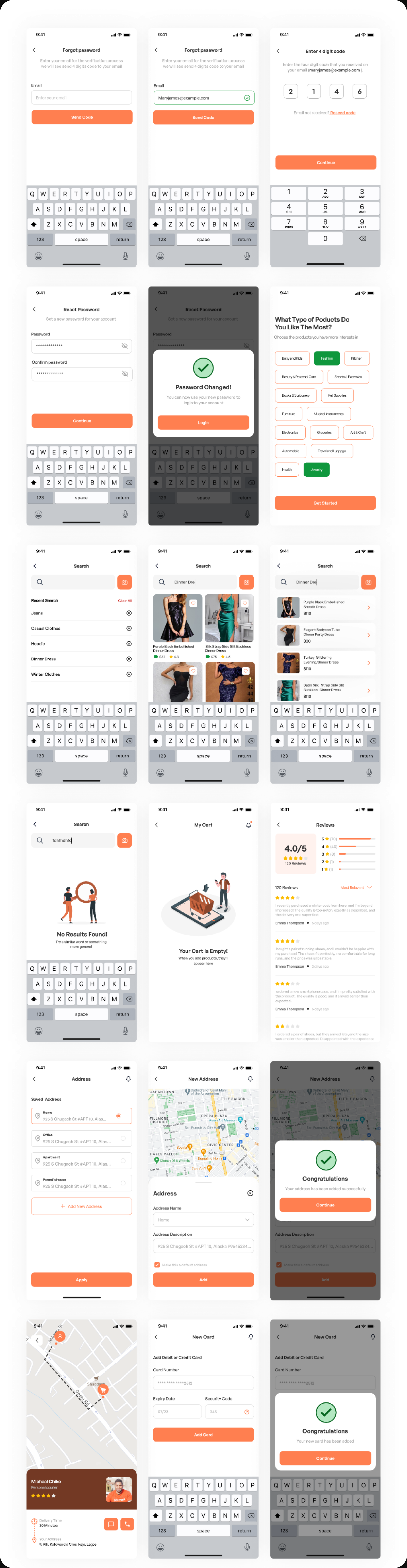
Beyond the main flows — password recovery, product preferences, search and empty states, address and card management. The parts that decide whether an app feels finished or half-built.
Outcome & Reflection
Shoppr was a concept, so there's no shipped metric — but it did what I set it up to do: take the two hardest parts of online shopping and design real, considered answers to them, all the way down to the empty states and error messages most concepts skip.
If I picked it back up, three things. I'd rework the primary color usage across the app — the coral does too much work in places and I'd explore stronger combinations. And I'd take the two signature features, virtual try-on and the AI suggestions, from static screens into a working prototype — those flows are the whole pitch, and they'd land harder as something you can actually move through than as annotated stills.
Enjoyed reading this? Thank you.
This took a bit of work to put together, so if you liked it, I’d really appreciate you sharing it. If you have a similar project in mind, let’s work together.
What People Say About Me and My Work
One of the smoothest design experiences we've had. Joshua turned complex ideas — AI onboarding, unified inbox, automation builder — into polished, intuitive flows, with a design system that kept us consistent across mobile and web.

Brian T George
CEO, Unifiedbeez

Love his work! Always professional, detail-oriented, and delivers top-quality results. He understands the vision and brings it to life better than expected. Reliable, creative, and a joy to work with — highly recommend!

Becky Idiale
CEO, Daibo Consulting
Josh redesigned our landing page and nailed it. His attention to detail and smooth communication made everything easy. The new design boosted engagement and feels more aligned with our brand. Highly recommend.

Areous A
CEO, Pixel Pioneer Studios

Joshua consistently delivers clean, thoughtful, user-centered designs. He's proactive, reliable, and communicates ideas clearly. Every project gets real creativity and attention to detail — a true asset to any design team.

Chi Onyeukwu
CEO, Njem

Working with Joshua on the Koboneer app was smooth start to finish. He understood the product, turned complex ideas into a clean, intuitive interface, and stayed open to feedback. His attention to detail made a real difference.

Solomon Okafor
CEO, Koboneer

Joshua has been an outstanding contributor at Dingpay. His design solutions are thoughtful, intuitive, and aligned with our users' needs. He works with speed and precision while keeping strong creativity and brand consistency.

Itohowo Udofia
CEO, Dingpay

Great experience working with Joshua. He pays attention to details and provided excellent communication throughout the project.

Donny Gamble
CEO, The Elevation Group

Joshua transformed the AllFoods UK site into something modern, professional, and easy to navigate. He was proactive, responsive, and cared about reflecting our brand. We've had great feedback since.

Akinyemi Arabambi
CEO, AllFoods UK



Let’s Work Together!
Whether it's a freelance project, a full-time role, or you just want a second opinion on something. Tell me a bit about what you're building and where you're stuck. That's plenty to start.


© Joshua Ikhine, 2025.
All rights reserved.
 hello@joshuaikhine.com
 +234 806 258 9858