
Jump to section
Savoré - Mobile App
Overview
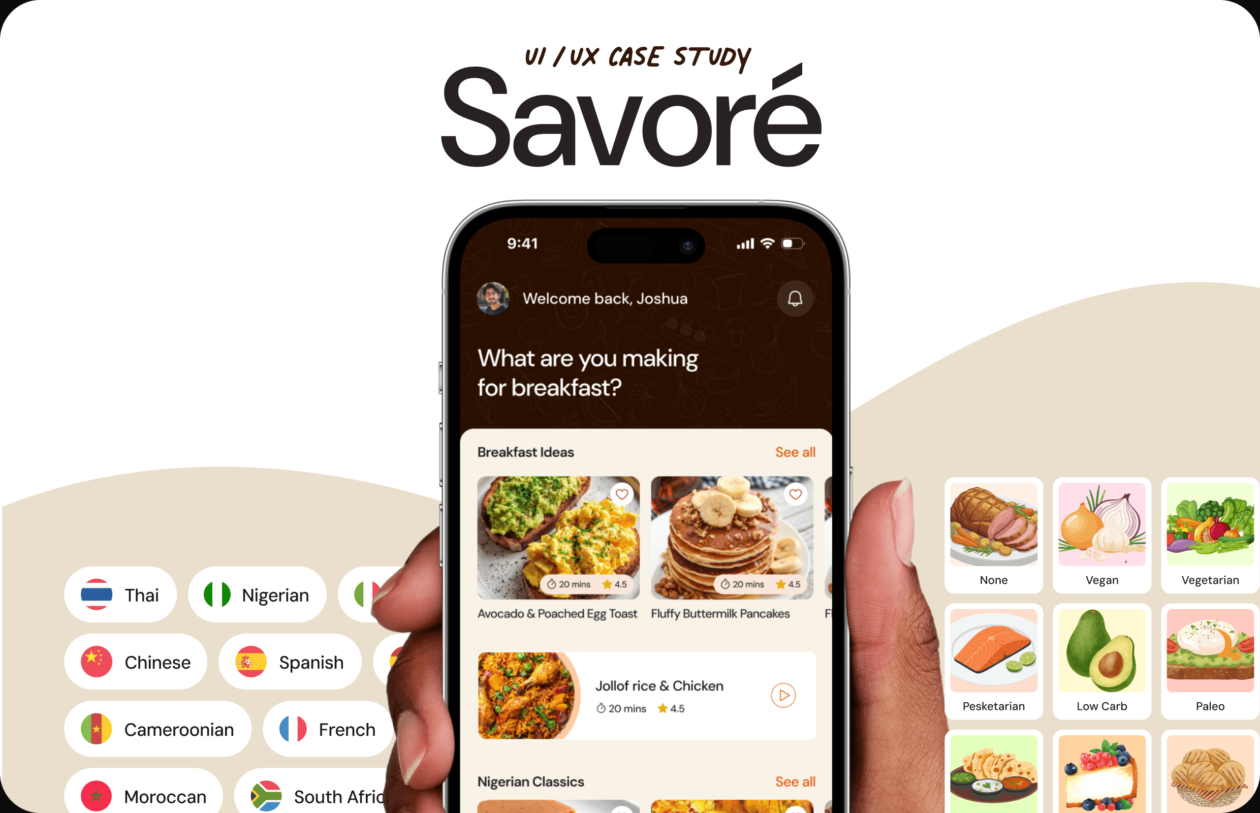
Savoré is a concept mobile app for people who actually cook — and the ones who want to start. It treats finding a recipe, cooking it, and sharing your own as one connected experience instead of three disconnected ones.
The idea came from a gap I kept noticing in every recipe app I used: they're built like search engines. You find something that looks good, tap in, read a wall of text, and then you're on your own — phone locking mid-cook, scrolling back to check how much soy sauce you needed, losing your place. Savoré was built around a different premise: that the actual cooking, not just the finding, is the thing worth designing for.
I designed the whole thing end to end as a self-initiated project — a chance to take a familiar, messy experience and rebuild it around how people really cook.
My Role
Solo project, start to finish. I owned the positioning, UX, UI, and design system myself over about four weeks. Tools were Figma for design and prototyping, Illustrator for assets, and Jitter and Premiere Pro for motion.
Problem
Most recipe apps stop at the recipe. They help you find something, then leave you alone for the part that actually matters. Specifically:
- Discovery is generic — feeds don't know what time it is, what you like, or what you can actually cook
- The cooking itself gets the least design attention, even though it's the hardest part
- You lose your place constantly — phone locks, you scroll back for a measurement, you forget which step you were on
- Home cooks with great recipes have nowhere proper to share them, so they end up cramming a recipe into an Instagram caption
The result is the same for most people: a tool that helps for thirty seconds and abandons you for the next thirty minutes.
Competitive Analysis
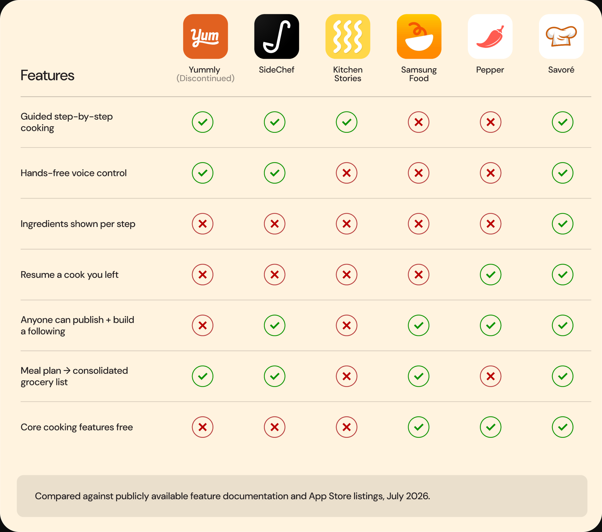
I benchmarked Savoré against the main recipe apps — Yummly, SideChef, Kitchen Stories, Samsung Food, and Pepper — comparing against publicly available feature documentation and App Store listings.
A clear split emerged. Yummly, SideChef, and Kitchen Stories built genuinely good cooking tools, then locked the best parts behind a subscription with almost nothing for the person who wrote the recipe. Pepper and Samsung Food built the social layer — feeds, follows, communities — then handed you a wall of text when it was time to actually cook. Nobody did both well, and not one of them surfaced ingredients per cooking step. That gap became the space Savoré was designed to occupy.
User Flow
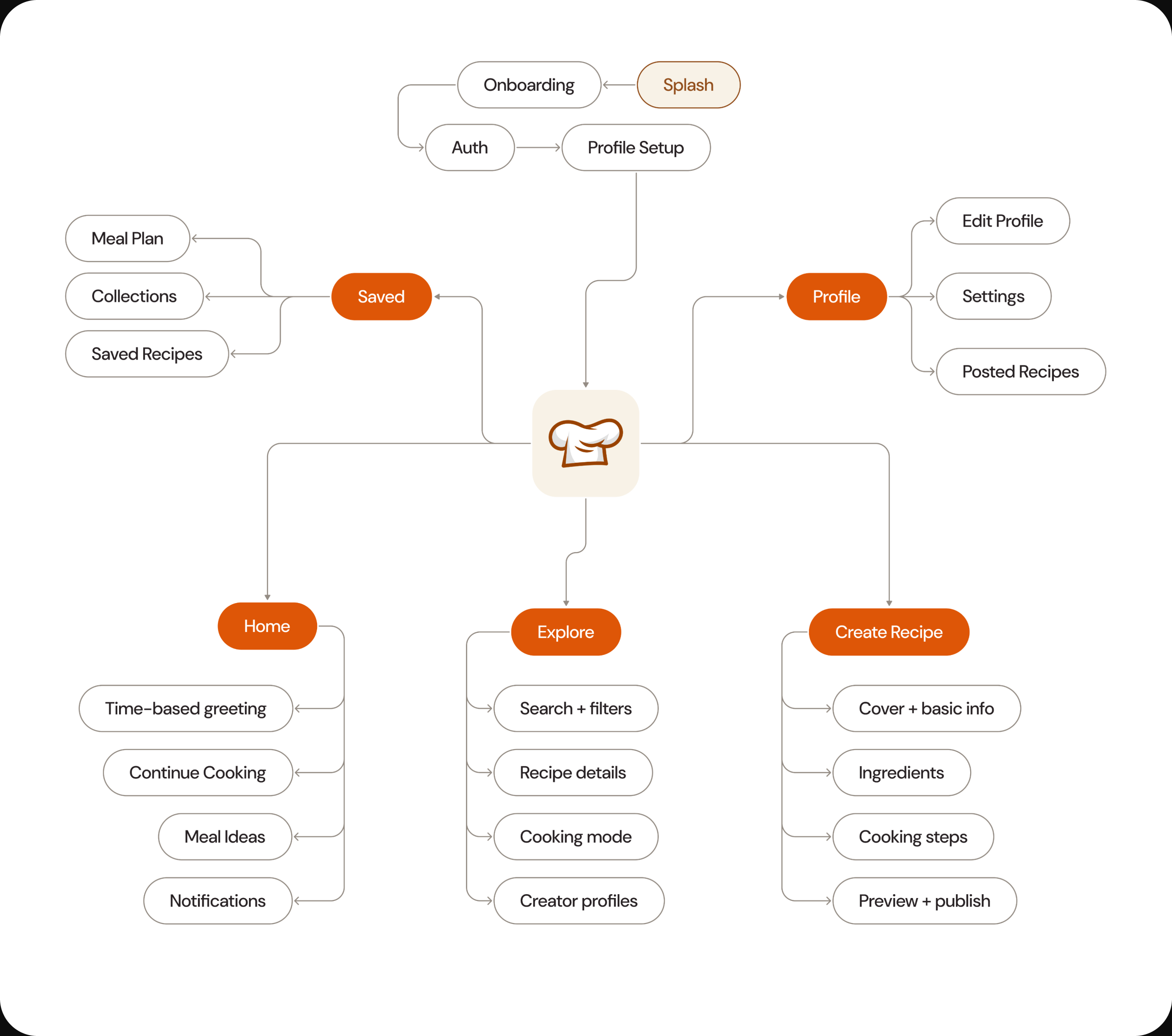
Before designing any screens, I mapped the full user flow — from splash and onboarding through the home, explore, saved, profile, and create-recipe branches. Laying the whole journey out first showed me where users would struggle and let me simplify the structure before committing to any one direction.
Design Process
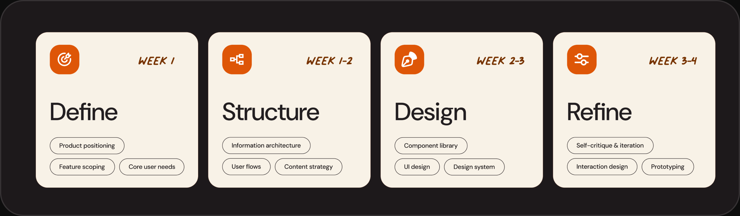
This was a self-initiated project, so instead of user research I leaned on competitive analysis, real cooking behaviour, and repeated self-critique. Every decision has a reason behind it. The work moved through four phases:
- Define — product positioning, feature scoping, core user needs
- Structure — information architecture, user flows, content strategy
- Design — component library, UI design, design system
- Refine — self-critique, interaction design, prototyping
Design System
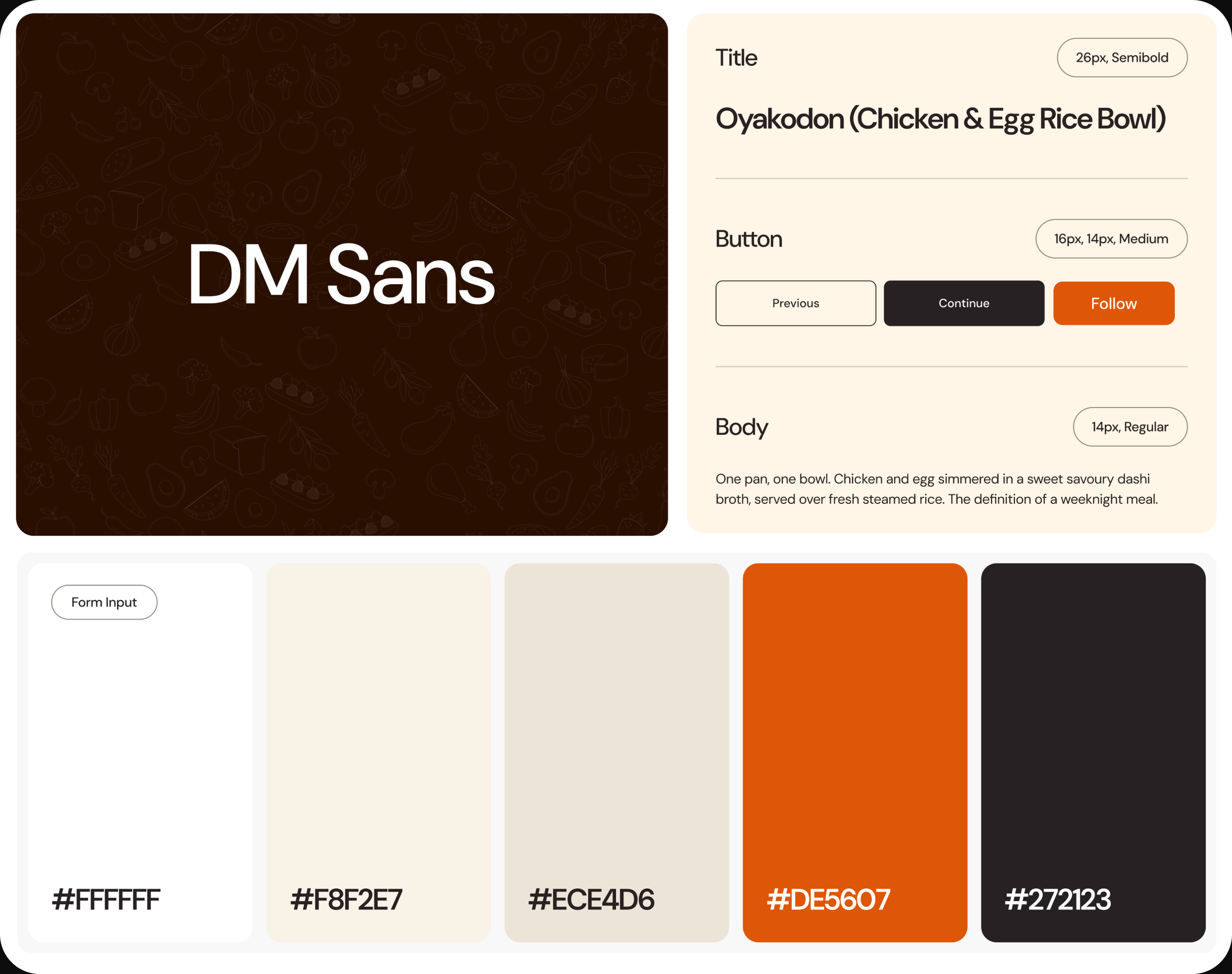
I built a small design system to keep everything consistent across 40+ screens — one typeface, five colours, and a tight set of components.
The system runs on DM Sans throughout, anchored by a warm palette of cream and terracotta on white. Standardising the type scale, colour, and core components early kept the interface coherent as the screen count grew, and would make it far faster to extend or hand to a developer.
Solution
Savoré pulls finding, cooking, and sharing into one flow, built around a single goal: getting someone from "I'm hungry" to "I made this" without friction.
- A feed that changes with the time of day, ordered around the cuisines and skill level you actually chose
- A full-screen cooking mode with per-step ingredients, built-in timers, voice control, and a saved position if you step away
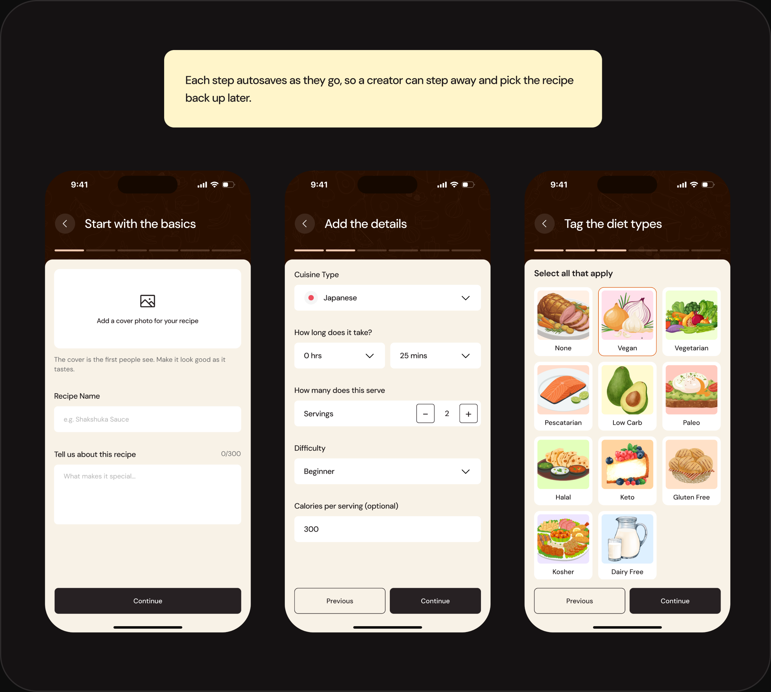
- A creator flow that feels conversational instead of like a form, with autosave throughout
- Meal planning that builds a consolidated grocery list — merged duplicates, grouped by aisle
- All of it in a calm, warm interface that makes cooking feel guided rather than lonely
App Design
Here are the screens I designed for the mobile app.
Onboarding Flow
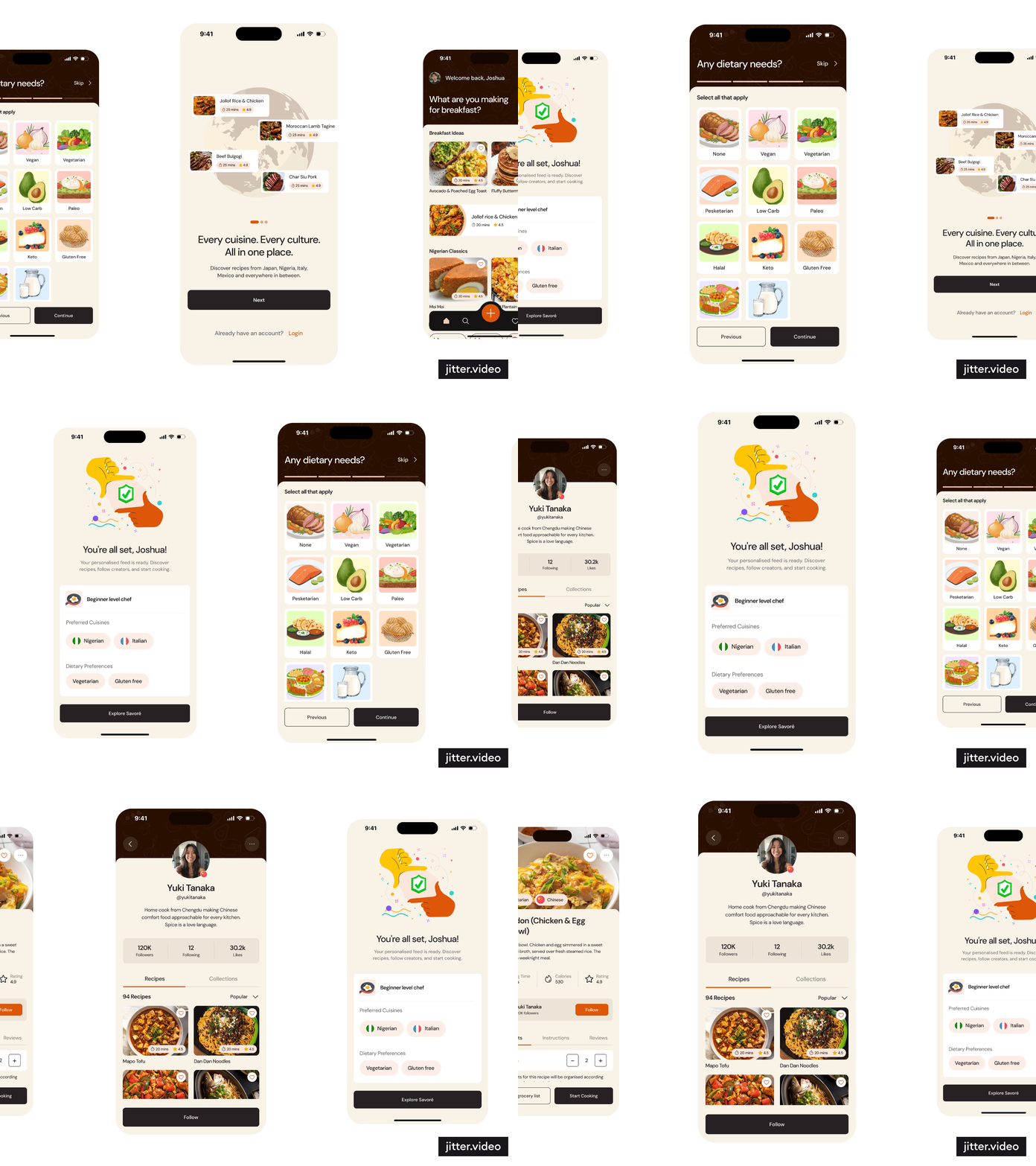
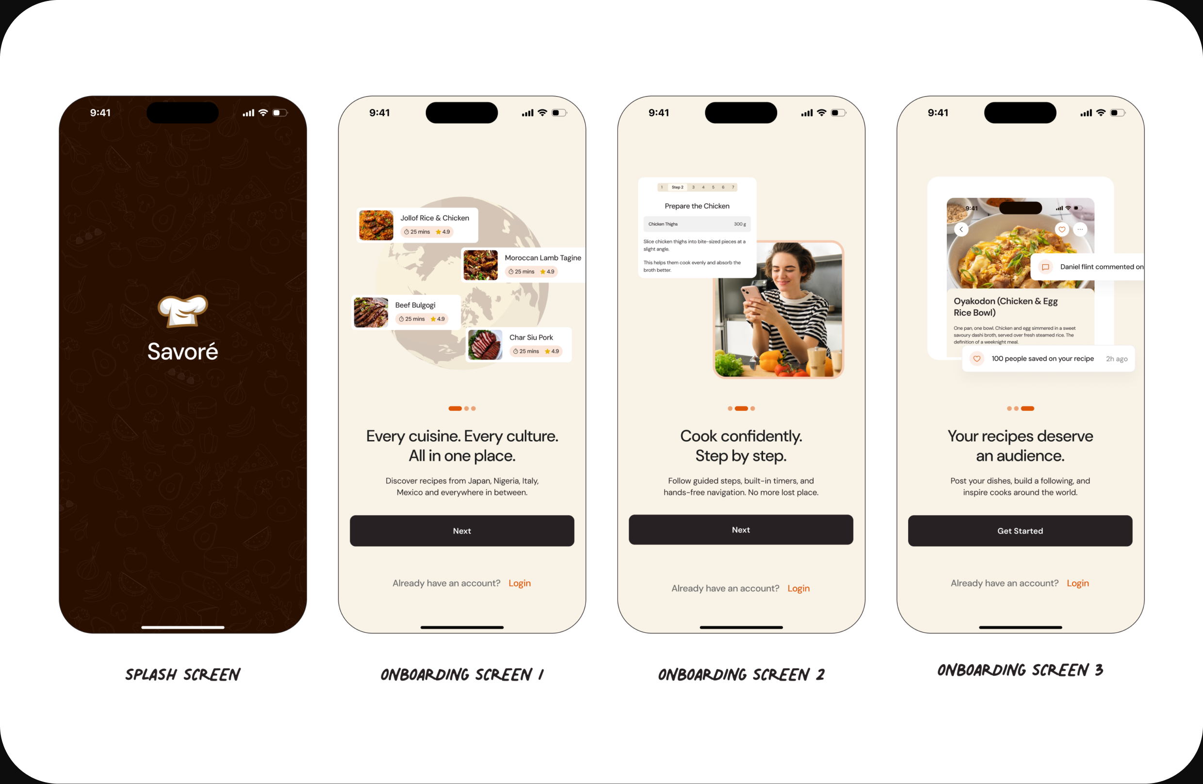
When the user opens the app, the splash screen appears first, followed by three onboarding screens that set the promise before asking for anything — every cuisine in one place, guided step-by-step cooking, and an audience for your own recipes. It's a quick, engaging introduction to what Savoré does, before the user commits to signing up.
Create Account / Profile Setup
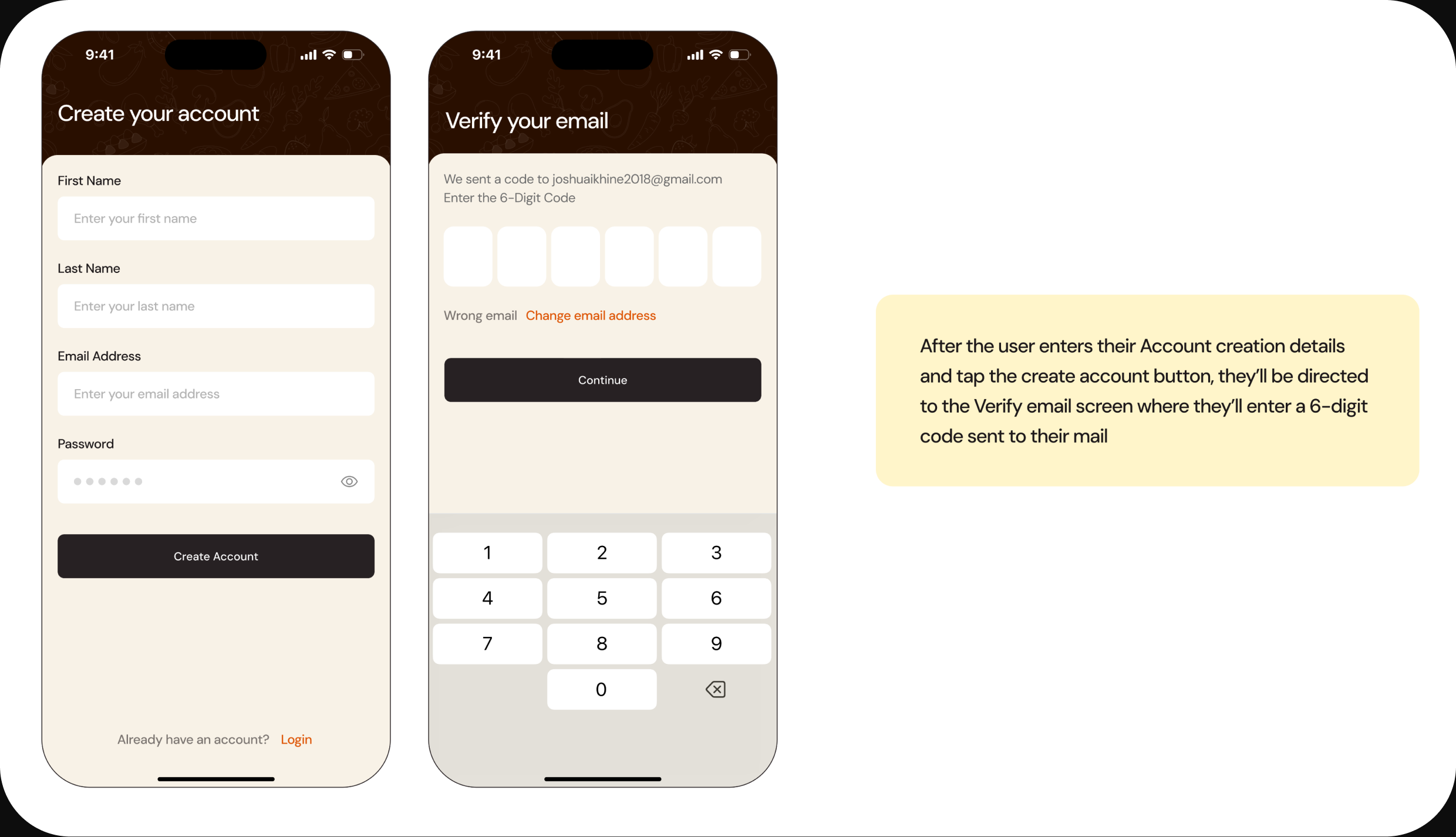
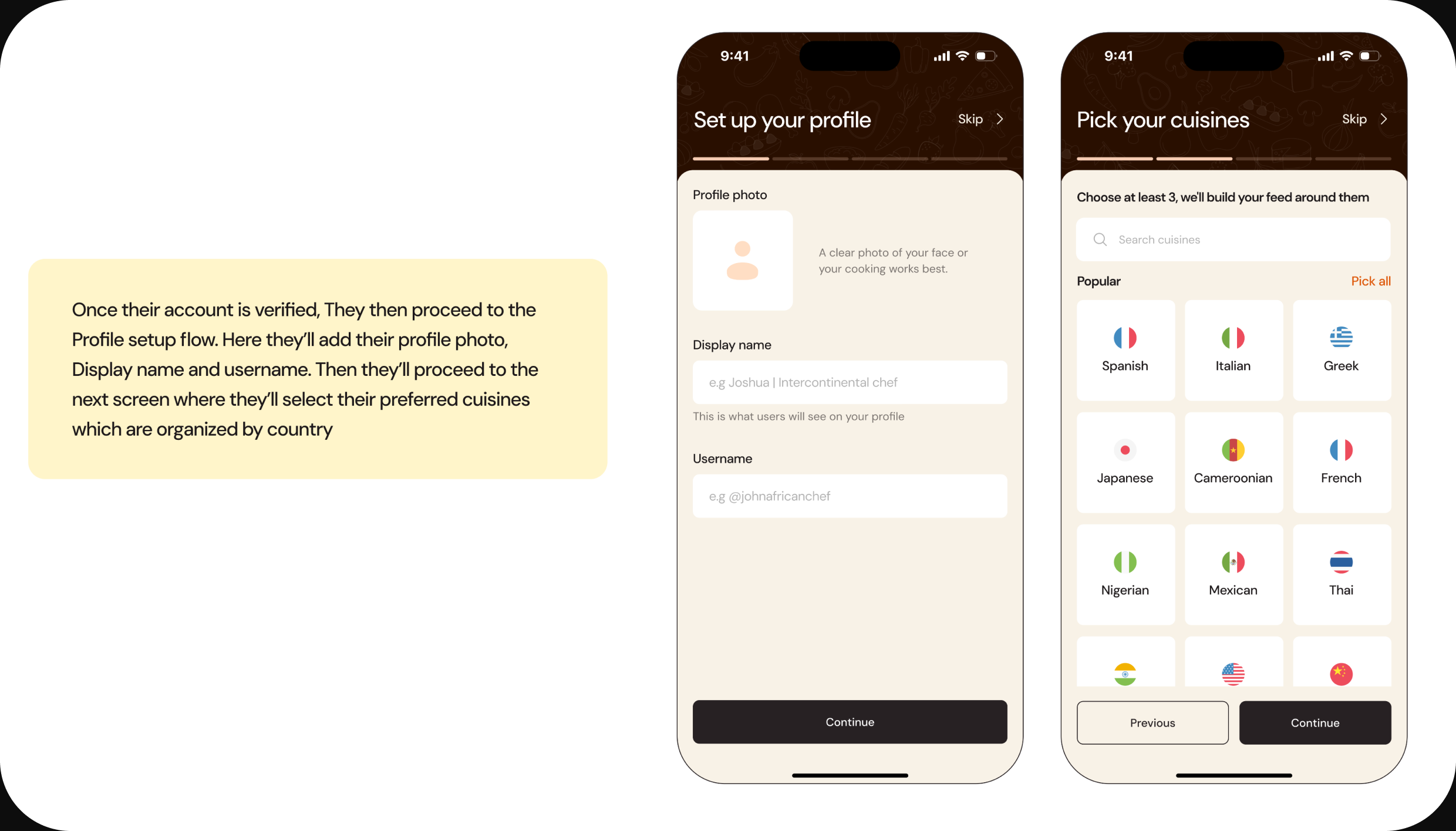
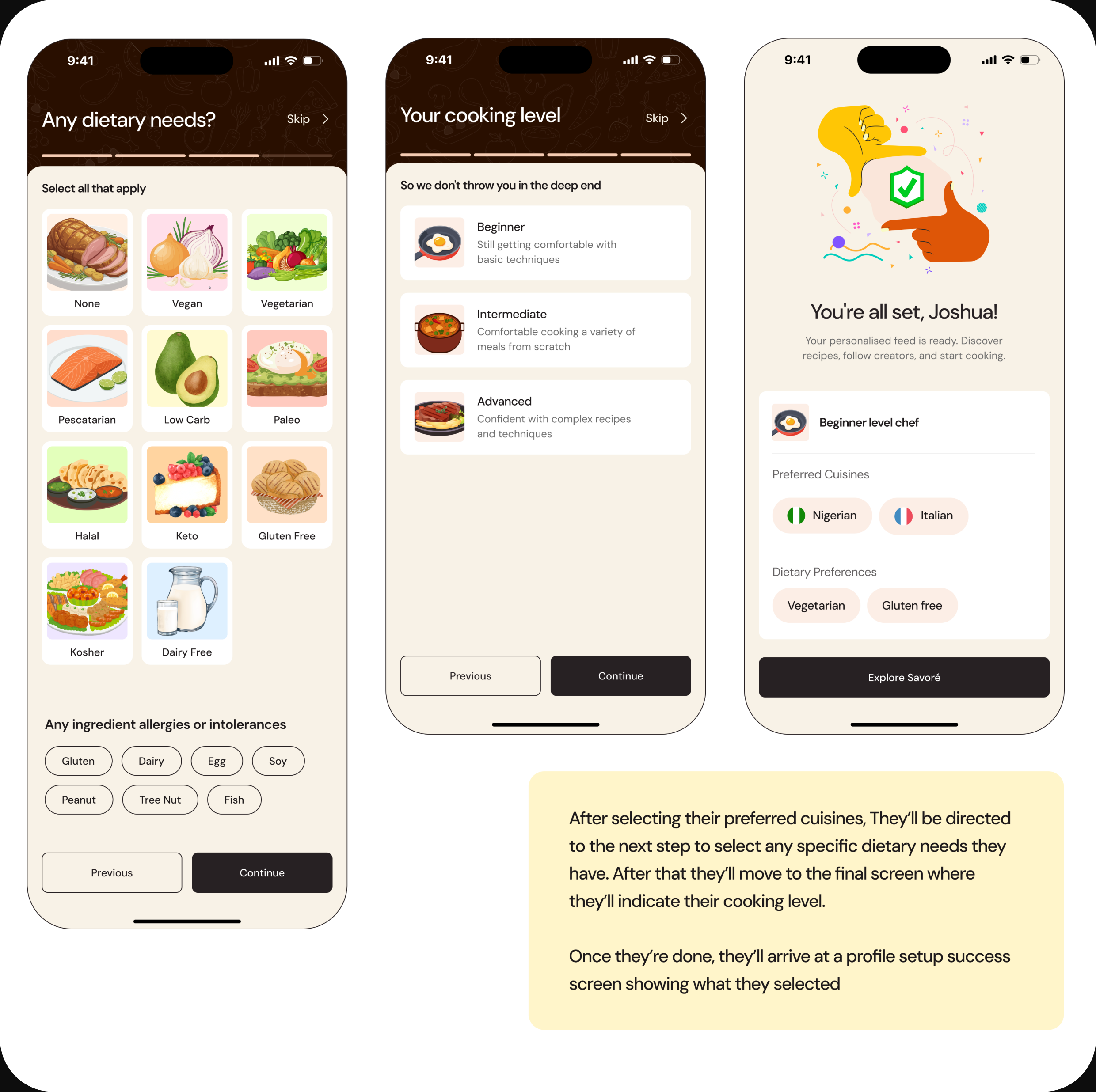
Users start by entering their name, email, and password, then verify their email with a 6-digit code. Once verified, they move into the profile setup flow — adding a profile photo, display name, and username, then selecting their preferred cuisines, which are organised by country. From there they indicate any dietary needs and allergies, set their cooking level, and arrive at a success screen that mirrors back everything they selected. Each step is skippable and clearly sequenced, so setup always feels lighter than the payoff.
Home Screen
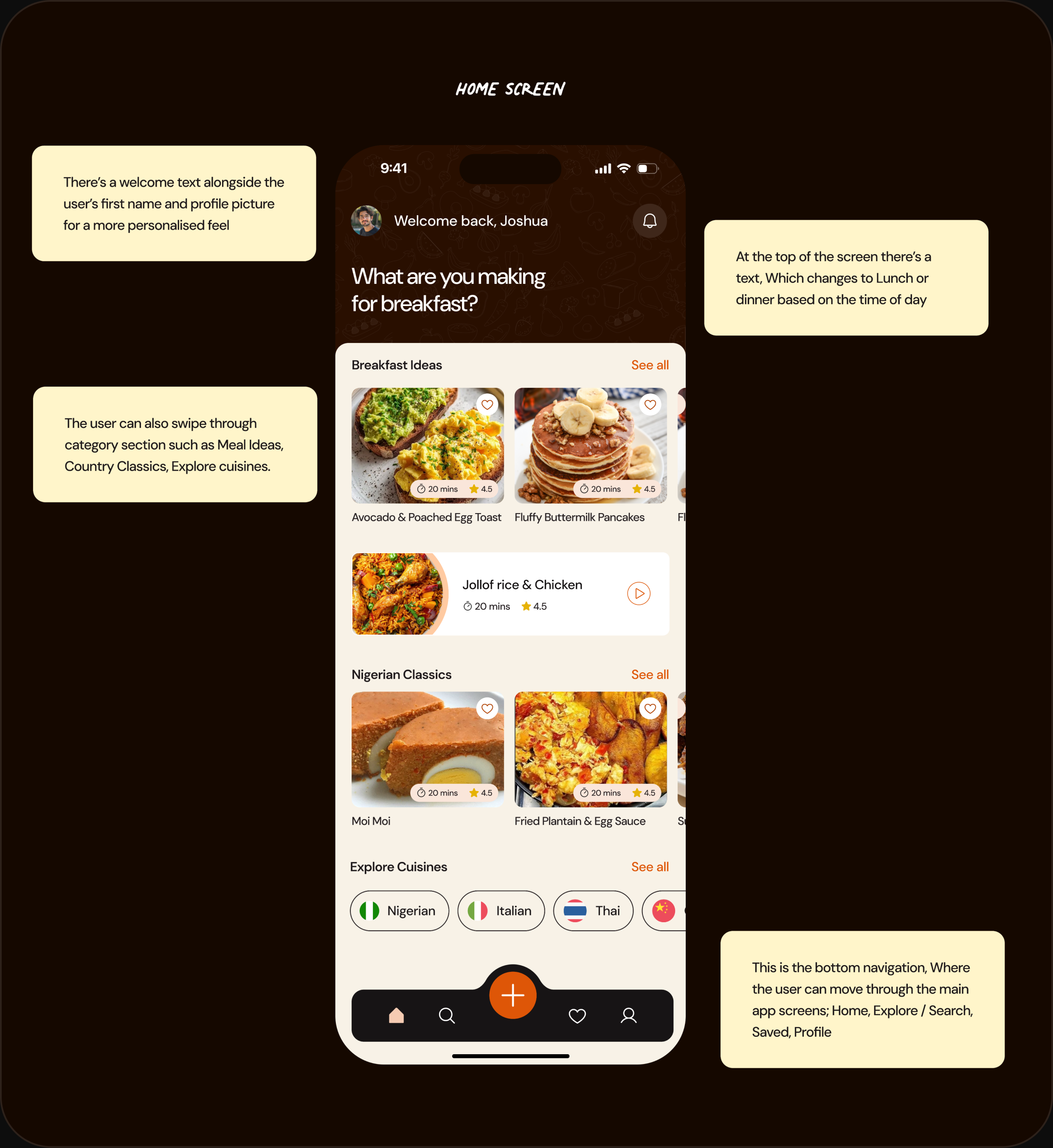
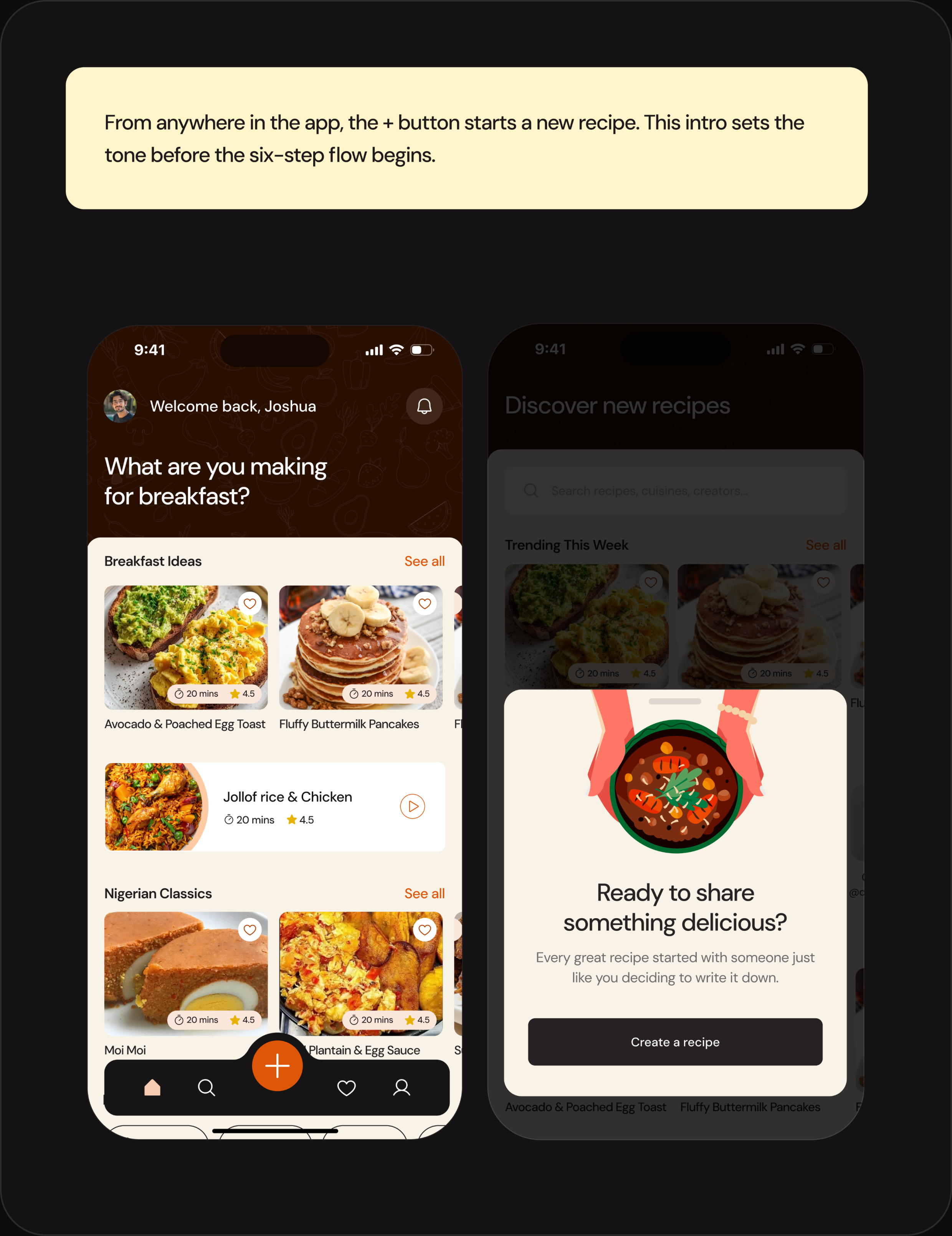
The home screen opens with a personalised welcome — the user's first name and photo — and a prompt that shifts with the time of day, changing to lunch or dinner as the day goes on. Below it, category rails like Breakfast Ideas, Nigerian Classics, and Explore Cuisines let the user browse laterally, ordered around the cuisines and skill level they set during onboarding. A persistent bottom navigation moves them between Home, Explore, Saved, and Profile, with a central button to create a recipe from anywhere.
Meal Category Ideas Screen
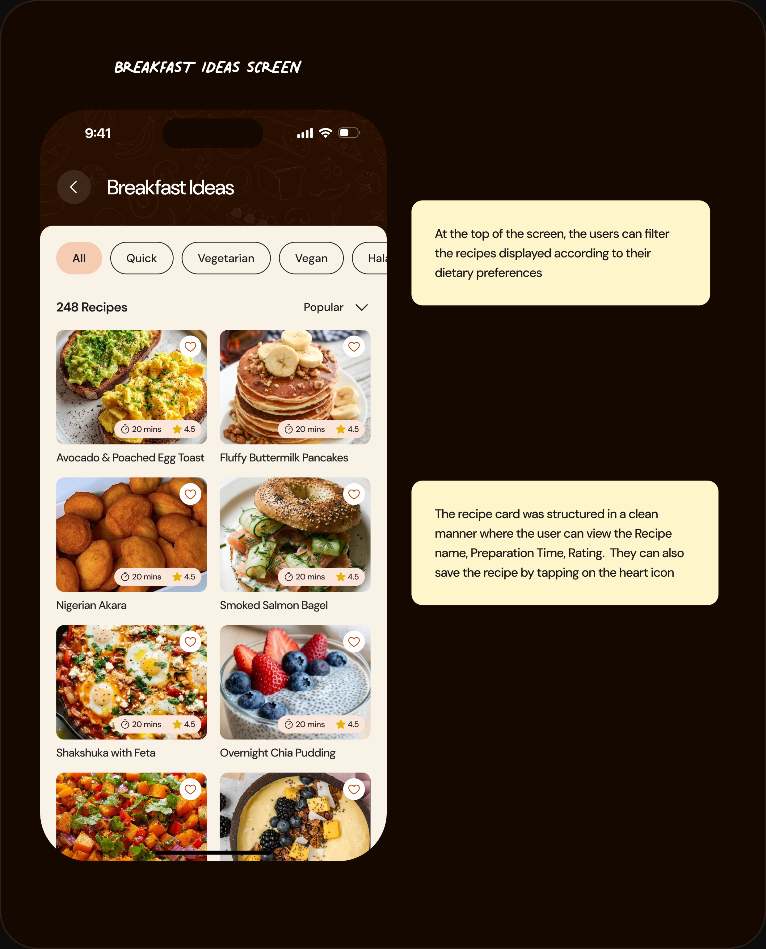
Tapping "See all" on a category opens its full listing. At the top, users can filter recipes by their dietary preferences — Quick, Vegetarian, Vegan, Halal, and more. Each recipe card is structured cleanly, showing the recipe name, preparation time, and rating, with a heart icon to save it in place.
Notifications Screen
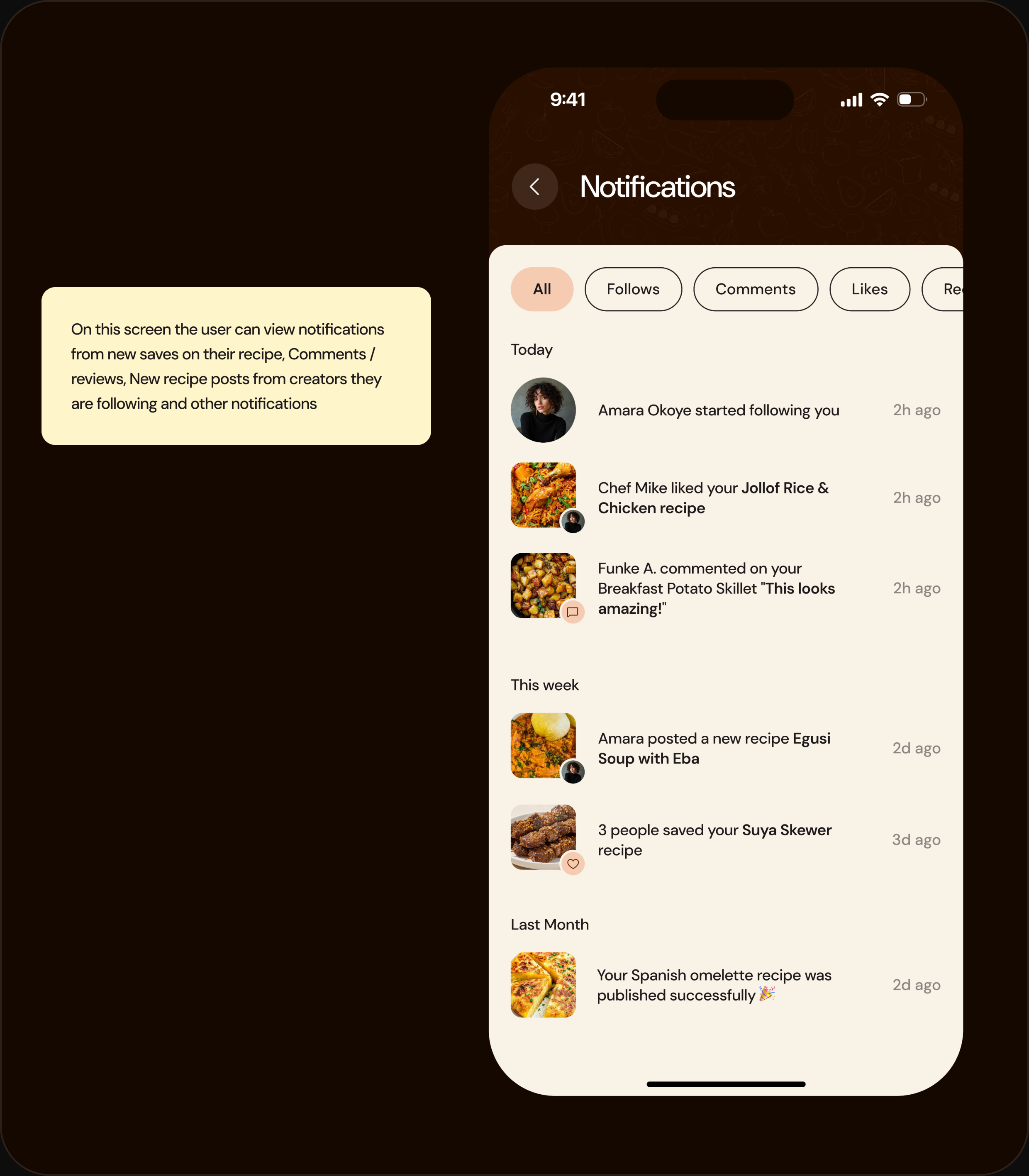
On this screen the user can view notifications from new saves on their recipes, comments and reviews, new recipe posts from creators they follow, and other activity — grouped by Today, This week, and Last month, with filters for Follows, Comments, and Likes.
Explore & Creator Profiles
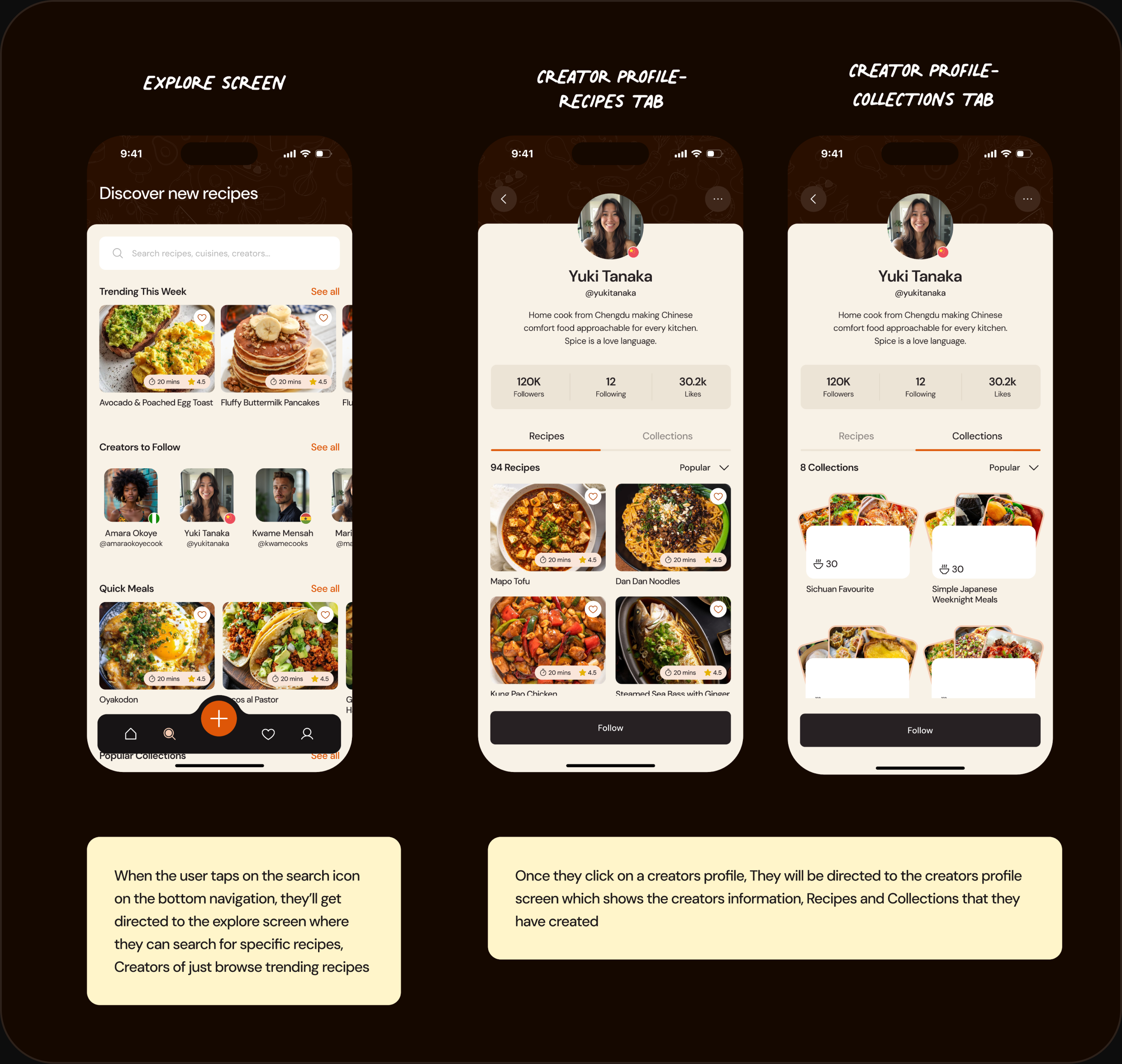
Tapping the search icon takes the user to the Explore screen, where they can search for specific recipes and creators or browse trending recipes, creators to follow, quick meals, and popular collections. Selecting a creator opens their profile — bio, follower stats, and their recipes and collections across two tabs — so a home cook's work finally has a proper home.
Collection & Recipe Details
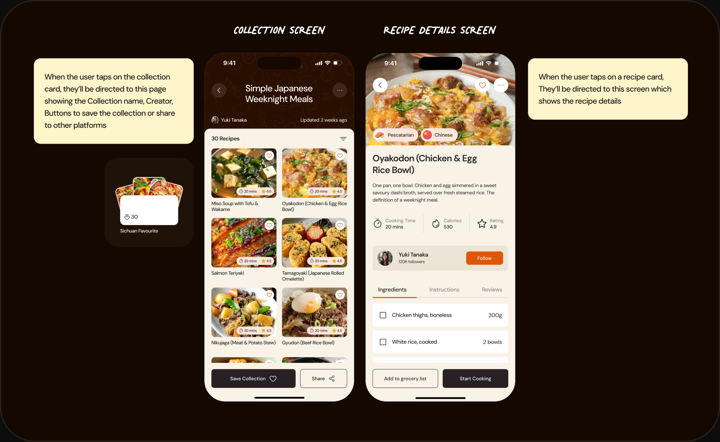
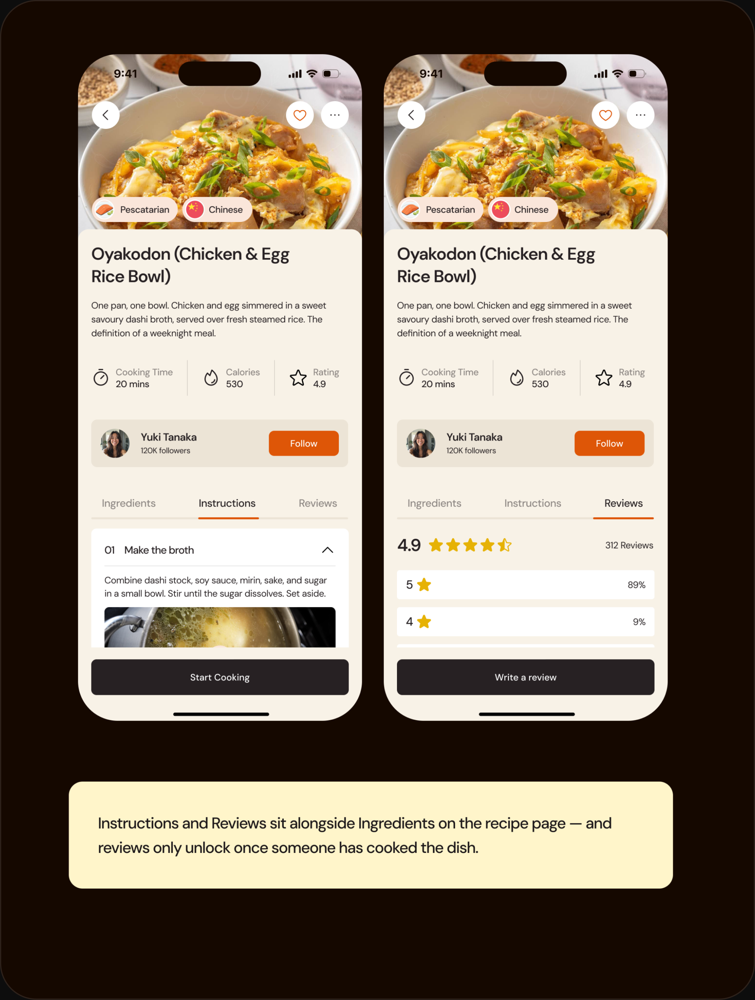
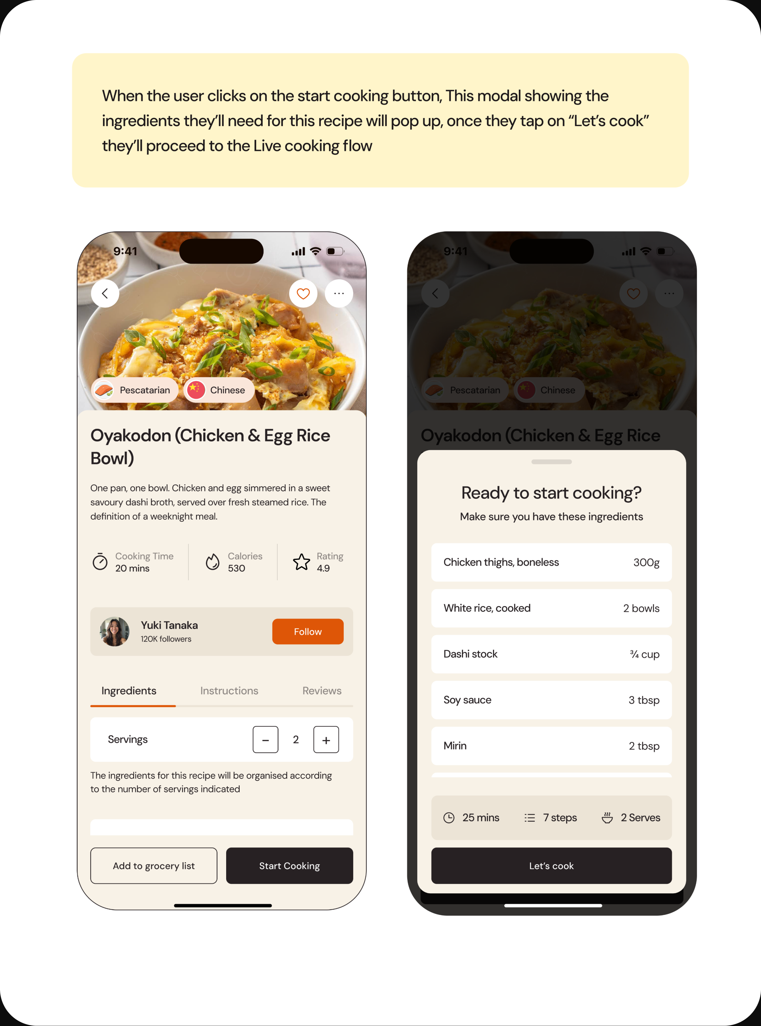
Tapping a collection card opens the collection — its name, creator, and the recipes inside, with buttons to save it or share it elsewhere. Tapping a recipe card opens the recipe details screen, where ingredients, instructions, and reviews sit together under one tabbed view, alongside the essentials a cook needs to commit: cooking time, calories, rating, and the creator behind it.
Grocery List
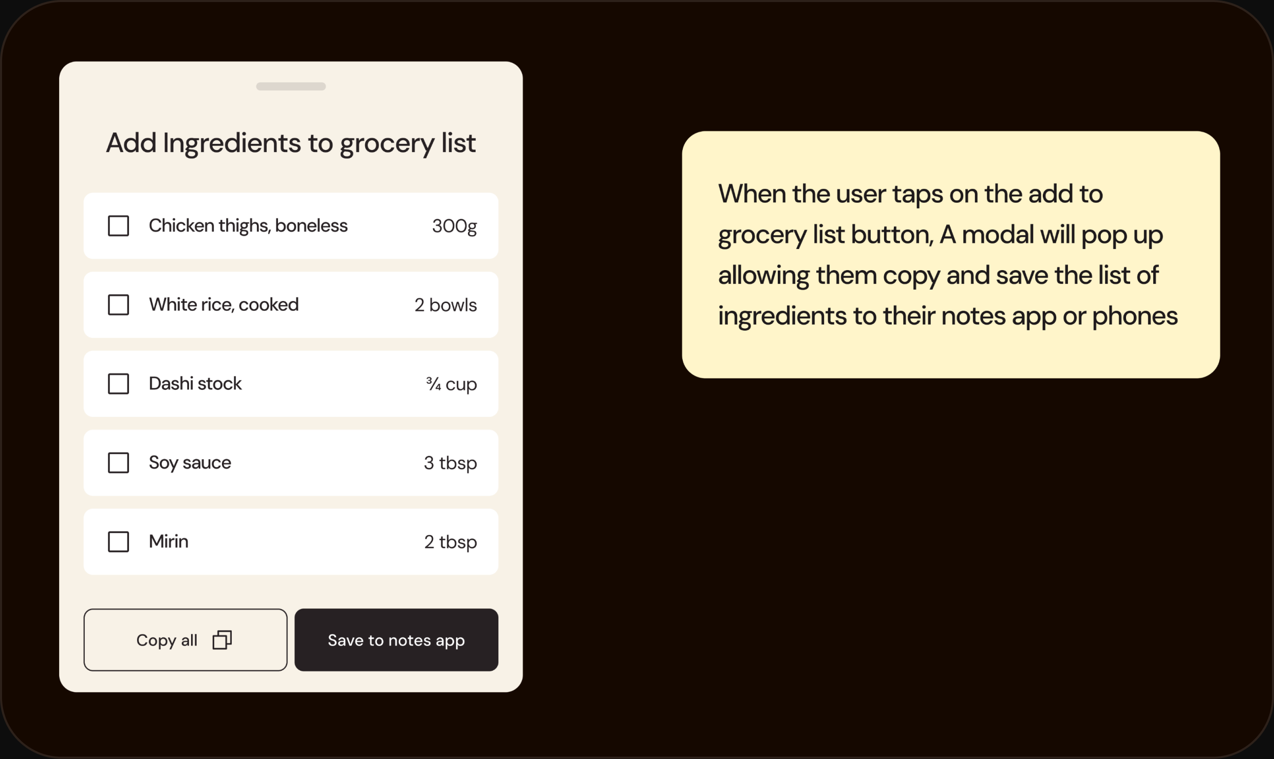
When the user taps "Add to grocery list," a modal appears with the recipe's ingredients, letting them copy the full list or save it straight to their phone's notes app — so the ingredients make it to the store without being retyped.
Live Cooking Flow
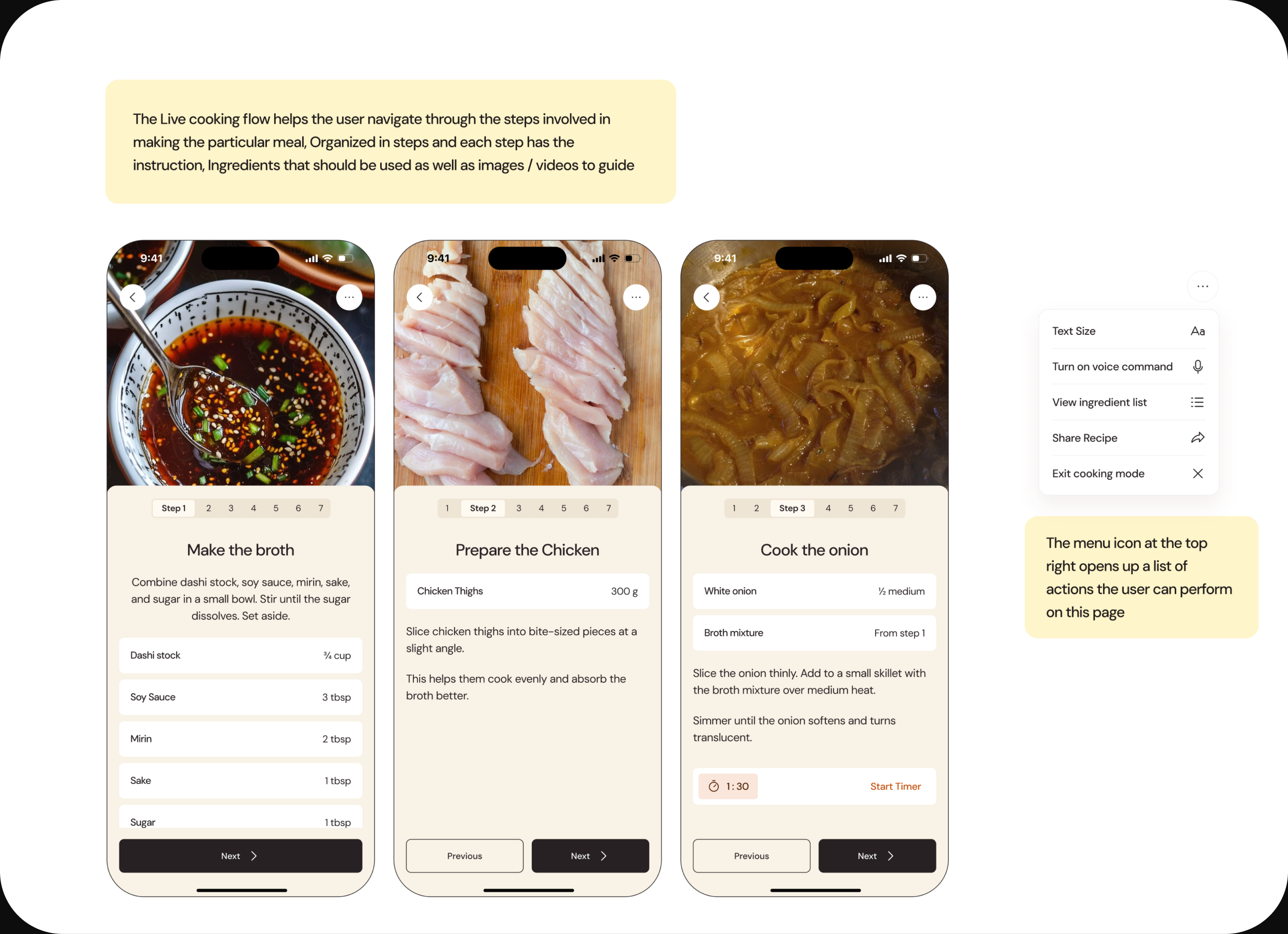
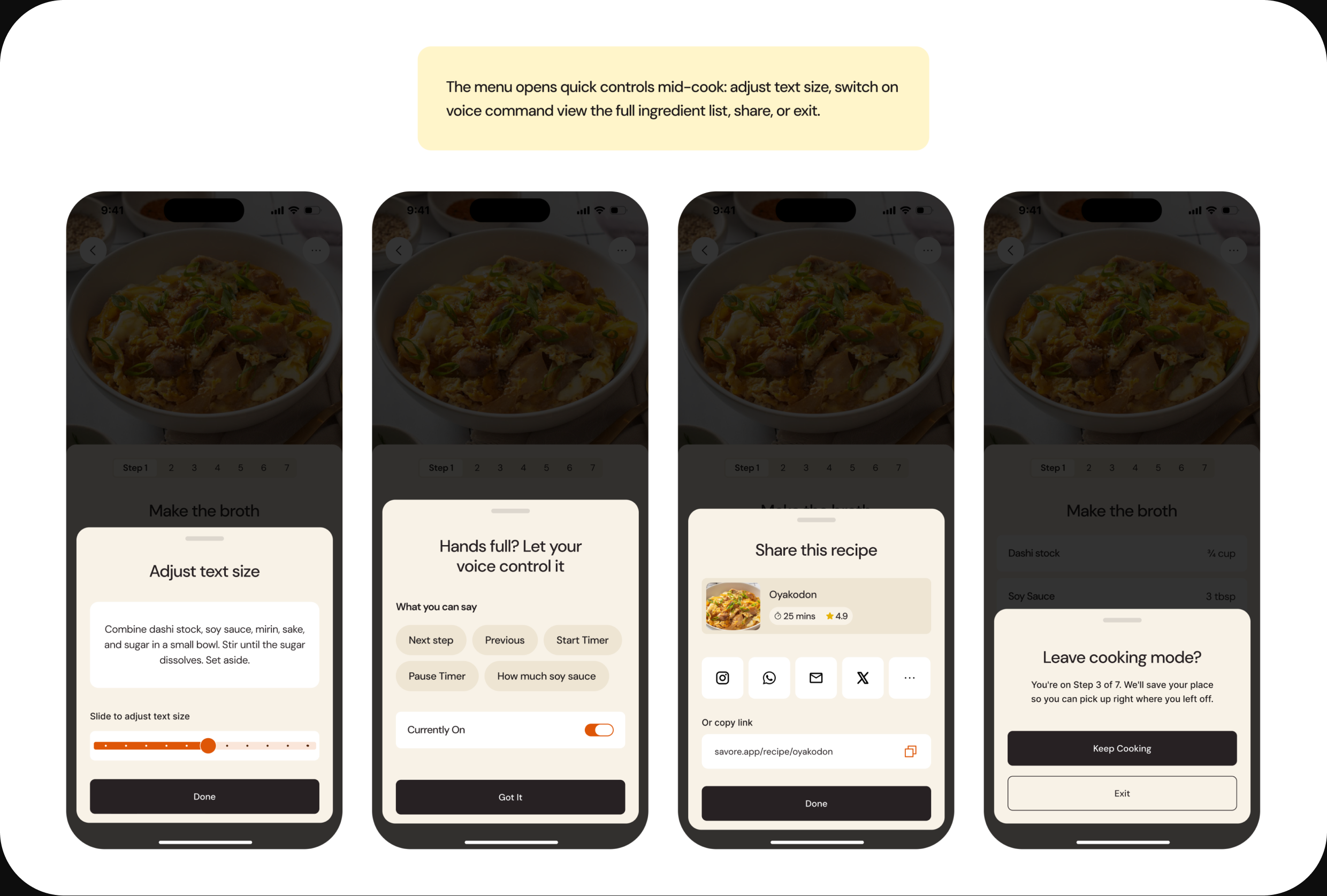
The live cooking flow guides the user through the meal one step at a time. Each step carries its own instruction, only the ingredients that step needs, and a photo or video to guide them — and it cross-references earlier steps ("from step 1") instead of repeating ingredients. A menu at the top right opens quick controls mid-cook: adjust text size, switch on voice command, view the full ingredient list, share the recipe, or exit. If the user leaves, the app saves their place so they can pick up exactly where they stopped.
Rating & Review
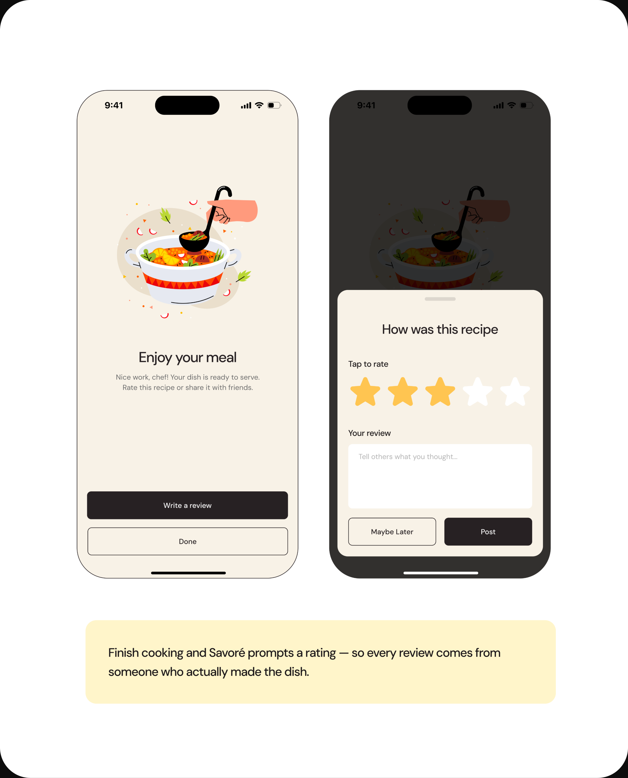
When the cooking flow finishes, the user lands on an "Enjoy your meal" screen and is prompted to rate the recipe. Because this prompt only appears after someone has actually cooked the dish, every review on Savoré comes from someone who made it — not someone who only looked.
Create a Recipe
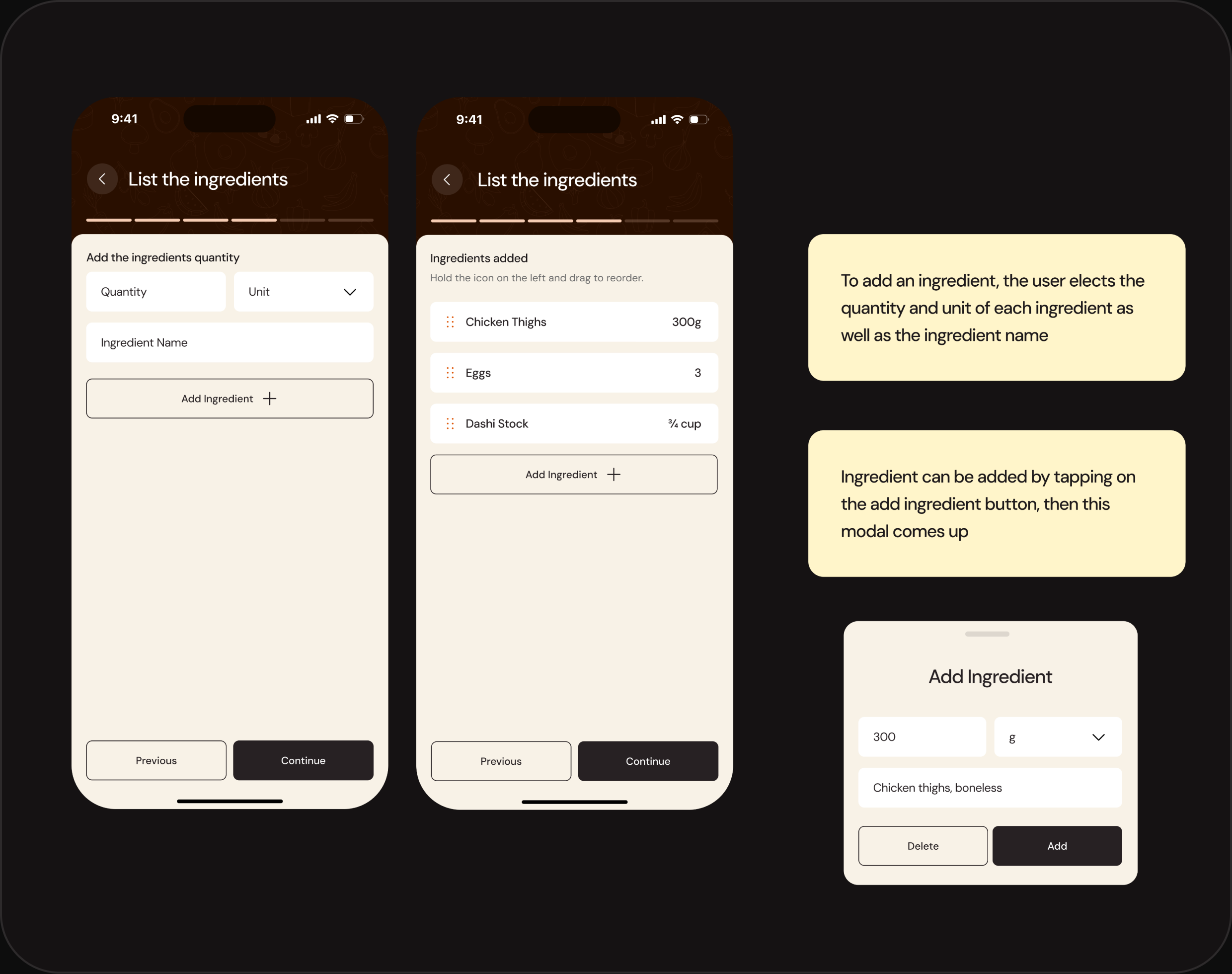
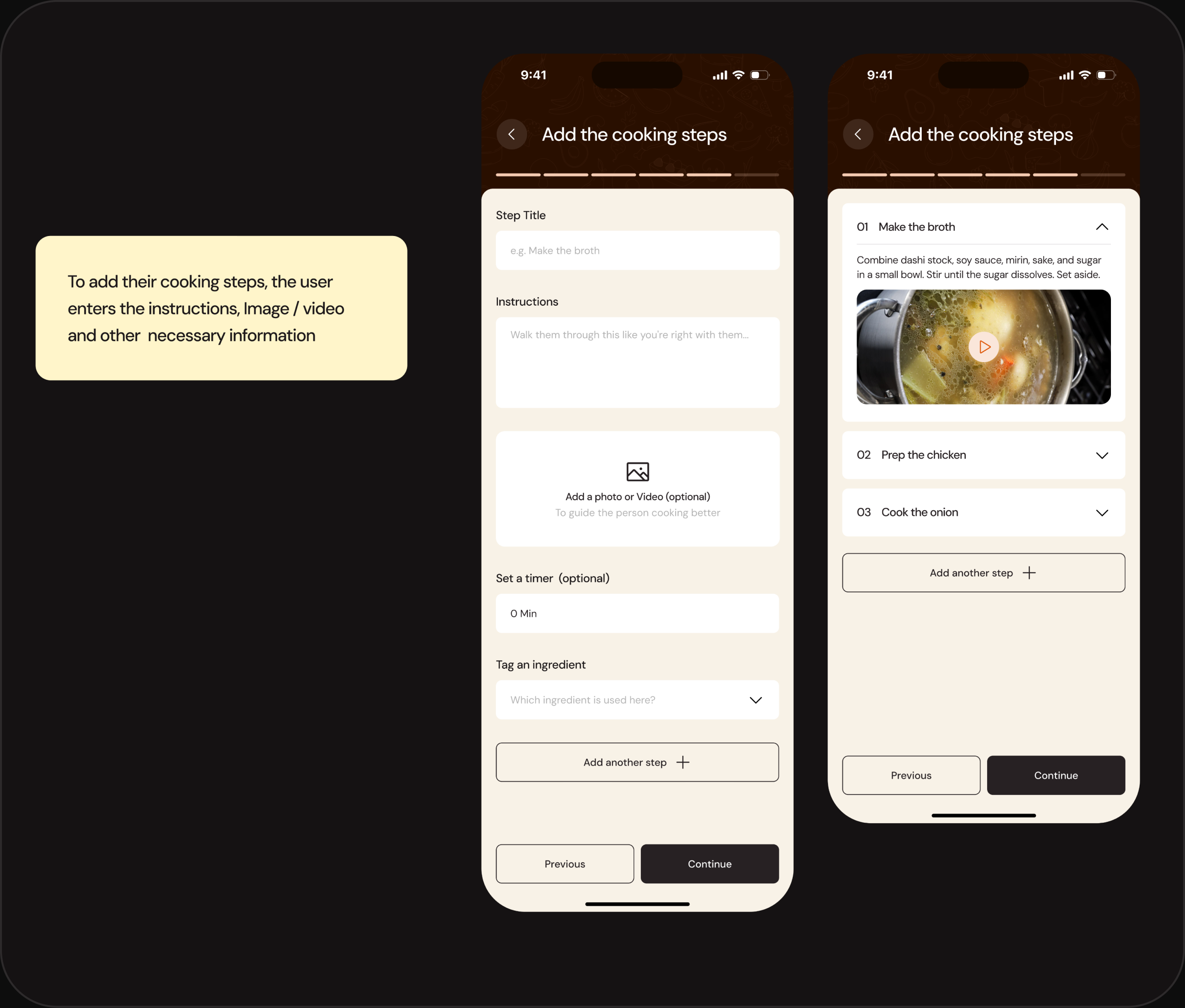
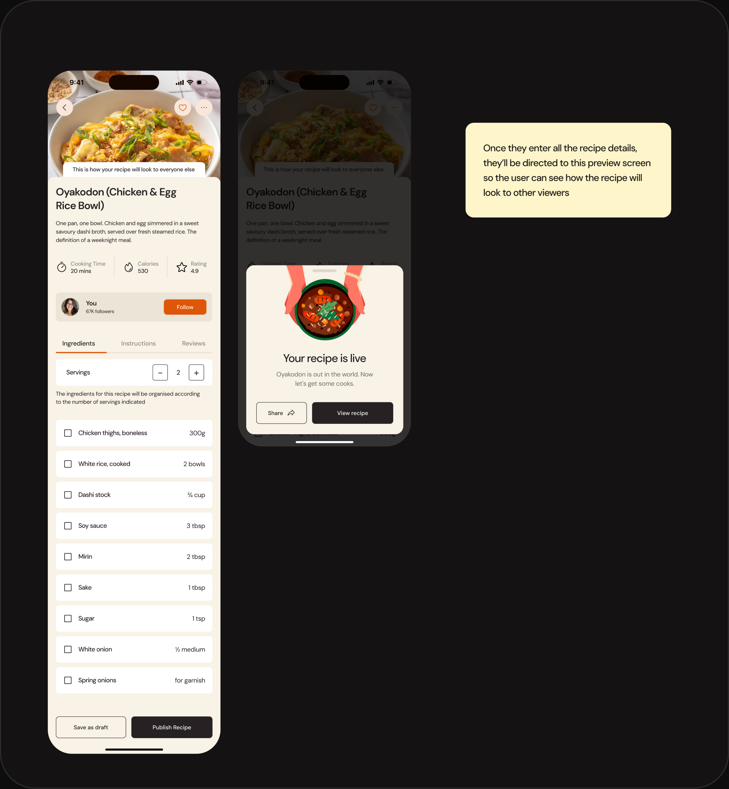
From anywhere in the app, the central "+" button starts a new recipe. The creator moves through a six-step flow — basics, details, diet tags, ingredients, cooking steps, and preview — that autosaves at every step, so they can step away and pick it back up later. The pivotal moment is ingredient tagging: creators attach each ingredient to the specific step that uses it, which is what powers the per-step cooking experience for everyone who makes the recipe afterward. A live preview shows the recipe exactly as a viewer will see it before publishing.
Saved, Collections & Meal Plan
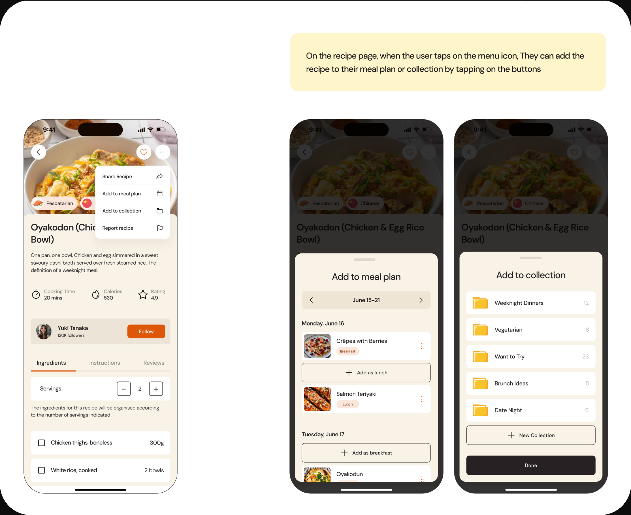
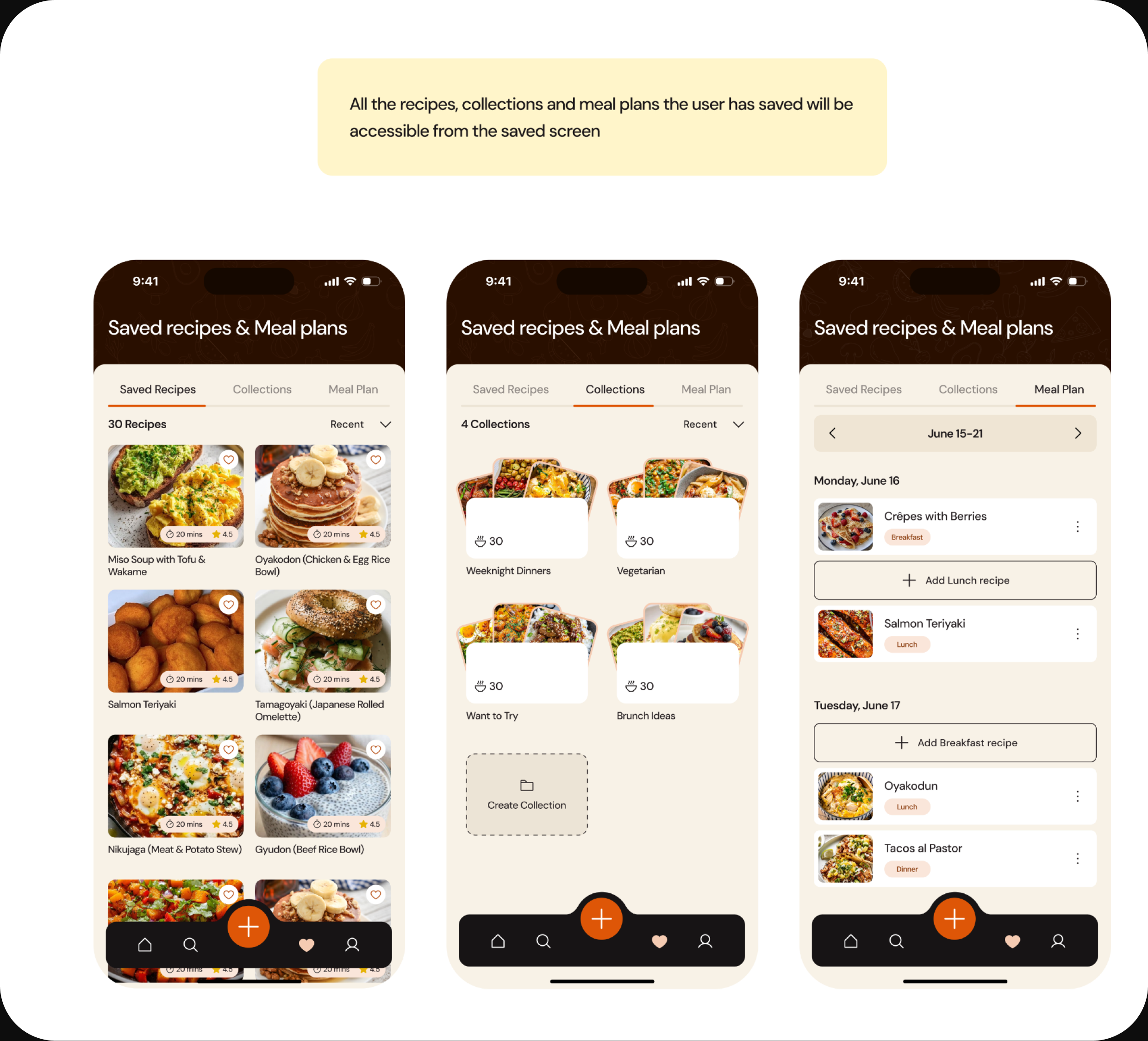
Everything the user keeps lives under one Saved screen, split across three tabs — Saved Recipes, Collections, and Meal Plan. Any recipe can be dropped into a day's meal plan or a named collection from the recipe's menu. The meal plan then feeds a consolidated grocery list that merges duplicate ingredients across every planned recipe and groups them by aisle — the point where planning stops being an app activity and becomes a real-world one.
Key Design Decisions
With no user research to point to, the thinking lives in the decisions — and the tradeoffs I accepted to make them.
1. I removed the Explore/Following tab split. A Following feed is valuable — it's what brings people back — and the obvious home for it was a tab on the Explore screen, matching Instagram and every social app. But that forces a choice before the user has even started browsing: two modes for one intent. I moved Following into a Home section instead and let Explore be purely about discovery. One less decision, one clearer screen. The cost: Following is slightly less prominent. Worth it — discovery is what a recipe app is for.
2. Ingredients live inside each cooking step, not just the top. Every recipe app lists ingredients once, at the top. Repeating them per step risks clutter and looks redundant on paper. But mid-cook, hands busy, "wait — how much soy sauce?" means scrolling back and losing your place. So each step surfaces only its own ingredients, with amounts, and cross-references earlier steps instead of repeating them. This is only possible because creators tag ingredients to steps at creation time. The creator's structure becomes the cook's experience. That's the row no competitor has.
3. Reviews are gated behind actually cooking. More reviews means more social proof, which makes for a healthier-looking app. Gating them means fewer reviews. But a review from someone who only looked at a recipe is noise. By only surfacing "Write a review" after the cooking flow completes, every review comes from someone who made the dish. Fewer, but trustworthy. I chose signal over volume.
4. The grocery list consolidates across recipes. The easy build is one ingredient list per recipe, stacked — clear provenance, simple logic. But nobody shops per-recipe; they shop once. So the list merges duplicates across every planned meal (olive oil from three recipes becomes one line) and groups items by aisle: Produce, Protein, Dairy, Pantry. More complex to design, but it matches how a real person actually walks a supermarket.
Prototype
To see Savoré as more than static frames, I rebuilt the core flows as a working build using Claude Code — prompting, reviewing, and iterating on the real thing in real time instead of just handing off a Figma file. Here's a look at that process.
Outcome & Reflection
Savoré was a concept, so there's no launch metric to point to — but it did what I set out to do: take a familiar experience everyone tolerates and rebuild it around how people actually cook.
Working without user research was the biggest constraint, and in hindsight the most useful one. It forced every screen to be defensible on reasoning alone rather than a persona quote — which is why the design decisions, not the pixels, are the real substance of this project.
If I took Savoré further, the first thing I'd pressure-test is the per-step ingredient model with real cooks mid-recipe, since its entire value rests on an assumption about behaviour I couldn't validate. I'd also want to see whether gated reviews produce enough volume to feel like a living community, or whether the trust gain costs too much social proof early on. Both are the kind of tradeoff only real usage can settle — and knowing exactly which assumptions I'd test first is the part I'm most glad I got out of this.
Enjoyed reading this? Thank you.
This took a bit of work to put together, so if you liked it, I’d really appreciate you sharing it. If you have a similar project in mind, let’s work together.



What People Say About Me and My Work
One of the smoothest design experiences we've had. Joshua turned complex ideas — AI onboarding, unified inbox, automation builder — into polished, intuitive flows, with a design system that kept us consistent across mobile and web.

Brian T George
CEO, Unifiedbeez

Love his work! Always professional, detail-oriented, and delivers top-quality results. He understands the vision and brings it to life better than expected. Reliable, creative, and a joy to work with — highly recommend!

Becky Idiale
CEO, Daibo Consulting

Josh redesigned our landing page and nailed it. His attention to detail and smooth communication made everything easy. The new design boosted engagement and feels more aligned with our brand. Highly recommend.

Areous A
CEO, Pixel Pioneer Studios

Joshua consistently delivers clean, thoughtful, user-centered designs. He's proactive, reliable, and communicates ideas clearly. Every project gets real creativity and attention to detail — a true asset to any design team.

Chi Onyeukwu
CEO, Njem

Working with Joshua on the Koboneer app was smooth start to finish. He understood the product, turned complex ideas into a clean, intuitive interface, and stayed open to feedback. His attention to detail made a real difference.

Solomon Okafor
CEO, Koboneer

Joshua has been an outstanding contributor at Dingpay. His design solutions are thoughtful, intuitive, and aligned with our users' needs. He works with speed and precision while keeping strong creativity and brand consistency.

Itohowo Udofia
CEO, Dingpay

Great experience working with Joshua. He pays attention to details and provided excellent communication throughout the project.

Donny Gamble
CEO, The Elevation Group

Joshua transformed the AllFoods UK site into something modern, professional, and easy to navigate. He was proactive, responsive, and cared about reflecting our brand. We've had great feedback since.

Akinyemi Arabambi
CEO, AllFoods UK



Let’s Work Together!
Whether it's a freelance project, a full-time role, or you just want a second opinion on something. Tell me a bit about what you're building and where you're stuck. That's plenty to start.


© Joshua Ikhine, 2025.
All rights reserved.
 hello@joshuaikhine.com
 +234 806 258 9858