
Jump to section

Koboneer — Mobile App
Overview
Koboneer is a Nigerian fintech brand building one app for crypto, gift cards, e-funds and everyday payments — all settling to a single naira wallet.
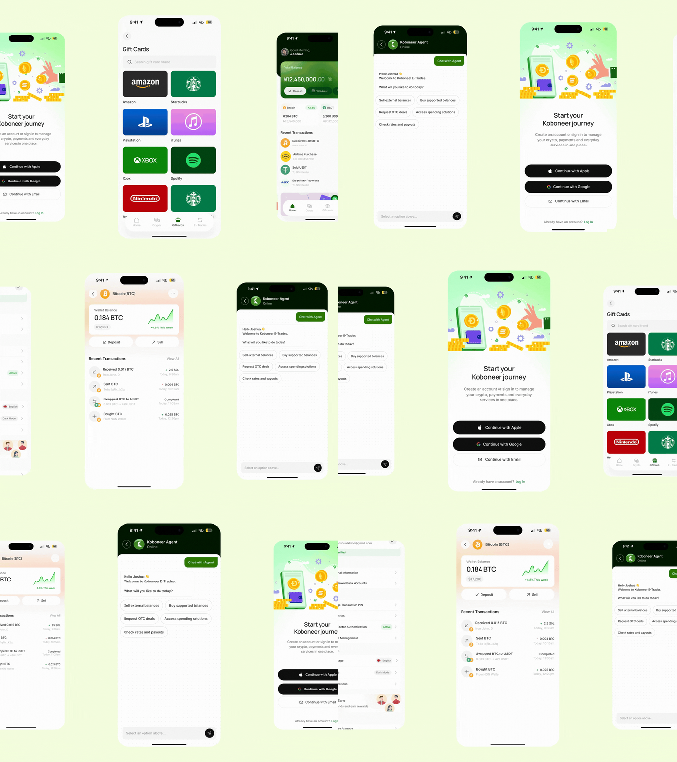
I designed the mobile app: onboarding, the trading and payment flows, and the design system that holds 26 screens together. The premise was simple to say and hard to build — every action, whether you're selling Bitcoin or paying a light bill, should land in the same balance, at a rate you see before you commit.
The app is now live.
My Role
UI/UX Designer
Problem
Nigerians who live in crypto and digital payments are stuck stitching tools together. Buying crypto, funding a betting wallet, or paying for electricity means juggling separate apps with rates hidden until you commit. Selling a gift card is worse — it usually means messaging an informal agent on WhatsApp, with no visible rate, no receipt, and no record the trade ever happened.
The goal was one app where all of it settles to a single naira balance, at rates the user sees upfront.
Target Audience
Koboneer is built for people already active in crypto and payments, just tired of the app-switching.
- Crypto traders and holders — buy, sell and swap regularly, want fast naira payouts at visible rates
- Gift card sellers — sitting on unused Amazon, Apple or Steam cards, currently selling through informal agents
- Freelancers and remote earners — paid in USD via Cash App, PayPal or Zelle, need a reliable local cash-out
- Everyday users — want airtime, data, cable and electricity from the same balance, without another app
User Flow
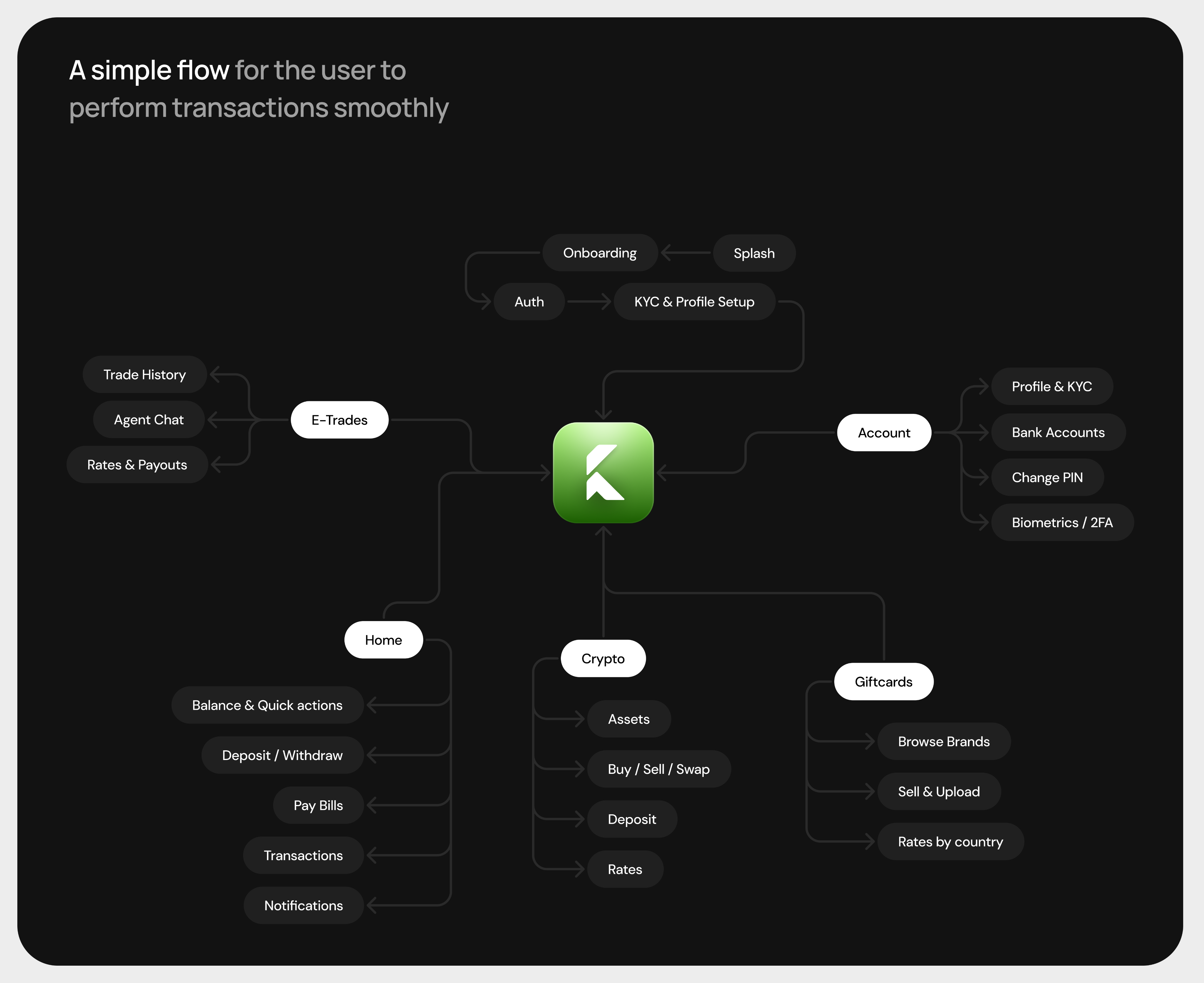
The app is mapped as a hub, not a ladder. The wallet sits in the centre, and every major area branches straight off it — so a user is never more than one step from home, and never has to back out of one flow to start another.
The entry path runs once: Splash → Onboarding → Auth → KYC & Profile Setup, and from there the user lands in the wallet. After that, five areas radiate out:
- Home — balance and quick actions, deposit/withdraw, pay bills, transactions and notifications
- Crypto — assets, buy/sell/swap, deposit, and live rates
- Giftcards — browse brands, sell and upload, rates by country
- E-Trades — agent chat, trade history, rates and payouts
- Account — profile and KYC, bank accounts, change PIN, biometrics and 2FA
Each branch is self-contained, but every money-moving path inside it converges on the same close: review → fees → PIN → receipt. That's the design bet — the navigation gives users freedom to move between crypto, gift cards and bills without friction, while the transaction ending stays identical everywhere, so the pattern is learned once and trusted everywhere after.
Design Approach
Three principles shaped every screen.
01 — One balance, every service. Crypto, gift cards, bills and e-funds all settle to one naira wallet. The user never has to think about where their money lives.
02 — Rates before commitment. Live crypto and gift card rates are visible before any trade starts. No surprises at checkout.
03 — Confirm, don't surprise. Every money-moving action ends in a review screen with fees broken out, then a transaction PIN. Nothing leaves the wallet by accident.
Design System
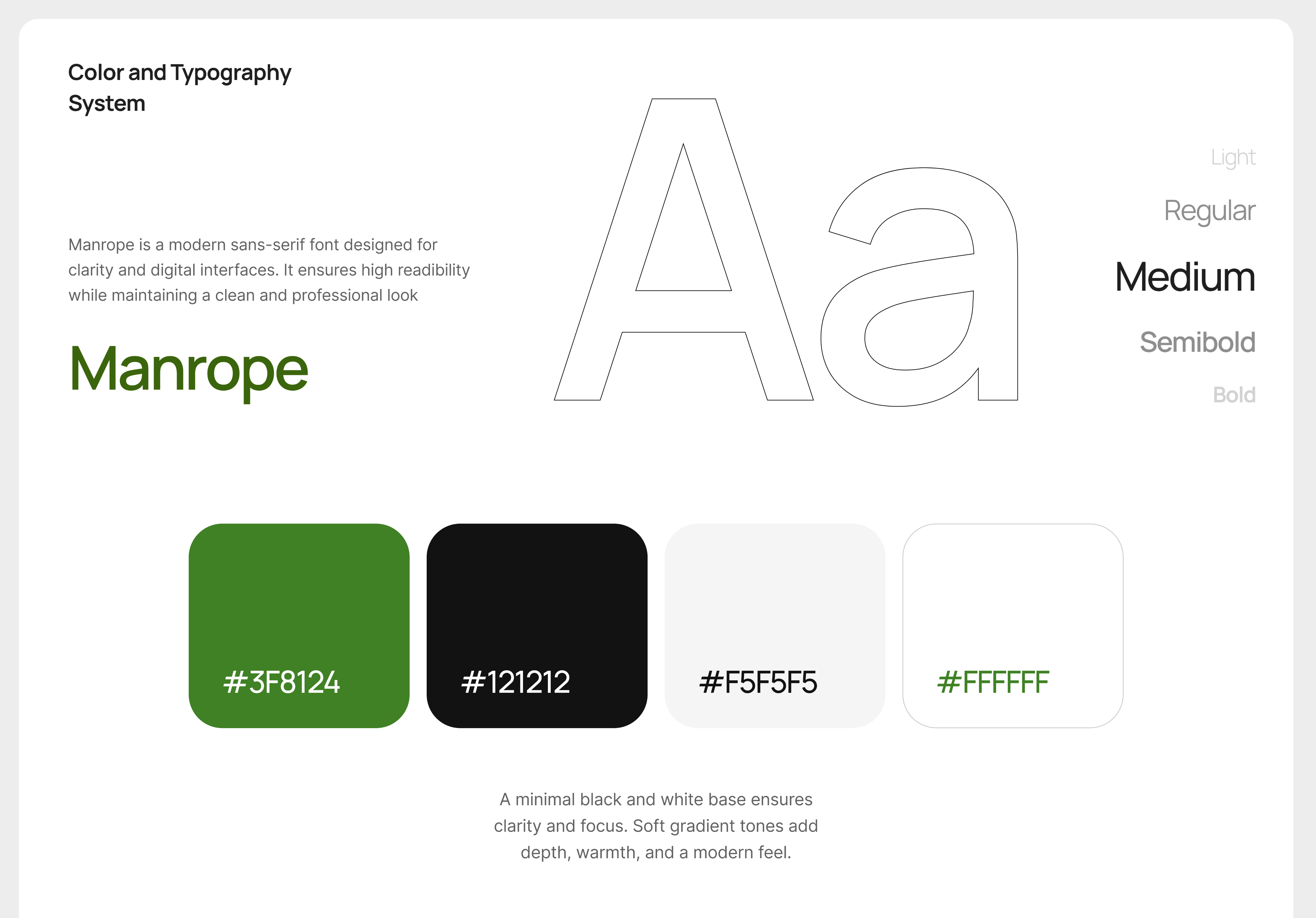
A single green anchors the brand; black carries every primary action, so the main step on any screen is never ambiguous. Two patterns do most of the heavy lifting: the bottom sheet for any focused task, and the success modal to close every completed action. Reusing them is what keeps 100+ screens feeling like one product.
App Design
Here are the screens I designed for the mobile app.
Onboarding Flow
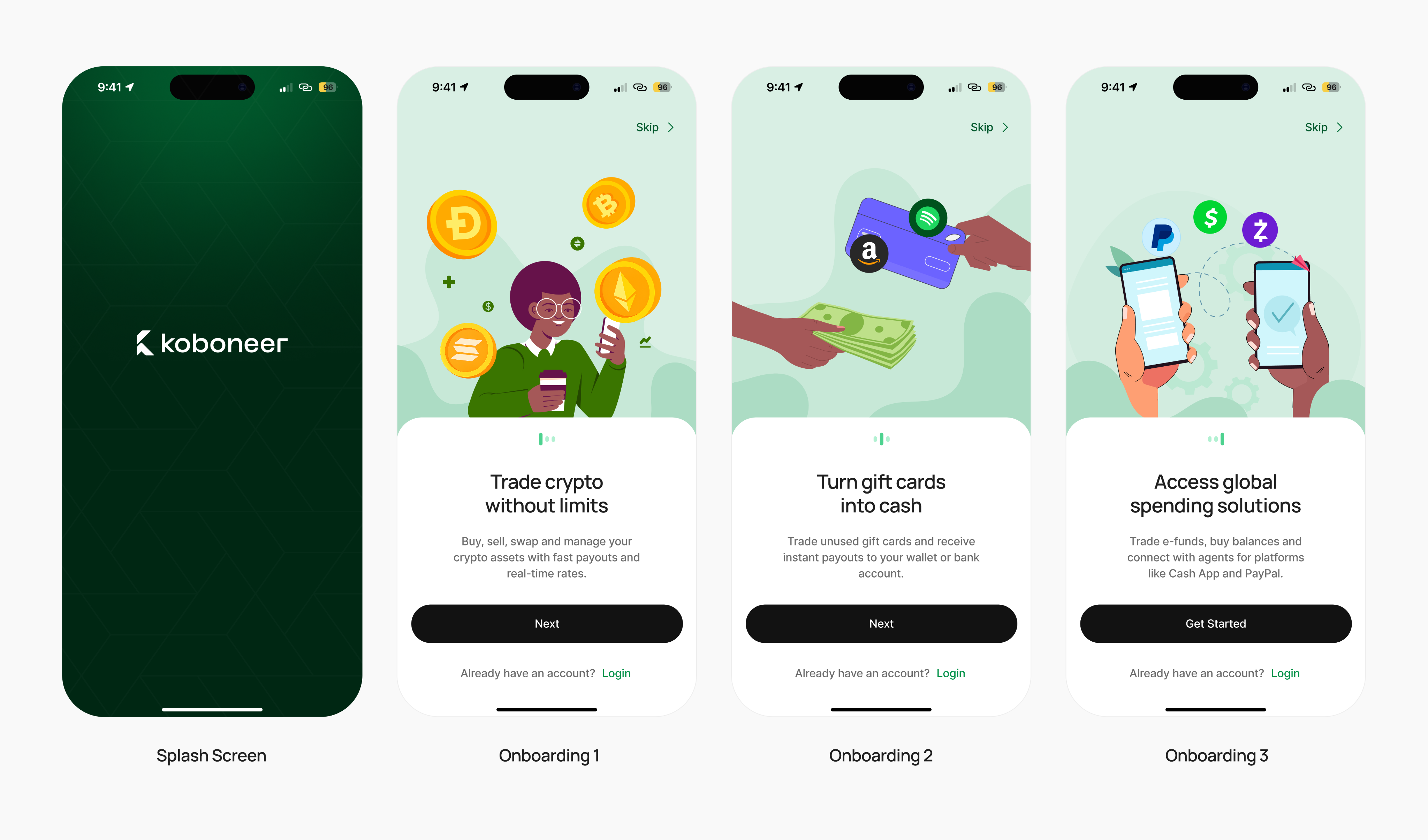
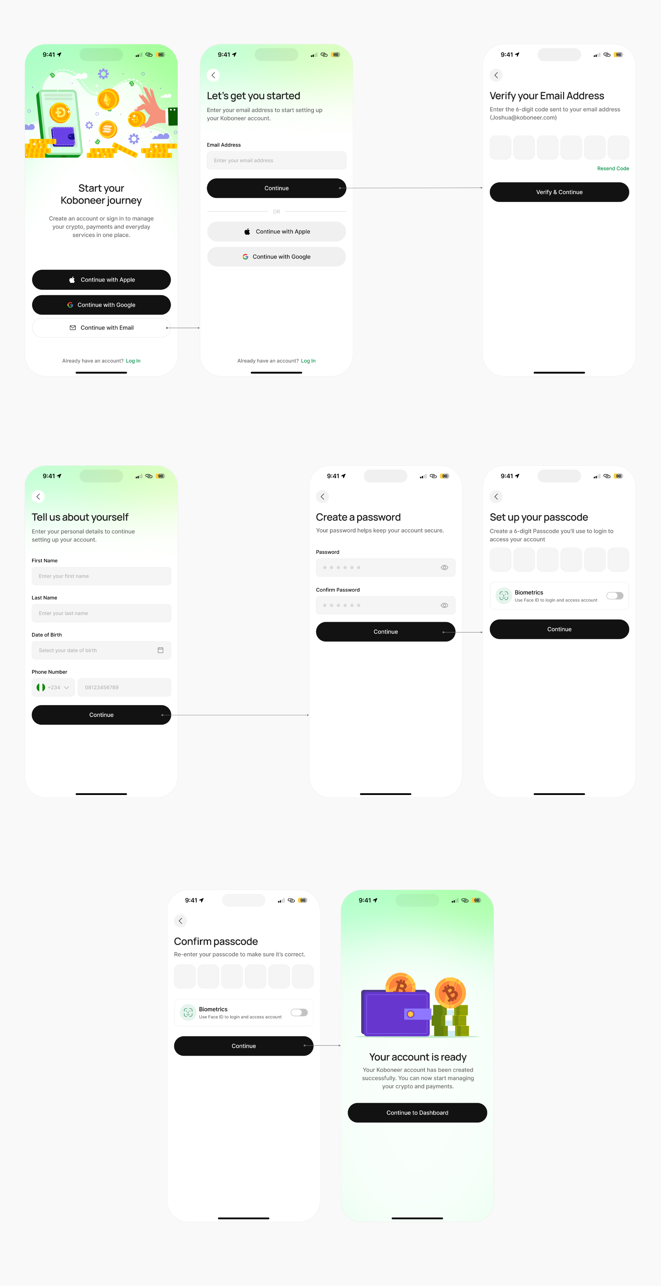
A progressive sign-up that only asks for personal and KYC details after the account exists — cutting the drop-off that comes from demanding everything upfront. Splash → onboarding → sign up → email verification → personal details → password → transaction PIN → ready. Biometrics are offered early, so returning users go straight to Face ID.
Home
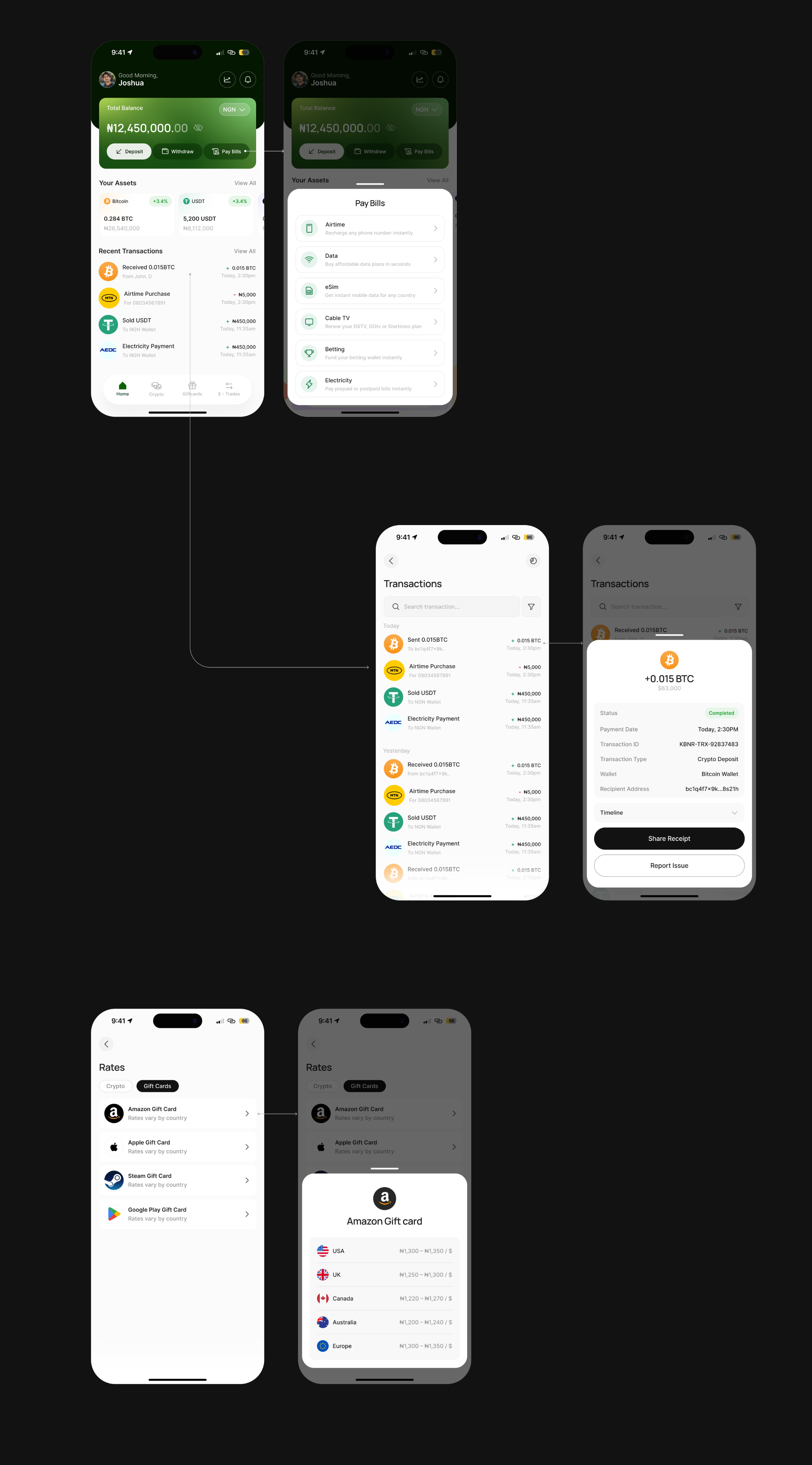
The dashboard adapts to the user's stage. New users see a zero balance with clear first actions — deposit, withdraw, pay bills — and prompts to try crypto, gift cards and e-funds. Returning users see their balance, an income/expense split, and recent activity. Same layout, different weight — so day one isn't an empty, discouraging screen.
Withdrawal
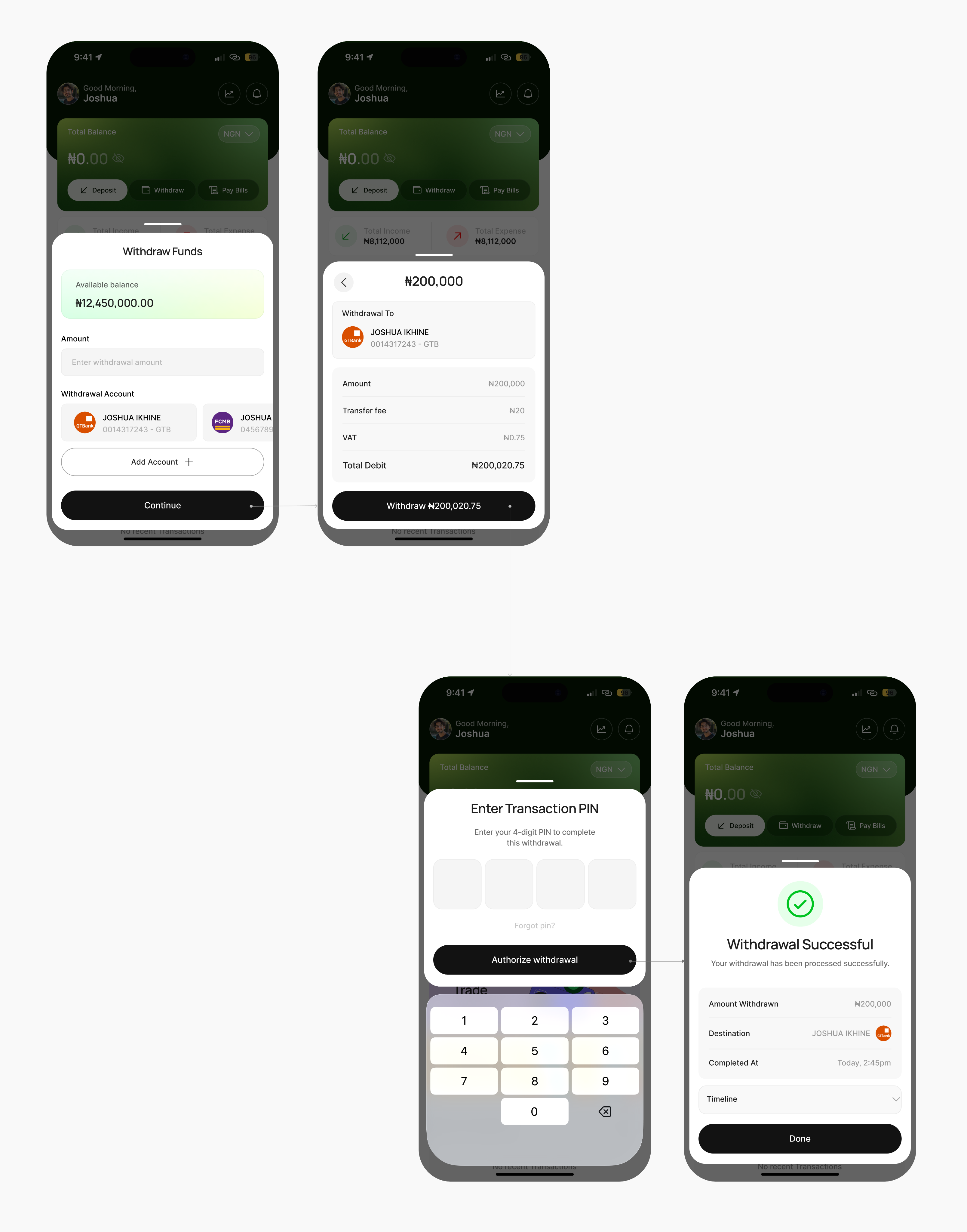
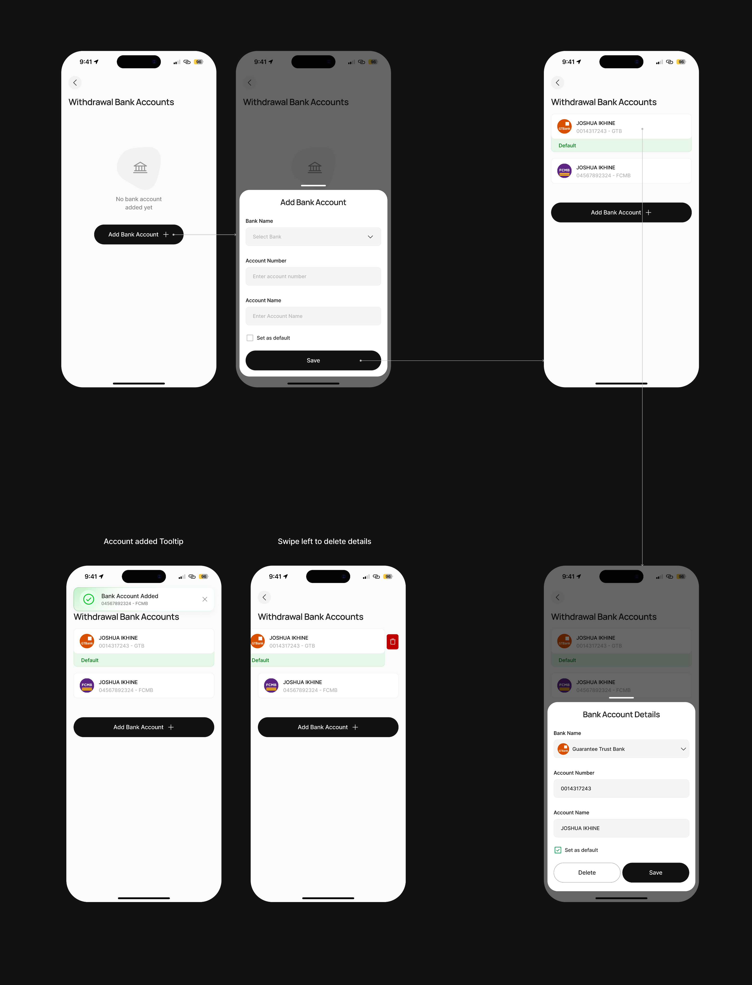
Withdrawal is the most trust-sensitive flow in the app, so it's the most explicit. Amount → destination account → a review screen breaking out transfer fee, VAT and total debit → transaction PIN → a success screen with a status timeline. The fees show before you commit, not after. The timeline (initiated → processing → completed) tells you exactly where your money is. Users can add, edit, set-default and delete withdrawal accounts, so payouts always land where they expect.
Everyday Payments
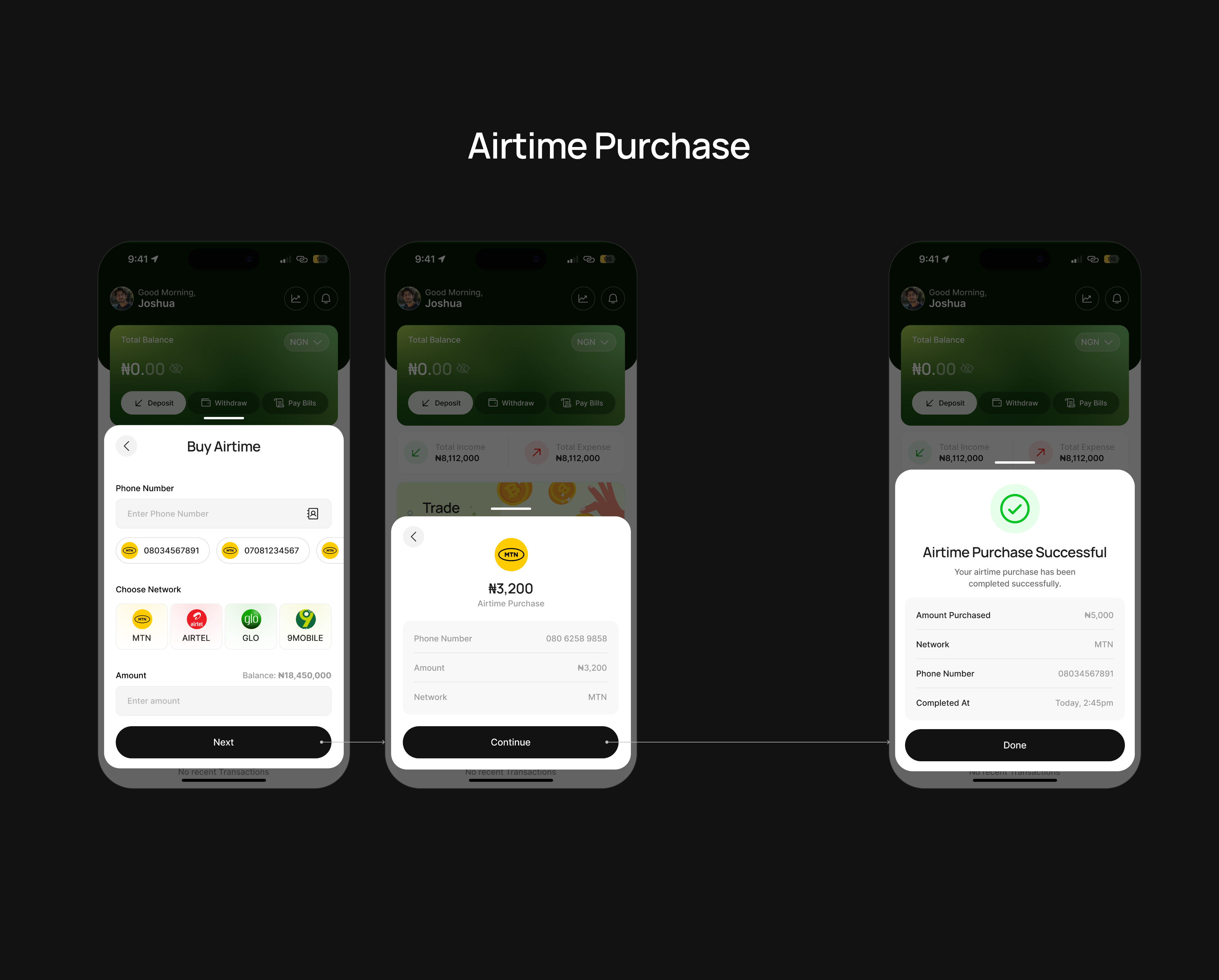
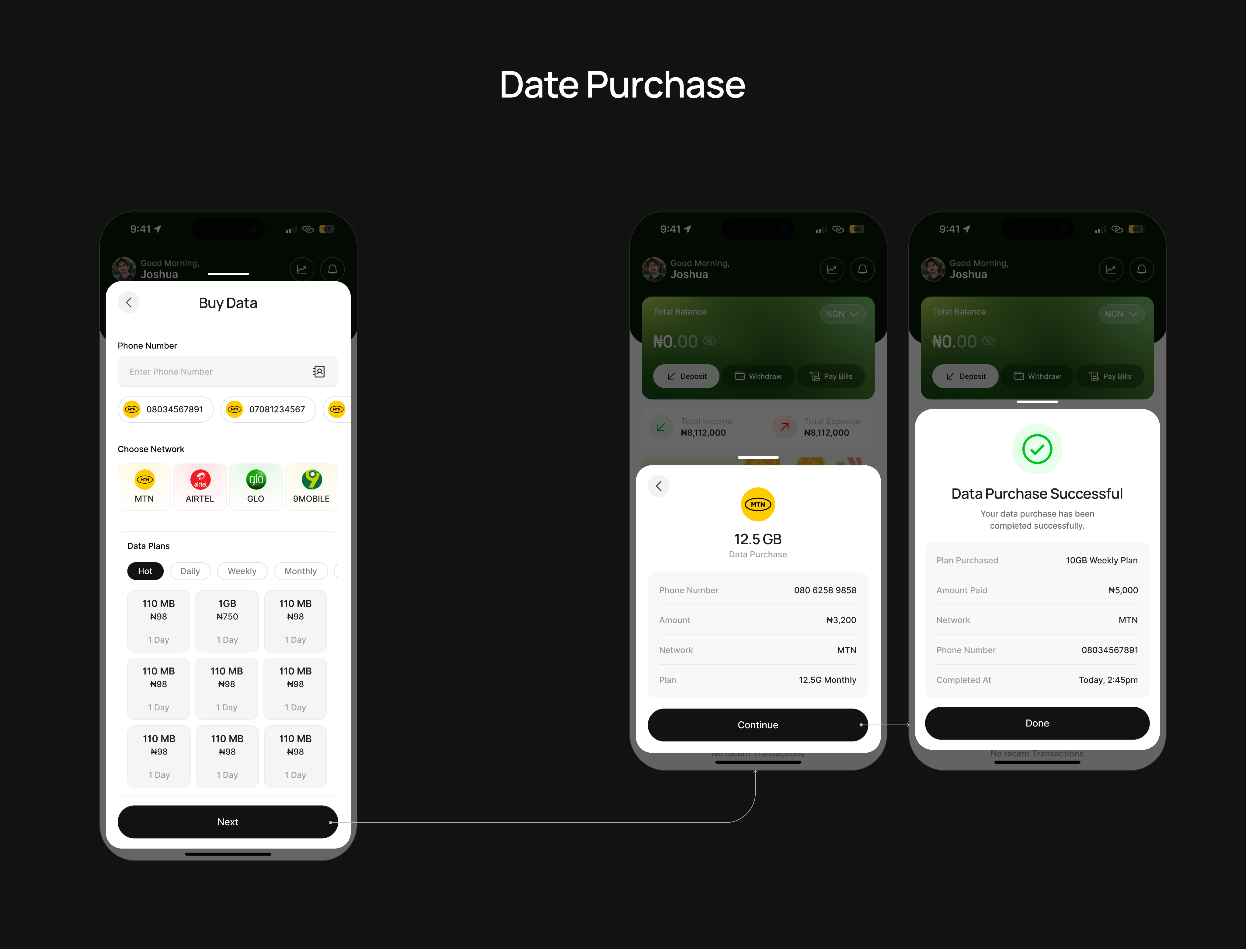
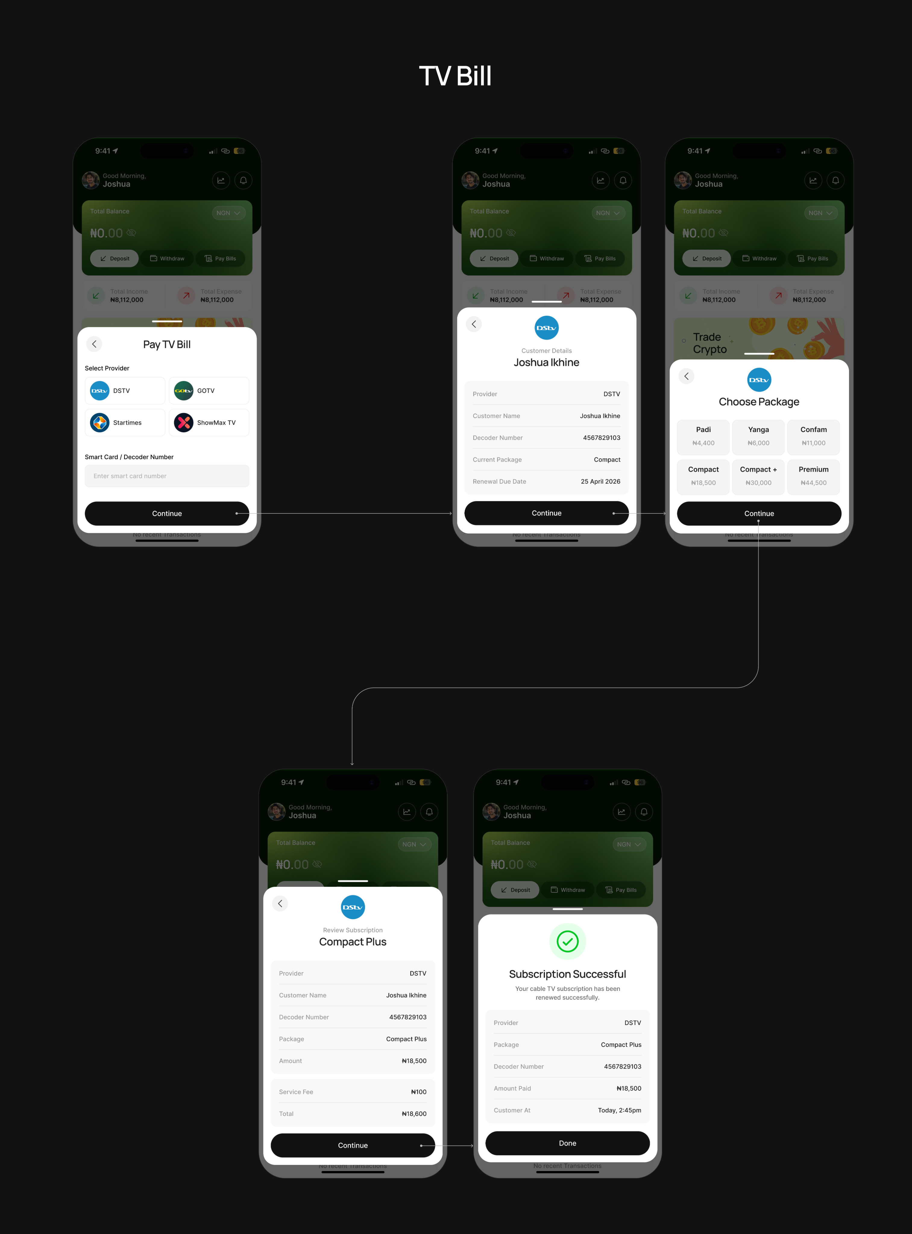
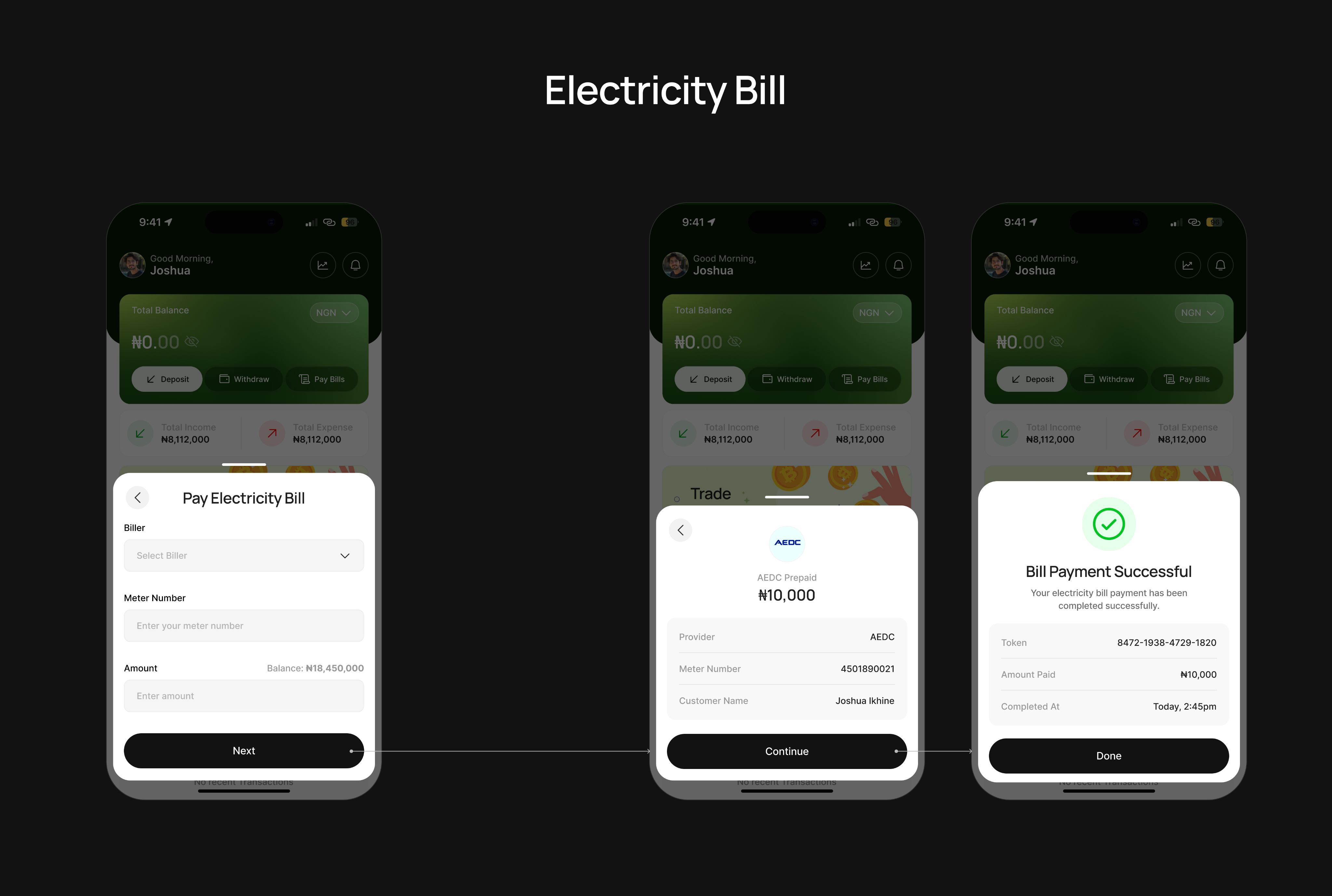
Five bill types share one interaction model: select → review → PIN → receipt. Learn it once, use it everywhere. Each ends in a receipt with something the user can keep — token numbers for electricity, plan details for data, decoder info for cable.
Crypto Transactions
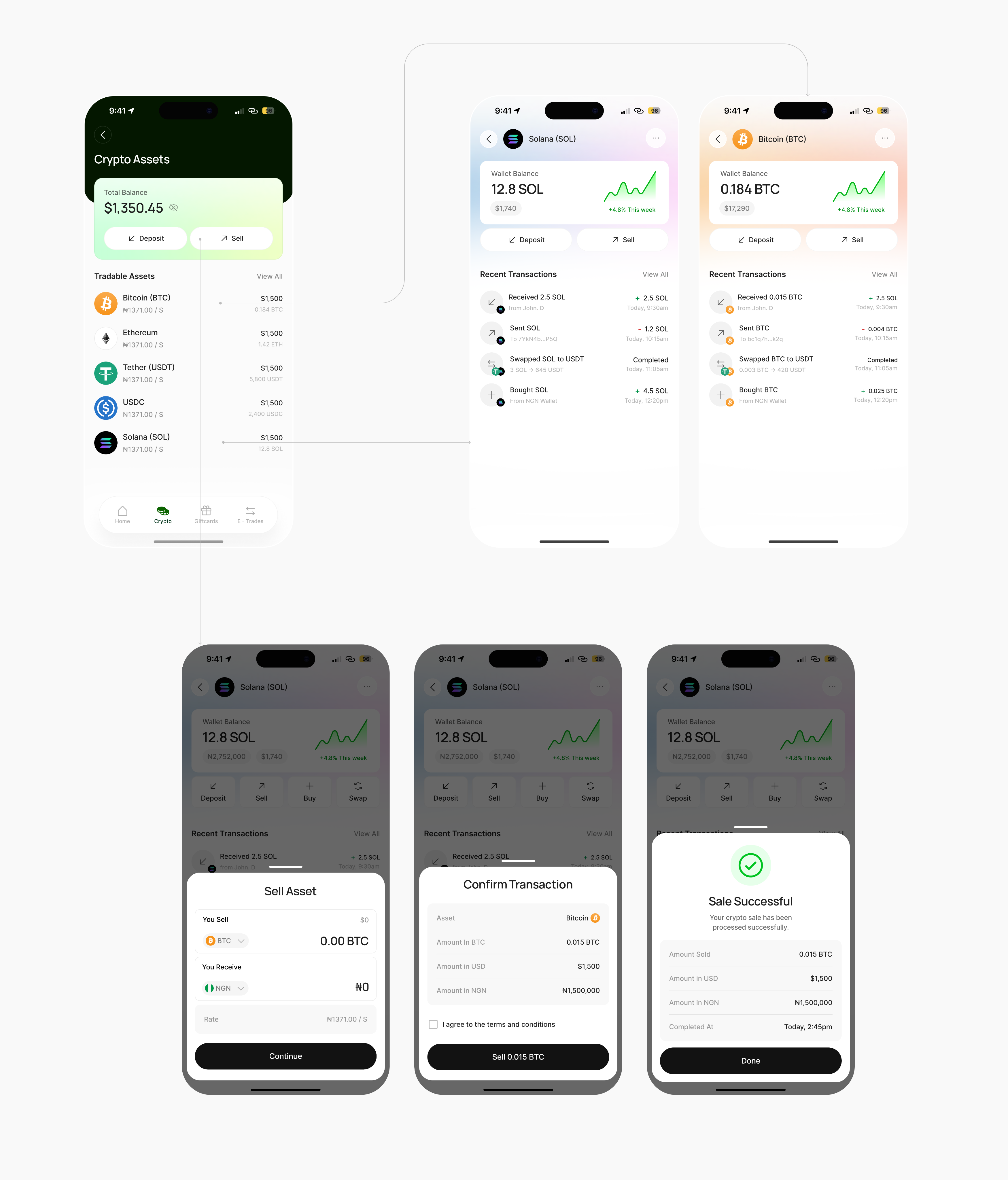
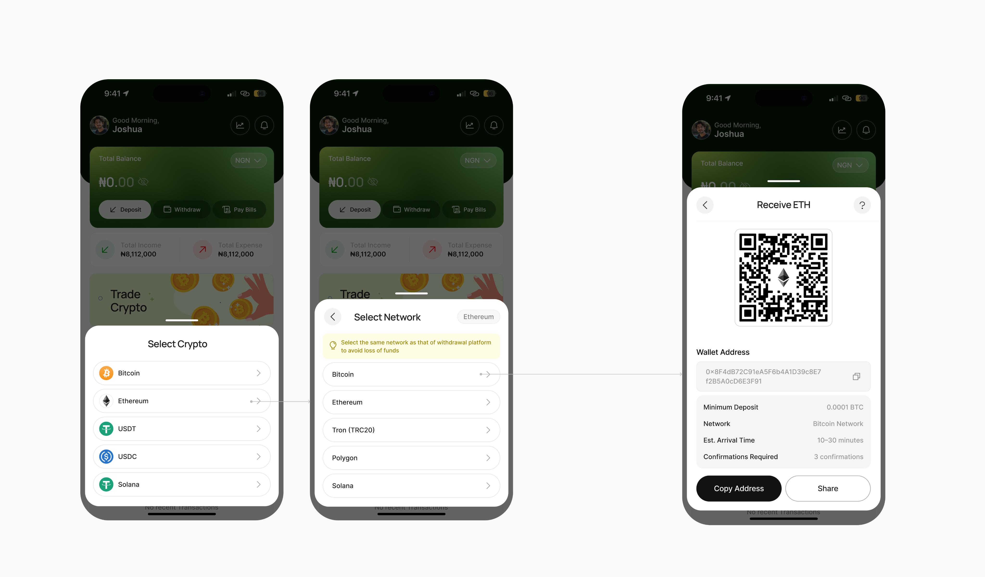
Per-asset wallets with a price trend, and deposit, sell, buy and swap on each. The deposit flow forces network selection with a visible warning — select the same network as the sending platform to avoid loss of funds — a small piece of UX that prevents an expensive, irreversible mistake. The sell flow shows the live rate and the naira you'll receive before you confirm.
E-Trades
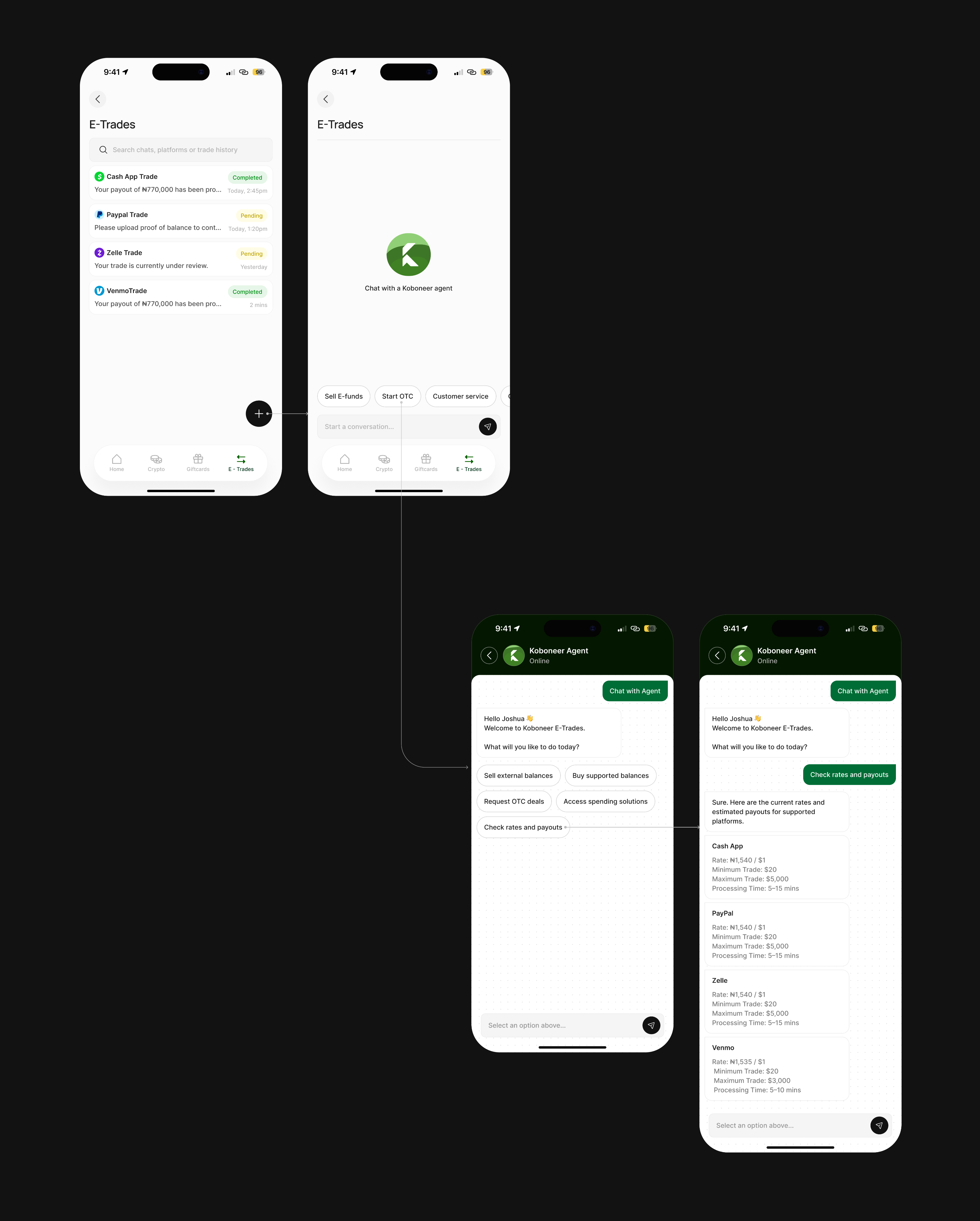
Some platforms — Cash App, PayPal, Zelle, Venmo — can't be fully automated. For these, a guided agent chat handles the trade. Instead of an open text box that leaves you unsure what to say, the chat leads with quick-reply chips: sell external balances, buy supported balances, check rates and payouts. Rates come back inline, formatted and scannable. It's the informal-agent experience, made structured and trustworthy.
Gift cards
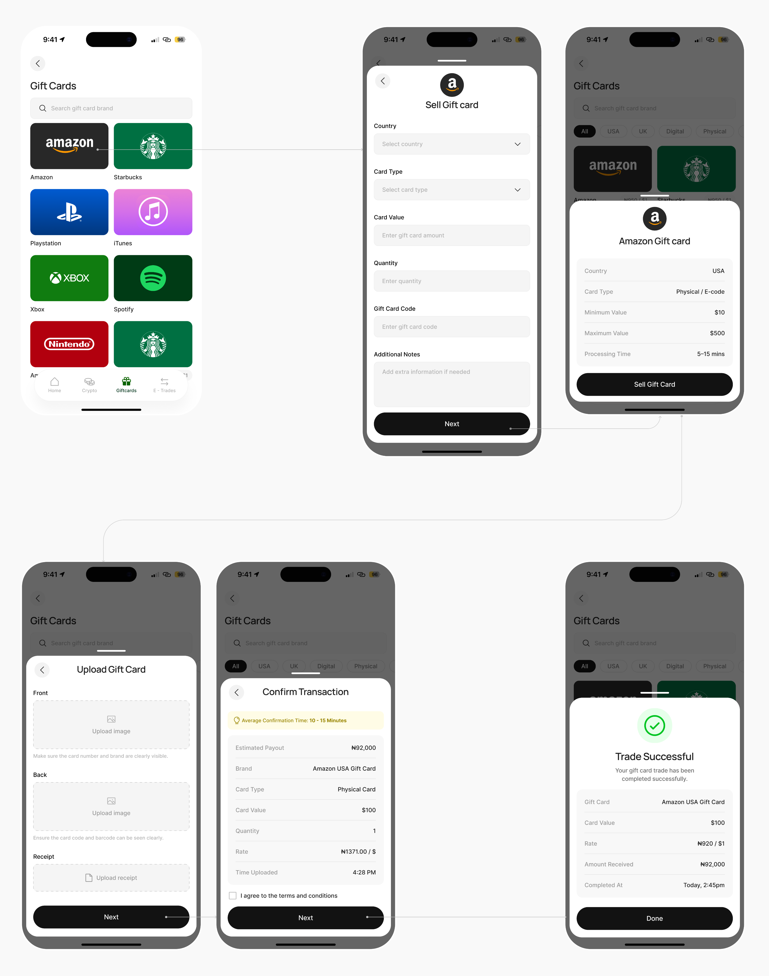
A sell flow that replaces the informal-agent process with something transparent: pick country, card type and value, upload front, back and receipt, then confirm against an estimated payout at the current rate. You see what you'll get before uploading anything sensitive.
Account & Security
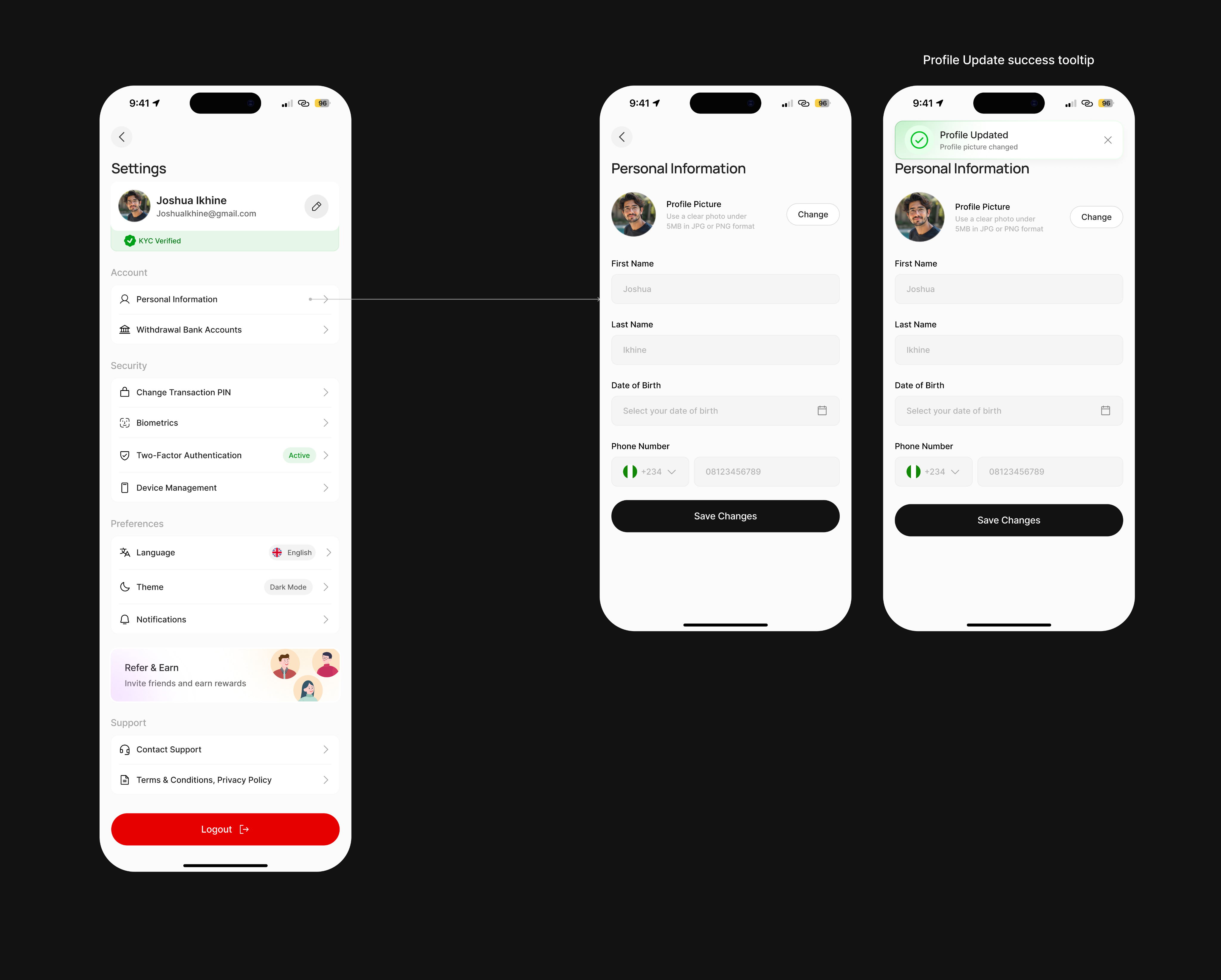
KYC status surfaced up front. Withdrawal accounts with full management. Transaction PIN changes, biometrics and two-factor. Profile editing with instant confirmation. Security settings are grouped in plain language, so the safety features are easy to find and actually get used.
Outcome and Reflection
Koboneer is live, and the direction I designed — one wallet for crypto, gift cards, e-funds and everyday payments — carried into the shipped product.
The part I'd defend hardest is the decision to make every money-moving flow end the same way: review, fees, PIN, receipt. In a fintech app the temptation is to make trading feel fast and effortless. But "effortless" and "moving someone's money" are a dangerous pair. The friction is the feature — one predictable pattern that tells you what's about to happen every single time.
If I took it further, I'd want to pressure-test the E-Trades agent chat with real cash-out sessions, since it's the one flow still leaning on a human on the other end. That's the kind of thing only real usage settles.
Enjoyed reading this? Thank you.
This took a bit of work to put together, so if you liked it, I’d really appreciate you sharing it. If you have a similar project in mind, let’s work together.

What People Say About Me and My Work
One of the smoothest design experiences we've had. Joshua turned complex ideas — AI onboarding, unified inbox, automation builder — into polished, intuitive flows, with a design system that kept us consistent across mobile and web.

Brian T George
CEO, Unifiedbeez

Love his work! Always professional, detail-oriented, and delivers top-quality results. He understands the vision and brings it to life better than expected. Reliable, creative, and a joy to work with — highly recommend!

Becky Idiale
CEO, Daibo Consulting

Josh redesigned our landing page and nailed it. His attention to detail and smooth communication made everything easy. The new design boosted engagement and feels more aligned with our brand. Highly recommend.

Areous A
CEO, Pixel Pioneer Studios

Joshua consistently delivers clean, thoughtful, user-centered designs. He's proactive, reliable, and communicates ideas clearly. Every project gets real creativity and attention to detail — a true asset to any design team.

Chi Onyeukwu
CEO, Njem

Working with Joshua on the Koboneer app was smooth start to finish. He understood the product, turned complex ideas into a clean, intuitive interface, and stayed open to feedback. His attention to detail made a real difference.

Solomon Okafor
CEO, Koboneer

Joshua has been an outstanding contributor at Dingpay. His design solutions are thoughtful, intuitive, and aligned with our users' needs. He works with speed and precision while keeping strong creativity and brand consistency.

Itohowo Udofia
CEO, Dingpay

Great experience working with Joshua. He pays attention to details and provided excellent communication throughout the project.

Donny Gamble
CEO, The Elevation Group

Joshua transformed the AllFoods UK site into something modern, professional, and easy to navigate. He was proactive, responsive, and cared about reflecting our brand. We've had great feedback since.

Akinyemi Arabambi
CEO, AllFoods UK



Let’s Work Together!
Whether it's a freelance project, a full-time role, or you just want a second opinion on something. Tell me a bit about what you're building and where you're stuck. That's plenty to start.


© Joshua Ikhine, 2025.
All rights reserved.
 hello@joshuaikhine.com
 +234 806 258 9858