 Back
BackFÉRRÓ — E-commerce Jewelry Store
Jump to section
FÉRRÓ — E-commerce Jewelry Store
Overview
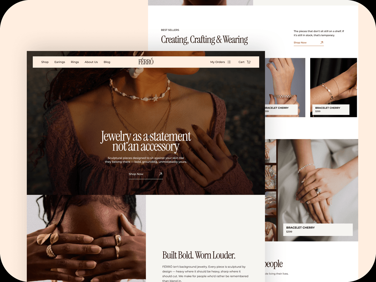
FÉRRÓ is a jewelry brand I designed and built around one idea: a premium shopping experience should be as easy to use as it is nice to look at. Luxury e-commerce usually picks one. I wanted both.
Sculptural metal pieces, editorial photography, quiet luxury. Cream and deep brown, big serif headlines, full-bleed imagery, a lot of room to breathe. The reference bar was the houses that own this space — Louis Vuitton, Chanel, Hermès — not to match their budget, but to design toward the standard they set: restraint, considered motion, nothing accidental.
Then the harder part: making sure every one of those choices still served the person shopping, not just the mood.
My Role
Designer and builder. UI/UX and front-end build, on my own. Designed in Figma, built with Claude Code, deployed on Vercel.
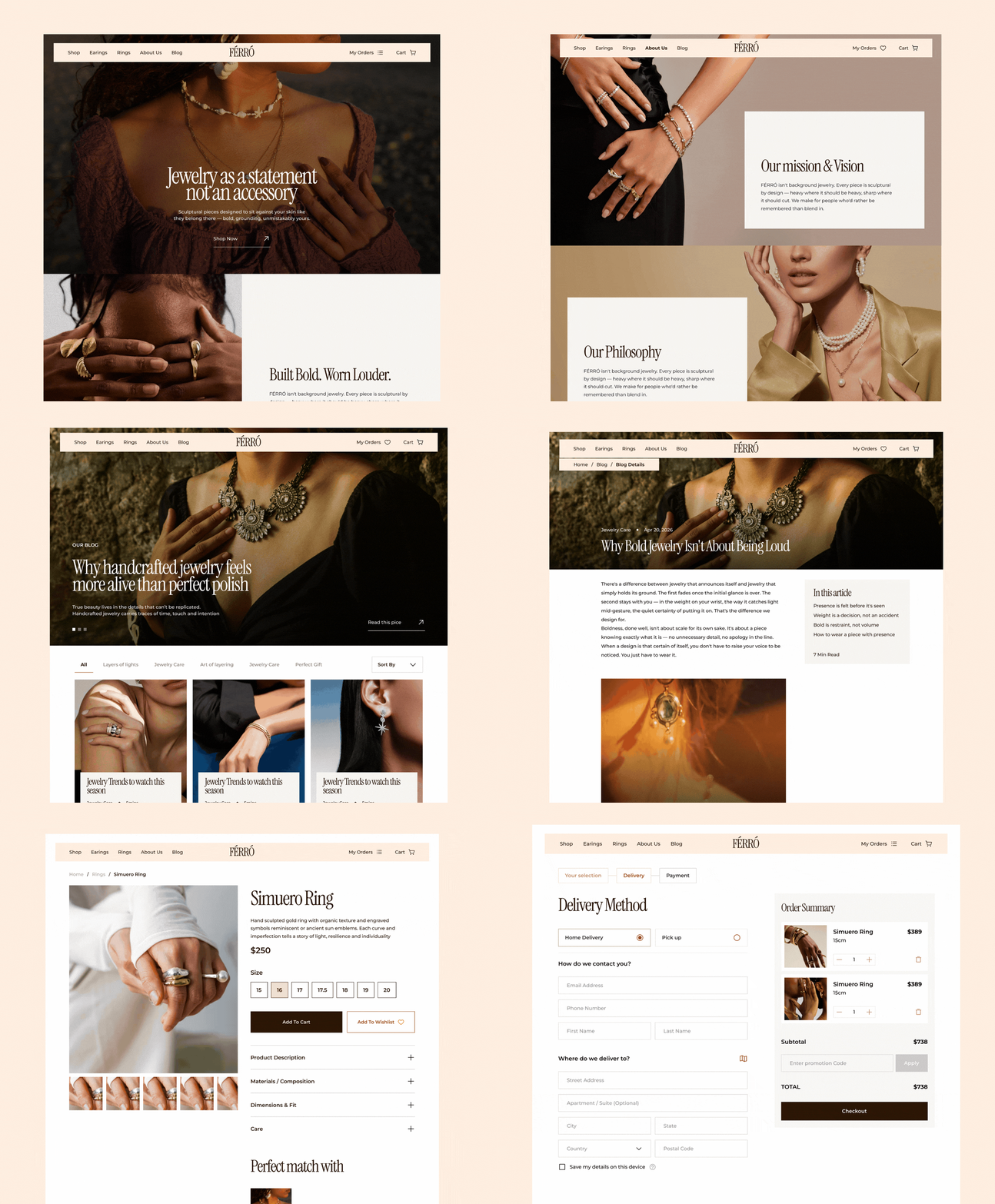
Around 6 screens across the storefront and the full order flow, plus the content pages (About, Blog, category and product templates). Timeline: 1 week. Status: live demo.
The problem
Luxury sites have a reputation. They look incredible and they're often a pain to use. Endless intro animations, navigation hidden for the sake of mood, a full second of ceremony before you can do the thing you came to do. The aesthetic gets served, the person doesn't.
So the brief I set myself wasn't "make it look premium." That's the easy half. It was: make it feel premium and still respect the person using it. Every expensive-feeling detail had to earn its place without slowing anyone down.
That framing decided everything. Premium became a discipline, not a coat of paint.
Premium is in the details
Premium isn't one big move. It's a hundred small decisions pulling the same way, held together by restraint.
Type. Instrument Serif for display, high-contrast, so a headline reads like an object. Montserrat for body, geometric and quiet, so it never competes. That tension — expressive serif against neutral sans — is the premium signal. Both are free typefaces, chosen for the structure, not the license.
Colour. Cream (#ffeee0) and deep brown (#2a1606), almost nothing else. The one exception is red, reserved for destructive actions. When colour means something everywhere, that single break reads instantly — nobody has to guess which button is dangerous.
Interaction. Main CTAs don't just recolour on hover, they animate: a filled block rises through the button while the label swaps upward behind it. Small controls stay quiet — a fade, a slight scale. If everything animates, nothing feels considered. All of it answers keyboard focus too, so the polish isn't only for mouse users.

Motion, used sparingly
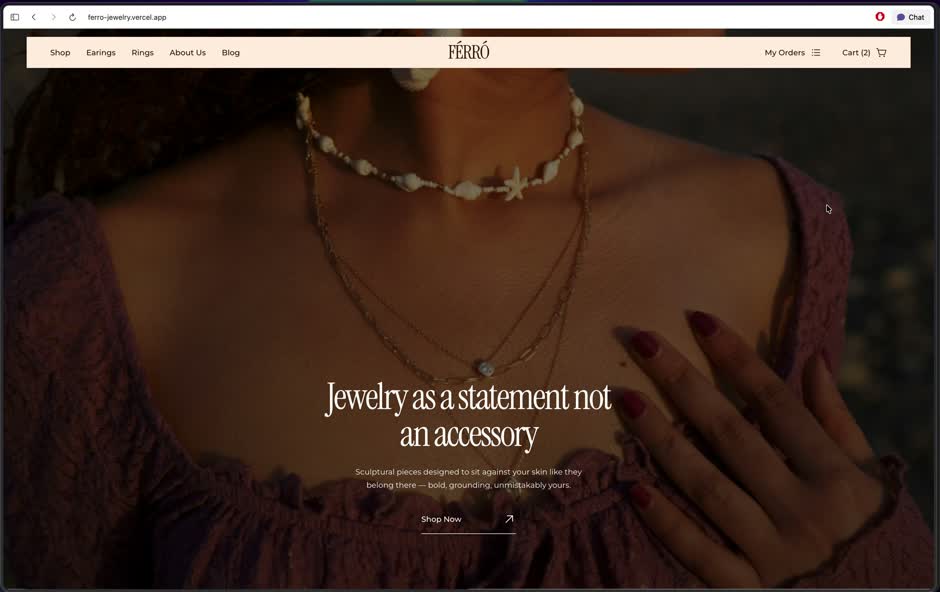
One signature move: navigating plays a cream panel that sweeps up from the bottom with the FÉRRÓ wordmark in it, swaps the page behind it, and continues off the top as the new content eases in. One continuous motion, about a second.
Scrolling is smooth site-wide (Lenis), with subtle parallax on section imagery. The restraint is the point. The transition skips in-page filtering, so browsing a category never triggers the full ceremony, and the whole system respects prefers-reduced-motion. Motion is the accent, not the substance.
Guest checkout
Premium doesn't mean frictionless at any cost. Sometimes the considered choice is to remove a feature.
The default instinct is accounts — save your details, log back in. I cut all of it. Real accounts mean auth, sessions, password resets, a backend to run them, and plenty of DTC brands push guest checkout anyway because it cuts friction. So guest-only was the position, not a limitation.
The catch: a lot of checkout UI is quietly designed for accounts, and if you don't notice you ship dead controls. My delivery screen started with a saved-addresses list and a "set as default" toggle, both meaningless without a logged-in user. Out they came, replaced by a single contact-and-address form and one honest extra: a "save my details on this device" checkbox backed by local storage. Convenience without pretending there's an account.
One line I held: no hand-built card fields. Payment selects a method and hands to a processor. Rolling your own card inputs is a liability, not a feature.
Tracking without accounts
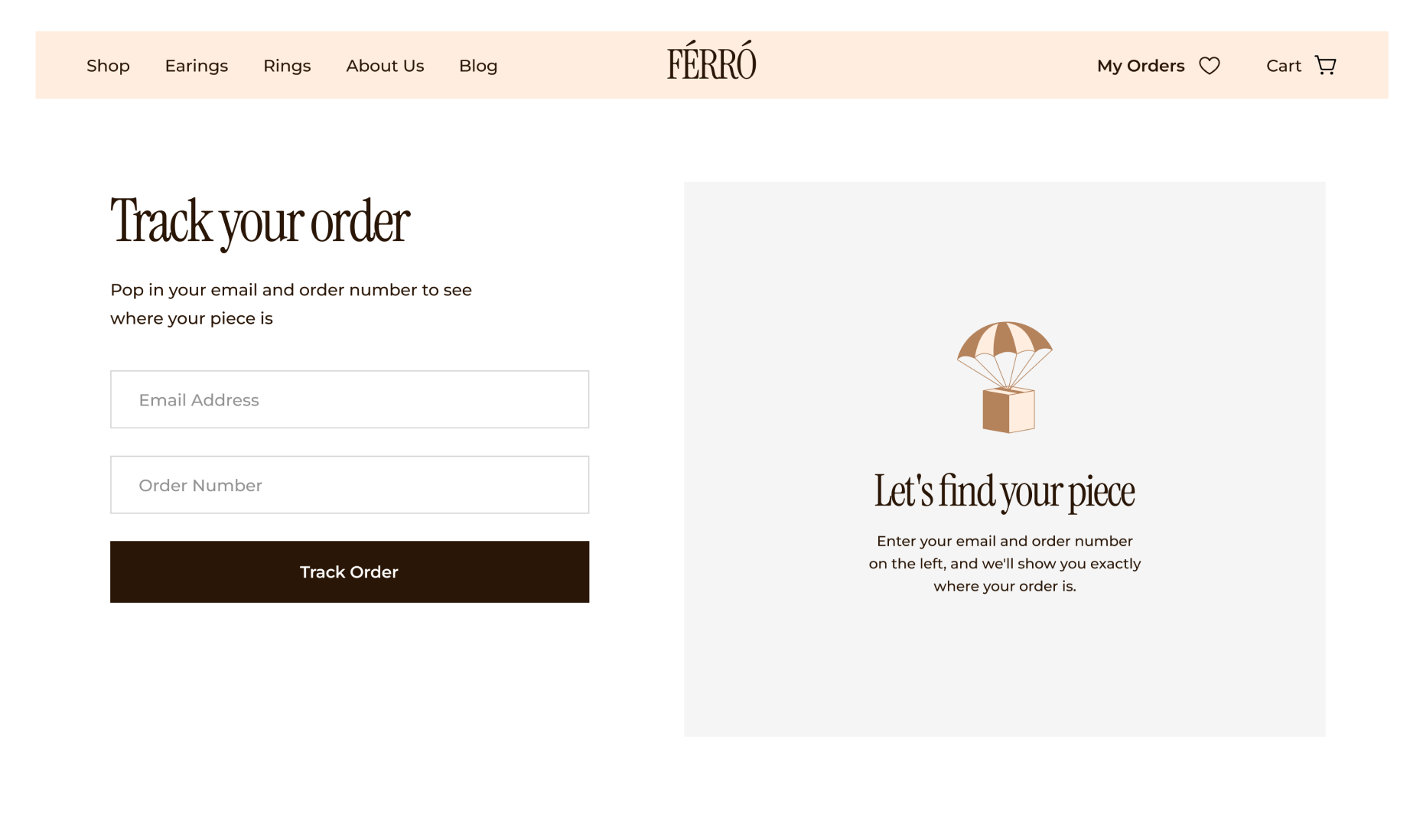
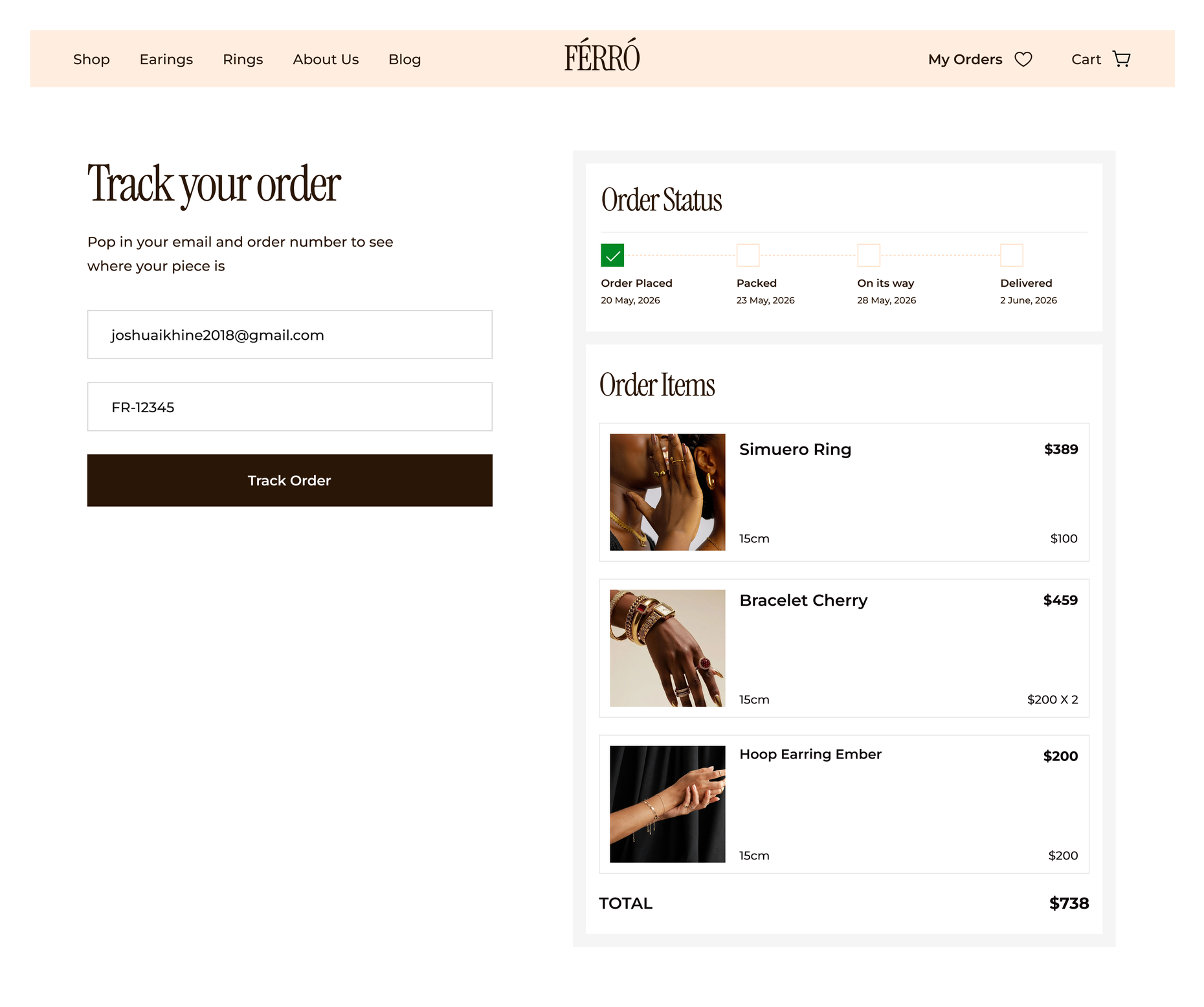
The decision I'm happiest with. "Order history" is an account feature — every order tied to a "me" that a guest login doesn't provide. So there's no history page. What a guest needs is to find the one order they already have the number for.
So tracking takes email plus order number, together, never email alone. Email alone is a privacy hole: type any address, see a stranger's orders and shipping address. The order number is the thing only the real buyer has, so it's the key. The lookup finds the order by number, then returns it only if the email matches.
In production the number arrives by email. With no mail service, I closed the loop in-app: the confirmation shows the number and hands it straight to the tracking page, no retyping. Same logic as an email link, minus the email. Adding a mail service later changes nothing here — email just becomes a second way to deliver a number the app already knows.
The Pages
The site is built on a shared shell — nav, footer, made once and reused — so a fix lands everywhere instead of in six places. Product, category, cart, checkout, confirmation and tracking share one order object and one storage layer, isolated behind two functions so it can move from local storage to a real database later without touching the UI.
On top of that shell, each page does one job.
Landing Page
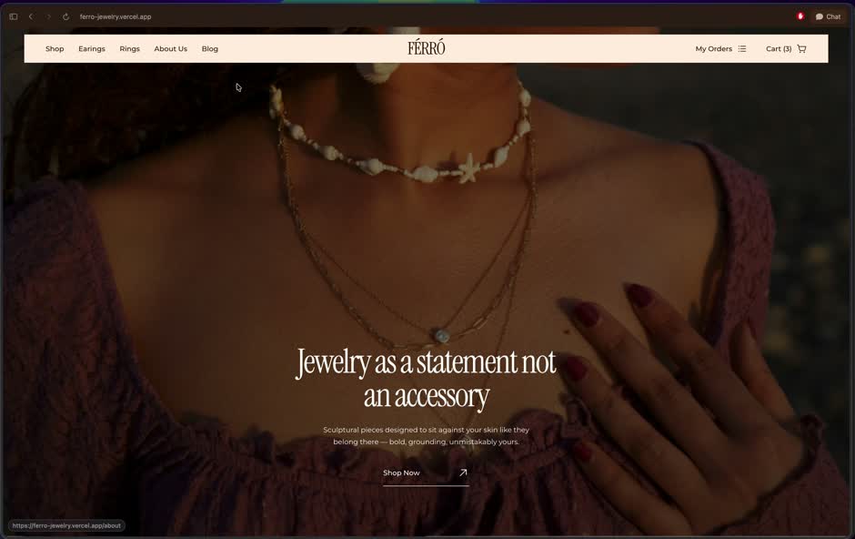
The storefront's argument, top to bottom: a full-bleed hero with the brand line, a manifesto block (Built Bold. Worn Louder.), best sellers, new arrivals, the craft story, real-people social proof, and a trimmed FAQ. The pinned scroll section lives here. The order is deliberate — hook, voice, product, proof, reassurance — so a first-time visitor is sold before they're asked to browse.
Shop
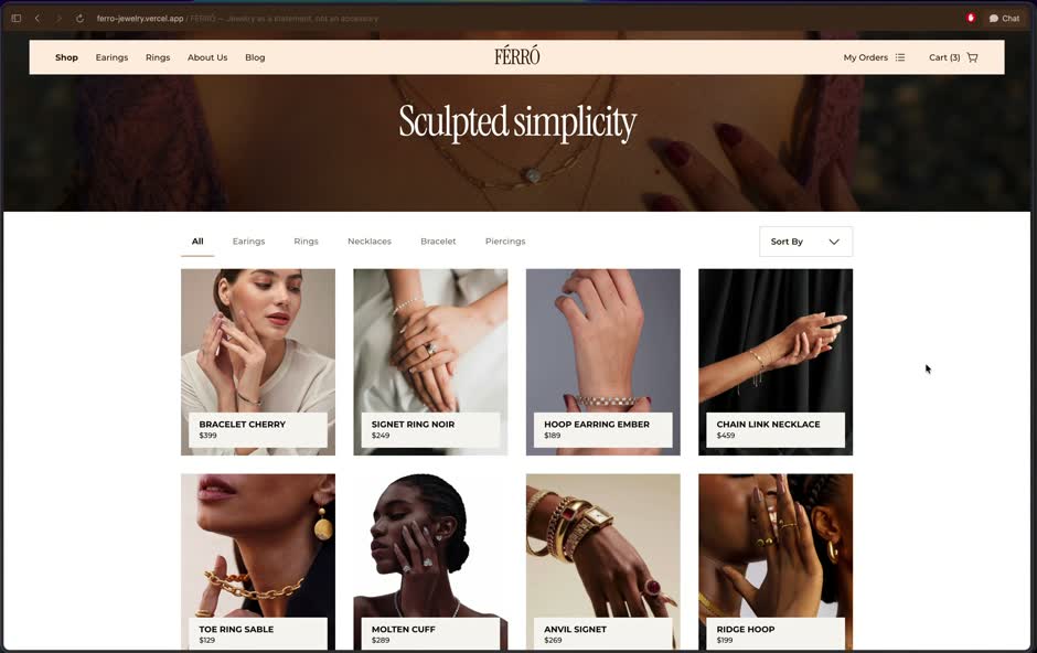
The browse page gets out of its own way. A thin category banner, then filters by product type (rings, earrings, necklaces, bracelets), a sort control, and a ratio-locked product grid that never shifts as images load. Filtering happens in place, no page transition, so browsing stays fast and quiet. This is the one page where the job is speed, not ceremony, and the design respects that.
Product details
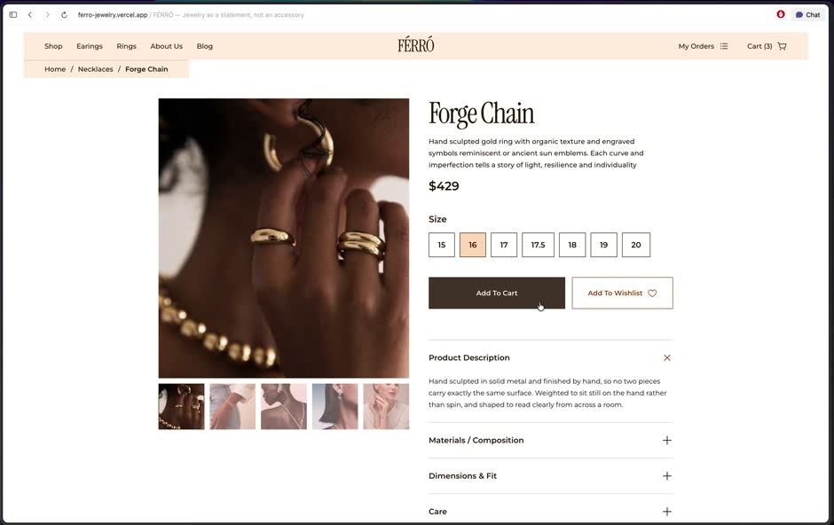
The page that has to close the sale. A gallery with thumbnails, a size selector, add to cart and add to wishlist, and the details split into an accordion — Description, Materials, Dimensions & Fit, Care — so the specifics are there for people who want them without burying the buy action for people who don't.
Below it, a "Perfect match with" cross-sell and a "You may also like" row. Progressive disclosure doing exactly what it's for: everything available, nothing shouting.
About
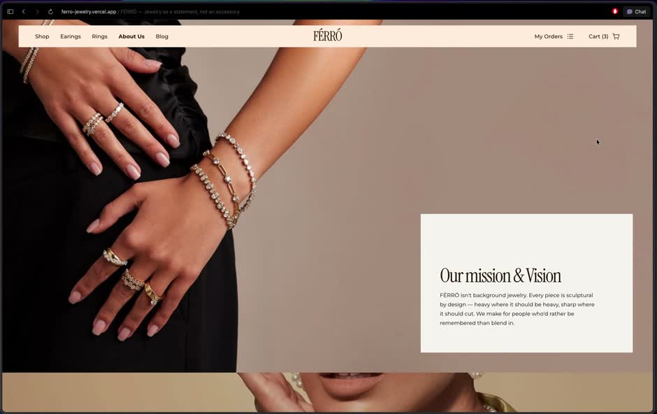
The brand story, told in distinct full-bleed blocks — Mission and Vision, Philosophy, Craft, Materials — each with its own copy and its own image rather than a repeated house line. This is where the "quiet luxury" typography and generous spacing do the most work. It reads like a magazine spread, which is the point.
Blog and article
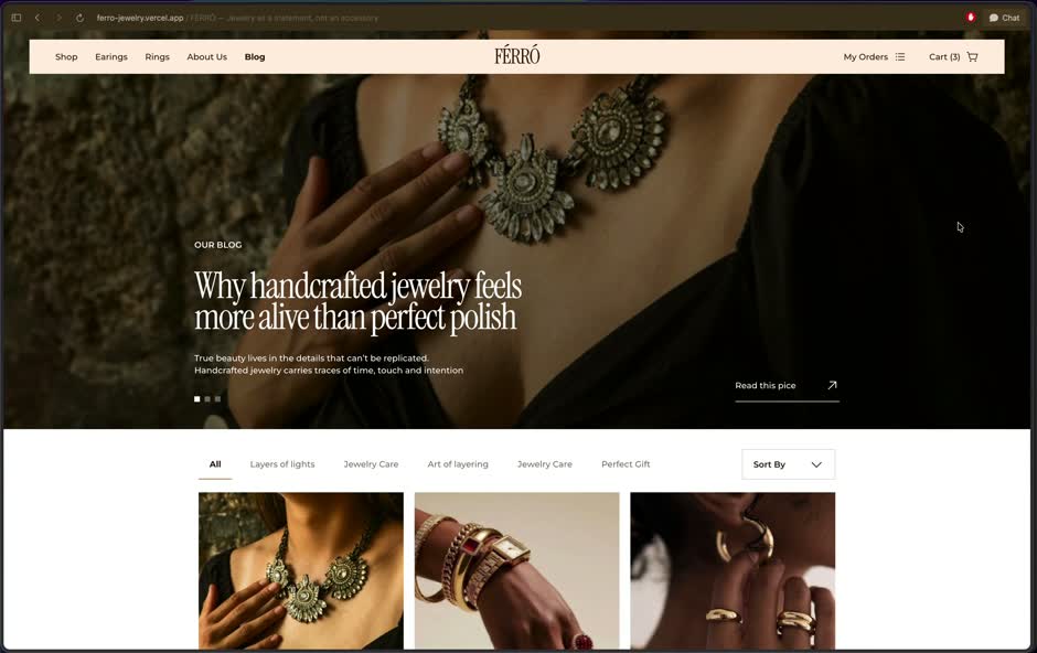
A content layer that gives the brand depth and somewhere to land search traffic. The index runs real topics (craftsmanship, styling, care, gifting), and the article template carries an "In this article" contents rail that mirrors the actual section headings, a reading-time estimate, and related pieces at the end. The article copy holds the same voice as the rest of the site, so the blog reads like the brand talking, not a bolted-on CMS.
Cart
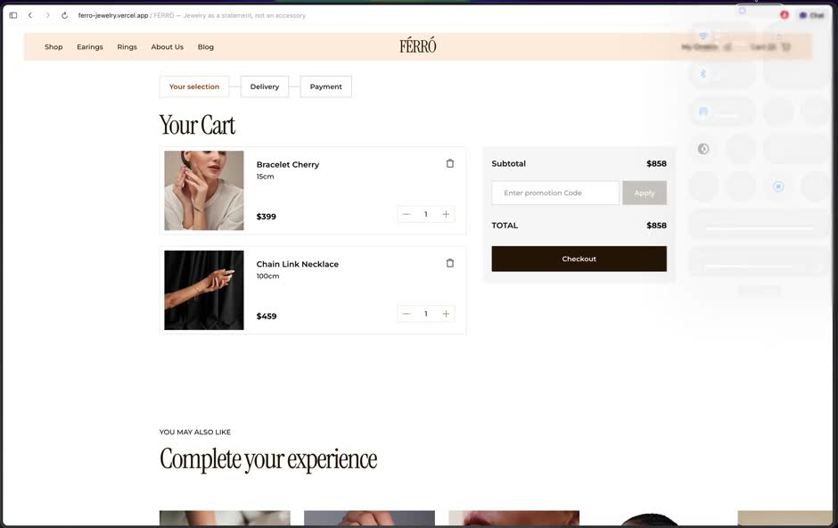
Covered in the checkout flow above, but worth noting it shares the same order object and summary component the rest of the flow uses, so the numbers are consistent from cart to confirmation. Line items sum correctly to the subtotal, which sounds obvious until you notice how many demos get it wrong.
The copy is its own system across all of it. Each section earns its own voice instead of repeating a house line, the FAQ answers the questions people actually ask, and the microcopy does real work: the tracking states guide, reassure, or help you retry rather than leaving dead space.
What I'd change
The signature page transition is a risk I'd revisit. A full second of ceremony is beautiful the first time and a tax by the tenth. I kept it off in-page filtering and off for reduced-motion users, which helps, but I'd give repeat navigations a lighter, faster variant. A second of wordmark on every click is where premium tips into precious.
The demo shipped with placeholder content in places — repeated products, a couple of duplicated sections, filler photography. It reads as unfinished the moment you look closely, and on a premium site that's exactly where the illusion breaks. I'd finish the content pass before calling it done.
Order status is faked. It defaults to a stage and can fake progression off the order date, but there's no real fulfillment behind it. Fine for a demo, worth being upfront about.
Tracking has no rate limiting. Email plus number is the right gate, but a real store would throttle attempts so the number can't be brute-forced. I designed the honest lookup and stopped short of hardening it.
Reflection
Premium turned out to be the sum of decisions no single one of which is impressive. The serif against the sans. The one red break in a calm palette. The button that rises instead of recolouring. The frame that holds its shape so the page never jumps. Pull them all one direction and the thing feels expensive. Miss a few and it feels like a template with nice photos.
The discipline was refusing to let any of it cost the person using the site. The considered choice and the usable choice kept landing in the same place — ratio-locked images that look clean and stop layout shift, motion that impresses once and then gets out of the way, guest checkout that's less to build and less to fight through.
Looks get someone in the door. The details are what make them believe the brand once they're inside.
Enjoyed reading this? Thank you.
This took a bit of work to put together, so if you liked it, I’d really appreciate you sharing it. If you have a similar project in mind, let’s work together.
What People Say About Me and My Work
One of the smoothest design experiences we've had. Joshua turned complex ideas — AI onboarding, unified inbox, automation builder — into polished, intuitive flows, with a design system that kept us consistent across mobile and web.

Brian T George
CEO, Unifiedbeez

Love his work! Always professional, detail-oriented, and delivers top-quality results. He understands the vision and brings it to life better than expected. Reliable, creative, and a joy to work with — highly recommend!

Becky Idiale
CEO, Daibo Consulting
Josh redesigned our landing page and nailed it. His attention to detail and smooth communication made everything easy. The new design boosted engagement and feels more aligned with our brand. Highly recommend.

Areous A
CEO, Pixel Pioneer Studios

Joshua consistently delivers clean, thoughtful, user-centered designs. He's proactive, reliable, and communicates ideas clearly. Every project gets real creativity and attention to detail — a true asset to any design team.

Chi Onyeukwu
CEO, Njem

Working with Joshua on the Koboneer app was smooth start to finish. He understood the product, turned complex ideas into a clean, intuitive interface, and stayed open to feedback. His attention to detail made a real difference.

Solomon Okafor
CEO, Koboneer

Joshua has been an outstanding contributor at Dingpay. His design solutions are thoughtful, intuitive, and aligned with our users' needs. He works with speed and precision while keeping strong creativity and brand consistency.

Itohowo Udofia
CEO, Dingpay

Great experience working with Joshua. He pays attention to details and provided excellent communication throughout the project.

Donny Gamble
CEO, The Elevation Group

Joshua transformed the AllFoods UK site into something modern, professional, and easy to navigate. He was proactive, responsive, and cared about reflecting our brand. We've had great feedback since.

Akinyemi Arabambi
CEO, AllFoods UK



Let’s Work Together!
Whether it's a freelance project, a full-time role, or you just want a second opinion on something. Tell me a bit about what you're building and where you're stuck. That's plenty to start.


© Joshua Ikhine, 2025.
All rights reserved.
 hello@joshuaikhine.com
 +234 806 258 9858