
Jump to section
Banklink — Brand Identity
Overview
Banklink is a concept for a modern banking app built to stand out in a saturated market — personalized, AI-assisted, and designed to feel like a challenger to the "archaic bank." I designed the brand identity that gives it that challenger energy.
My Role
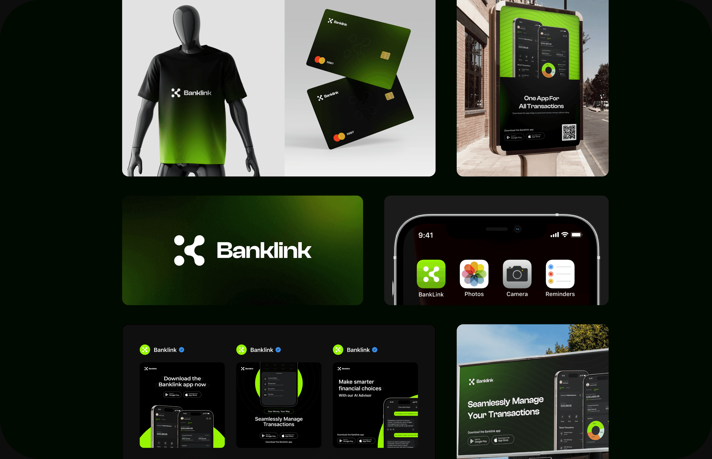
Brand designer. I handled the full identity — logo, color, typography, and applications (card, merch, out-of-home). The product UI/UX was designed by a separate designer; my work is the brand it sits inside. (The app screens shown here are the UI designer's — I've included them for context on the finished product.)
Brand Personality
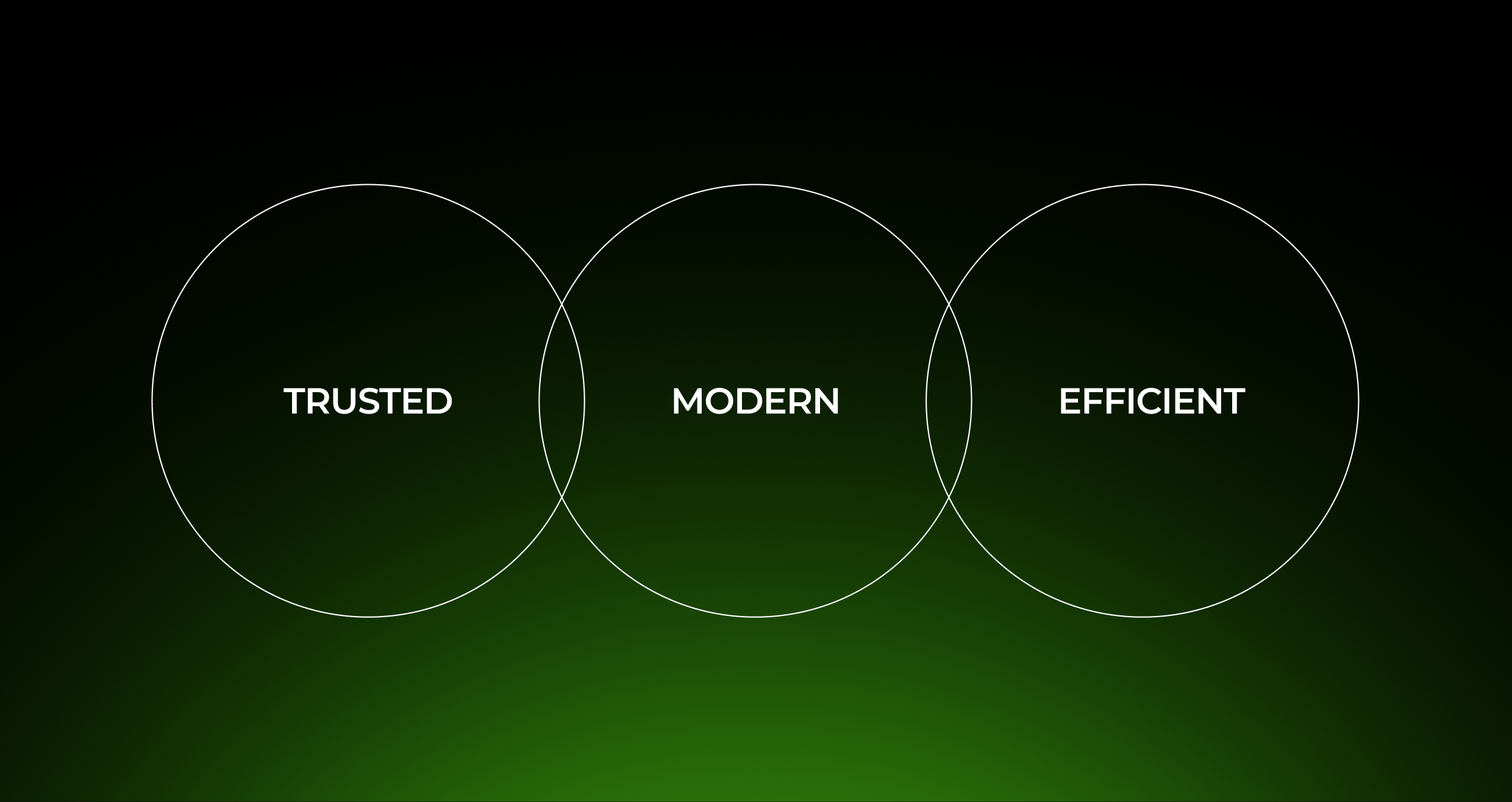
Three words anchored every decision: trusted, modern, efficient. The identity had to feel secure enough for a bank and fresh enough to beat one.
The Mark
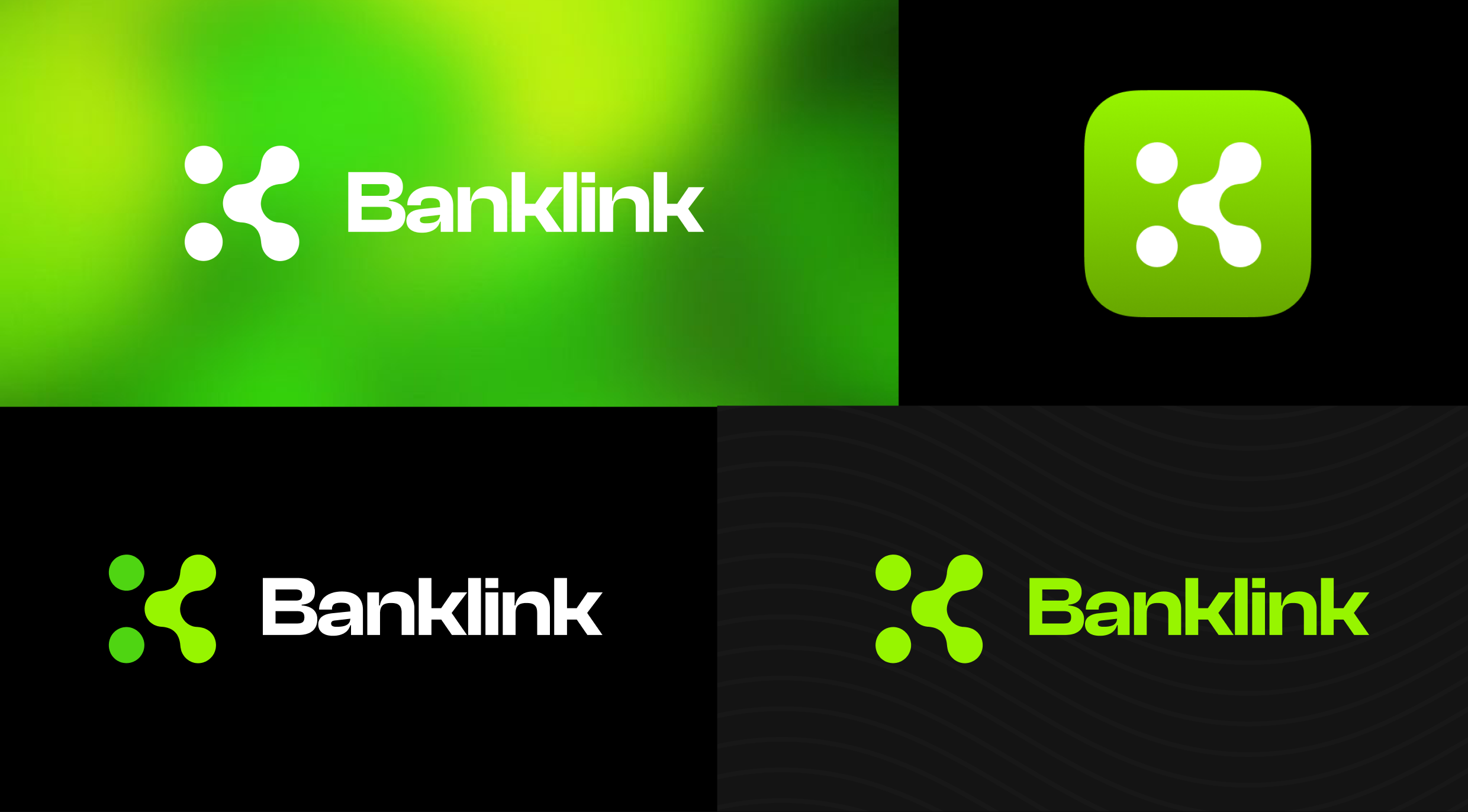
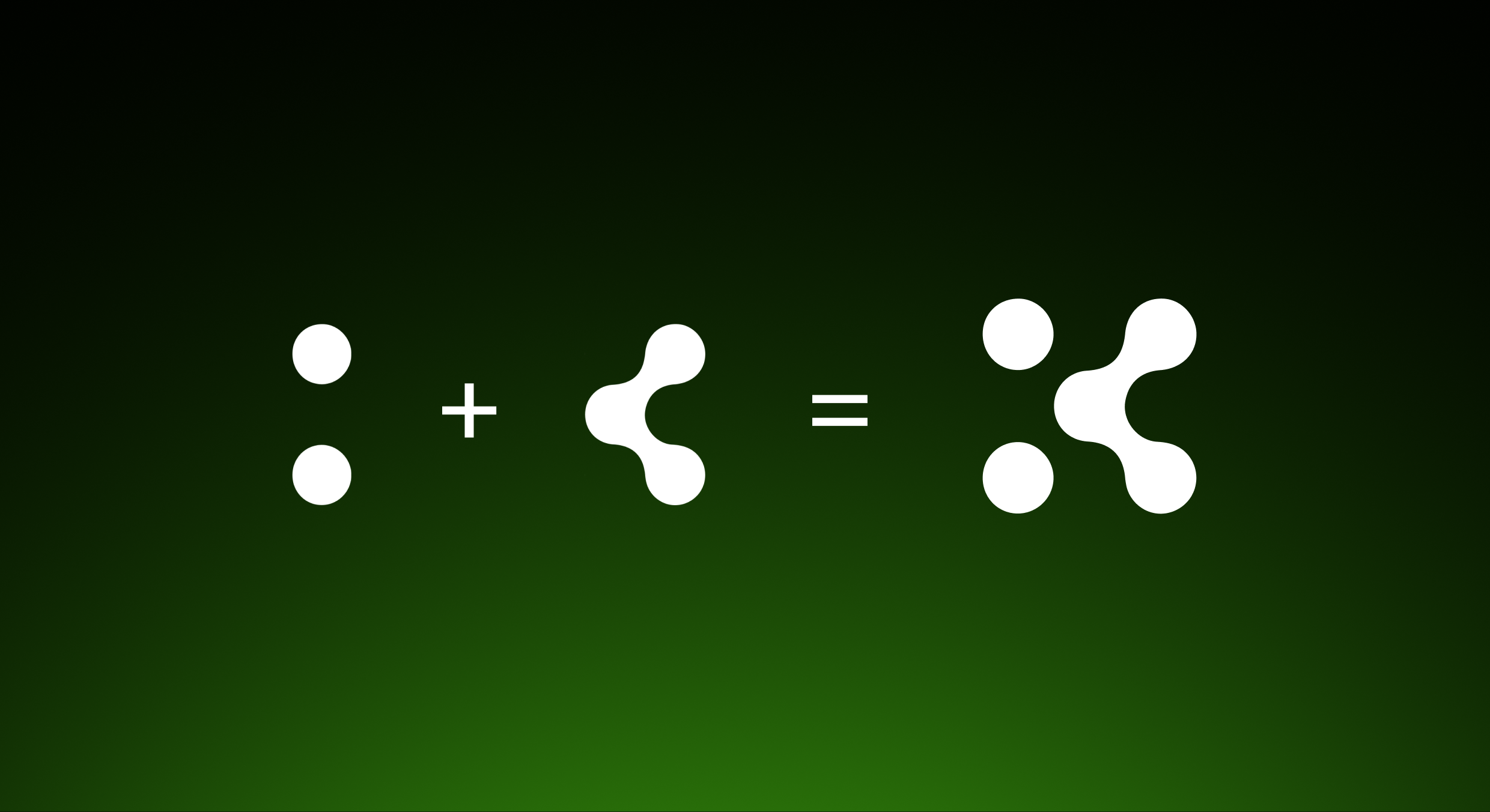
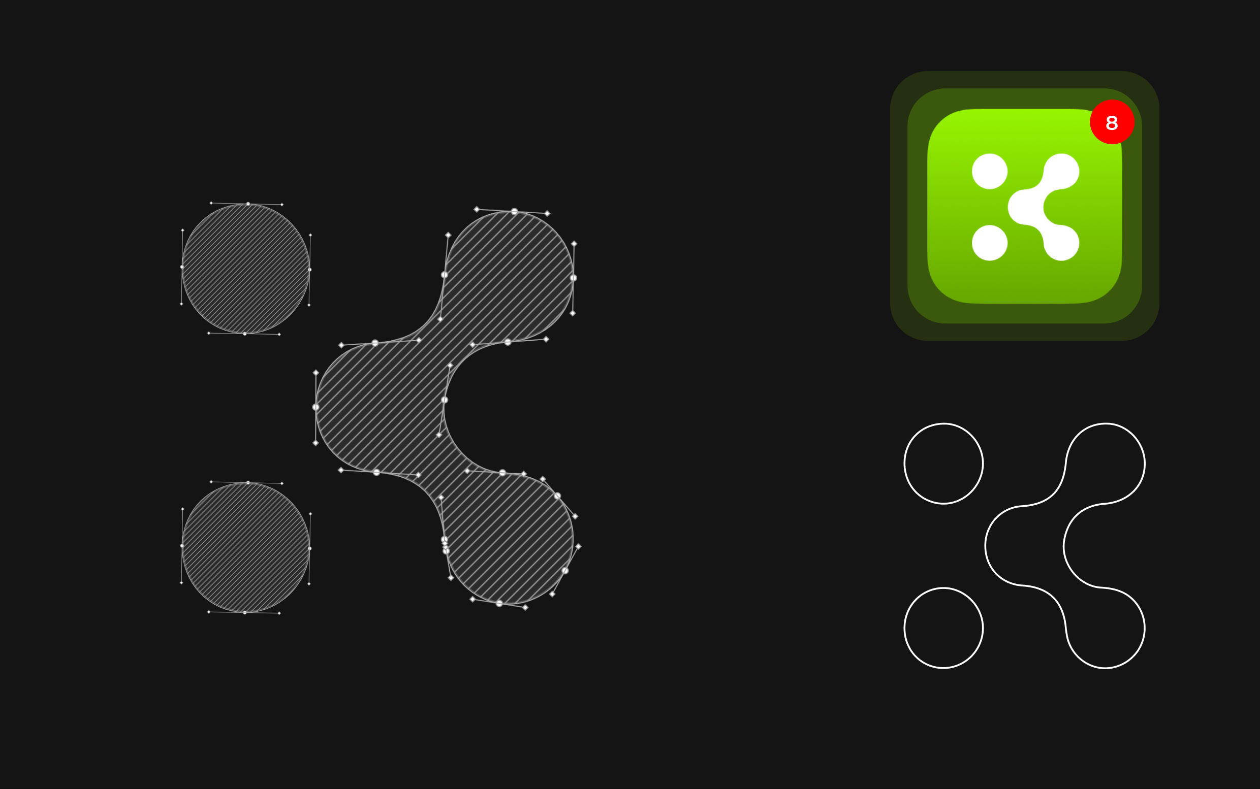
The logo is built from linked circles — one for the user, the others for Banklink's AI chatbot and conversational interface. Together they represent the exchange between user and system: individual, connected, intelligent. It works as a full wordmark lockup and as a standalone app-icon mark. (Logo Concept + construction + variations.)
Color Palette
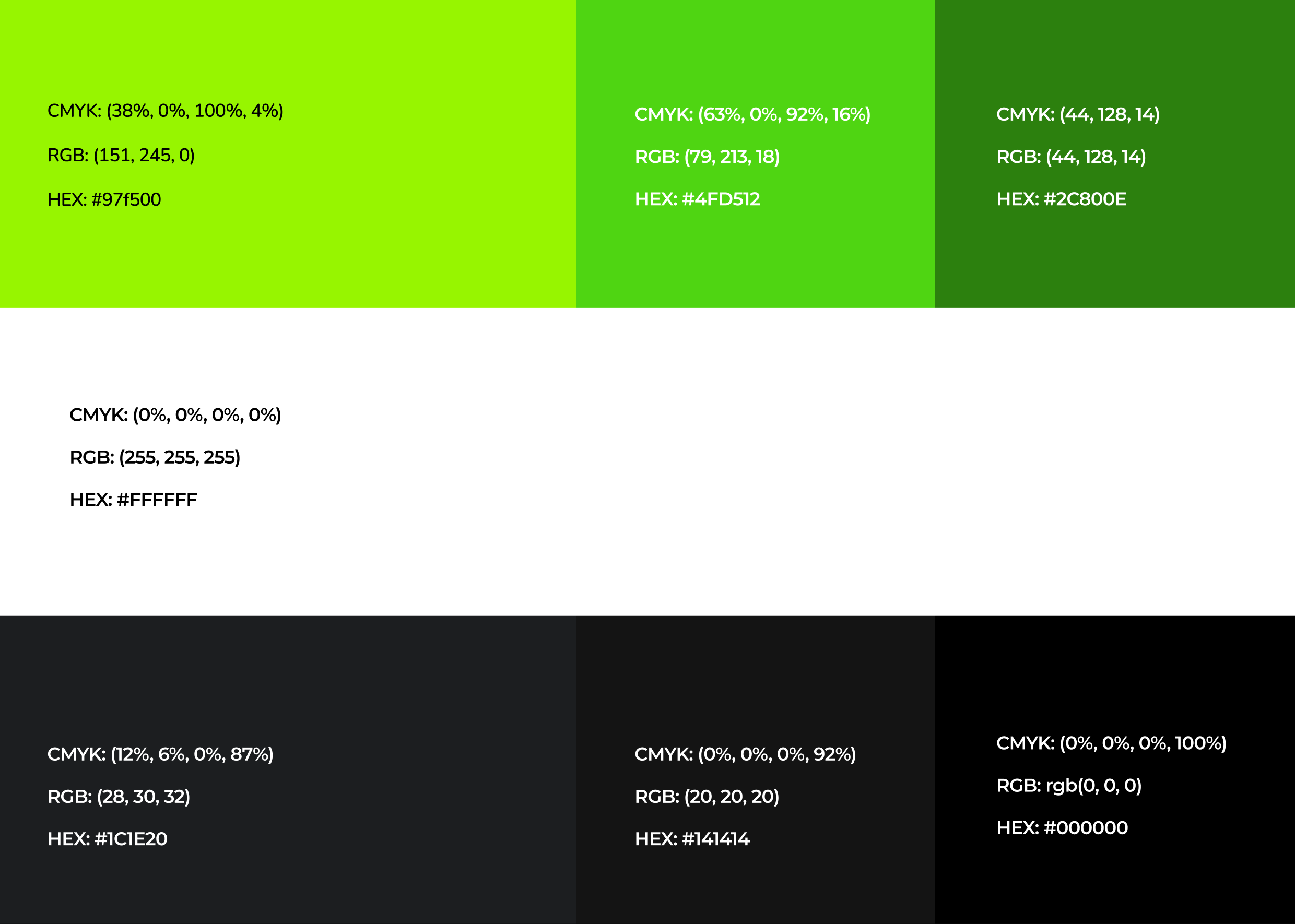
A high-energy acid green against deep black — the green signals modern and tech-forward, the black keeps it premium and trustworthy. It's the combination that makes Banklink read as challenger, not legacy bank.
Typography
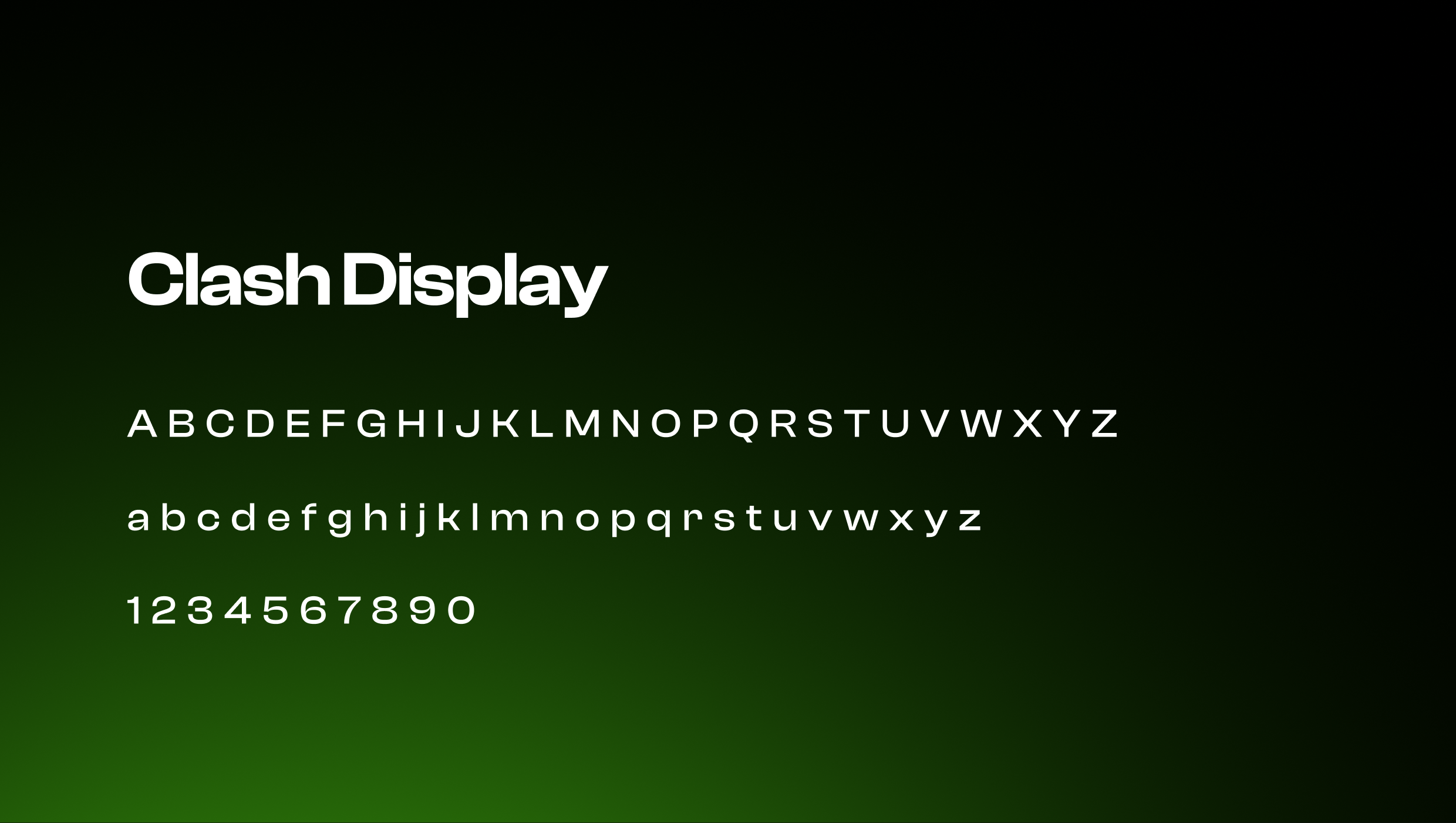
Clash Display throughout — geometric, confident, contemporary. It carries the "modern challenger" tone in one typeface.
In use
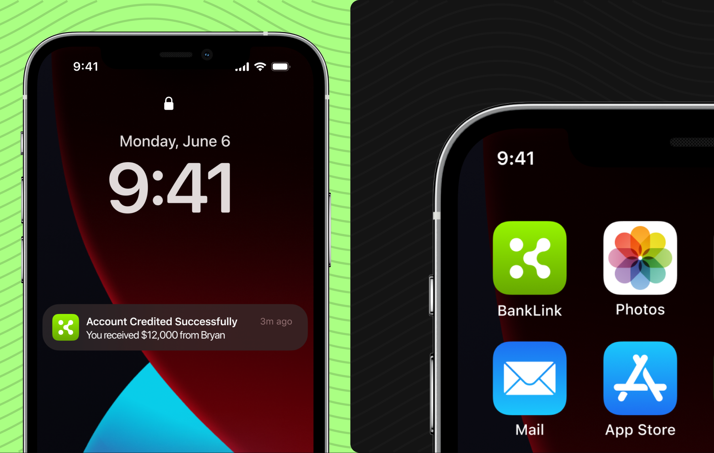
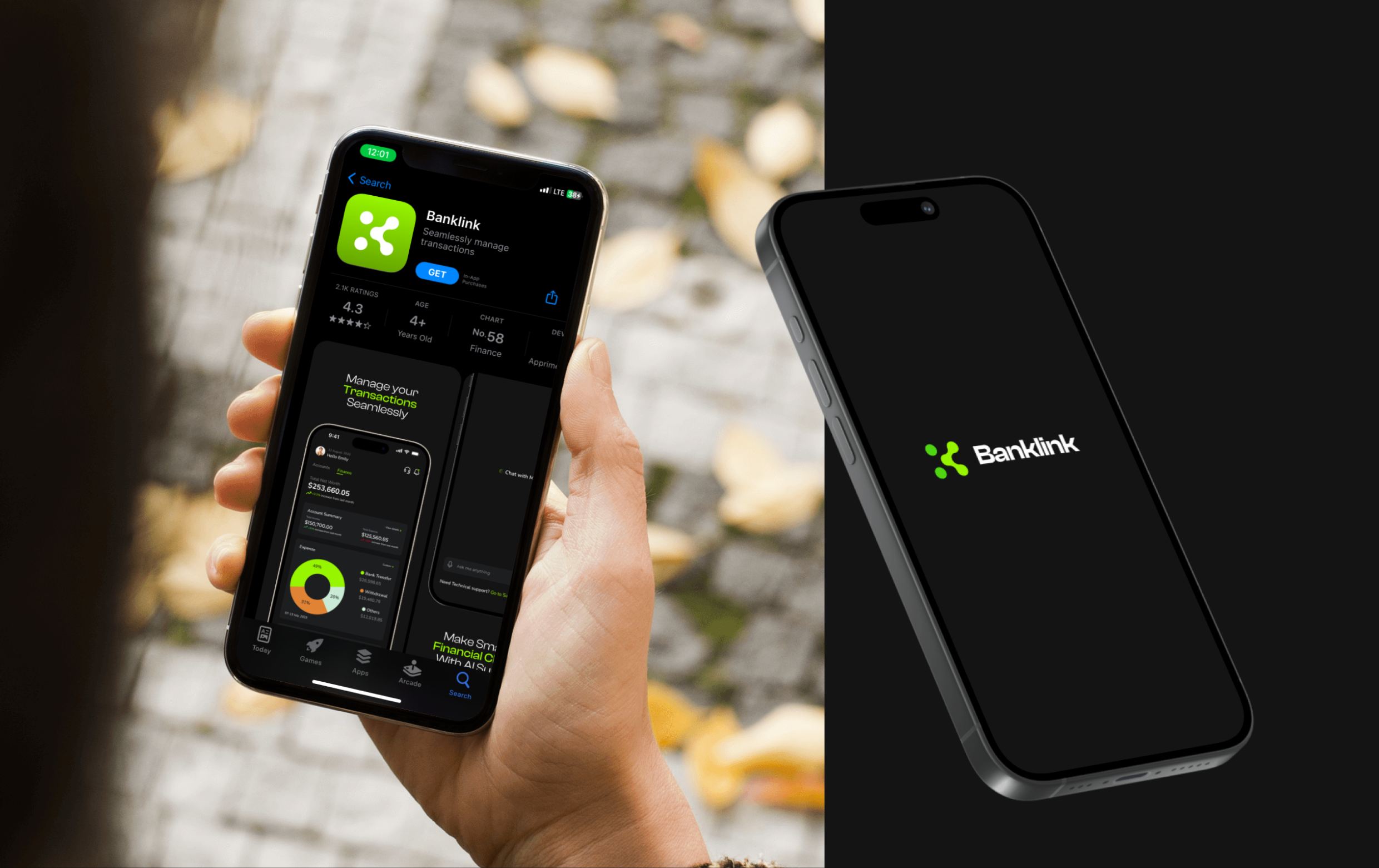
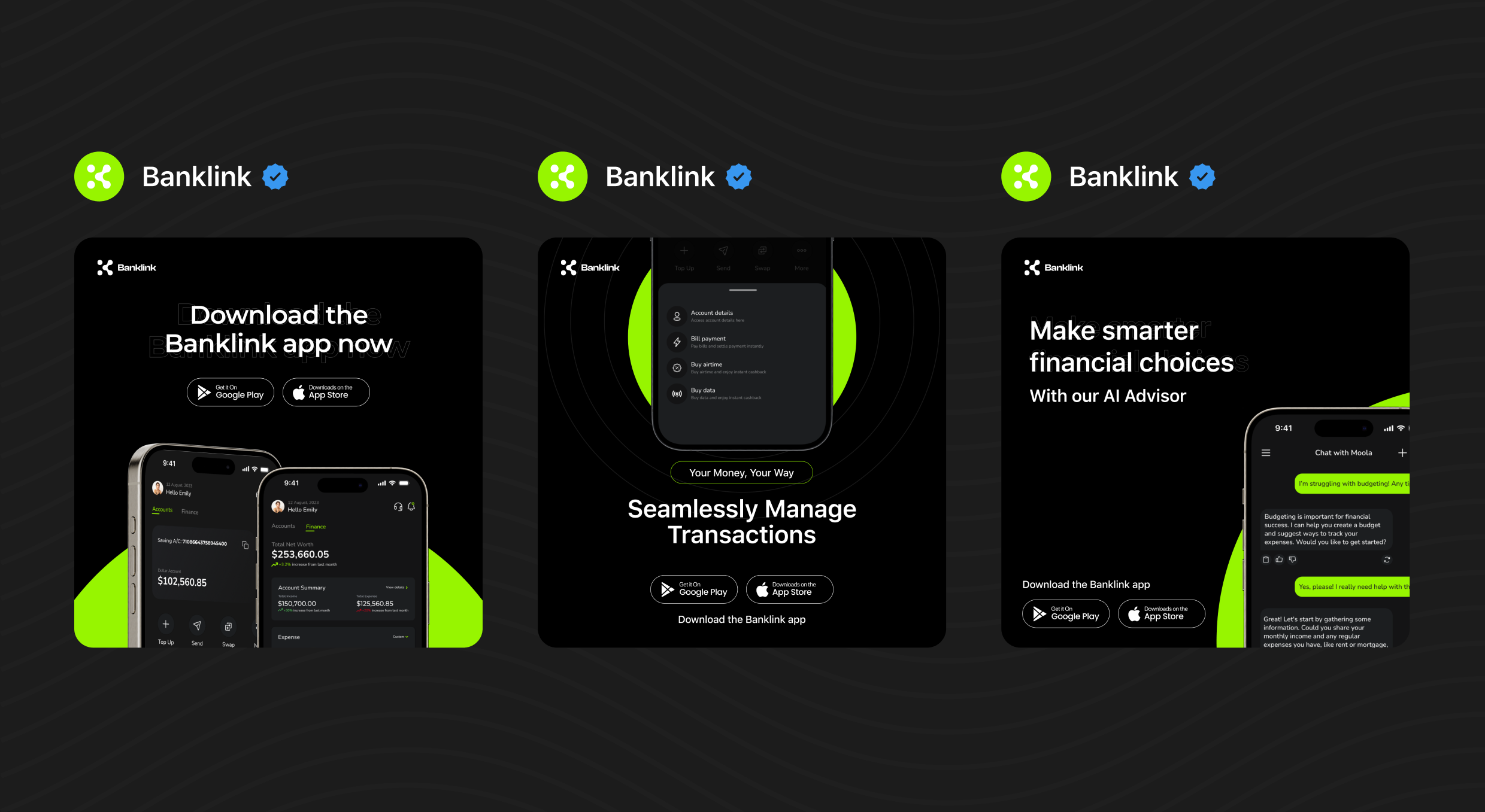
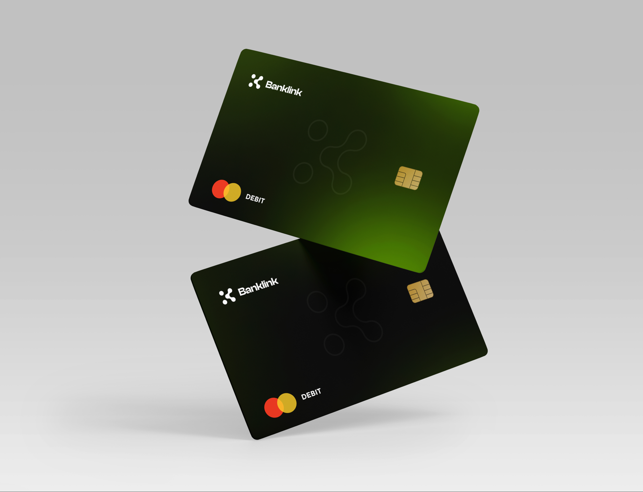
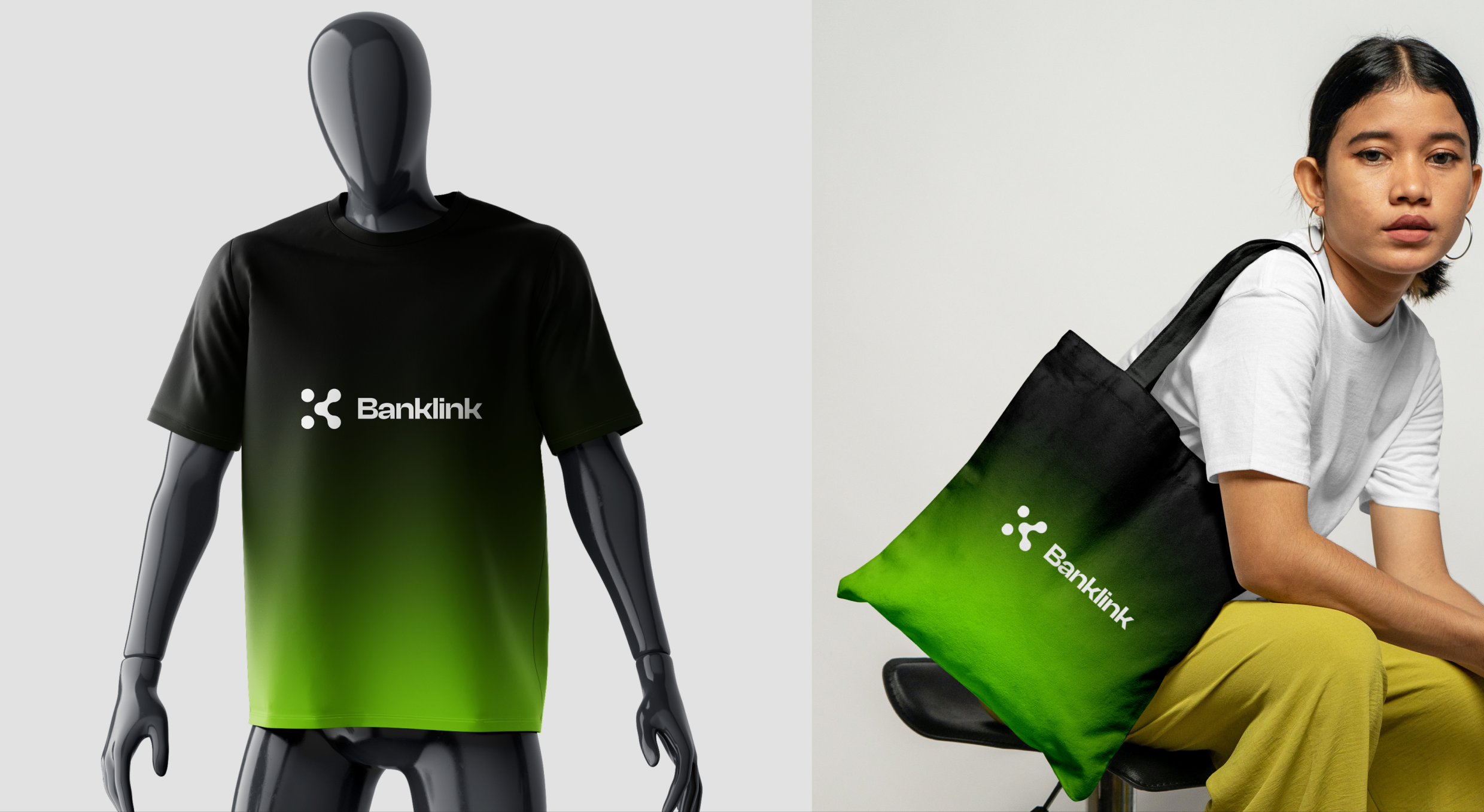
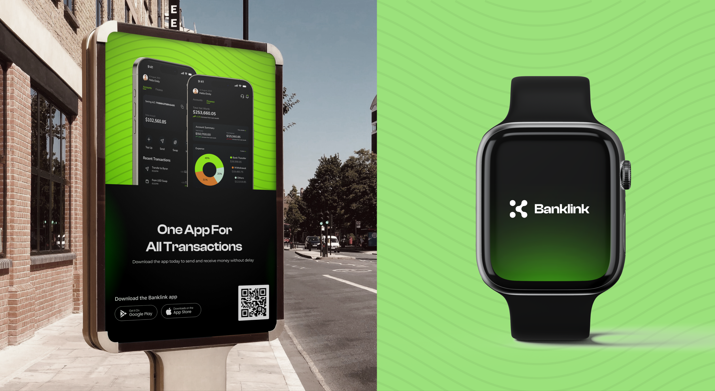
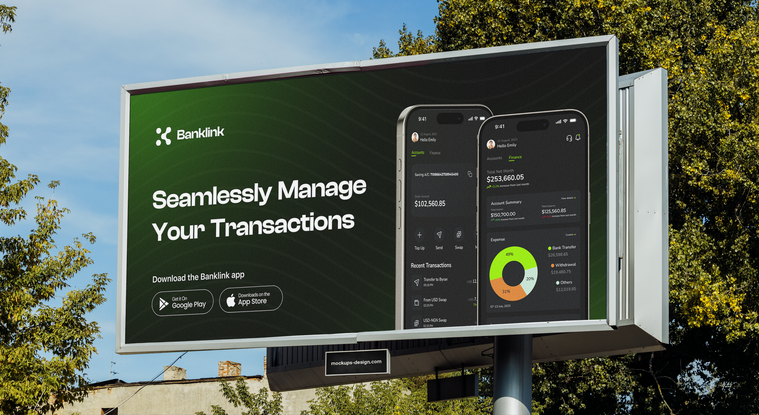
The identity applied across the debit card, app icon and notifications, merch, billboards, transit posters, and even a watch face. This is where the brand proves it scales.
Design notes
The brief was to make a banking app feel like a challenger. I did that through contrast — acid green against black, geometric type, a mark built on connection and AI. The brand's job was to signal "not your archaic bank" before a user opens the app.
Enjoyed reading this? Thank you.
This took a bit of work to put together, so if you liked it, I’d really appreciate you sharing it. If you have a similar project in mind, let’s work together.
What People Say About Me and My Work
One of the smoothest design experiences we've had. Joshua turned complex ideas — AI onboarding, unified inbox, automation builder — into polished, intuitive flows, with a design system that kept us consistent across mobile and web.

Brian T George
CEO, Unifiedbeez

Love his work! Always professional, detail-oriented, and delivers top-quality results. He understands the vision and brings it to life better than expected. Reliable, creative, and a joy to work with — highly recommend!

Becky Idiale
CEO, Daibo Consulting
Josh redesigned our landing page and nailed it. His attention to detail and smooth communication made everything easy. The new design boosted engagement and feels more aligned with our brand. Highly recommend.

Areous A
CEO, Pixel Pioneer Studios

Joshua consistently delivers clean, thoughtful, user-centered designs. He's proactive, reliable, and communicates ideas clearly. Every project gets real creativity and attention to detail — a true asset to any design team.

Chi Onyeukwu
CEO, Njem

Working with Joshua on the Koboneer app was smooth start to finish. He understood the product, turned complex ideas into a clean, intuitive interface, and stayed open to feedback. His attention to detail made a real difference.

Solomon Okafor
CEO, Koboneer
Joshua has been an outstanding contributor at Dingpay. His design solutions are thoughtful, intuitive, and aligned with our users' needs. He works with speed and precision while keeping strong creativity and brand consistency.

Itohowo Udofia
CEO, Dingpay

Great experience working with Joshua. He pays attention to details and provided excellent communication throughout the project.

Donny Gamble
CEO, The Elevation Group

Joshua transformed the AllFoods UK site into something modern, professional, and easy to navigate. He was proactive, responsive, and cared about reflecting our brand. We've had great feedback since.

Akinyemi Arabambi
CEO, AllFoods UK



Let’s Work Together!
Whether it's a freelance project, a full-time role, or you just want a second opinion on something. Tell me a bit about what you're building and where you're stuck. That's plenty to start.


© Joshua Ikhine, 2025.
All rights reserved.
 hello@joshuaikhine.com
 +234 806 258 9858