 Back
Back
Arokobodúndé Agro — Brand Identity
Jump to section
Arokobodúndé Agro — Brand Identity
Overview
Arokobodúndé Agro is a Nigerian agro-export brand — premium dried catfish, snails, and native snacks packaged and priced for an international shelf, not just a local market stall.
The brand needed an identity that could carry that jump: instantly, proudly Nigerian, but polished enough to sit next to any import in a foreign retailer's aisle.
My Role
Brand designer. The client brought the name and business direction; I owned everything design — logo and construction, color, typography, full guidelines, and every application from packaging to merch.
The brief
An agro brand built for export has to do two things at once: feel rooted and authentically Nigerian, and look polished enough to compete globally. Lean too local and it reads as informal. Lean too corporate and it loses the heritage that's the whole selling point. Every decision here — the mark, the tagline, the palette, the type — is aimed at holding both.
The Mark
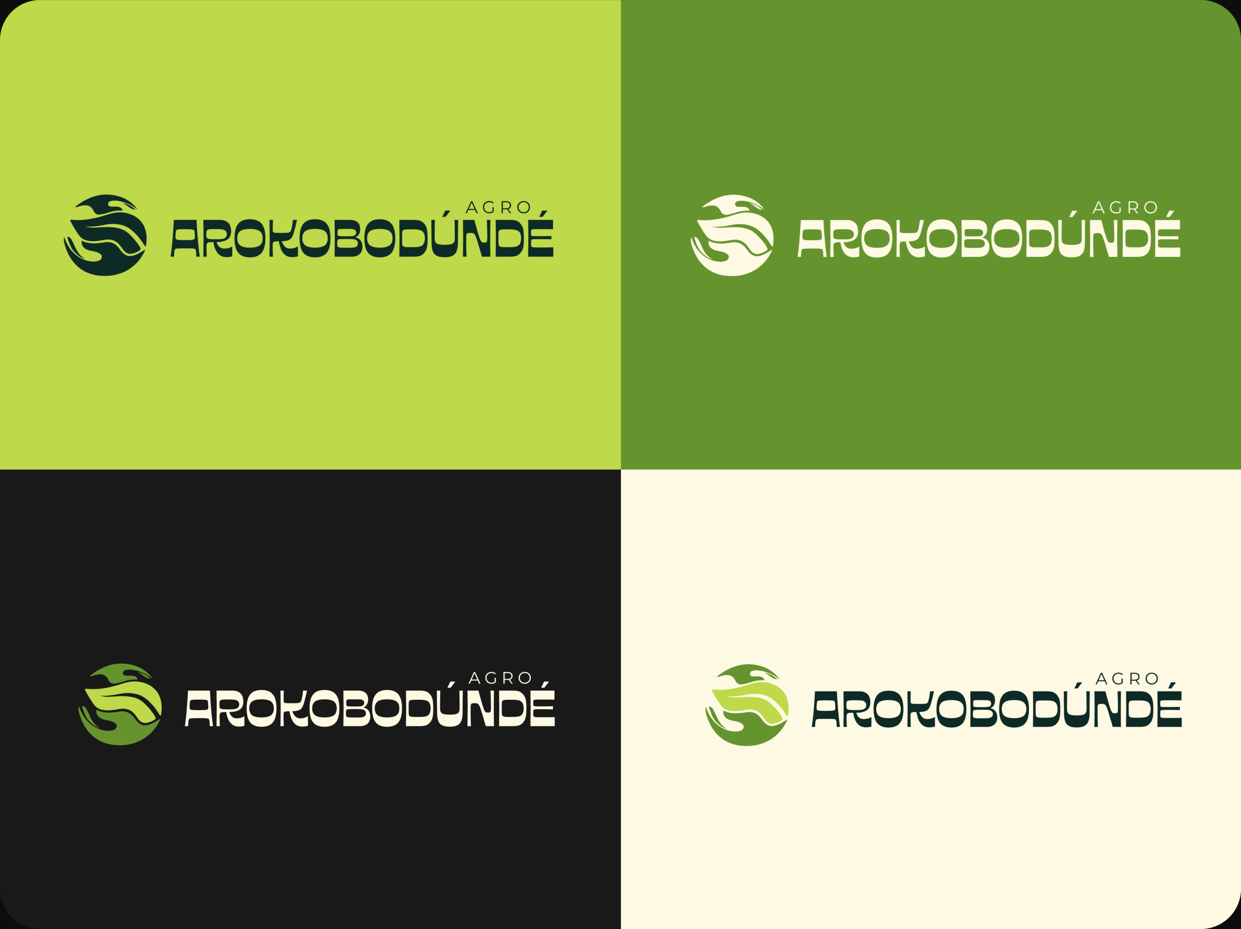
The logo is a green leaf held inside two open hands. The leaf is growth and the produce itself; the hands are the care and human effort behind every product. Together they say what the brand is: rooted in tradition, driven by care. I built it out into a full set — primary lockup, stacked secondary, and a standalone brand mark for favicons, stamps, and small applications — plus a misuse page setting the hard rules on spacing, color, and proportion.

Color Palette
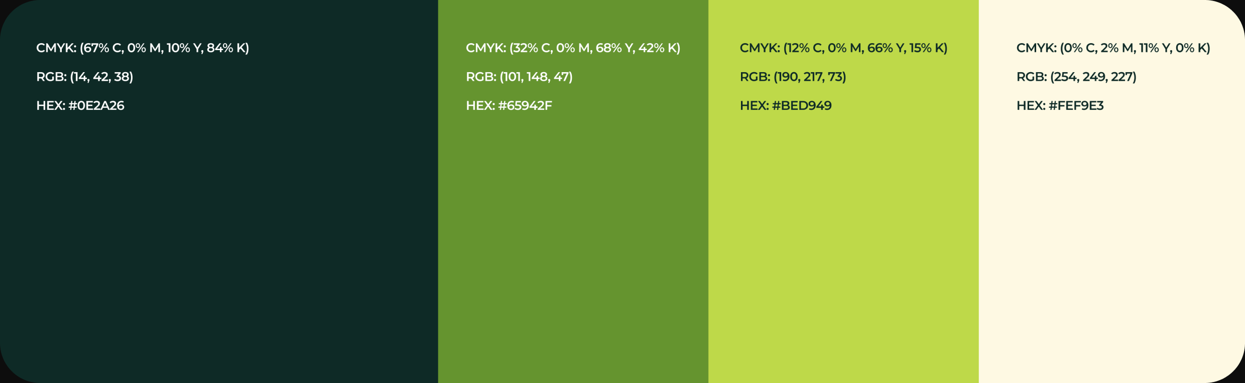
Four colors carry the system: a deep teal green as the anchor, olive green for the mark, a light lime for energy, and a warm cream to keep it from feeling cold or clinical. The guidelines set how the logo behaves on each background so it stays legible across dark, mid-green, light, and cream surfaces.
Typography
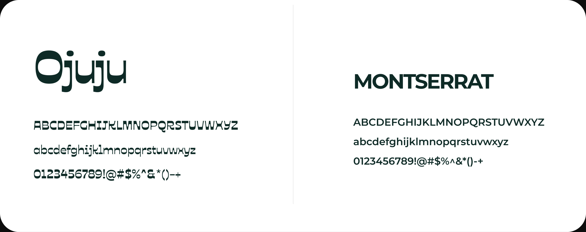
Ojuju for display — a distinctive, culturally expressive face that gives the brand its voice and character. Montserrat for everything else — clean, readable, and global-ready. The pairing balances personality against clarity: heritage in the headlines, professionalism in the body.
In use
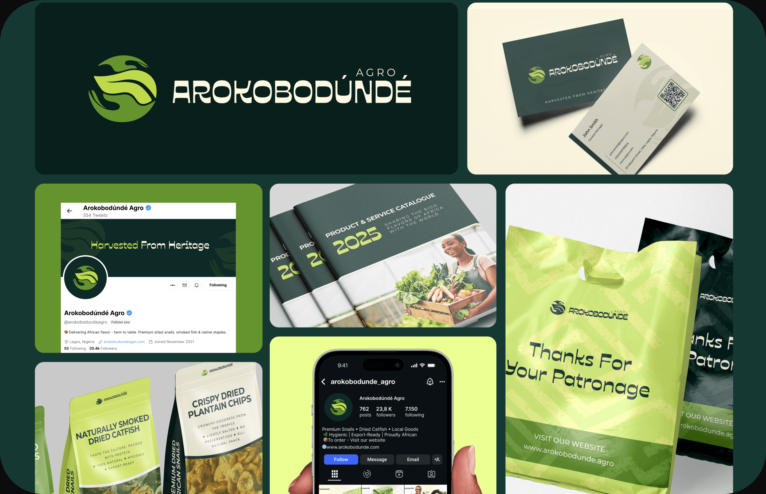
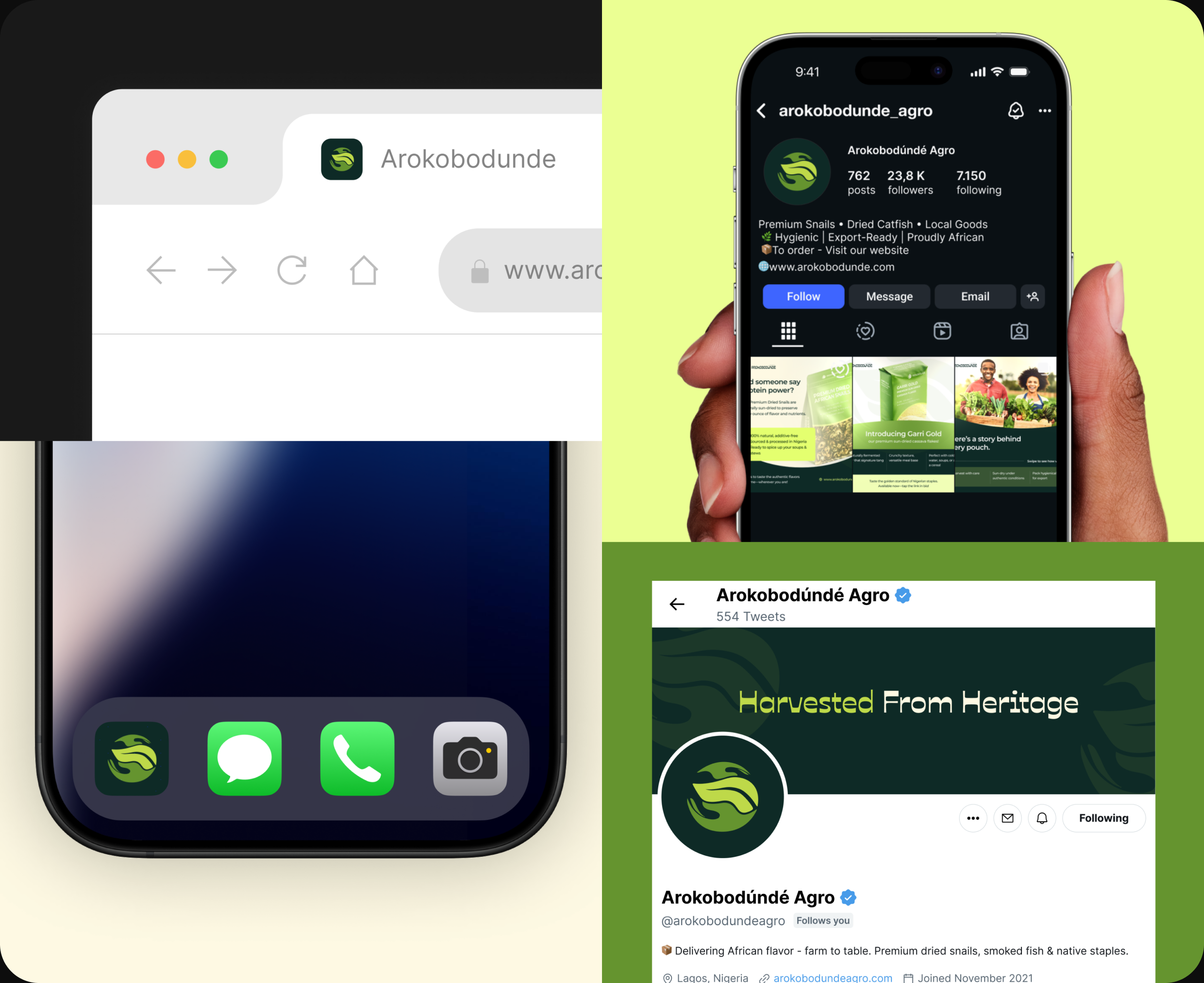
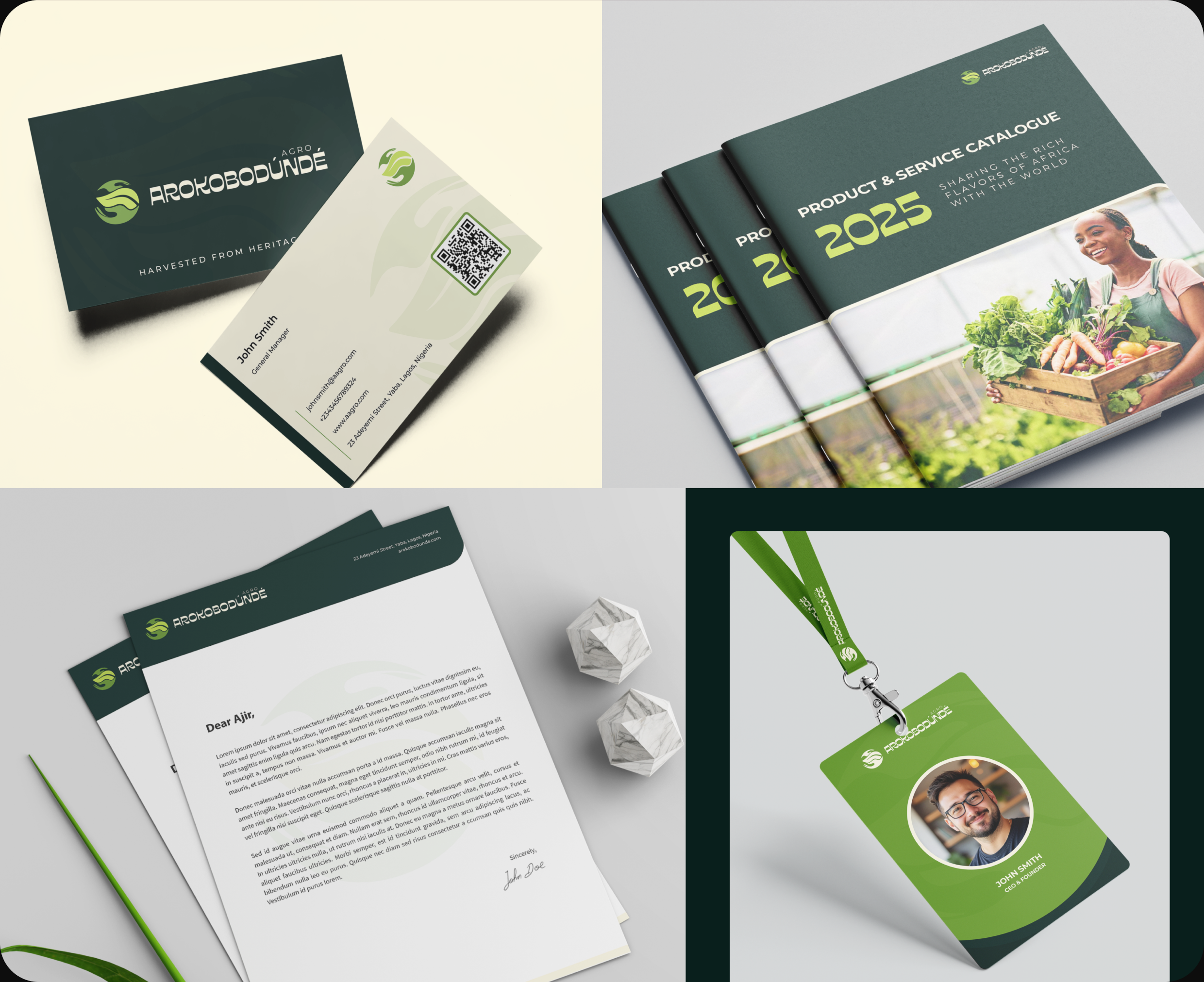
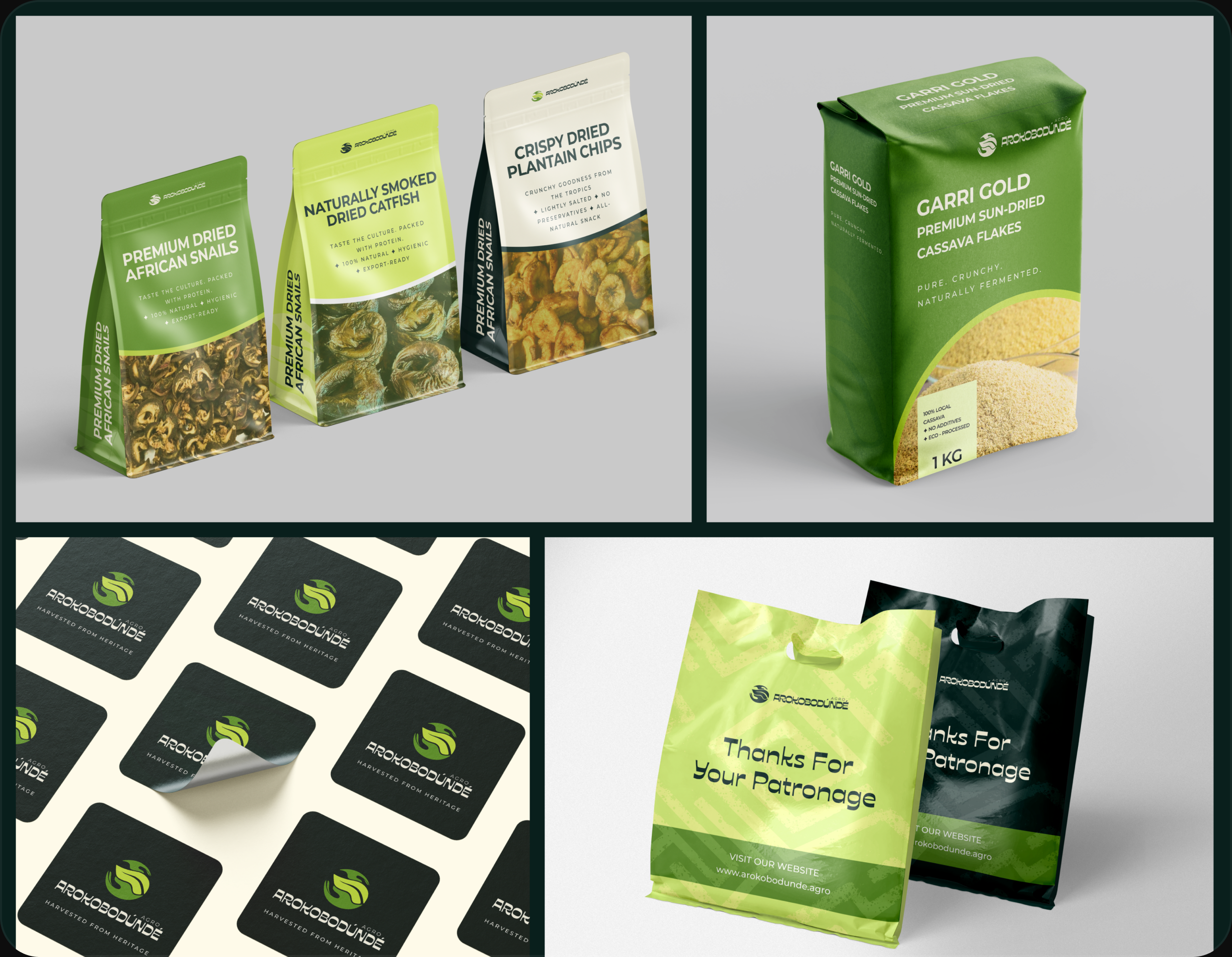
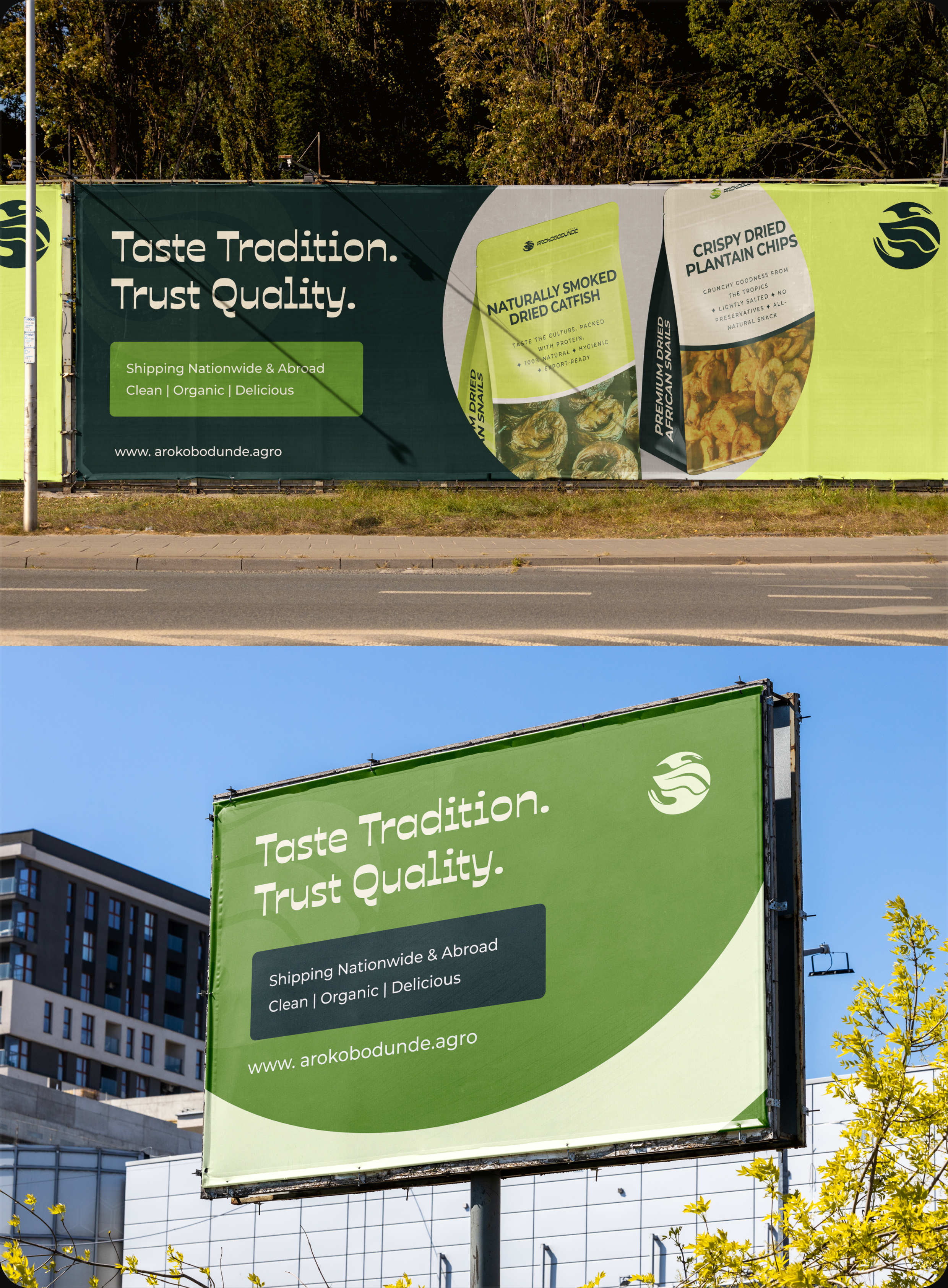
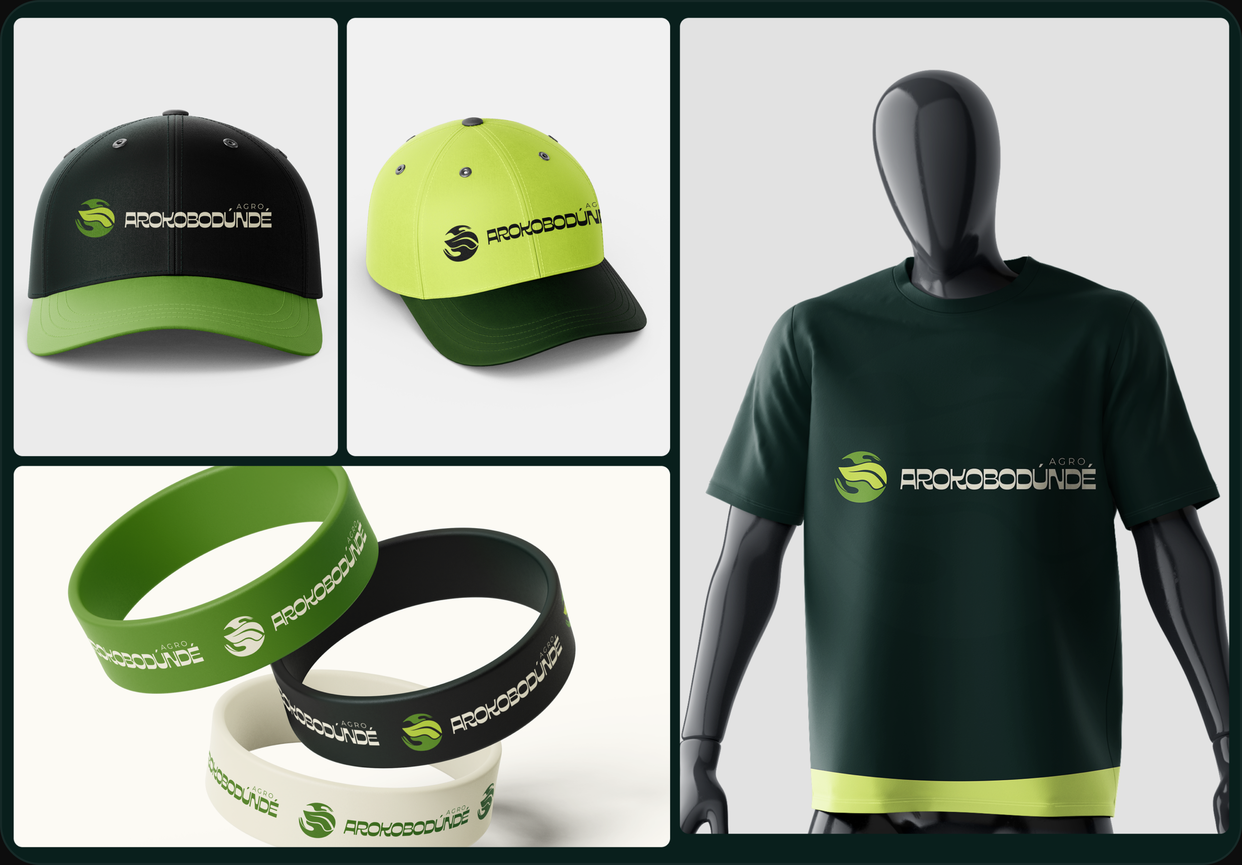
A brand is only as good as it looks in the real world, so I took it past the logo into a working system: product packaging, stationery, social profiles and posts, the website and app, out-of-home banners, shopping bags, and merch. "Harvested from Heritage" runs through all of it as the through-line.
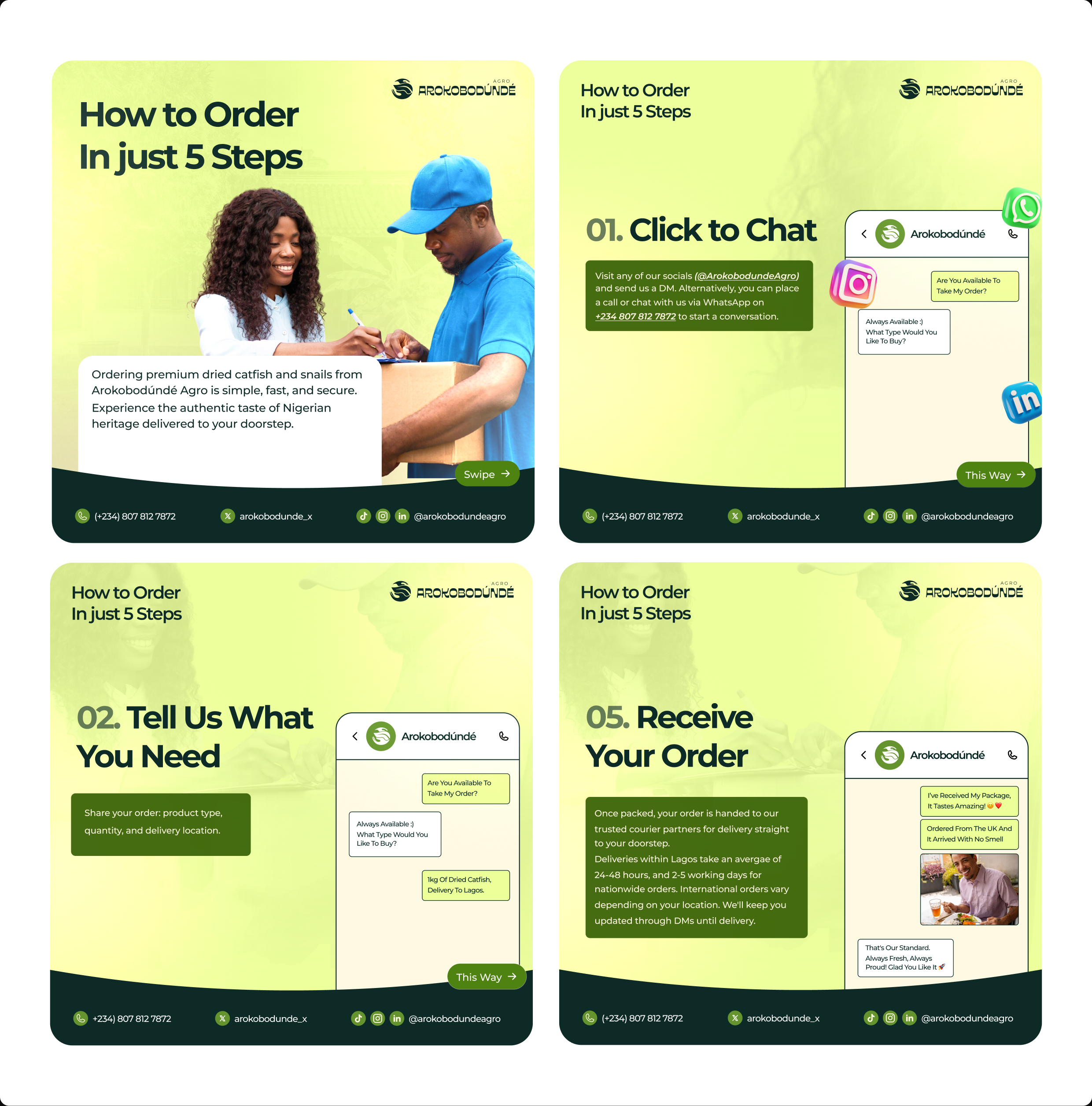
Post-Launch Social designs
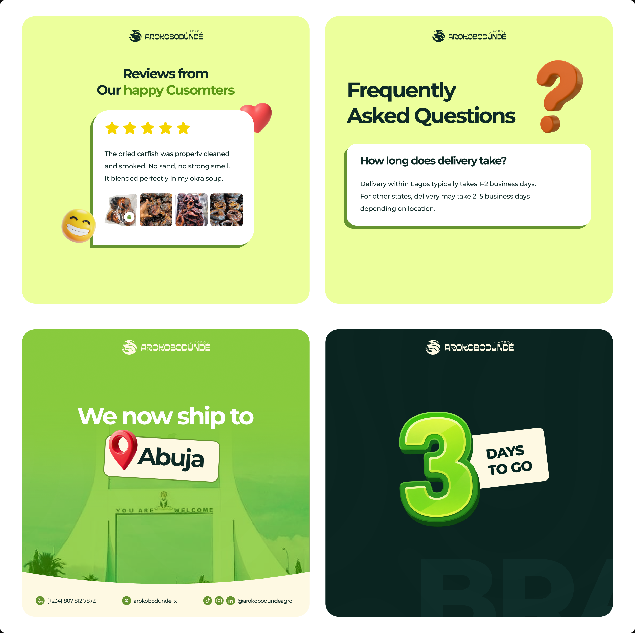
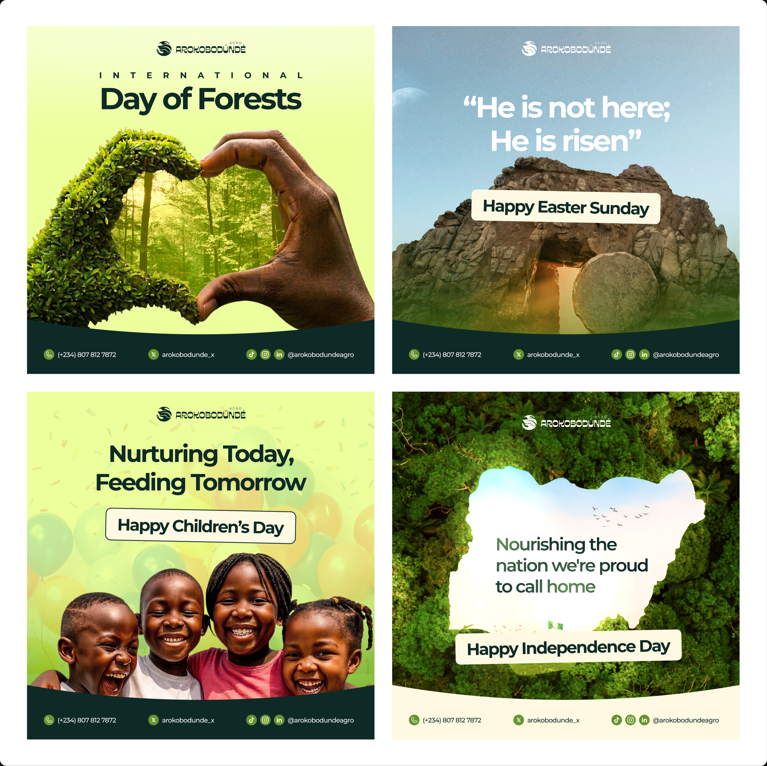
After launch, I stayed on to design social content — turning the brand system into a steady stream of posts for Instagram and beyond. Product features, campaigns, customer reviews, and seasonal pushes, all built on the identity so everything stayed on-brand as the account grew.
Design notes
The core challenge was positioning — premium and export-ready without losing the Nigerian roots that make the brand worth buying. I solved it in the details: a mark built on heritage symbolism, a palette that stays warm, a display face with local character, and a consistent application system that makes a farm-to-table agrobusiness look as credible as anything on an international shelf.
Enjoyed reading this? Thank you.
This took a bit of work to put together, so if you liked it, I’d really appreciate you sharing it. If you have a similar project in mind, let’s work together.
What People Say About Me and My Work
One of the smoothest design experiences we've had. Joshua turned complex ideas — AI onboarding, unified inbox, automation builder — into polished, intuitive flows, with a design system that kept us consistent across mobile and web.

Brian T George
CEO, Unifiedbeez

Love his work! Always professional, detail-oriented, and delivers top-quality results. He understands the vision and brings it to life better than expected. Reliable, creative, and a joy to work with — highly recommend!

Becky Idiale
CEO, Daibo Consulting
Josh redesigned our landing page and nailed it. His attention to detail and smooth communication made everything easy. The new design boosted engagement and feels more aligned with our brand. Highly recommend.

Areous A
CEO, Pixel Pioneer Studios

Joshua consistently delivers clean, thoughtful, user-centered designs. He's proactive, reliable, and communicates ideas clearly. Every project gets real creativity and attention to detail — a true asset to any design team.

Chi Onyeukwu
CEO, Njem
Working with Joshua on the Koboneer app was smooth start to finish. He understood the product, turned complex ideas into a clean, intuitive interface, and stayed open to feedback. His attention to detail made a real difference.

Solomon Okafor
CEO, Koboneer
Joshua has been an outstanding contributor at Dingpay. His design solutions are thoughtful, intuitive, and aligned with our users' needs. He works with speed and precision while keeping strong creativity and brand consistency.

Itohowo Udofia
CEO, Dingpay

Great experience working with Joshua. He pays attention to details and provided excellent communication throughout the project.

Donny Gamble
CEO, The Elevation Group
Joshua transformed the AllFoods UK site into something modern, professional, and easy to navigate. He was proactive, responsive, and cared about reflecting our brand. We've had great feedback since.

Akinyemi Arabambi
CEO, AllFoods UK


Let’s Work Together!
Whether it's a freelance project, a full-time role, or you just want a second opinion on something. Tell me a bit about what you're building and where you're stuck. That's plenty to start.


© Joshua Ikhine, 2025.
All rights reserved.
 hello@joshuaikhine.com
 +234 806 258 9858