 Back
BackAI Assistant Flow - Productivity App
Jump to section
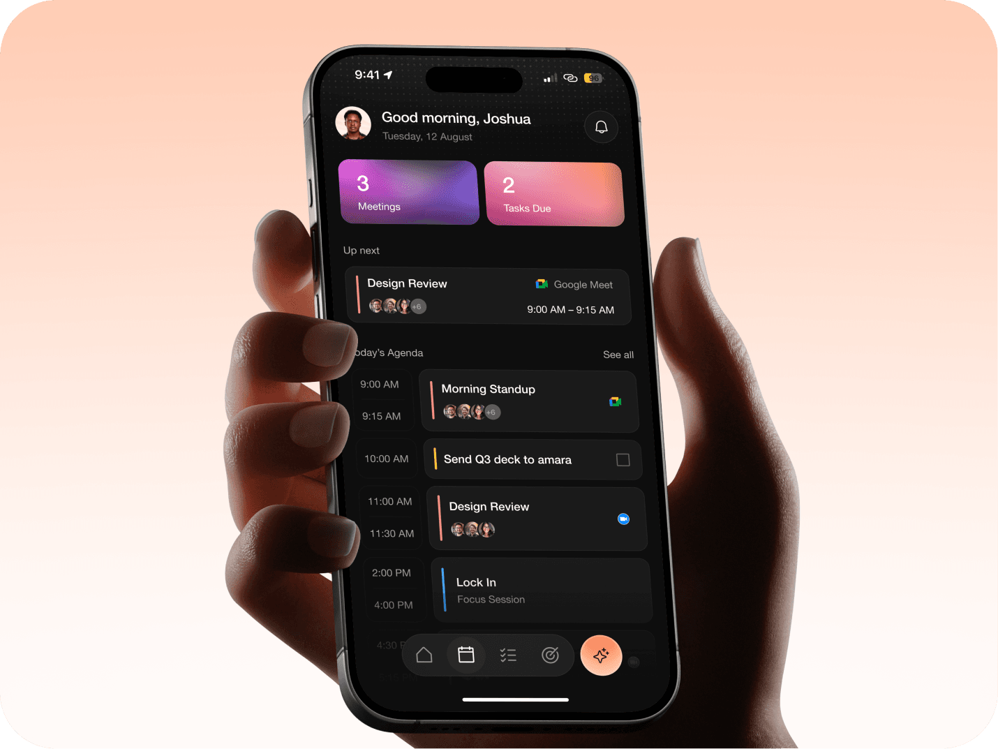
AI Assistant Flow - Productivity App
Overview
This is a design task for the AI assistant inside a productivity app: the kind that pulls calendar, email, tasks, and goals into one place. The premise: instead of jumping between four tools, you reach them through an assistant you can talk to. The brief gave me that hub and asked for two flows: a conversational chat for rescheduling a meeting, and a Focus Time settings experience with all its states.
What made it worth doing wasn't the screens; it was the edges. Rescheduling sounds simple until you ask who's allowed to move a meeting, whose calendar the AI can actually see, and what happens when the new time collides with something else.
I designed the two flows end to end, then took the work through a live review and reworked the core of it based on that feedback, which I've captured honestly further down.

My Role
Solo, start to finish: UX, UI, and a full component system, in Figma.
The Brief
I was solving a given problem, not inventing one. The prompt described a productivity app with an AI assistant at its centre (Calendar, Email, Tasks, Goals) and set two tasks:
Task 1, Reschedule flow. Design the assistant's chat as a sheet with four quick actions (AI Insights, Find Focus Time, Reschedule Meeting, Create Event), then the full end-to-end flow starting from "Reschedule Meeting," including edge cases like calendar conflicts and custom date/time selection.
Task 2, Focus Time. On the calendar, design Focus Time settings: preferred hours and all related states.
The instruction that shaped everything: show your product thinking, and build the components properly. The task wasn't really "make these screens." It was "show me how you reason, and how you build."
Approach
With a real brief but no users to interview, the substance had to live in the reasoning. So before drawing screens I pulled apart the two tasks looking for the assumptions most people would design straight past, the places where "reschedule a meeting" hides three or four separate problems. Those became the backbone of the work:
- Who actually has permission to move a meeting?
- What can the AI realistically see about other people's availability?
- What happens at every point where the happy path breaks?
Everything after that was in service of answering those honestly rather than drawing an idealised flow that only works when nothing goes wrong.
Design System
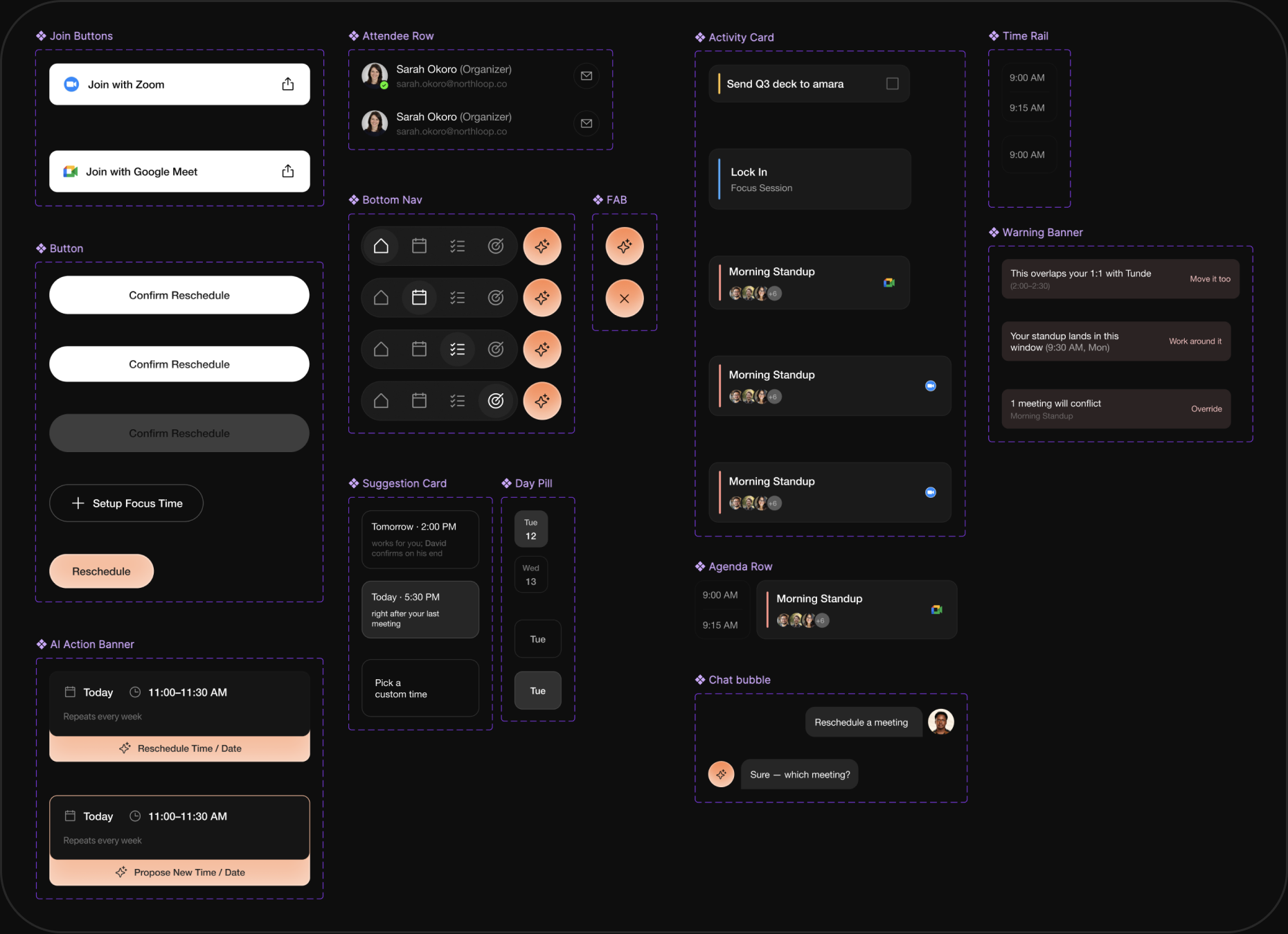
The task explicitly asked for components built to the fidelity of a real iOS app, so the system wasn't an afterthought; it was half the grade. I built it on a dark theme with a warm peach accent, a custom pill-shaped bottom navigation, and a separate circular action button for the assistant.
The rule I held to throughout: custom UI for the app's own surfaces, native iOS controls where users expect them. So date and time pickers use the system pickers, while cards, sheets, and navigation carry the app's own language. Knowing when not to design something is its own decision.
Under it sits a proper component library: a single Activity Card driven by variants and toggles, a Time Rail, an Attendee Row, buttons, banners, a chat sheet, and more. One card component covers meetings, tasks, and focus blocks; booleans turn its time, avatars, and provider label on or off per context. That's what let the screen count grow without the file falling apart.
Solution
The design answers the brief through one principle: the assistant only ever does what it's actually allowed to do, and only ever claims what it can actually see.
- A conversational chat sheet where every reschedule happens inside a real back-and-forth, not a stack of disconnected modals
- Reschedule that respects calendar permissions: organisers move meetings directly, invitees can only propose
- Suggestions grounded in what the assistant can verify, confident for internal attendees and honest about external ones
- Conflicts that always offer a way forward instead of dead-ending
- Focus Time with every state (empty, configured, active, disabled, and the meeting-conflict case), treated as a persistent status rather than a dismissible notification
App Design
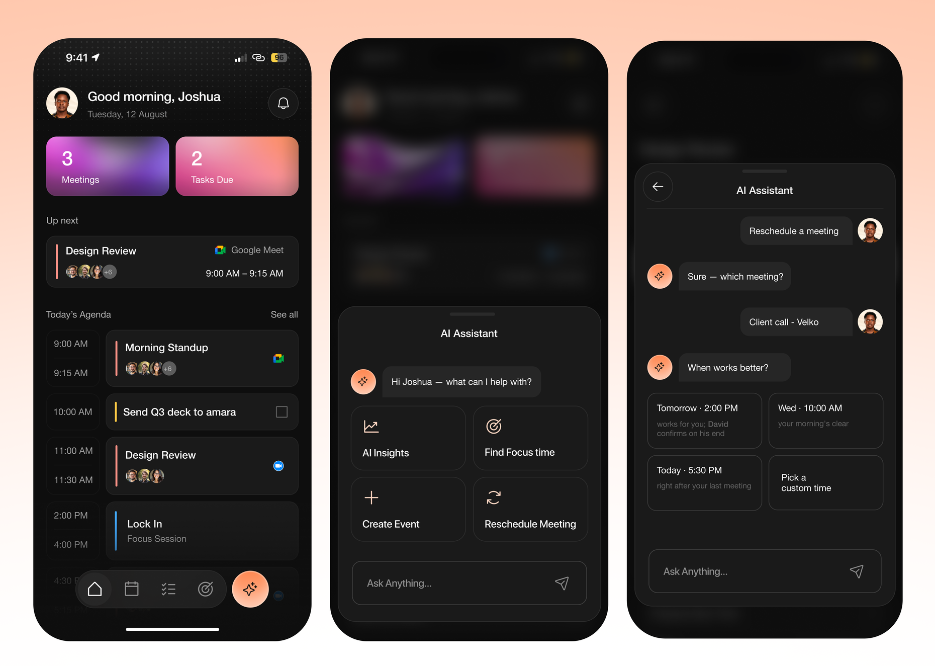
The Chat Sheet
The core of the flow is a conversational sheet. It opens with the four quick actions as entry points, but the actual experience is a chat: the assistant responds in bubbles, the user's choices appear as their own messages, and a text input stays available throughout so nothing forces you down a rigid path. Every flow lives inside this one conversation rather than branching off into separate screens.
Reschedule: Organiser Path
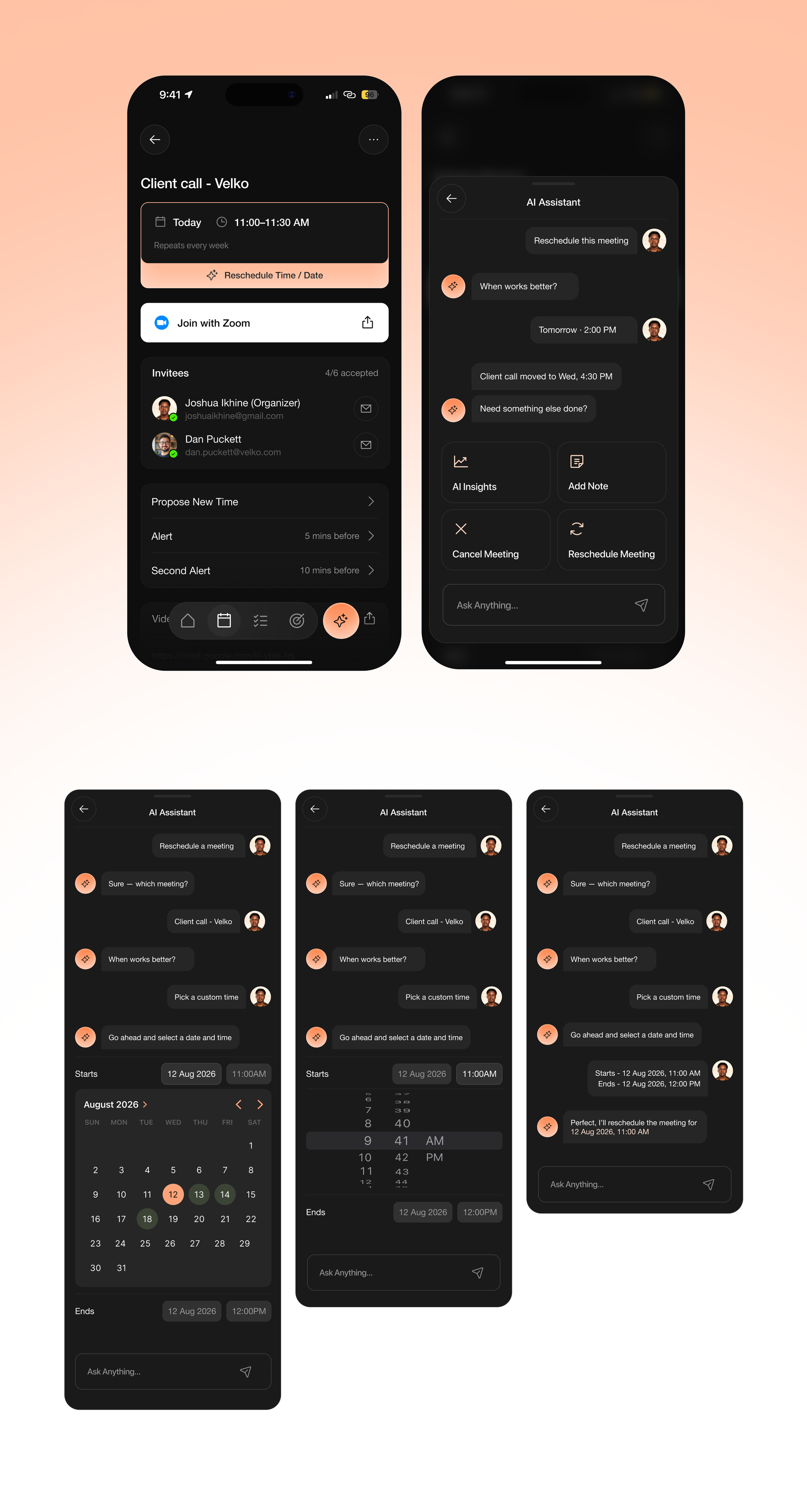
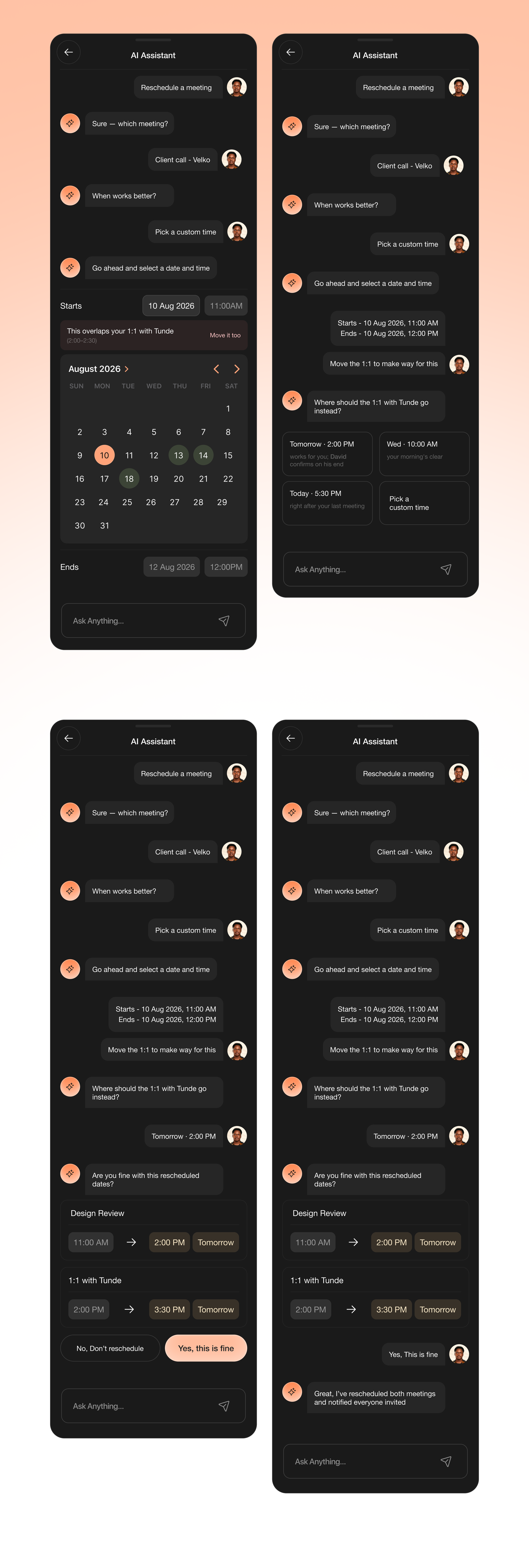
When the user owns the meeting (here, an external client call), they can move it directly. The assistant asks which meeting, surfaces the ones it thinks are likely, and offers a "choose from calendar" option for anything not shown, because a busy person with a full day shouldn't be limited to a shortlist. It then suggests times, each with a plain-language reason, and confirms the change back before anything is sent.
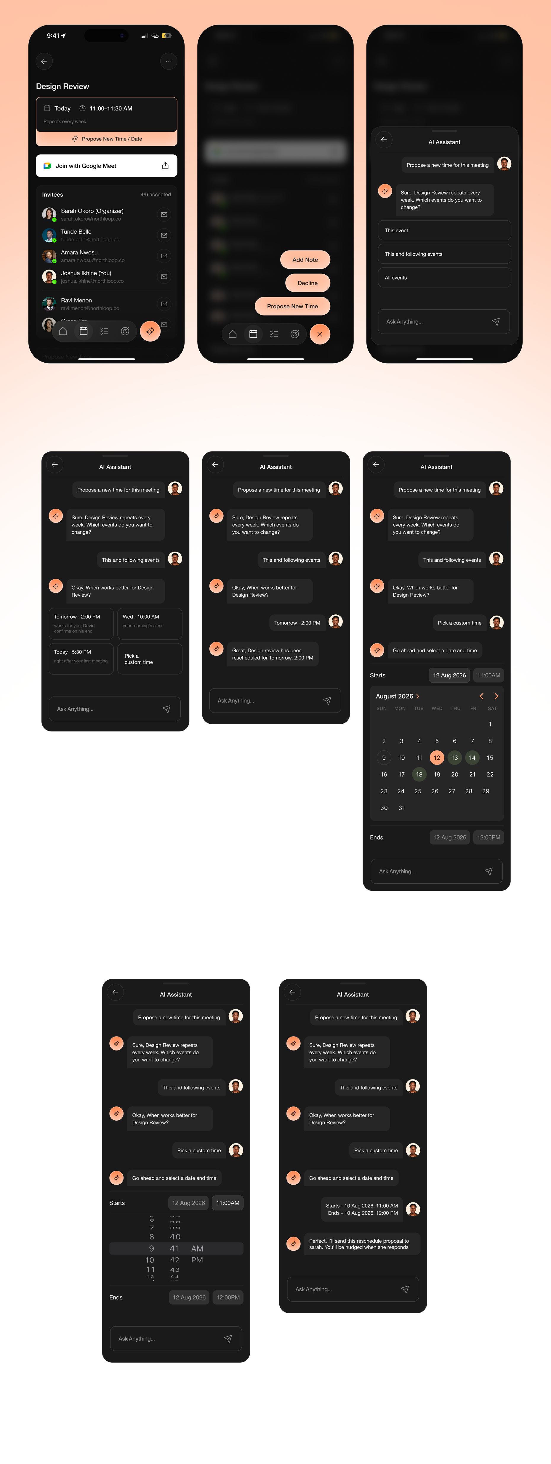
Propose New Time: Invitee Path
When the user doesn't own the meeting, the flow changes on purpose. The assistant can't move it, so it says so, plainly and not as an error, and pivots to proposing a new time to the organiser instead. Same conversation, different capability, because the permission is different.
Handling Conflicts
If a chosen slot collides with another of the user's meetings, the assistant surfaces it as a question, not a wall: move the blocking meeting too, or pick a different time. Choosing to move both is handled as a single, atomic action: both meetings resolve to new times and commit together, so the second one never gets orphaned mid-flow.
Focus Time
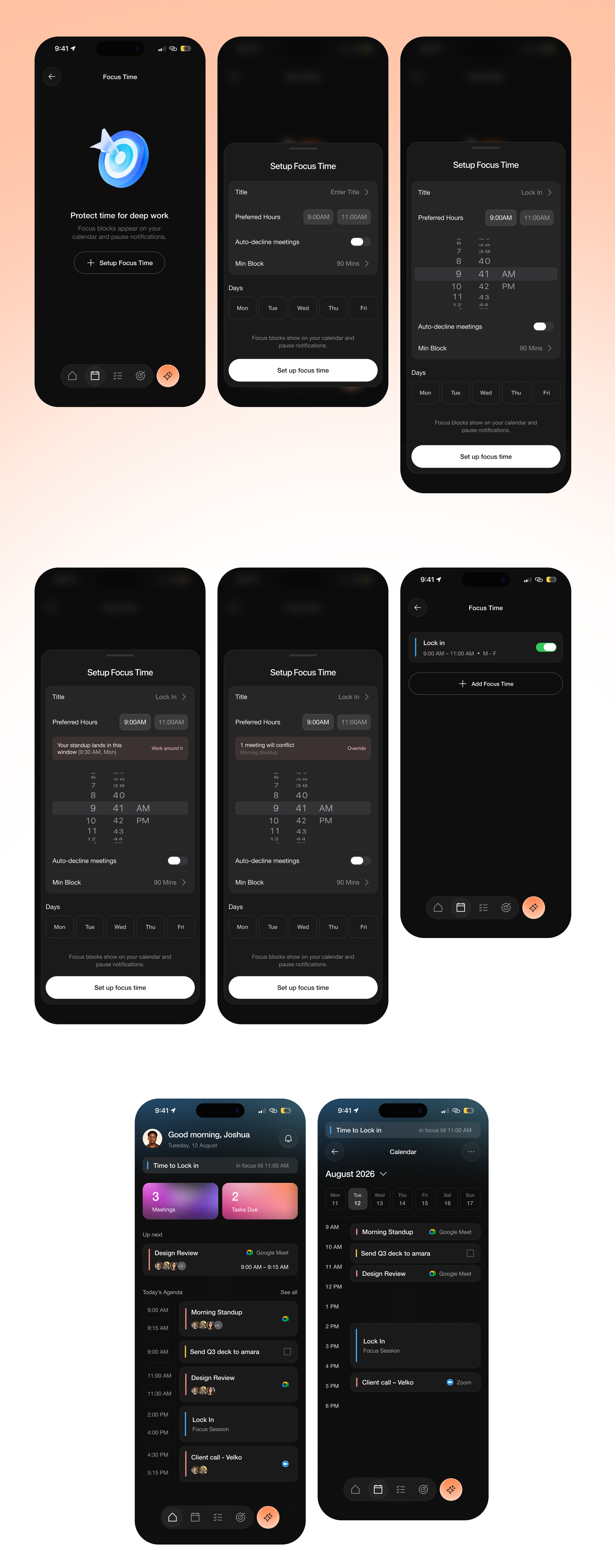
Focus Time protects blocks of deep work; they appear on the calendar and pause notifications. I designed the full set of states the brief asked for: the empty first-run, the configured/active state, an active "in focus now" indicator, disabled, and the important one, what happens when a meeting lands inside a focus window. That conflict isn't a reschedule; it's a rule. The user chooses whether focus flexes around the meeting or protects the full window and flags it.
Key Design Decisions
The task asked for product thinking, so the reasoning, and the tradeoffs behind it, is the real substance.
Permission and visibility are two separate constraints. The obvious mistake is treating "can I reschedule this?" as one question. It's two. Permission depends on whether you're the organiser: organisers move meetings, invitees can only propose. Visibility depends on whether an attendee shares your organisation's calendar. The assistant can see a colleague's availability but not an external client's. These don't line up: a client call you own is reschedulable but the assistant is blind to the client's calendar, while an internal meeting you don't own is fully visible but not yours to move. Designing these as one thing would have produced a flow that quietly lies to the user. Splitting them is what makes the assistant trustworthy.
The assistant only claims what it can verify. Free/busy data is shared inside an organisation, not across external attendees. So the suggestions say "everyone's free" only when that's actually knowable, and fall back to "works for you; David confirms on his end" when a calendar is invisible. The cost is that the assistant looks less omniscient. The gain is that it never overstates, and an assistant you can't trust to be honest about what it knows is worse than none.
A conflict is a fork, not a dead-end. When a new slot clashes with another meeting, the easy design is a warning that stops you. But a warning with no way forward just relocates the problem to the user. Since the screen already lets you pick another time by reselecting, the conflict banner surfaces only the thing the screen can't do on its own (moving the blocking meeting) as a single offered action. One control, no redundancy.
Focus is a status, not a notification. An active focus block is an ongoing state, still true after you'd swipe a banner away. Making it dismissible would let the user hide something that's still happening. So it stays visible as a lightweight status strip, and the only way out is "End focus," which changes the actual state rather than just hiding the indicator.
One card, driven by context. Meetings, tasks, and focus blocks look related because they are, so they're a single Activity Card component with a Type variant and booleans for time, avatars, and provider label, rather than three near-identical cards duplicated across the file. The agenda's time rail is deliberately a separate component, because a meeting has a duration and a task has a deadline: different data, different element. The build reflects the concepts, not just the layout.
Review & Rework
The most useful part of this project was that it didn't happen in a vacuum. The work went through a live review, and one piece of feedback was worth more than any polish.
My first version built the four quick actions as a strong card interface but treated the chat as a secondary input strip. A reviewer pointed back to the brief: the interaction with the assistant is meant to be a conversation on a sheet, with the quick actions as shortcuts inside it, not the other way round. They were right. I'd designed the scaffolding and skipped the thing it was scaffolding for.
So I reworked the entire reschedule flow into a genuine chat: the assistant responds in bubbles, choices post as user messages, structured pickers live inside the conversation, and the text input stays present so the user can type instead of tap at any point. The structured steps I'd already built didn't get thrown away, they moved inside the conversation.
I'm including this because how a designer responds to being wrong is part of the work. The rework made the flow materially better and brought it in line with what was actually being asked.
Outcome & Reflection
This was a design task, so there's no launch metric. The measure was whether it answered the brief with real product thinking, and I believe the edge-case reasoning is where it earns that.
The thing I'm most glad I caught is the permission-versus-visibility distinction, because it's the kind of detail that only shows up if you actually imagine a real person, an invitee on a meeting they don't own, with an external client whose calendar the app can't see, instead of designing the frictionless demo version.
If I took it further, the first thing I'd pressure-test is the conversational flow against messier real input: people don't say "reschedule my 11am," they say "can we push design review to some time thursday-ish." Whether the chat gracefully handles that ambiguity is the assumption the whole conversational premise rests on, and the one I'd want real usage to settle.
Enjoyed reading this? Thank you.
This took a bit of work to put together, so if you liked it, I’d really appreciate you sharing it. If you have a similar project in mind, let’s work together.
What People Say About Me and My Work
One of the smoothest design experiences we've had. Joshua turned complex ideas — AI onboarding, unified inbox, automation builder — into polished, intuitive flows, with a design system that kept us consistent across mobile and web.

Brian T George
CEO, Unifiedbeez

Love his work! Always professional, detail-oriented, and delivers top-quality results. He understands the vision and brings it to life better than expected. Reliable, creative, and a joy to work with — highly recommend!

Becky Idiale
CEO, Daibo Consulting

Josh redesigned our landing page and nailed it. His attention to detail and smooth communication made everything easy. The new design boosted engagement and feels more aligned with our brand. Highly recommend.

Areous A
CEO, Pixel Pioneer Studios

Joshua consistently delivers clean, thoughtful, user-centered designs. He's proactive, reliable, and communicates ideas clearly. Every project gets real creativity and attention to detail — a true asset to any design team.

Chi Onyeukwu
CEO, Njem

Working with Joshua on the Koboneer app was smooth start to finish. He understood the product, turned complex ideas into a clean, intuitive interface, and stayed open to feedback. His attention to detail made a real difference.

Solomon Okafor
CEO, Koboneer
Joshua has been an outstanding contributor at Dingpay. His design solutions are thoughtful, intuitive, and aligned with our users' needs. He works with speed and precision while keeping strong creativity and brand consistency.

Itohowo Udofia
CEO, Dingpay

Great experience working with Joshua. He pays attention to details and provided excellent communication throughout the project.

Donny Gamble
CEO, The Elevation Group

Joshua transformed the AllFoods UK site into something modern, professional, and easy to navigate. He was proactive, responsive, and cared about reflecting our brand. We've had great feedback since.

Akinyemi Arabambi
CEO, AllFoods UK



Let’s Work Together!
Whether it's a freelance project, a full-time role, or you just want a second opinion on something. Tell me a bit about what you're building and where you're stuck. That's plenty to start.


© Joshua Ikhine, 2025.
All rights reserved.
 hello@joshuaikhine.com
 +234 806 258 9858