

Jump to section
Activ8 — Subscription Platform
Overview
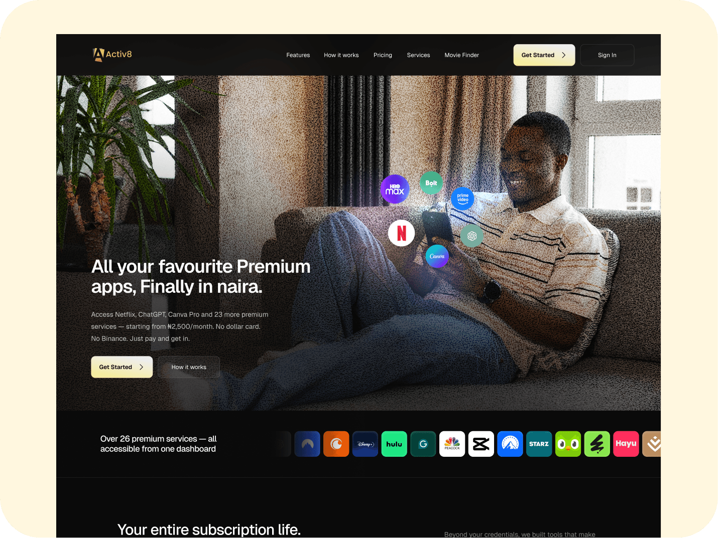
Activ8 is a Nigerian subscription platform that bundles premium apps — streaming, AI tools, VPNs, design software — into one plan billed in naira.
The model is pooled accounts. Activ8 holds the subscriptions and distributes access, which is how a ₦34,000 lineup becomes a ₦10,000 plan. Users pick a bundle or build their own, pay by bank transfer into a dedicated account, and get login credentials for each service in their dashboard.
Activ8 was already running. The client came to me with a working platform that had grown past its own interface — the model was proven, but using it had become harder than it needed to be. The brief was a redesign: same product, same business, rebuilt so people could actually find their way through it.
That scope covered the full consumer product — web app, mobile app, marketing site, and the email system that holds it all together.
My Role
Product Designer. Sole UI/UX design, structure through handoff.
I worked with a product manager, an engineering team, and an external review team.
I designed Around 55+ screens across desktop and mobile, plus eighteen email templates. The scope also covered an internal admin dashboard for provisioning and support ops, which I've left out of this page.
Timeline: 3 Months
Status: Redesign, handed to devs. Not live yet.
The problem
Premium apps are expensive in Nigeria.
Not hard to reach — you can get a Netflix subscription, you can find a way onto ChatGPT Plus. The problem is what happens when you want five of them at once. Five separate bills, five renewal dates, and a monthly total most people have never actually sat down and added up.
Activ8 adds it up. Its own pricing page puts the Plus lineup at ₦34,000+ a month if you bought each service separately. Activ8 charges ₦10,000.
That's the whole pitch. Good pitch. Then you sit down to design it and three genuinely annoying problems show up.
Payments
Card payments in Nigeria fail often enough that card-only checkout would bleed users at the exact moment they're ready to give you money. Cards get declined for reasons that have nothing to do with the balance — international payments switched off, foreign-merchant limits, a BIN the processor doesn't like.
Bank transfer is what always works. Everyone has a banking app, everyone knows how to send money. The catch is that transfers take a minute and nobody tells the app when they've sent one.
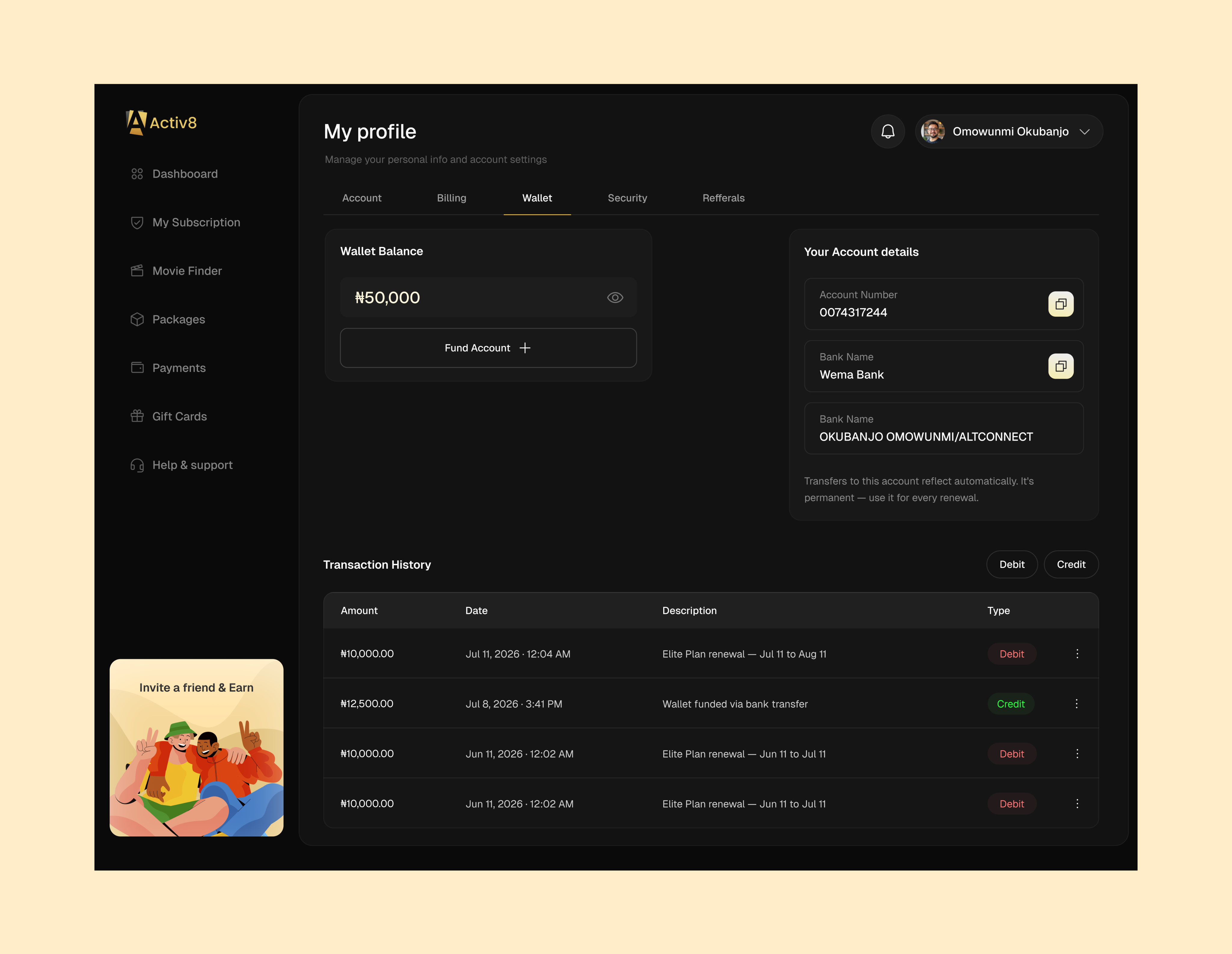
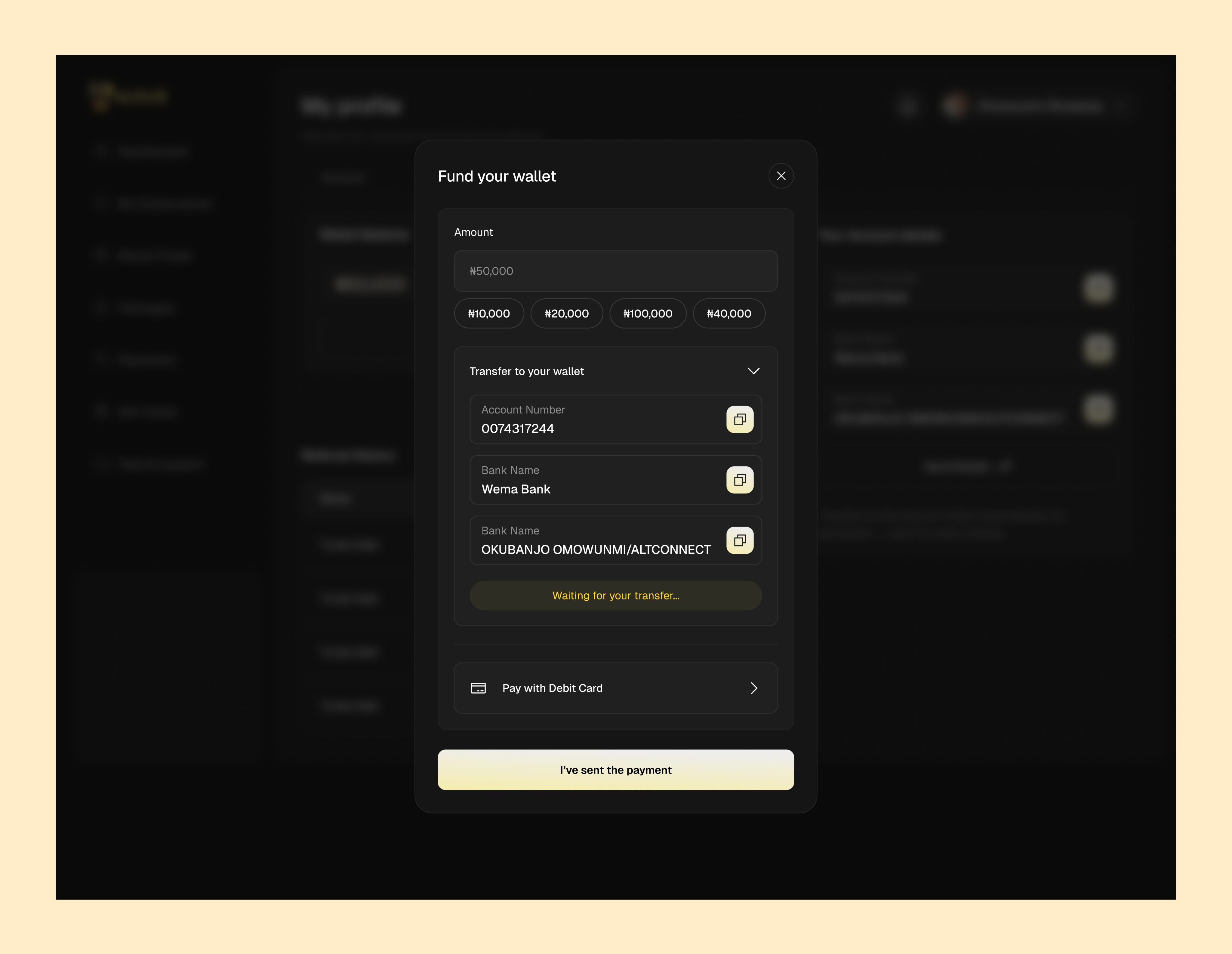
So: every user gets a permanent virtual account number at signup. Transfer to it from any bank, the money lands in a wallet, and every renewal, upgrade and gift card pulls from there.
Solved the reliability problem. Created a new one — now people are sending money into what feels like a void and waiting.
The waiting screen actually says it's waiting. You copy the account details and the panel sits there saying "Waiting for your transfer…" with a button that says "I've sent the payment." It doesn't fake a loading bar or pretend the transfer was instant.
The account number never changes, and the screen says so. "Transfers to this account reflect automatically. It's permanent — use it for every renewal." One line, and now nobody has to email support asking whether they get a new number next month.
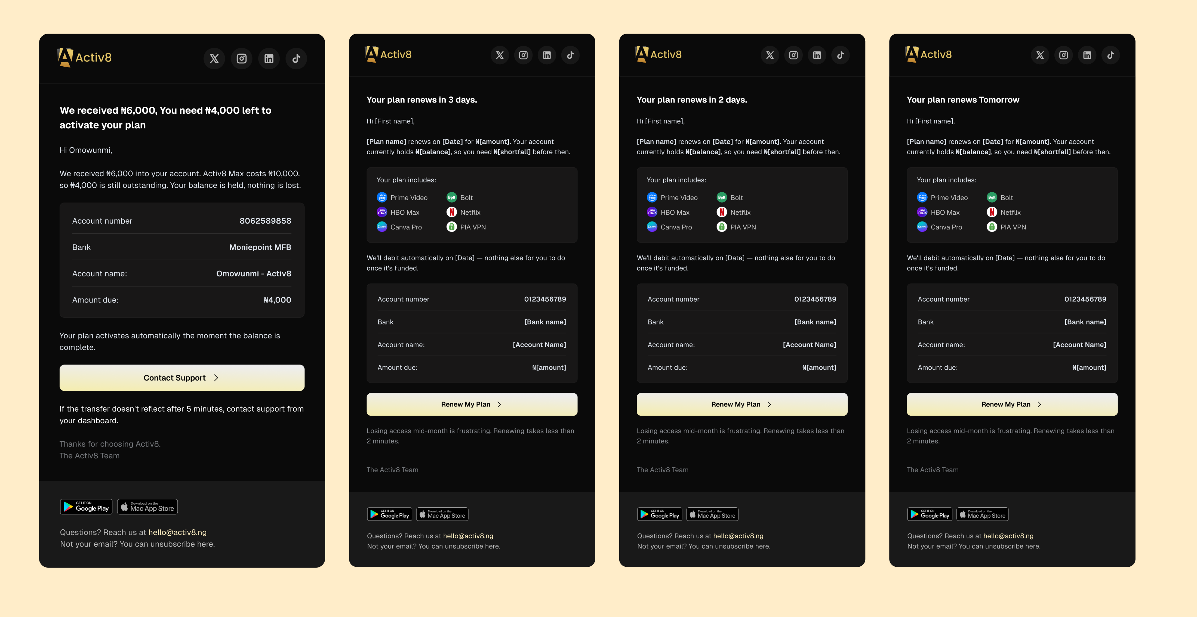
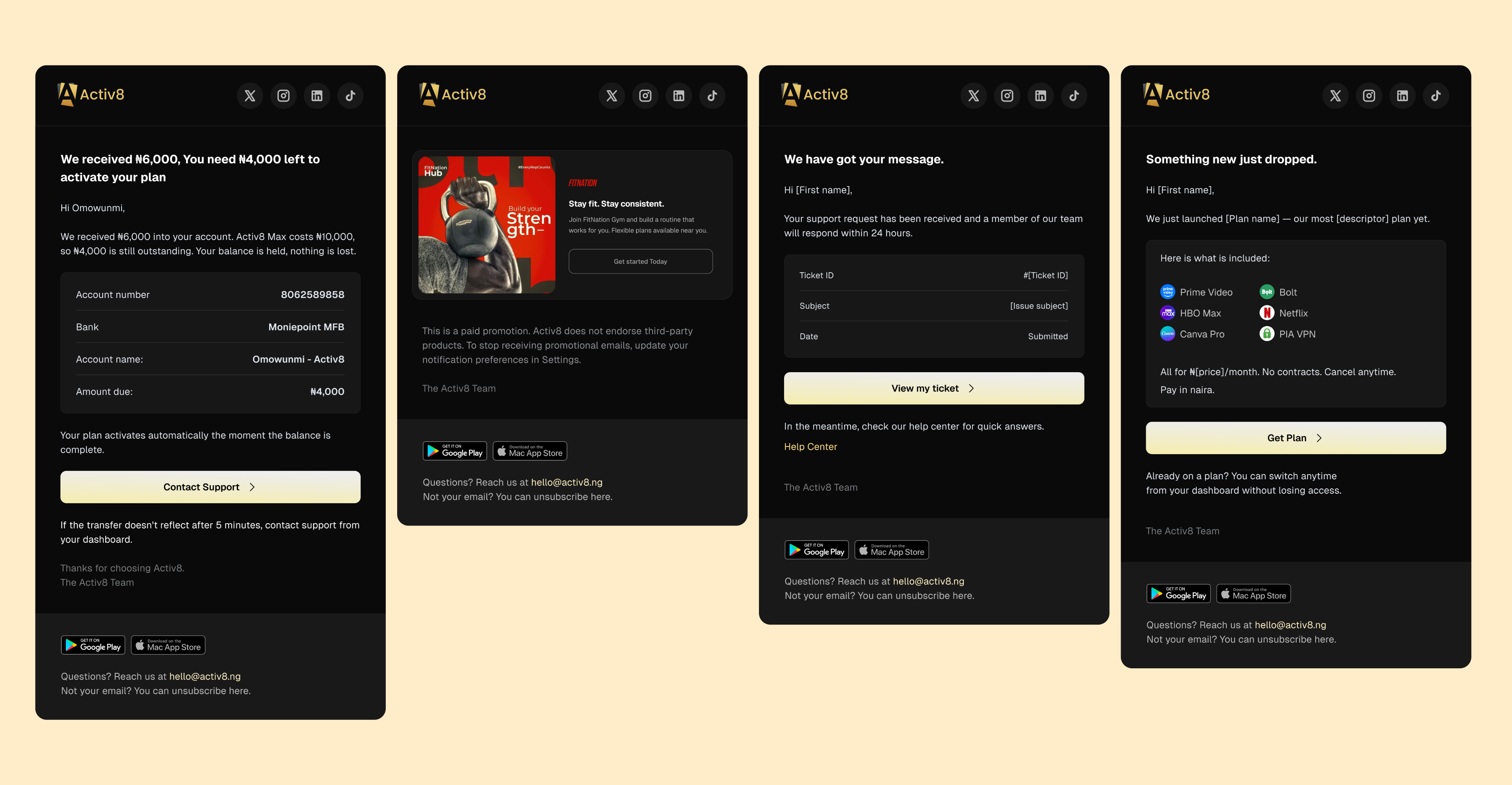
Partial transfers get their own email. Someone sends ₦8,000 for a ₦10,000 plan. Happens constantly — people type round numbers from memory. So: "We received ₦8,000 — ₦2,000 left to activate. Your balance is held, nothing is lost."
That last sentence is doing the real work. When you've just sent money into an app and nothing happened, you don't want a status update. You want to know your money still exists.
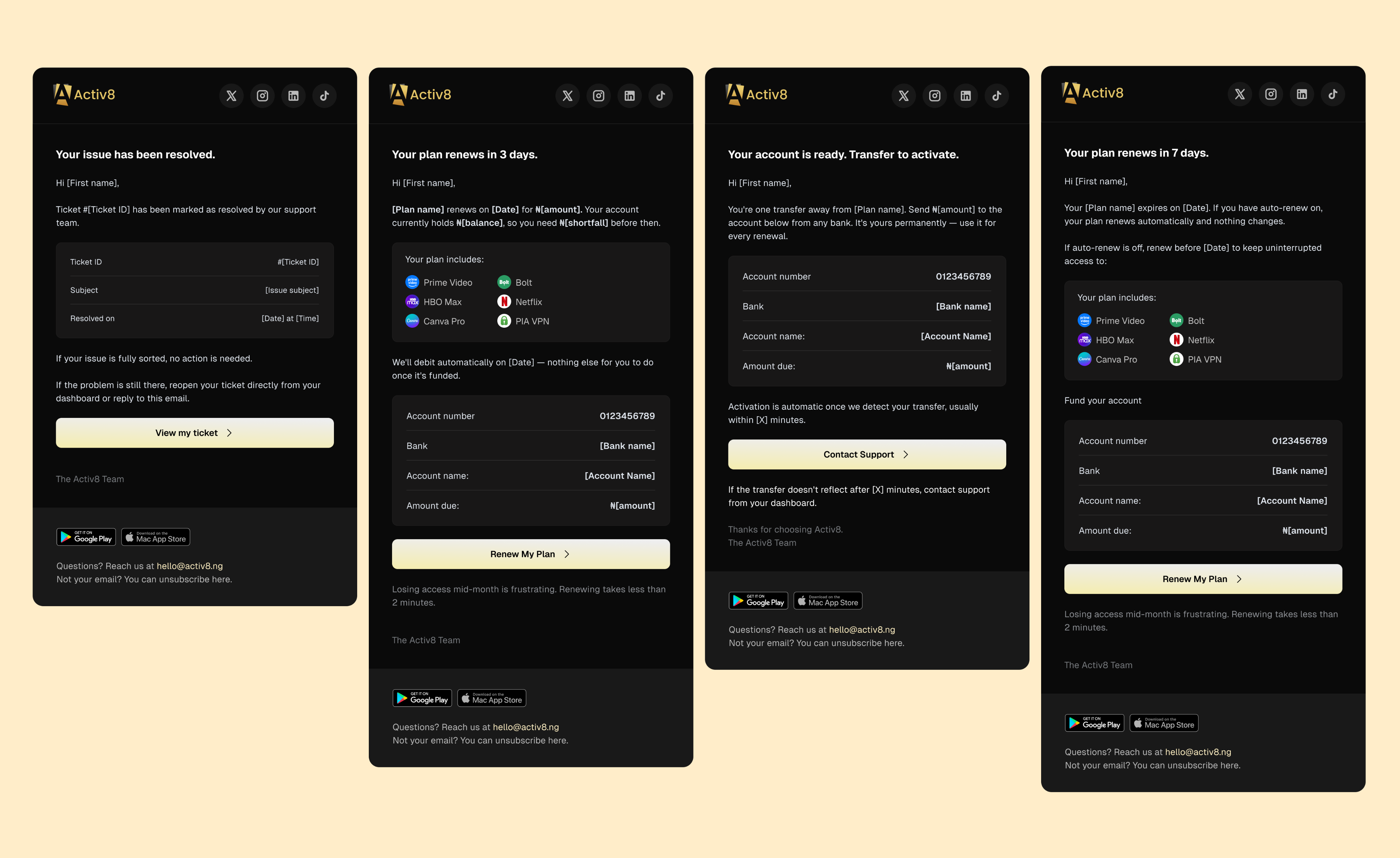
The renewal reminders run the same way — 7 days, 3 days, 2 days, tomorrow — and each one shows your balance, the exact shortfall, and where to send it. Not "your plan renews soon." Here's what you have, here's what's missing, here's the account number.
Credentials and access
Activ8 works by pooling accounts. You get login details for a shared service, not your own account.
That's the entire product, and it's also the thing that makes people nervous. So the credential screen has to carry a lot.
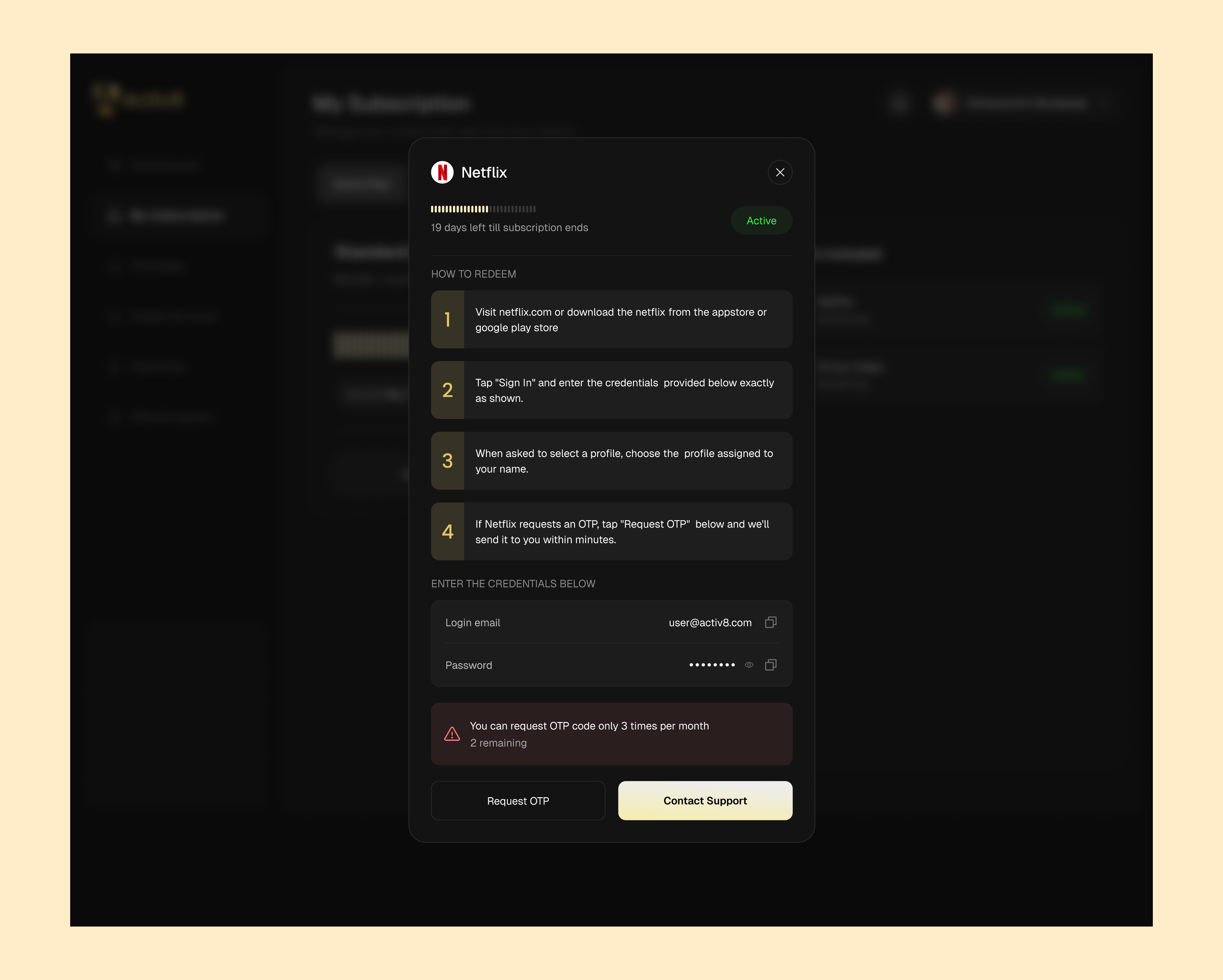
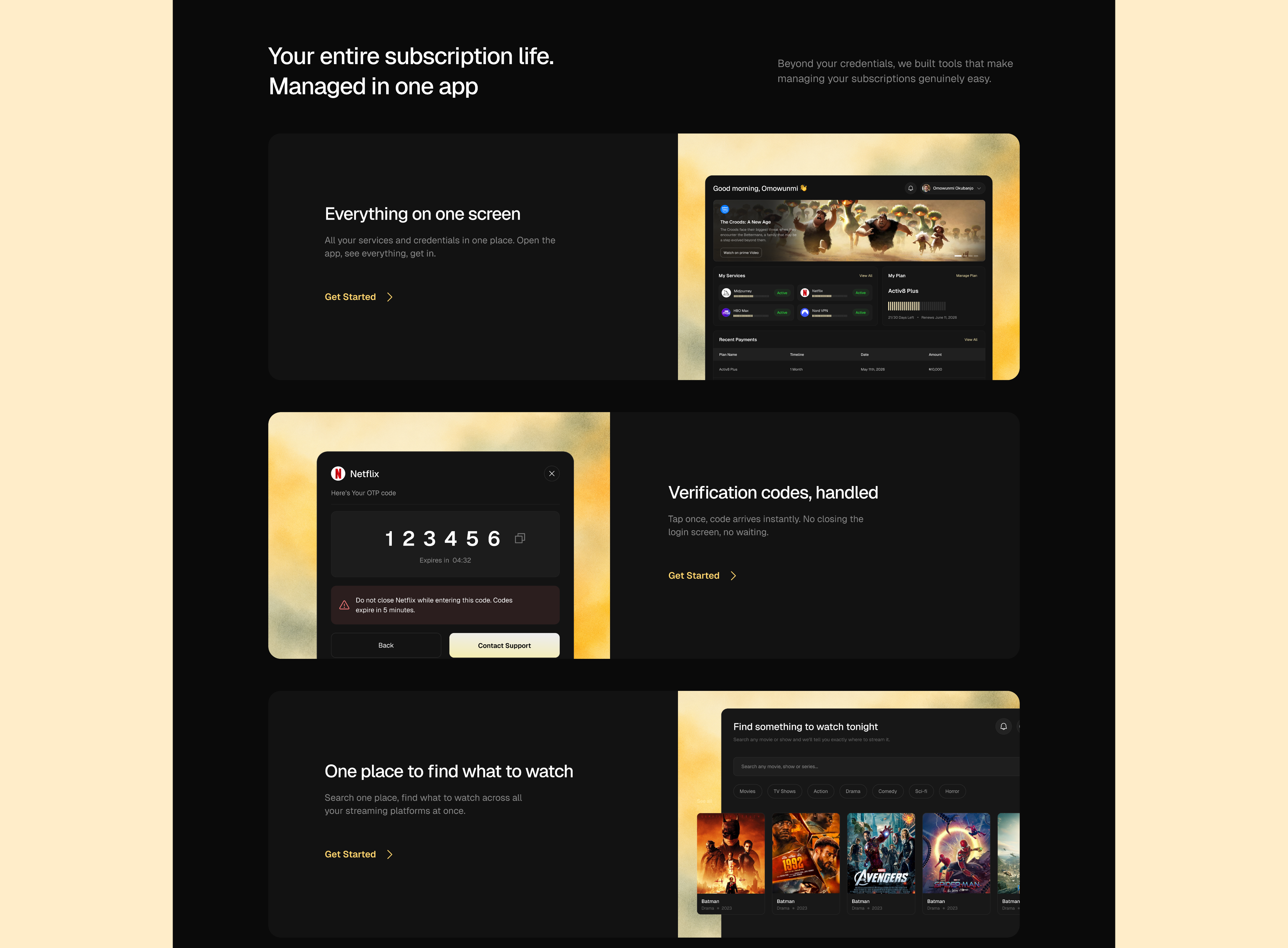
I built it as one modal per service, always in the same order: days remaining, numbered steps, credentials with copy buttons, OTP request. No "we take your security seriously" copy. The screen earns trust by being organised, not by saying trustworthy things.
Two bits I'm happy with:
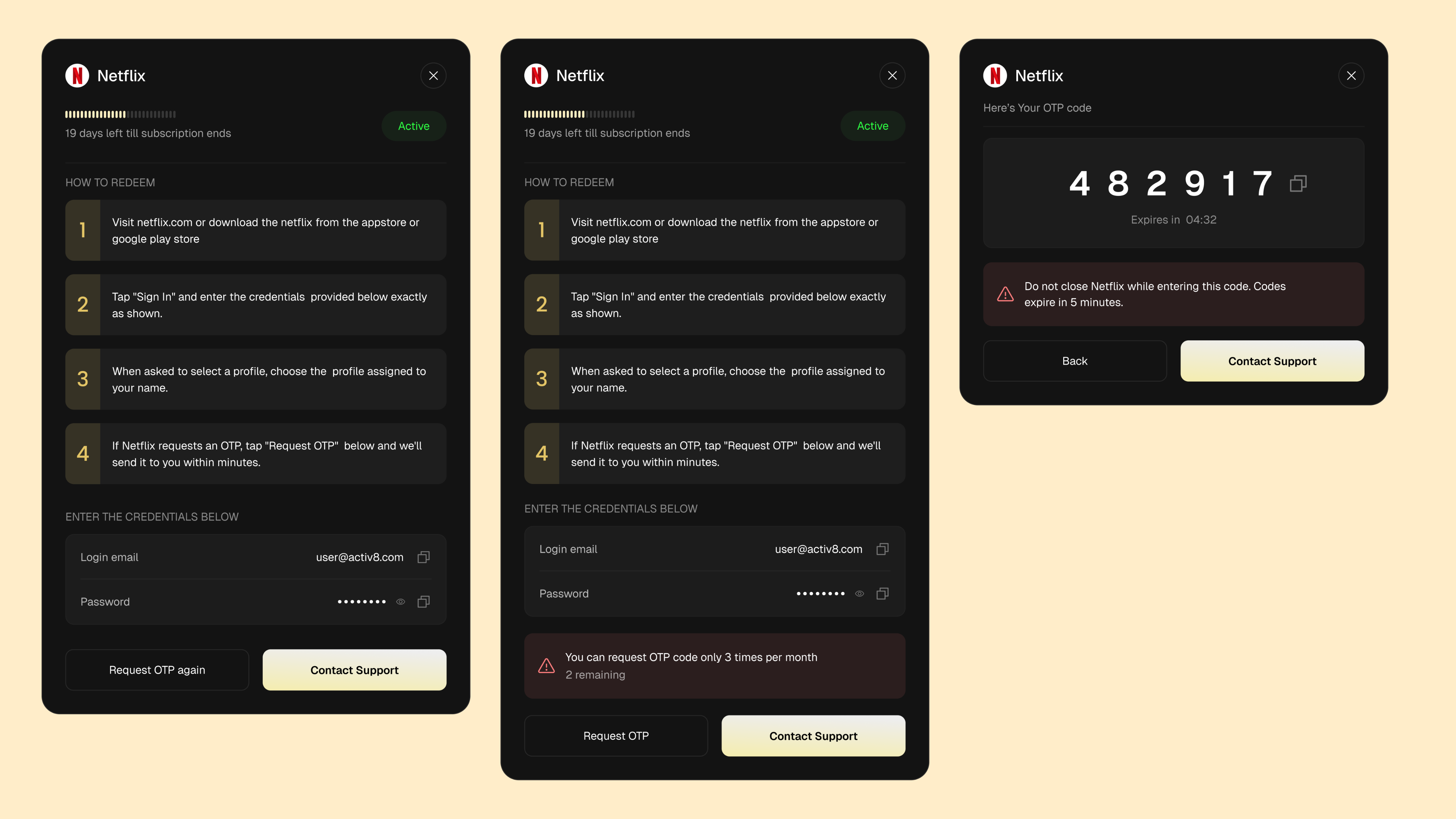
OTP relay is a real feature, not an afterthought. Netflix asks for a code sent to an inbox you don't control. Normally that's where you're stuck. Here you tap Request OTP, the code shows up with a countdown, and there's a warning: "Do not close Netflix while entering this code. Codes expire in 5 minutes." Because someone was definitely going to close Netflix.
The limit is on the screen before you hit it. "You can request OTP code only 3 times per month — 2 remaining." If you find out about a limit by slamming into it, the product is broken. If you know on request one, you just plan around it.
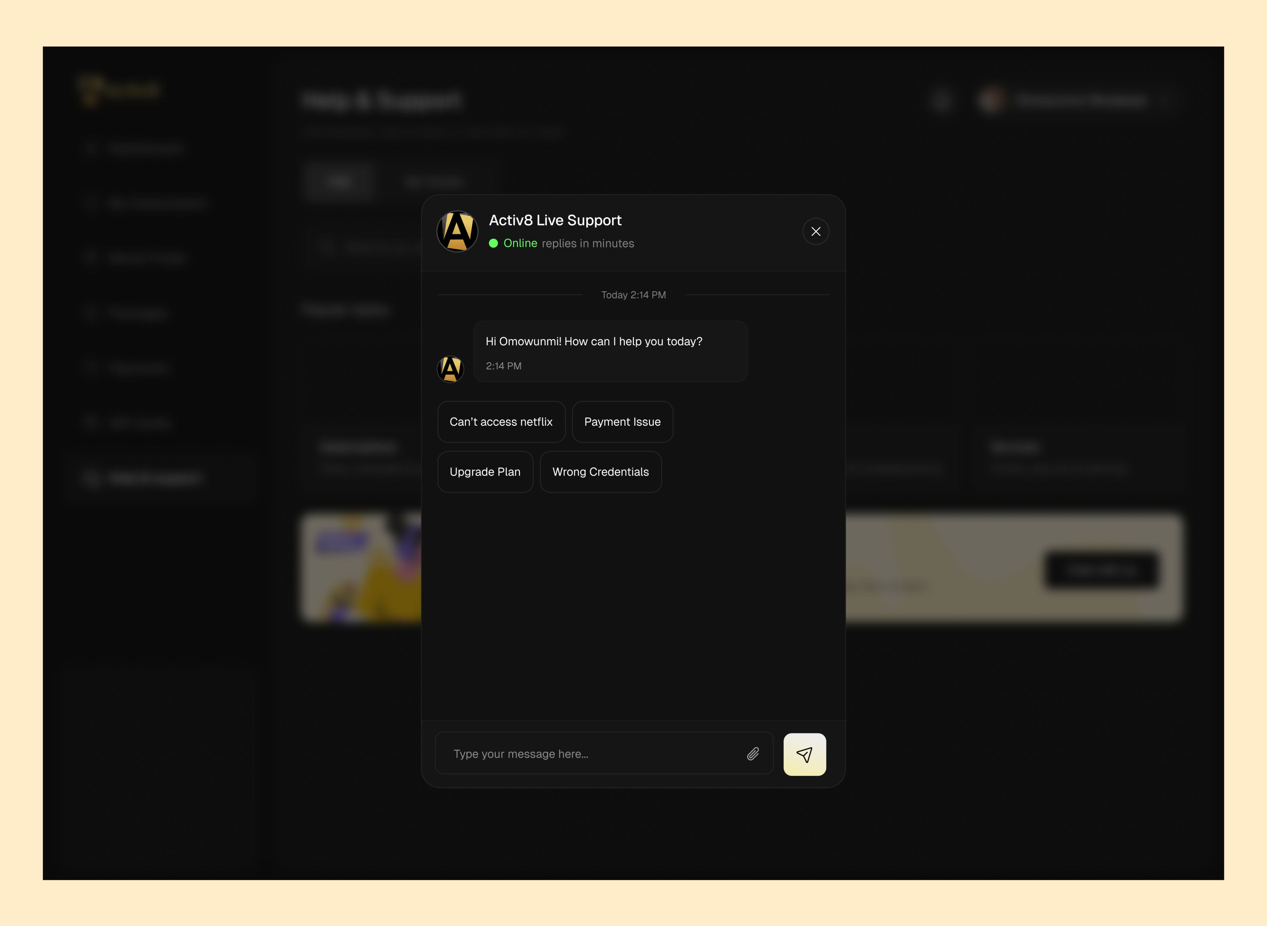
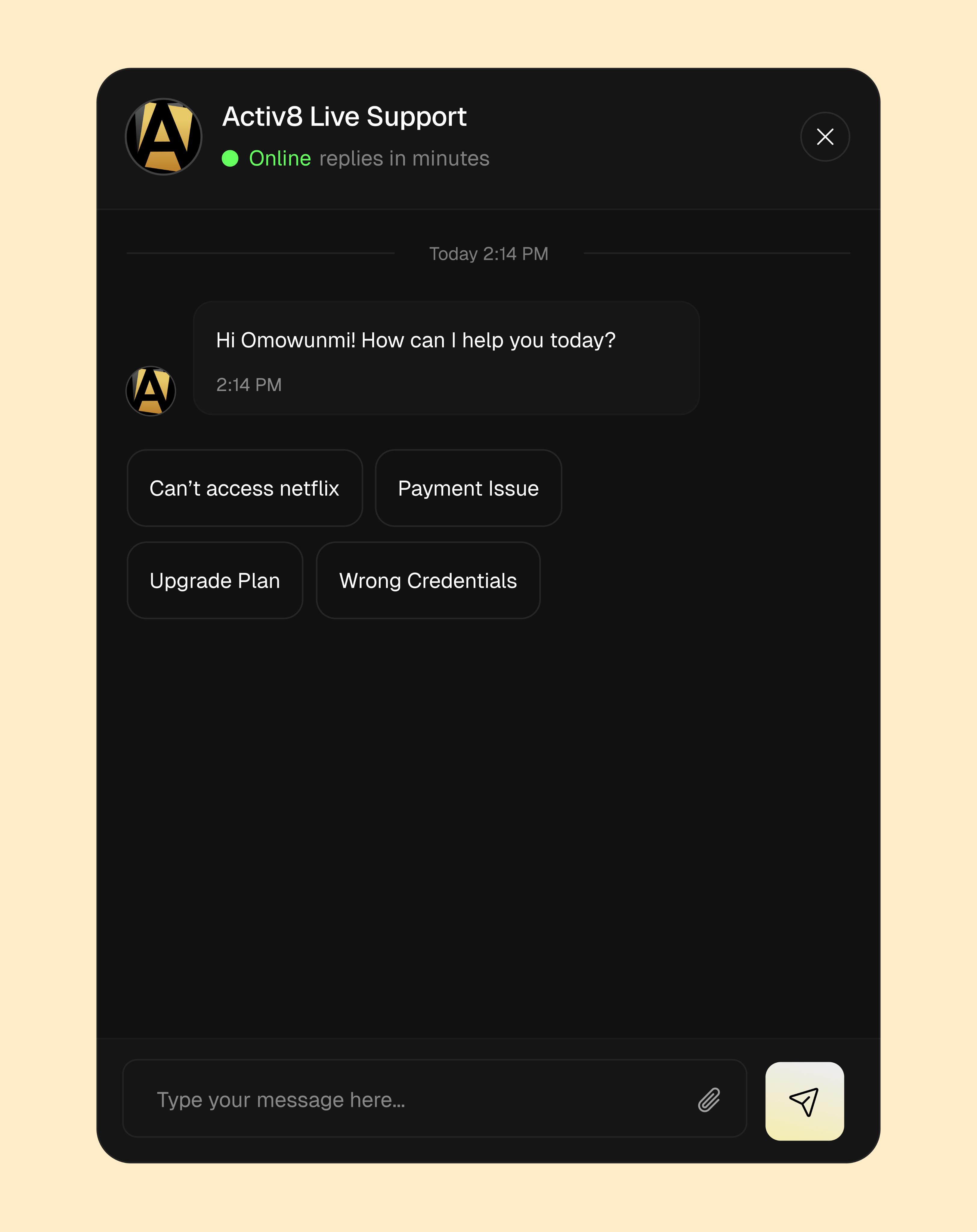
Support is one tap away on the same modal, since this is where things break. Live chat opens with four canned replies: Can't access Netflix, Payment Issue, Upgrade Plan, Wrong Credentials. Those weren't invented — that's the actual queue.
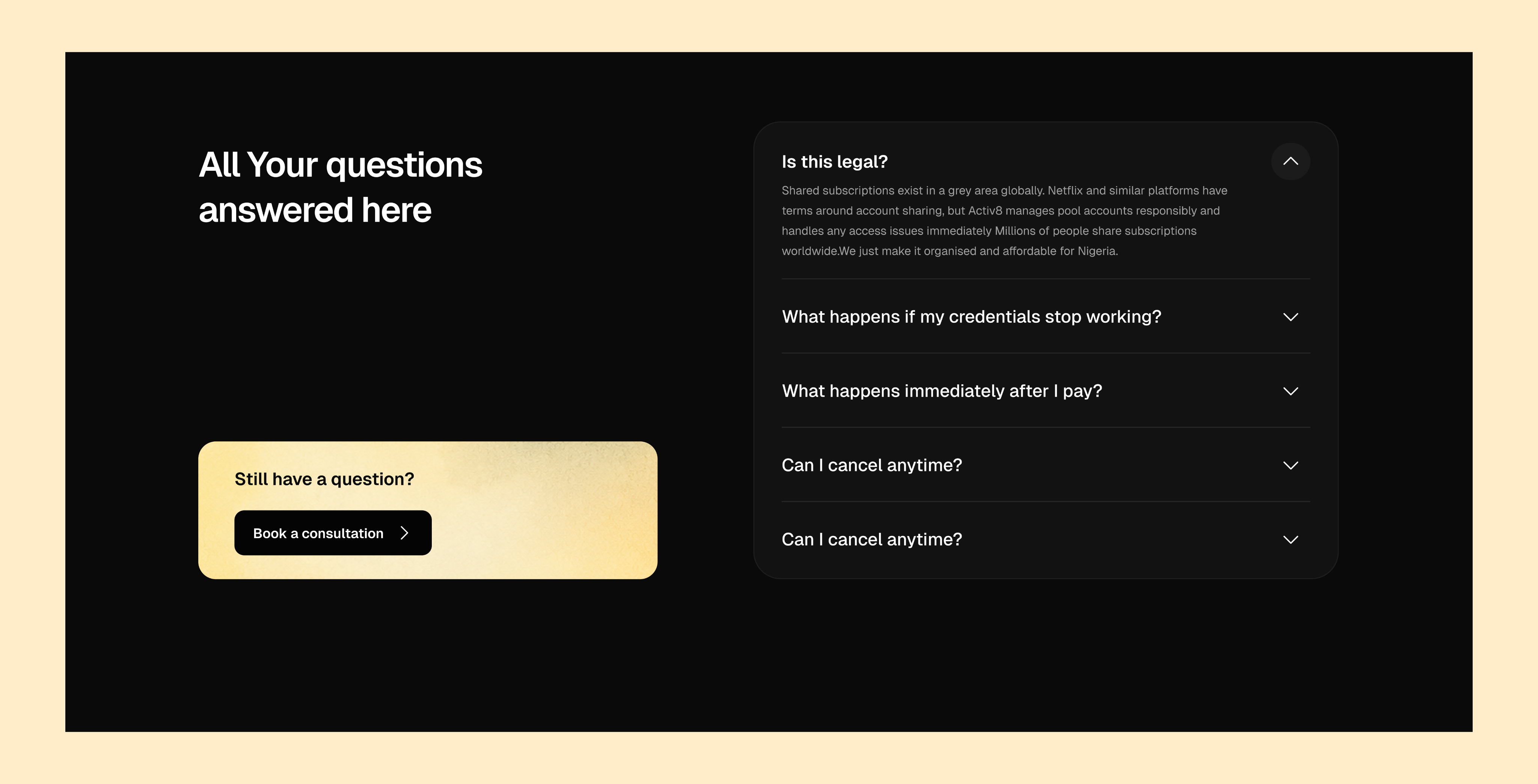
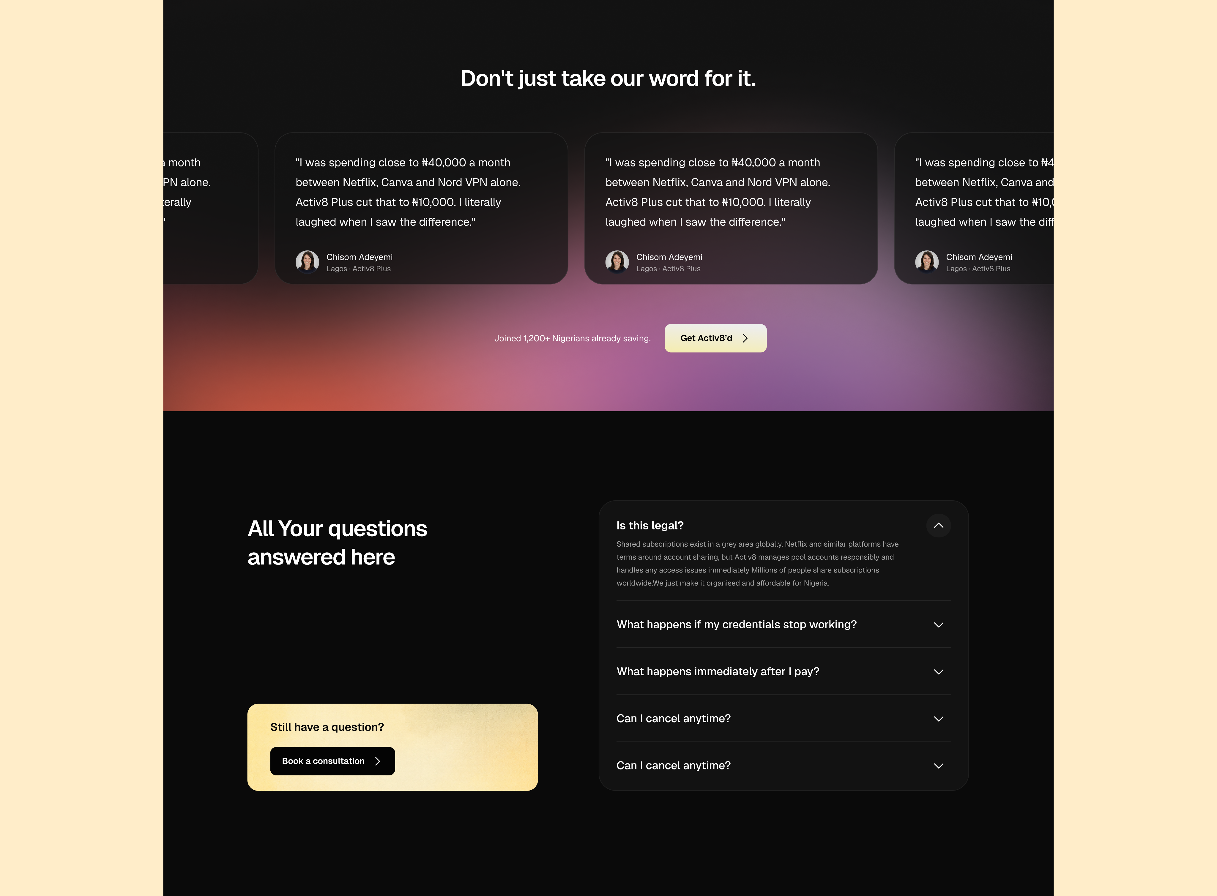
The marketing site does the same thing at scale. First FAQ is "Is this legal?", answered head-on. People are going to ask. Better they hear it from Activ8 than from a Reddit thread.
Movie Finder
Everything above is plumbing. It gets someone paid up and logged in, and then they're staring at nine services with no idea what to put on.
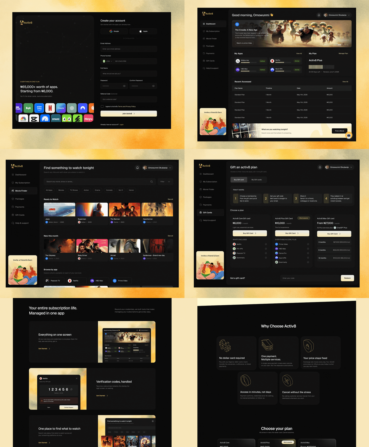
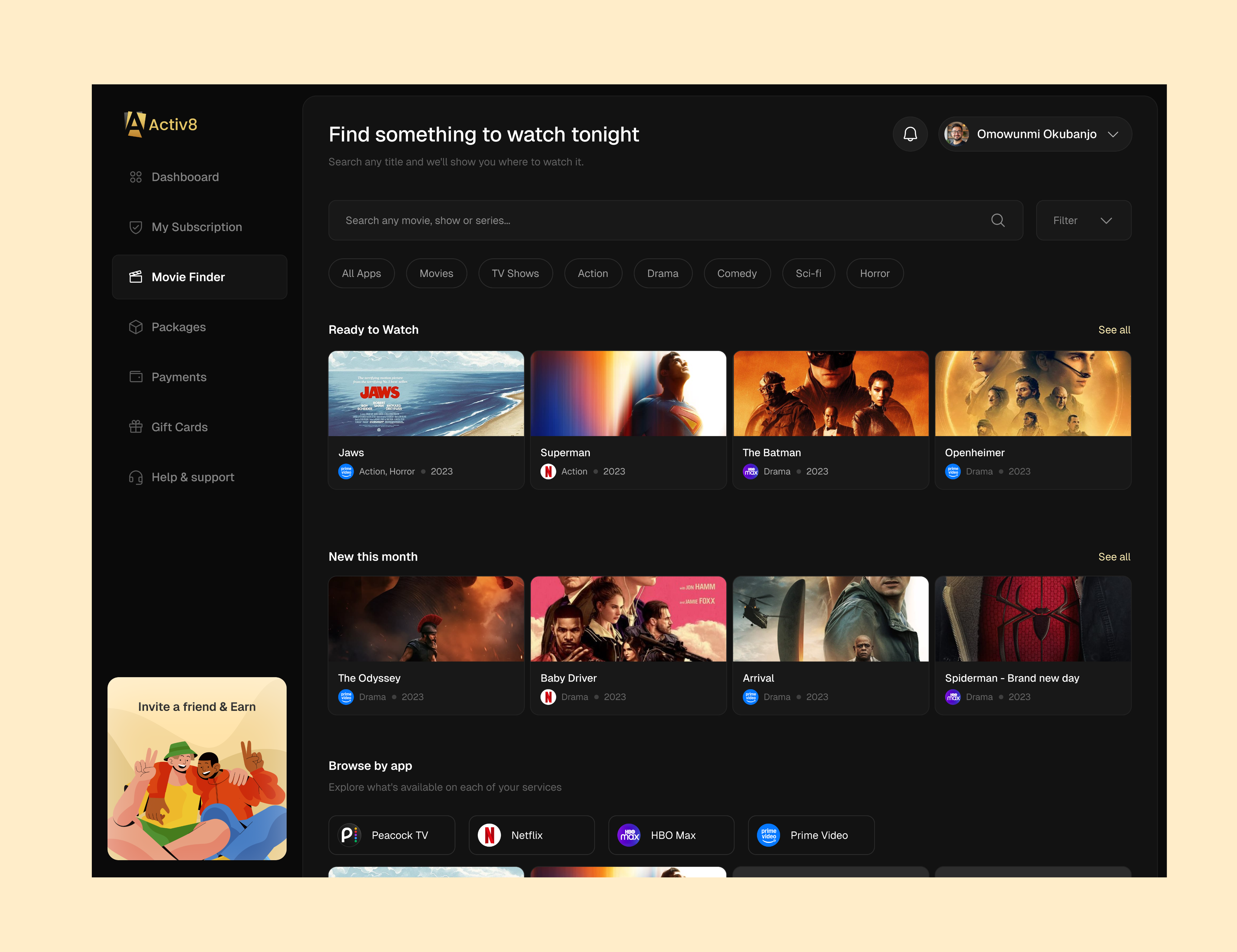
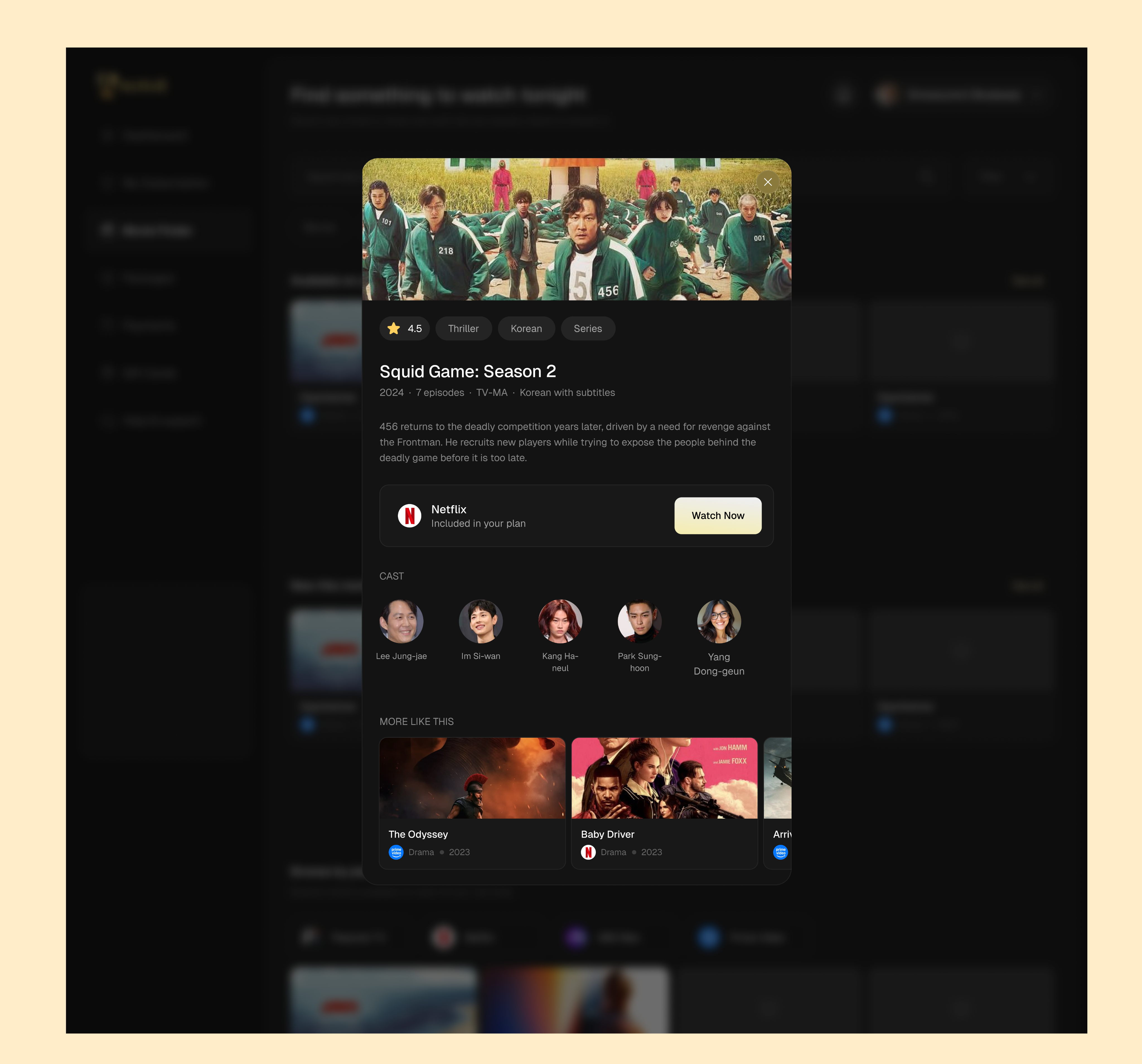
Movie Finder is the fix. Search a title, see which of your services has it, go. The detail view shows the platform with "Included in your plan" and a Watch Now button.
It's the only feature here that isn't about money, and it might be the most important one. Every other screen helps you pay. This is the one that gives you a reason to open the app on a Tuesday.
The system
Plans
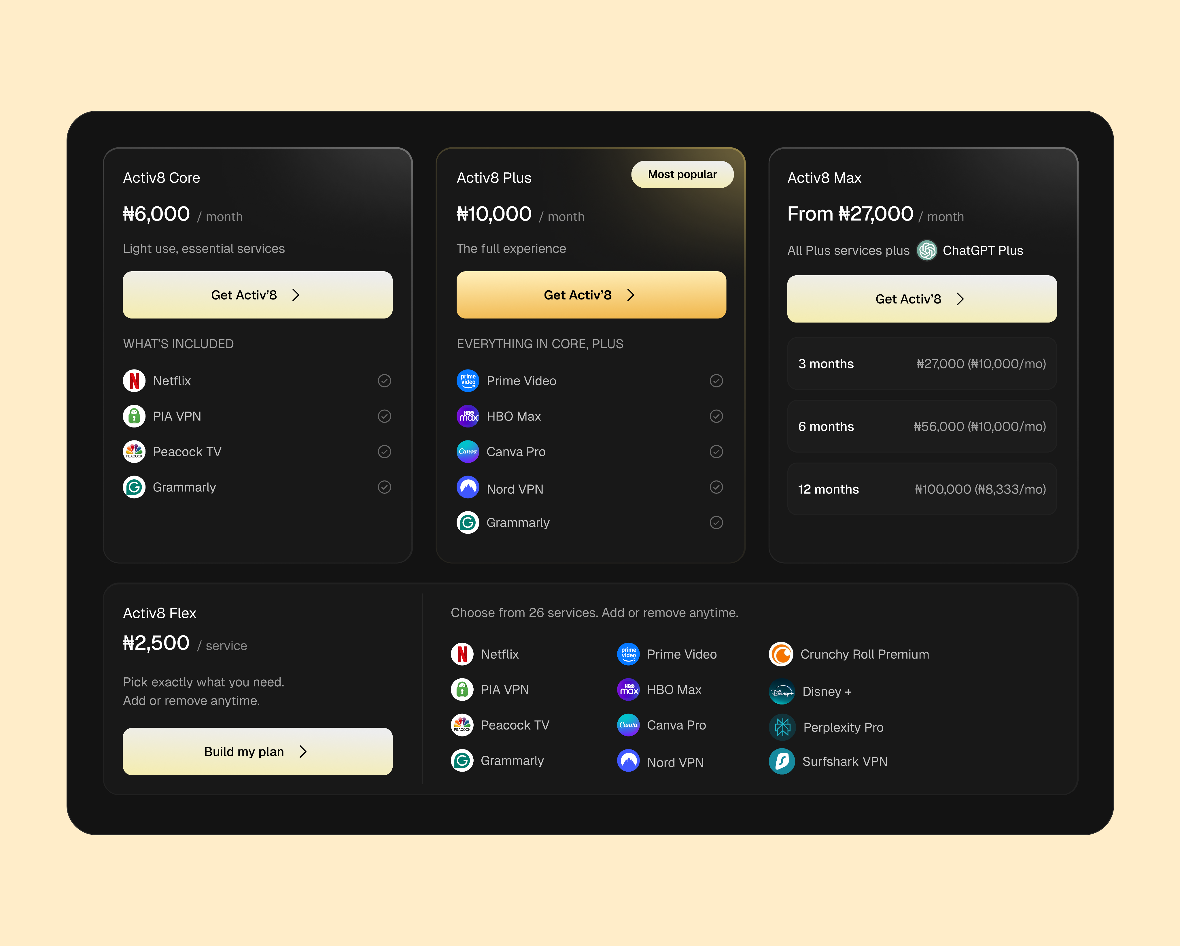
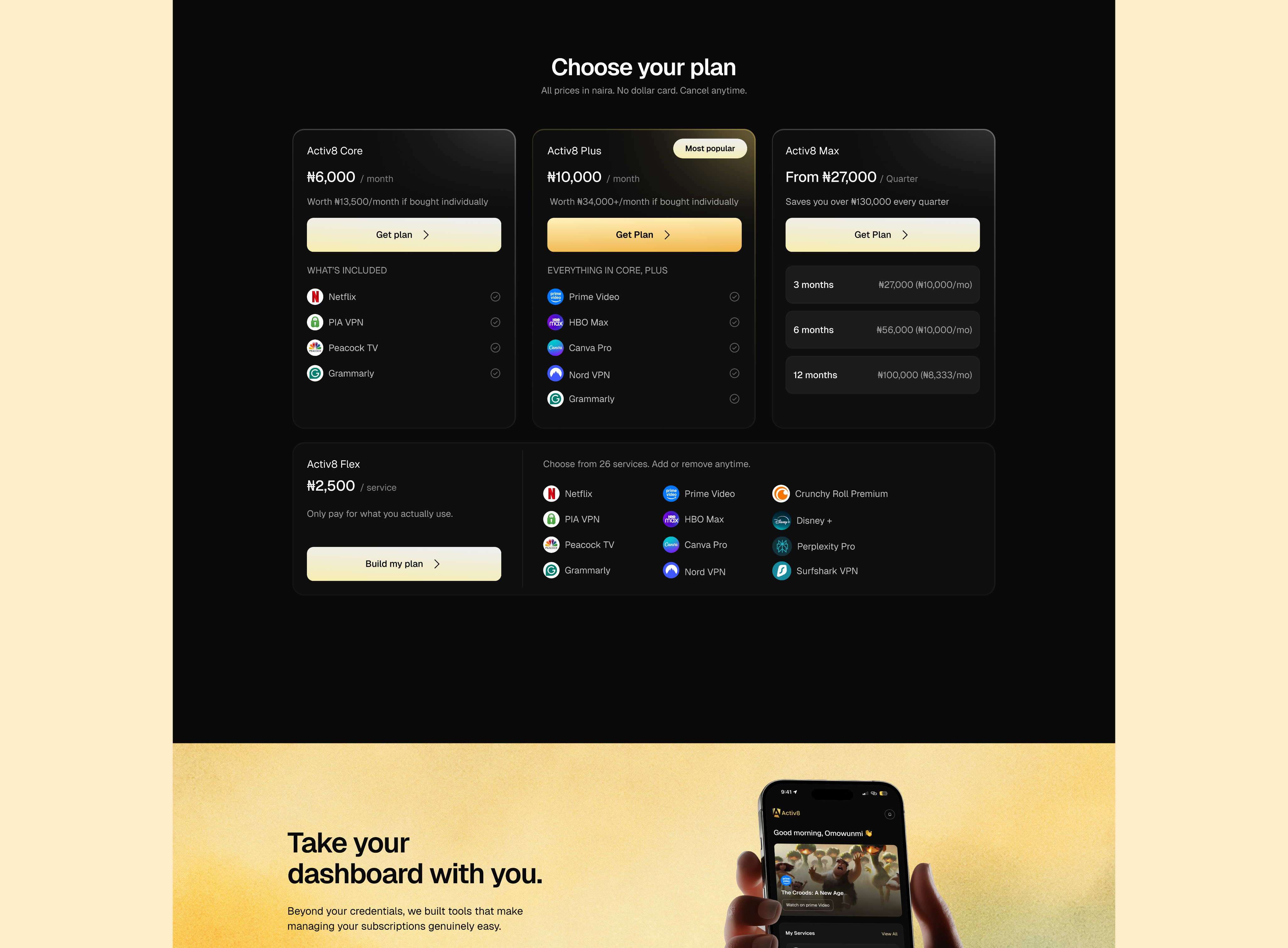
Four tiers. Core, Plus and Max are fixed bundles at rising price points; Max also sells on 3, 6 and 12-month cycles with the effective monthly rate shown against each, so the discount is visible rather than implied.
Flex is the fourth, and it works differently — ₦2,500 per service, build your own lineup. It exists because bundles always leave someone out. Somebody wants Canva and a VPN and nothing else. Somebody on Plus needs Midjourney for one month of a project. Without Flex both of those people either overpay or leave, so it runs as a standalone plan and as an add-on to the bundles.
The Packages page carries a full comparison matrix underneath, since anyone choosing between four options wants them on one screen.
Subscription management
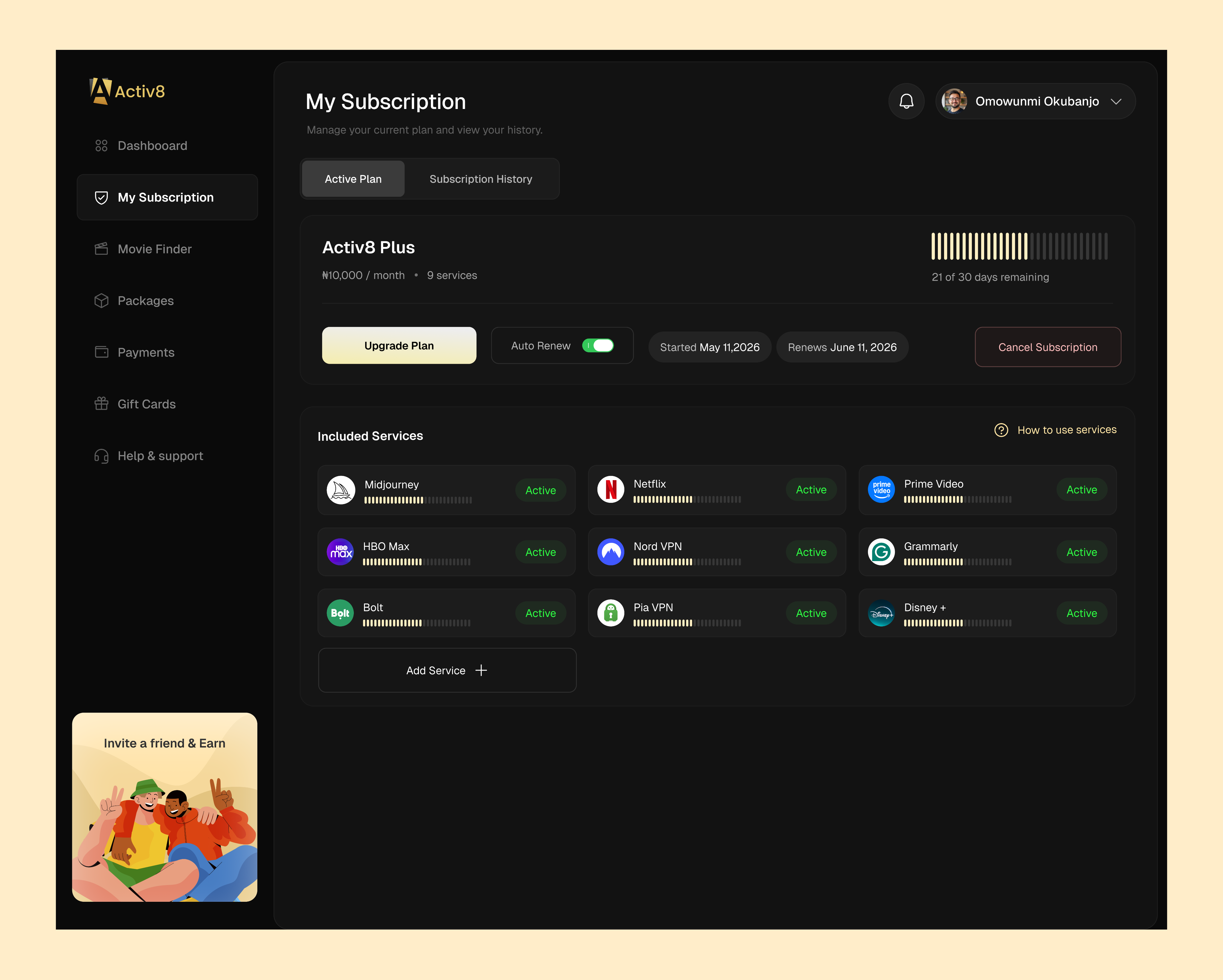
Active plan view with days remaining, renewal date and auto-renew state. A history tab with searchable, exportable records and downloadable receipts per transaction. Upgrade, add services, and cancel all branch from the same screen.
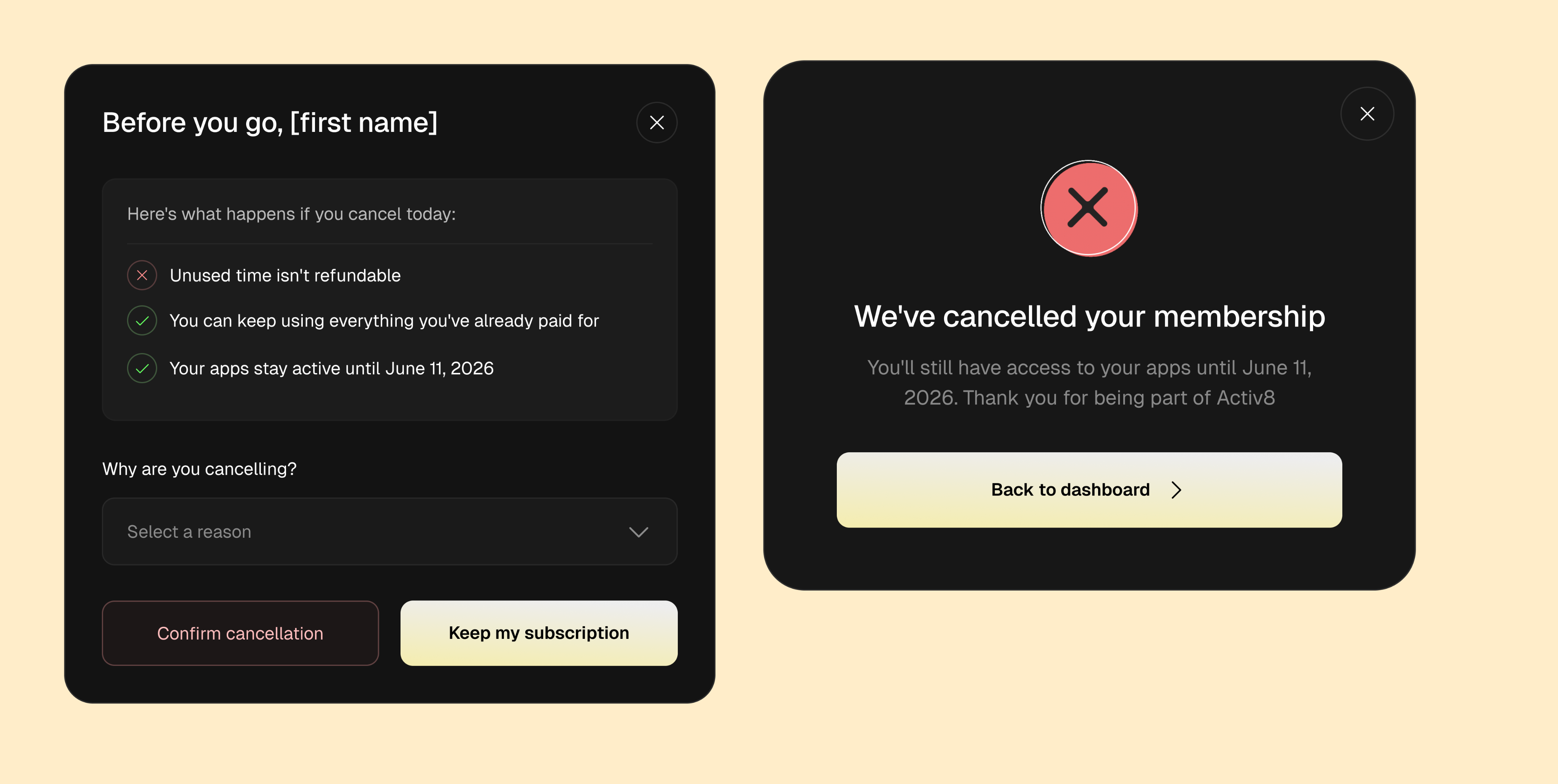
The cancel flow was the one I spent longest on. It shows the consequences before it asks for a reason — what you lose, what you keep, and the exact date access ends — then offers the reason dropdown, then the two buttons. Nothing is hidden behind the confirm, and there's no interstitial offer trying to buy the user back.
Marketing Website
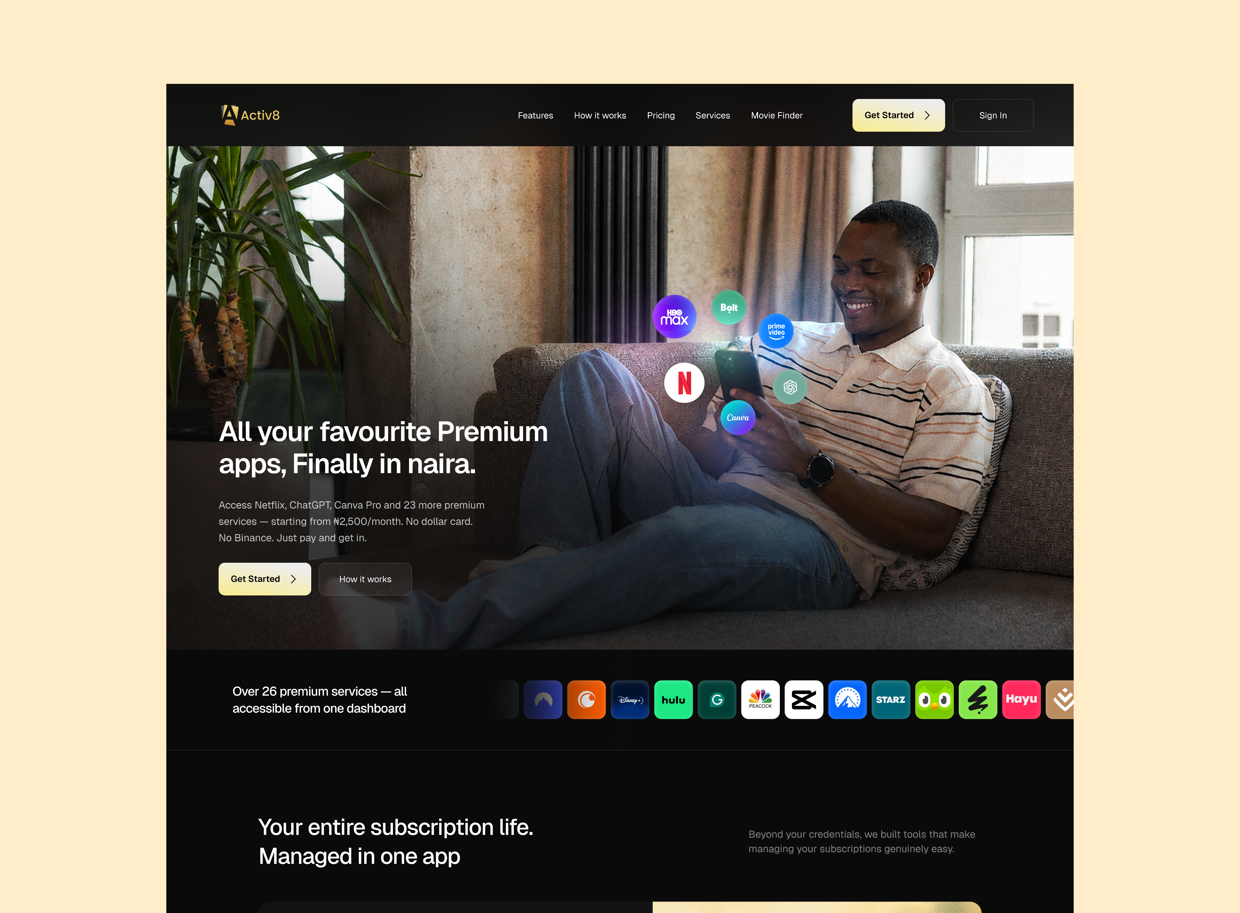
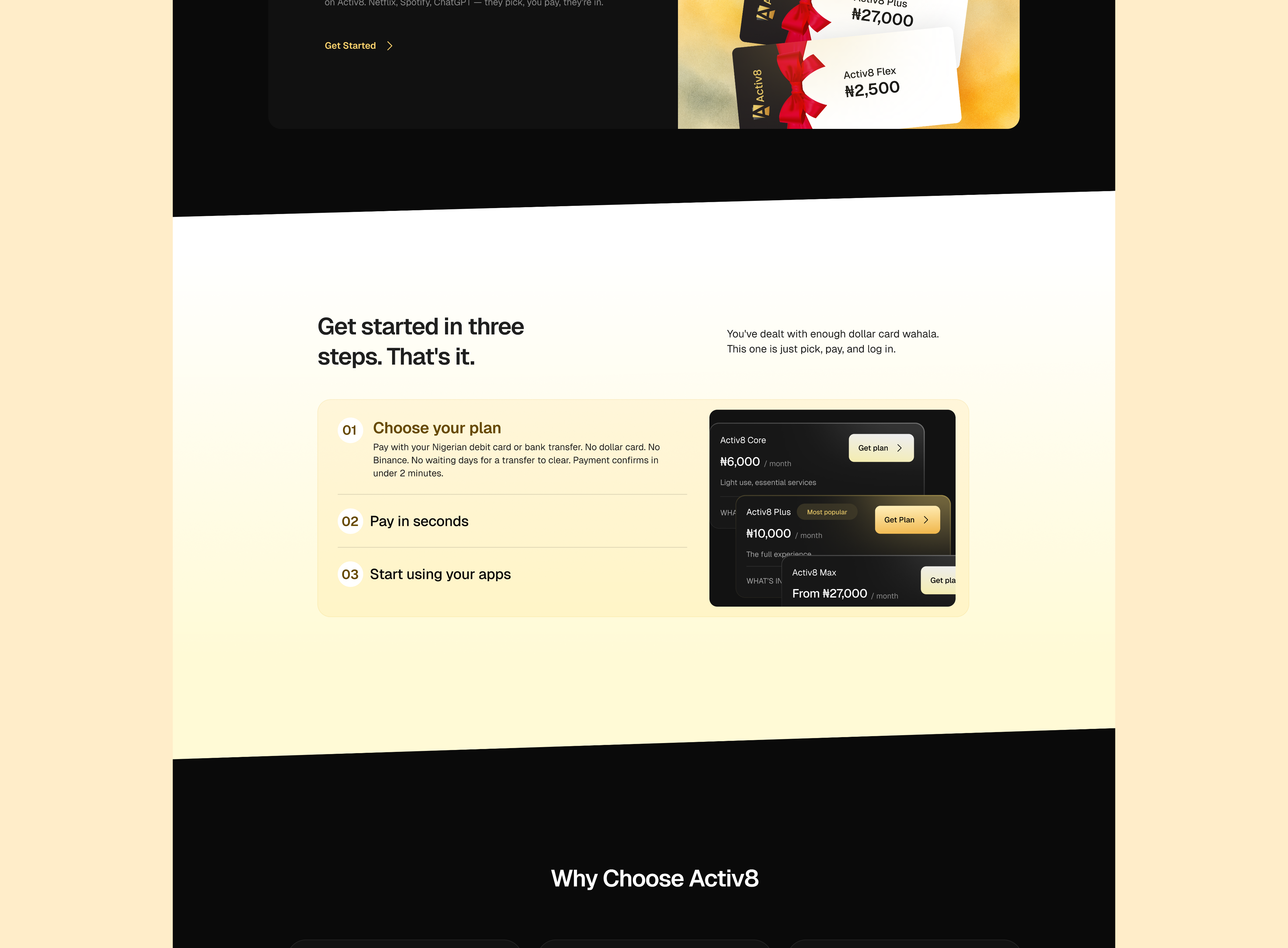
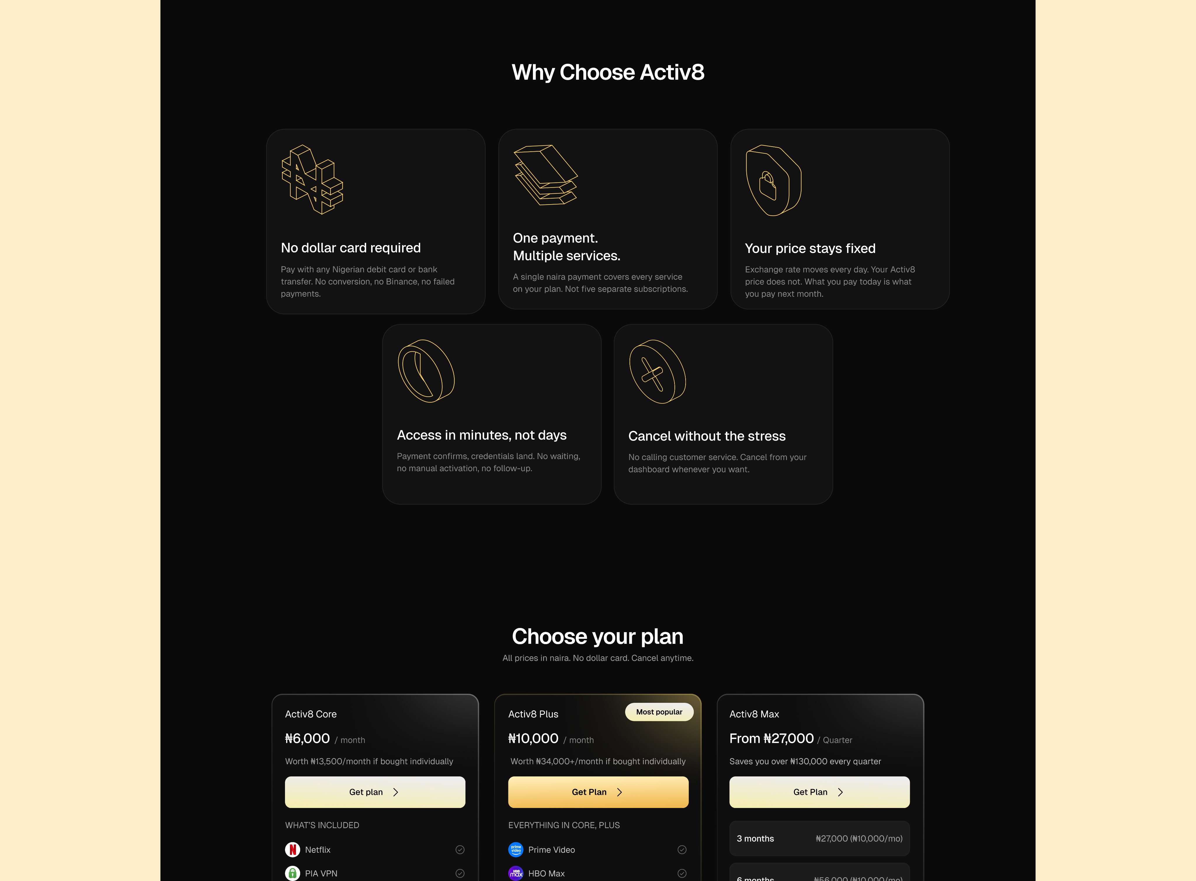
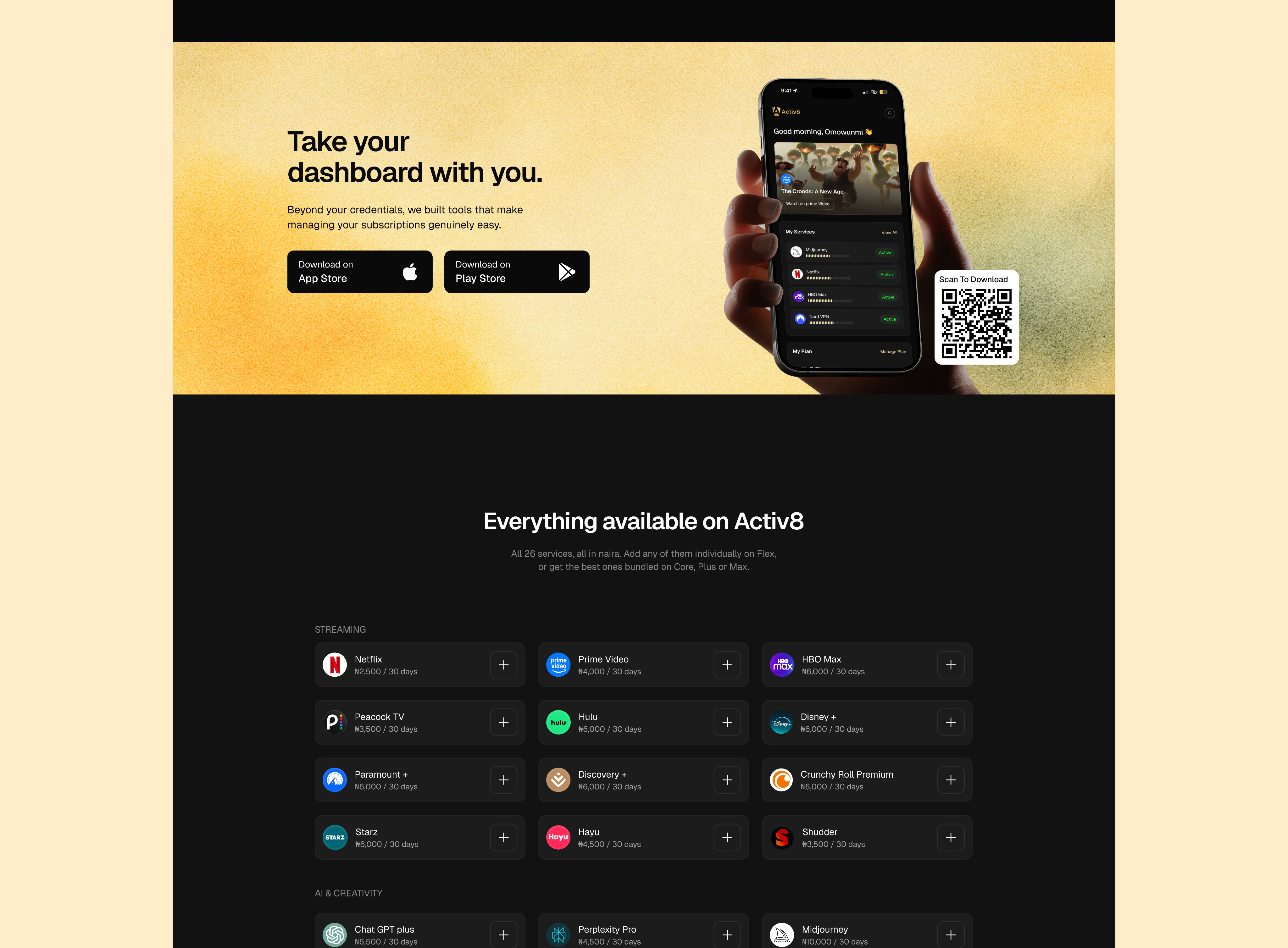
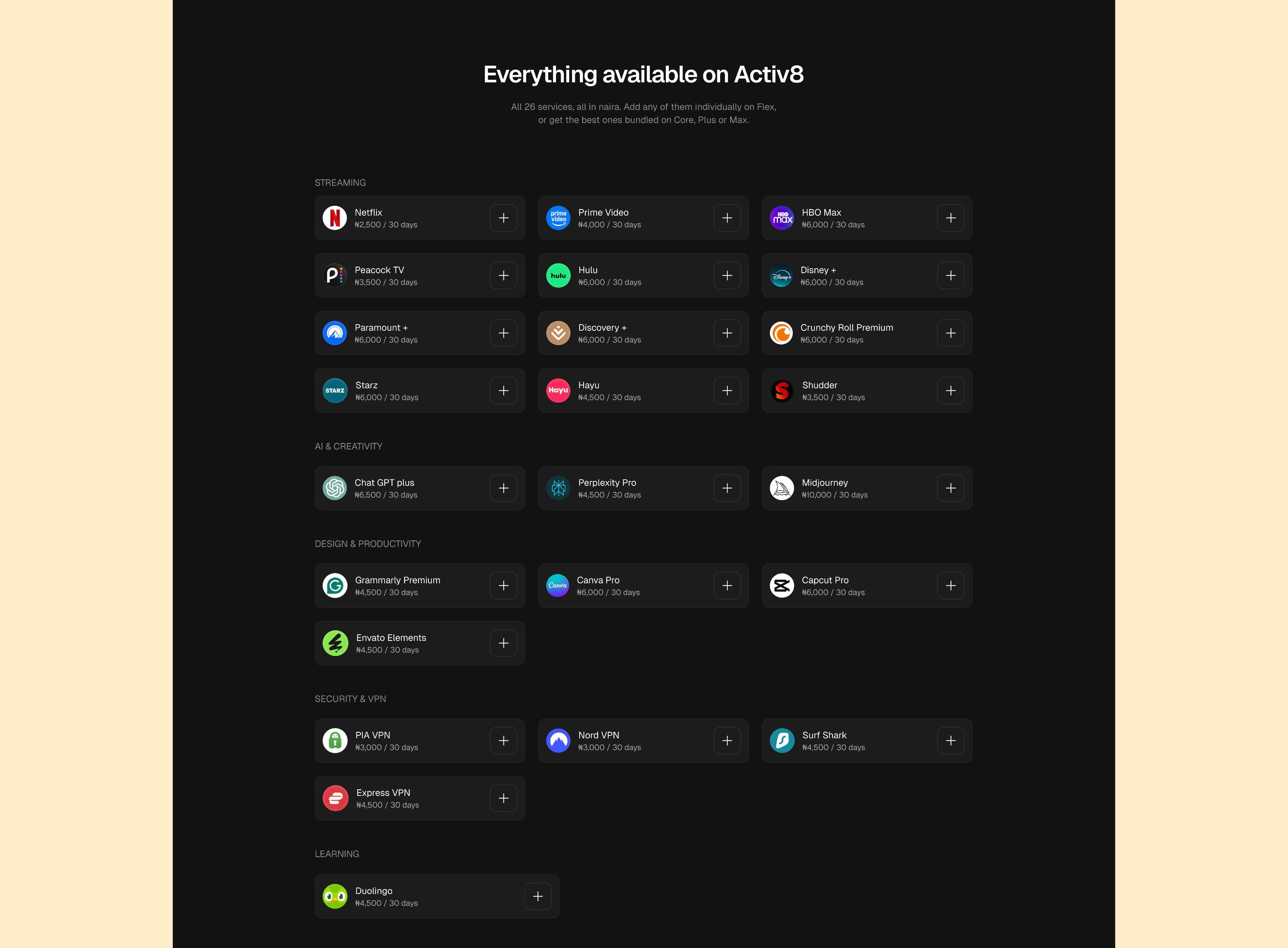
Value proposition in the hero, objection handled in the subhead: no dollar card, no Binance. Below that, five feature blocks mapped to the sections above, a three-step how-it-works with a payment confirmation shown inline, the plan grid, the full service catalogue by category, testimonials, and an FAQ that opens with "Is this legal?" rather than avoiding it.
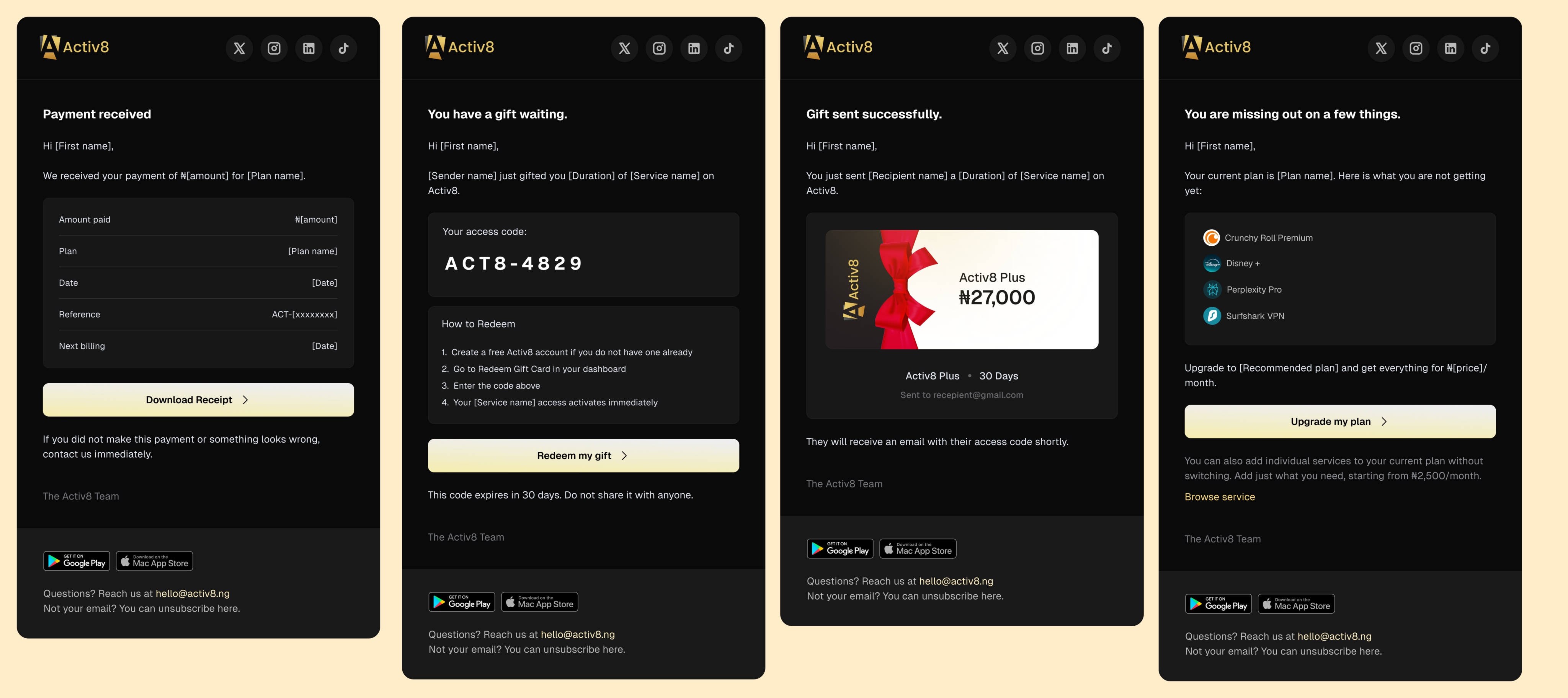
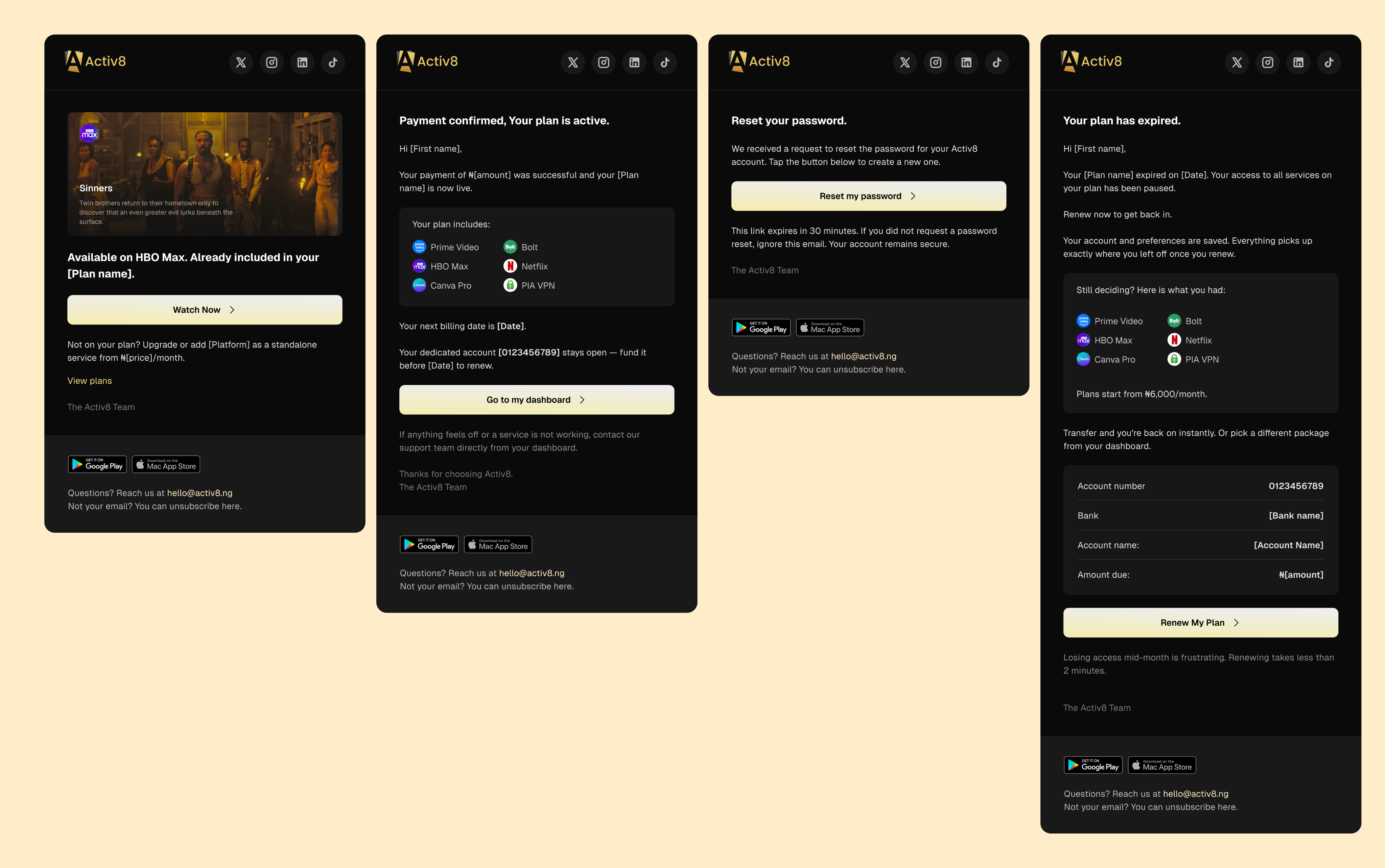
Eighteen templates across four groups: transactional (welcome, payment confirmed, receipts, password), lifecycle (the 7/3/2/tomorrow renewal ladder, renewal success, expiry, upgrade nudge), commerce (gift card sender and recipient, new plan announcements), and support (ticket opened, ticket resolved).
Email carries more weight here than in most products. The moments that matter — a transfer landing, a plan expiring, a balance falling short — usually happen when the user isn't in the app, so the email has to be self-sufficient. Every renewal email includes the account number, the current balance and the exact amount outstanding, so the user can act without opening anything.
Mobile
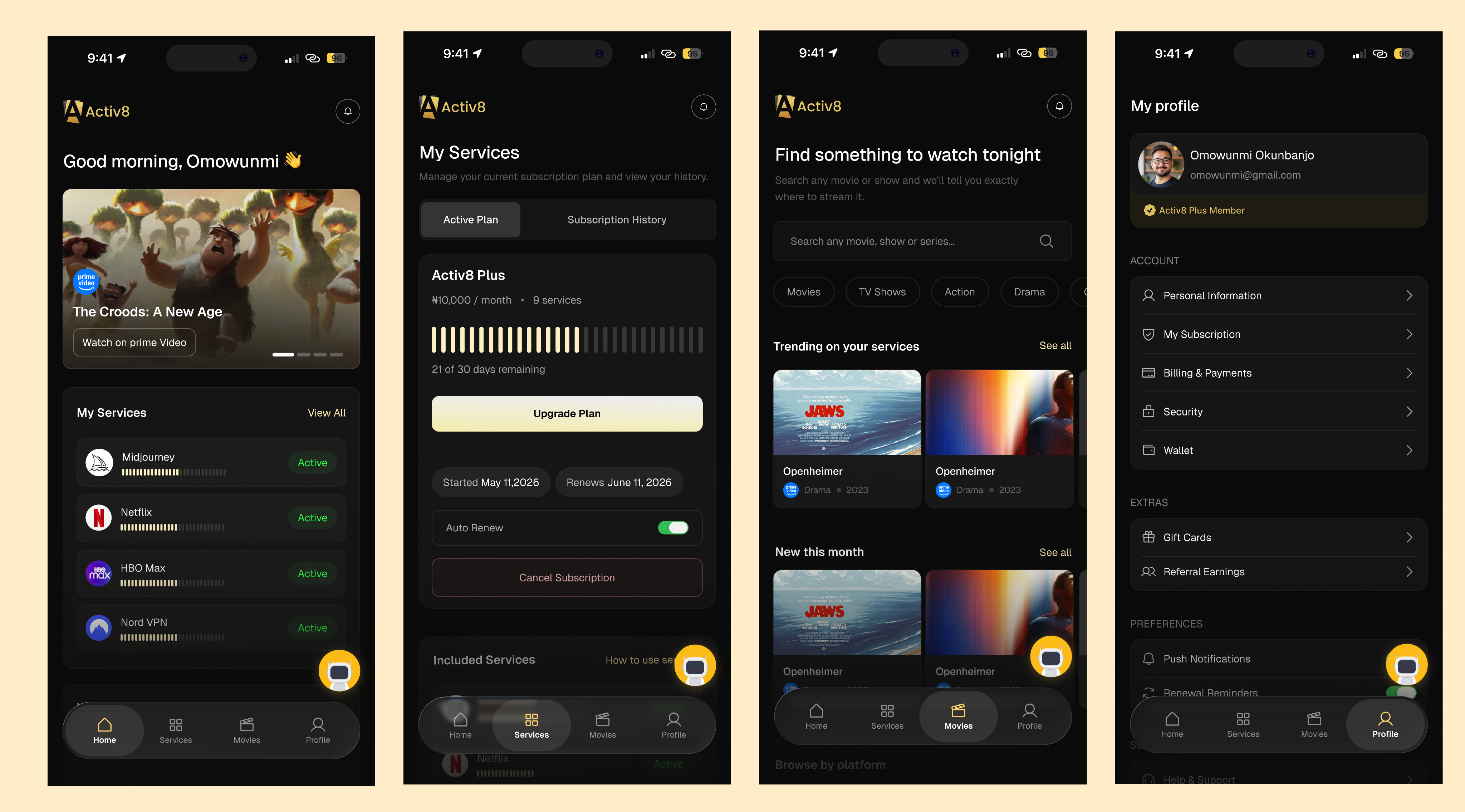
The mobile app follows the responsive web layouts with bottom navigation and a reordered dashboard that puts services and plan status above payment history.
What I'd change
Payment methods live in three places. Saved cards under Payments, again under Profile › Billing, and billing history in a third spot. Each one made sense when I designed it. Together they're clutter. I'd pick one home and link to it.
"All plans include up to 1,000 slots." I have no idea what a slot is and neither does anyone else. I should have pushed back on that instead of designing around it.
The upsell modal is guessing. "Add more of what you love" fires on page load whether or not you've ever added a service. It should trigger on behaviour, not on arrival.
Reflection
Most of the hard parts here weren't interface problems.
Bank transfers don't announce themselves. OTPs go to an inbox you don't own. A shared account raises a trust question before it raises a design one. The work was mostly figuring out how to be upfront about those things instead of designing around them.
The screens I'd defend hardest are the plainest ones — the transfer that hasn't landed, the two OTP requests you have left, the ₦2,000 you still owe.
Handed off in June. Curious to see what changes once it's in front of real users.
Enjoyed reading this? Thank you.
This took a bit of work to put together, so if you liked it, I’d really appreciate you sharing it. If you have a similar project in mind, let’s work together.
What People Say About Me and My Work
One of the smoothest design experiences we've had. Joshua turned complex ideas — AI onboarding, unified inbox, automation builder — into polished, intuitive flows, with a design system that kept us consistent across mobile and web.

Brian T George
CEO, Unifiedbeez

Love his work! Always professional, detail-oriented, and delivers top-quality results. He understands the vision and brings it to life better than expected. Reliable, creative, and a joy to work with — highly recommend!

Becky Idiale
CEO, Daibo Consulting

Josh redesigned our landing page and nailed it. His attention to detail and smooth communication made everything easy. The new design boosted engagement and feels more aligned with our brand. Highly recommend.

Areous A
CEO, Pixel Pioneer Studios

Joshua consistently delivers clean, thoughtful, user-centered designs. He's proactive, reliable, and communicates ideas clearly. Every project gets real creativity and attention to detail — a true asset to any design team.

Chi Onyeukwu
CEO, Njem

Working with Joshua on the Koboneer app was smooth start to finish. He understood the product, turned complex ideas into a clean, intuitive interface, and stayed open to feedback. His attention to detail made a real difference.

Solomon Okafor
CEO, Koboneer

Joshua has been an outstanding contributor at Dingpay. His design solutions are thoughtful, intuitive, and aligned with our users' needs. He works with speed and precision while keeping strong creativity and brand consistency.

Itohowo Udofia
CEO, Dingpay

Great experience working with Joshua. He pays attention to details and provided excellent communication throughout the project.

Donny Gamble
CEO, The Elevation Group

Joshua transformed the AllFoods UK site into something modern, professional, and easy to navigate. He was proactive, responsive, and cared about reflecting our brand. We've had great feedback since.

Akinyemi Arabambi
CEO, AllFoods UK



Let’s Work Together!
Whether it's a freelance project, a full-time role, or you just want a second opinion on something. Tell me a bit about what you're building and where you're stuck. That's plenty to start.


© Joshua Ikhine, 2025.
All rights reserved.
 hello@joshuaikhine.com
 +234 806 258 9858